Archives: Websites

eCommerce Websites

Leisure Project

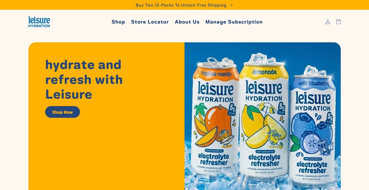
Leisure is a hydration brand selling non-carbonated, shelf-stable electrolyte drinks in flavors including Lemonade, Tropical Mango, Wild Blueberry and Strawberry Breeze, alongside variety packs and a Ggiata collaboration can. The brand markets itself on mental as well as physical recovery, with copy urging shoppers to “pause the scroll” and a tagline built around hydrating, resting and refreshing. Cans are non-caffeinated and sold mainly as 12-packs, with merch such as a trucker hat and tee sold alongside the drinks.

Website Design

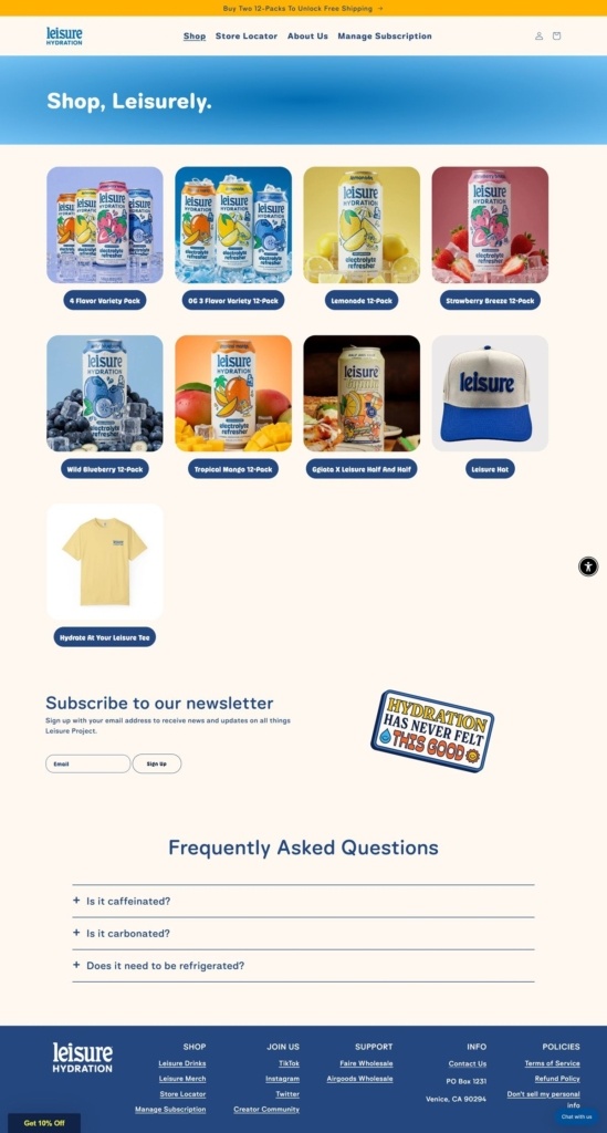
A cream ground with navy type. Pages sit on a warm off-white background with navy blue headings and body copy, a pairing that keeps focus on the illustrated can art rather than the interface around it. Each flavor carries its own colour cue: blue for Blueberry, orange-yellow for Mango, pale yellow for Lemonade.

Rounded, sticker-like display type. Headings such as “Shop, Leisurely” and the FAQ titles are set in a soft, rounded sans, and product badges are shaped as rounded pill labels rather than plain text, echoing the can’s illustrated style.

Product photography over lifestyle shots. The homepage grid uses close, styled shots of the cans with fruit and ice, while lifestyle photography of people wearing the merch appears mainly on merchandise product pages rather than throughout the site.

Shopping Experience

A single flat grid, no categories. The shop page lists drinks and merch together in one four-column grid rather than splitting by collection, with each card carrying just a product photo, name and price.

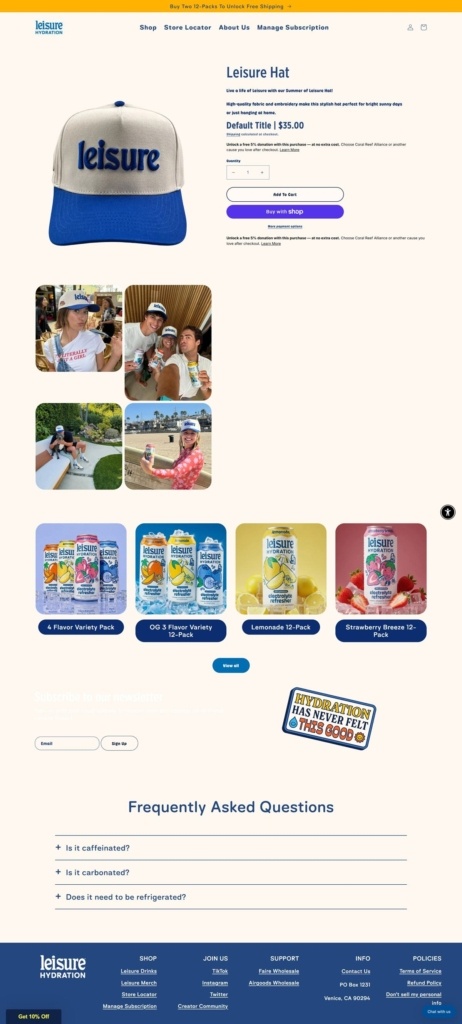
Minimal product pages. The Leisure Hat page runs a plain photo, price, quantity selector and Add to Cart button, followed by a strip of customer photos and then the same flavor grid repeated below, rather than a long features breakdown.

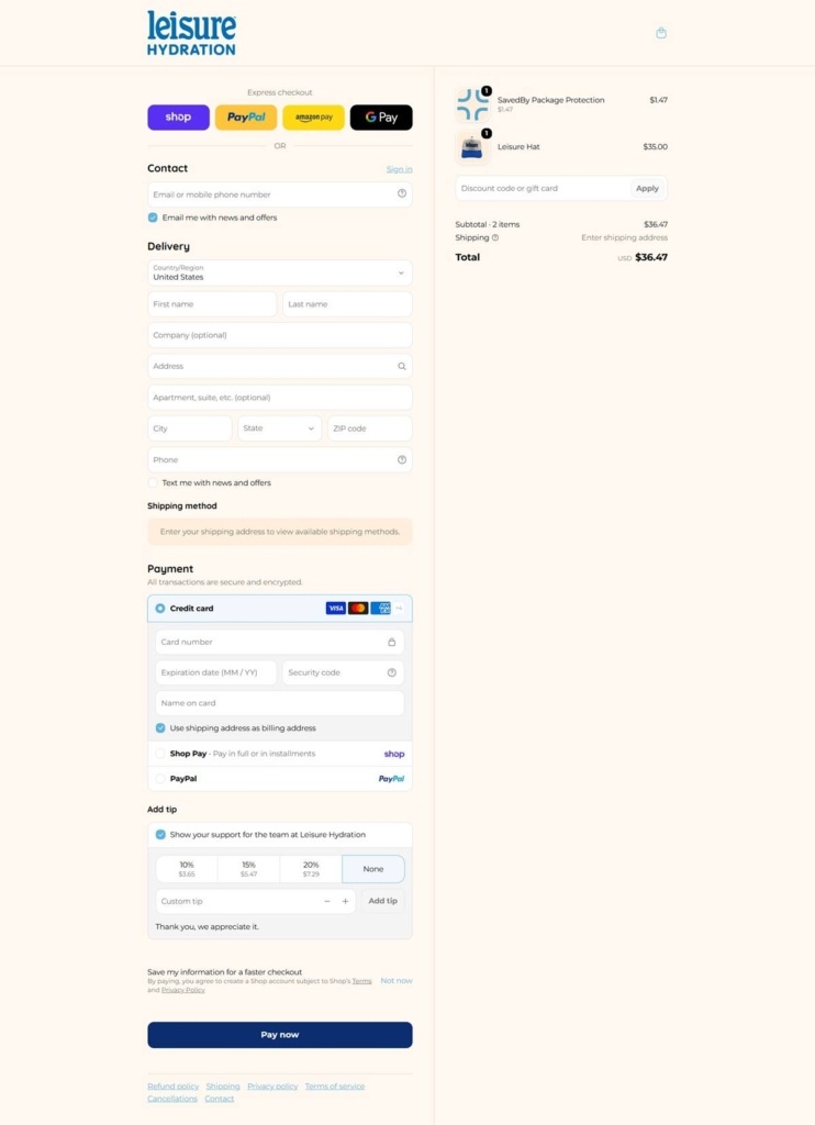
A tip prompt at checkout. The Shopify checkout offers Shop, PayPal, Amazon Pay and Google Pay as express options, and, unusually, includes a line to “show your support for the team” with preset tip percentages before the Pay Now button.

Brand Storytelling

Wellness language over ingredient claims. Homepage copy leans on rest and mood rather than electrolyte specifications, and an FAQ accordion answers basic questions like whether the drink is caffeinated or carbonated in plain language.

A slogan repeated as a sticker graphic. “Hydration has never felt this good” appears as an illustrated badge graphic near the newsletter form, reinforcing the tagline visually rather than only in text.

Notable Features

Bundled free shipping as the main offer. A persistent top banner promotes free shipping on two 12-packs rather than a discount code, tying the incentive to basket size.

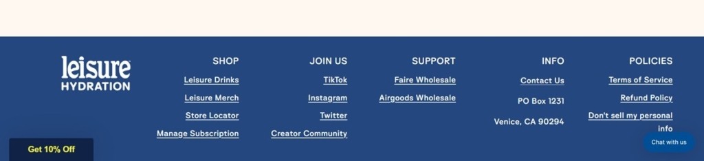
Community and wholesale links in the footer. The footer separates Join Us social links from Support, which lists Faire and Airgoods wholesale alongside a Creator Community page, extending the brand beyond direct retail.

Leisure Project Shop page example
Leisure Project Product page example
Leisure Project Checkout page example
Leisure Project footer example
Goldi

Goldi extra virgin olive oil is grown & cold-pressed in Australia on a single estate that maximises flavour, polyphenols and antioxidants.

Kimbala

Kimbala is a small-batch Indian chai and coffee brand selling concentrates and ready-to-drink bottles direct to households in the United States, with a wholesale presence in cafes, hotels and shops around Austin. The catalogue is short: chai, dirty chai and golden turmeric concentrates in twelve and twenty four packs, a fifteen-bottle variety pack at $99, and a digital gift card. Everything is brewed to order and shipped chilled, which shapes most of the shopping copy. Built on Shopify with a customised Dawn theme.

Website Design

Terracotta on grey. The theme sets near-black type on a light grey ground with white content panels, and the only brand colour is a warm terracotta, #cb916b, close to chai with milk in it. It fills one full-width band, tints the review stars and appears almost nowhere else.

Wave-cut section breaks. That band is trimmed top and bottom by an inline SVG wave rather than a straight edge, so the colour reads as poured liquid. It is the one piece of custom art direction in an otherwise stock layout.

Fira Sans over IBM Plex Sans. Headings run Fira Sans at weight 700, scaled up slightly against the body text, which is IBM Plex Sans at 400. Inside the terracotta band the heading is italicised, the only place the type leaves upright.

Shopping Experience

A four-product grid. The Products collection holds four items, each card showing a star rating and review count above the name, the price below and a Buy now button. Review counts are small and unrounded, one to eight.

Prices quoted as ranges. Concentrates sell in twelve and twenty four packs, so cards read From $43.00 and the product page resolves that to $43.00 or $85.00 once a size is picked.

Stock is currently empty. Every card carries a Sold out label and a site-wide banner states “All items will return soon, thanks for your patience while we restock!” The gift card stays purchasable.

Logistics live in the buy box. The product accordion covers United States shipping only, no PO Boxes, made-to-order preparation, chilled two to three day transit, UPS dispatch Monday to Wednesday and immediate refrigeration on arrival. Footer badges list Shop Pay, Apple Pay, Google Pay and the major cards.

Brand Storytelling

A semicolon for a logo. The About page translates Kimbala from Sanskrit as “what is your strength”, and the mark is a semicolon with an elephant worked into it, read as a pause and as strength in kindness.

Sourcing named, not implied. Ingredients are listed in full on the product page, down to Assam black tea, clove, cardamom, cinnamon, nutmeg and jaggery, and the coffee is traced to grower families in the Western Ghats.

Notable Features

A page about the packaging. Reuse and Recycle explains the fold-flat foam cooler and the recycled cotton liner used in shipments, with suggested second lives for each.

Stockists instead of a map widget. The Locations page lists named cafes, hotels and grocers by address, mostly in Austin, as a plain directory with Visit links.

A glossary blog. Chai 101 runs explainers such as a full guide to jaggery sugar, sitting beside a separate recipes blog and promoted on the homepage.

Back Suncare

Bask Suncare offers sunscreen products online. Bask Suncare makes lightweight, non-oily, easy to apply sunscreen using natural ingredients that protect your skin and the environment.

People of Substance

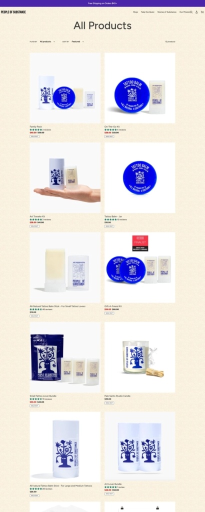
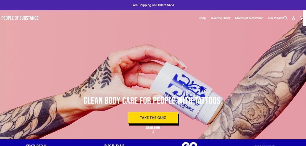
People of Substance sells clean body care made for tattooed skin: balms, balm sticks, kits and a studio candle, aimed at both fresh and healed tattoos. The homepage states the positioning in one line, “CLEAN BODY CARE FOR PEOPLE WITH TATTOOS”, and the mission page frames the range against a market split between drug-store ointments and cheaply made tattoo lotions. US based, shipping free over $45. Built on Shopify.

Website Design

A yellow paper ground. The stylesheet sets the body background to a paper texture rather than flat white, so panels, product cards and review blocks sit as white sheets on a warm tinted field.

Figtree with Bebas Neue buttons. Body and headings share a single family, Figtree. Buttons override it with Bebas Neue at 24px, uppercase and letterspaced, which gives calls to action a poster quality against otherwise plain text.

Colour used only where it acts. Body copy is #333232 and interface text #3a3a3a, buttons dark grey with white labels, sale prices a bright red #EA0606 and image overlays a mauve brown #685858. Button classes are named for their fills, yellow and green, the only saturated colours in the system.

Shopping Experience

Twelve products, kits first. The full catalogue is twelve items. Singles run from a balm stick at $15 through the Tattoo Balm jar at $18 to a Palo Santo Studio Candle at $39. The rest are kits and bundles, from the On-The-Go Kit at $28 to the Gift-A-Friend Kit at $56, each card showing the bundle price against a struck-through regular price.

A quiz as the entry route. Take the Quizz sits in the main navigation and repeats on the homepage under “What products are made for you?”, branching into repair and enhancement paths rather than pushing straight into a grid.

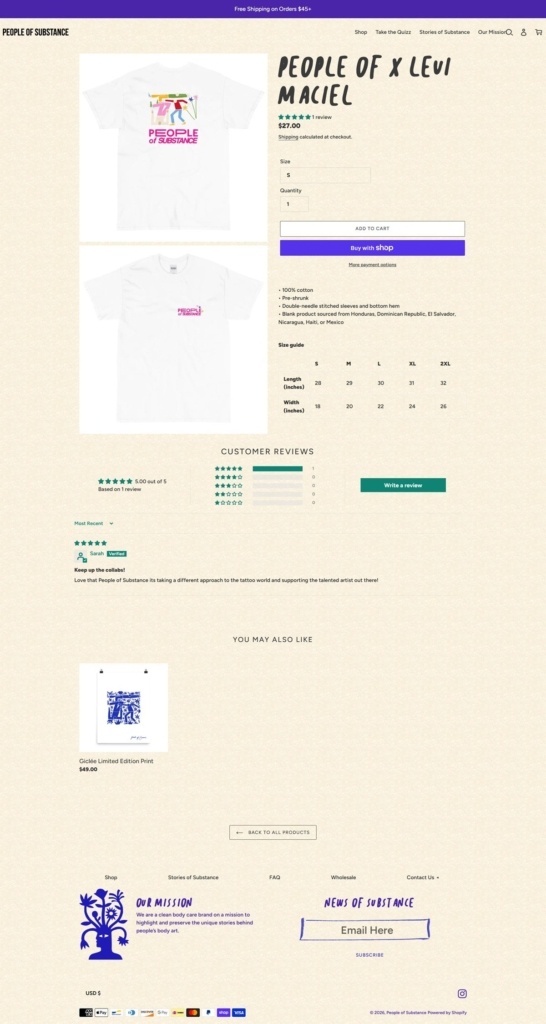
Product pages built like landing pages. Below the buy box come benefit tiles, a three-ingredient panel covering apricot, hemp and grape seed oil, then an accordion with usage notes for fresh versus healed tattoos, a full INCI list, fill weight and jar dimensions.

Reviews carried throughout. Star counts appear on collection cards, a homepage wall pulls from 115 reviews, and product pages show a rating distribution above individual entries.

Brand Storytelling

Story as the product. The mission page states it plainly: “We are a clean body care brand on a mission to highlight and preserve the unique stories behind people’s body art.” Stories of Substance is a standing editorial section with one entry per person.

A logo with a reading. The same page credits tattoo artist Lenny Mathé with the mark and reads it as the life stories that build inner character, closing on the hashtag preserveyourstory.

Notable Features

Free shipping stated above the header. The announcement bar carries the $45 threshold on every page, and the cart drawer repeats it.

Ingredient disclosure as a selling point. The full INCI list is on the product page rather than behind a link, alongside a separate ingredients page.

Wholesale beside retail. A wholesale page sits in the footer next to contact and FAQ, and a 2021 Beauty Independent awards nomination is cited on the product page.

People of Substance Shop page example

People of Substance Product page example

People of Substance Checkout page example

People of Substance footer example

KOA LIFE

KOA LIFE is a revolutionary new natural skincare line + influencer favorite made by women for women. KOA LIFE uses all natural + bio-active ingredients to resurrect dry dull skin for that healthy glow.