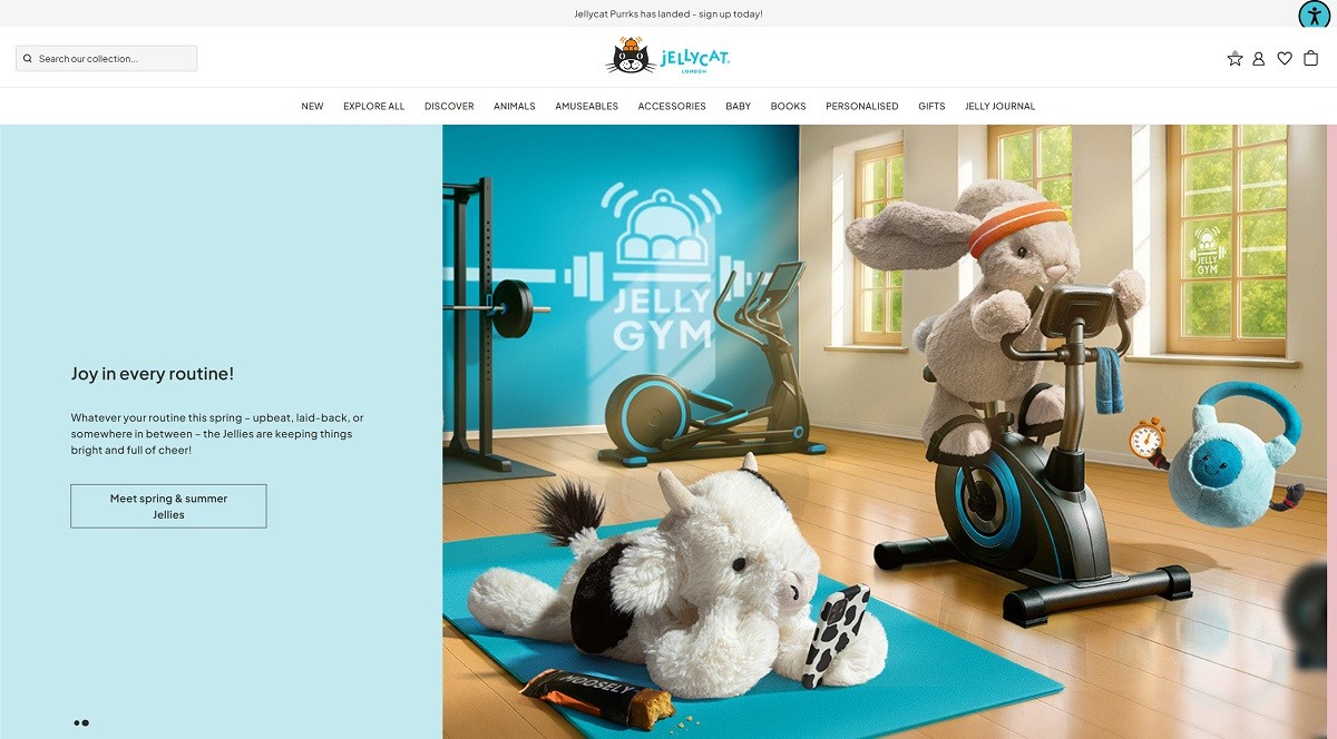
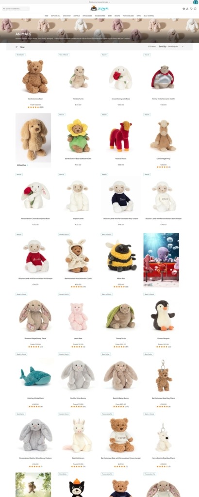
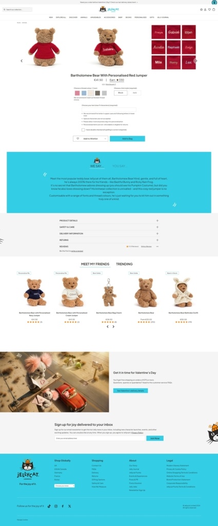
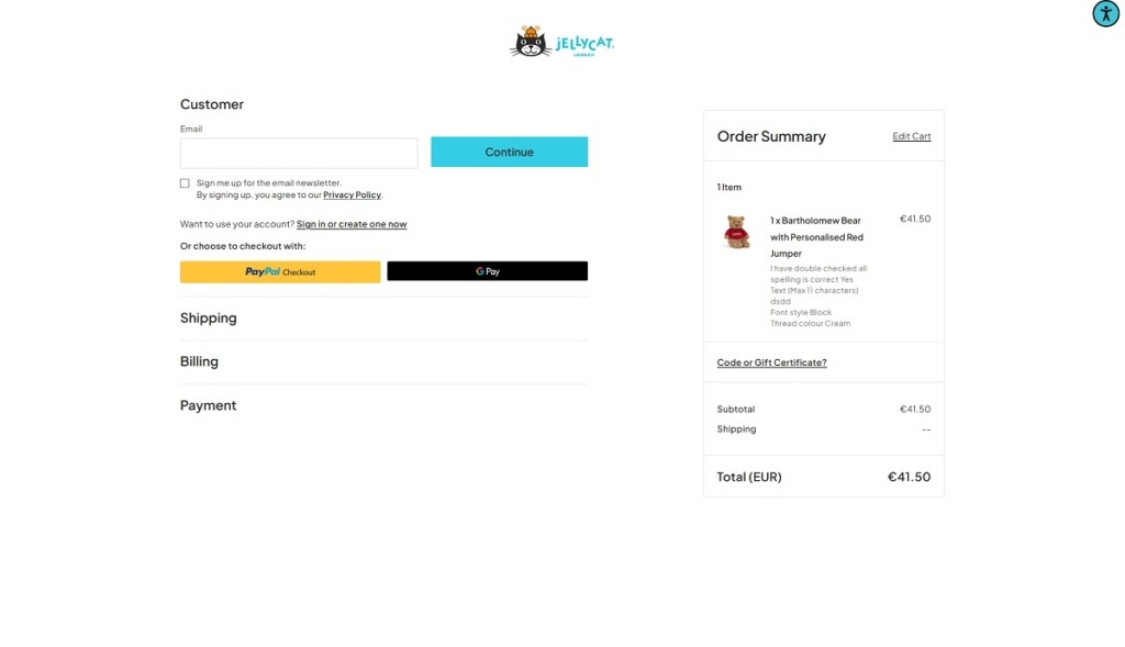
Jellycat’s site showcases the brand’s range of soft plush toys, from whimsical animals and characters to themed collections and accessories. The website design is playful and family-friendly, with bright, high-quality product imagery, clear category navigation, and a shop-forward layout that makes browsing easy. Product pages use large visuals and simple filters to help visitors find favourites by size, style, or theme.
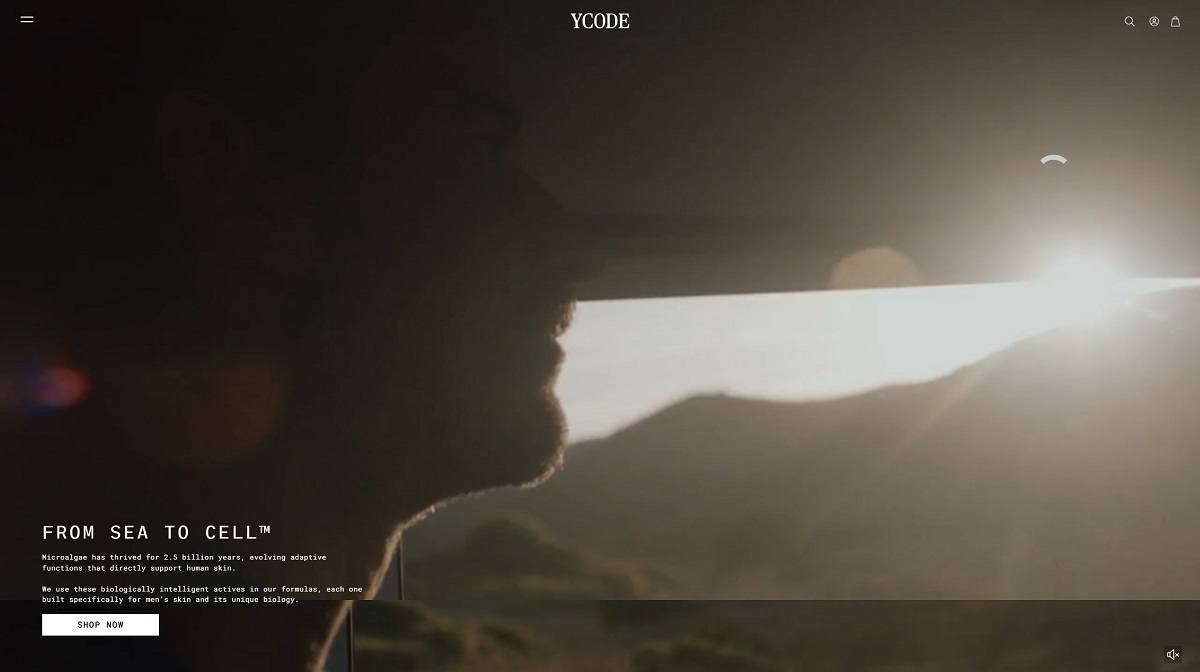
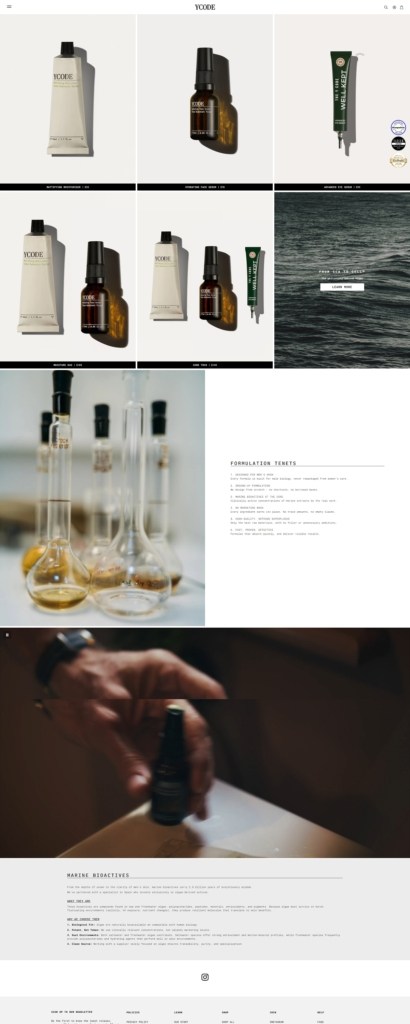
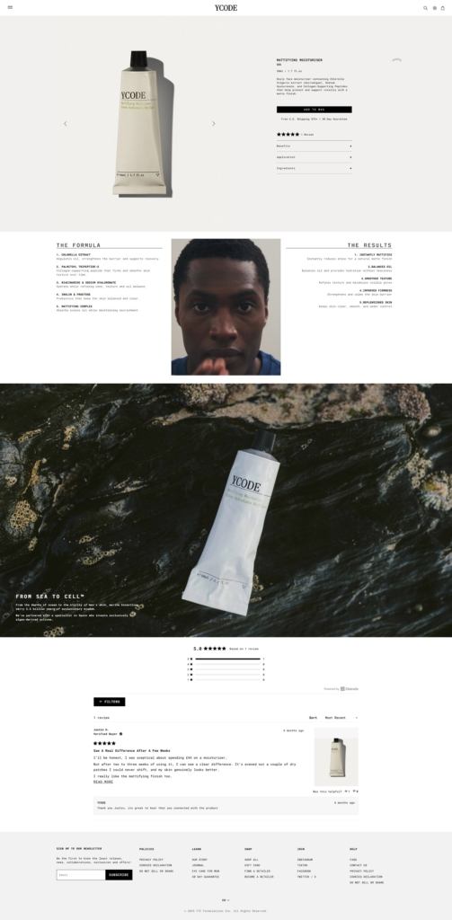
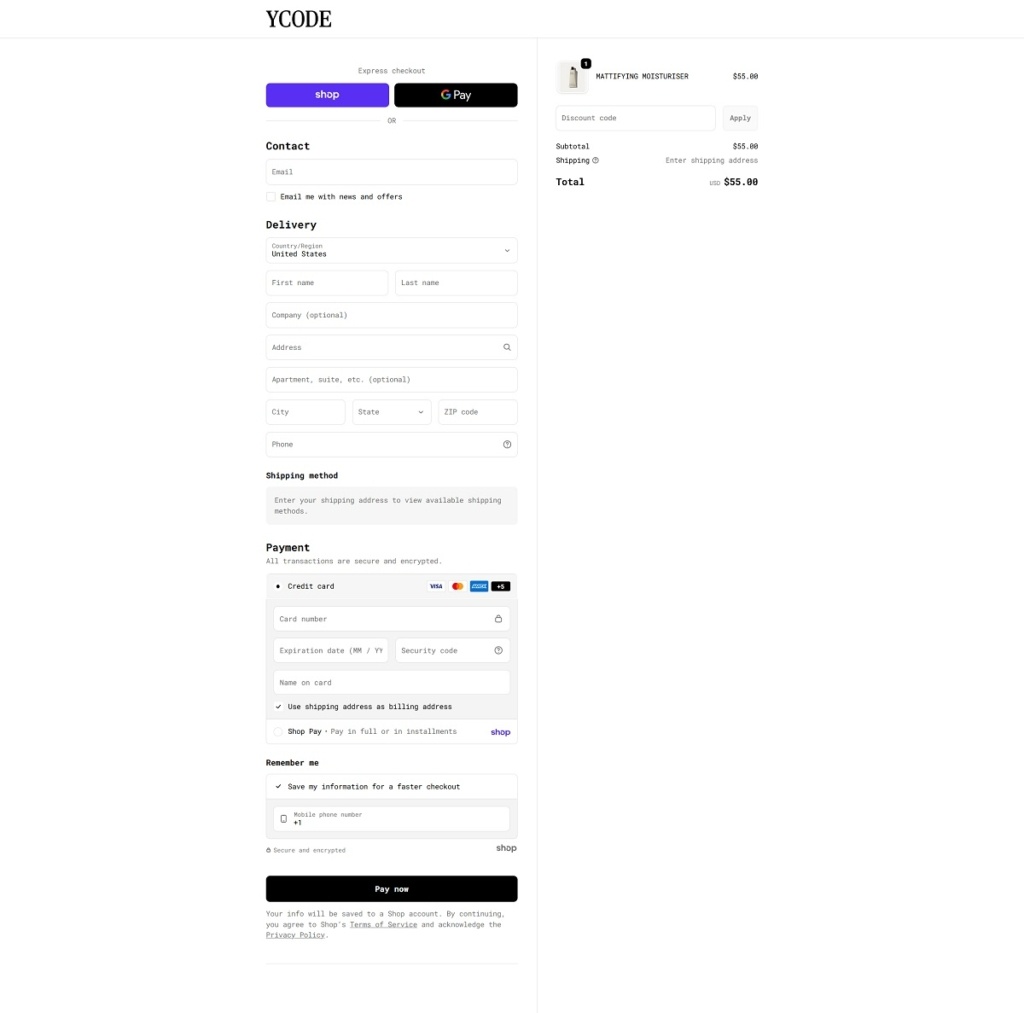
YCODE is a men’s skincare brand selling a small lineup of face products, including an advanced eye serum, hydrating face serum, and mattifying moisturiser, positioned around “marine bioactives” and formulas designed specifically for men’s skin. The website design is minimalist and product-led, using bold hero messaging, large imagery, and a simple top navigation (Shop, Journal, About, Stockists) that moves visitors quickly into featured products.
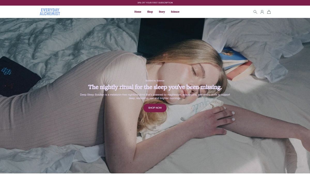
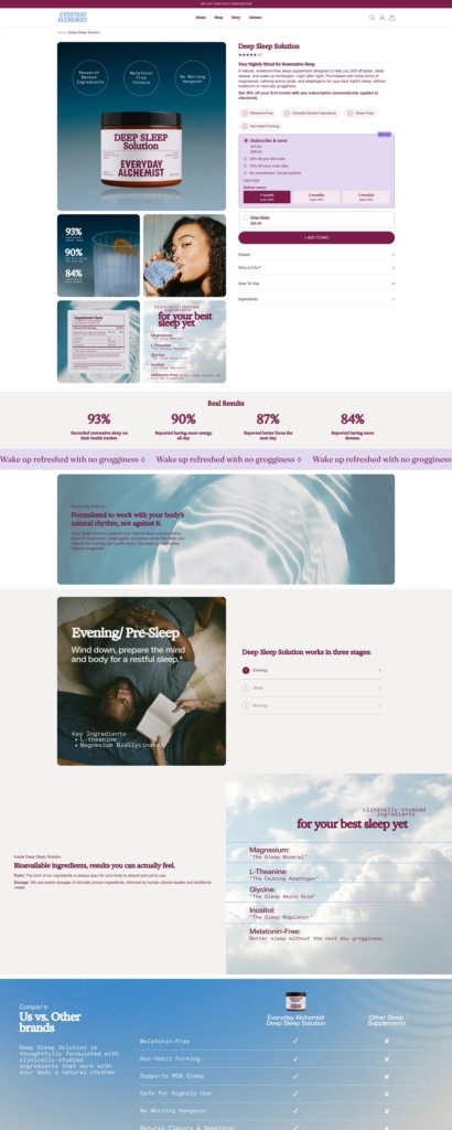
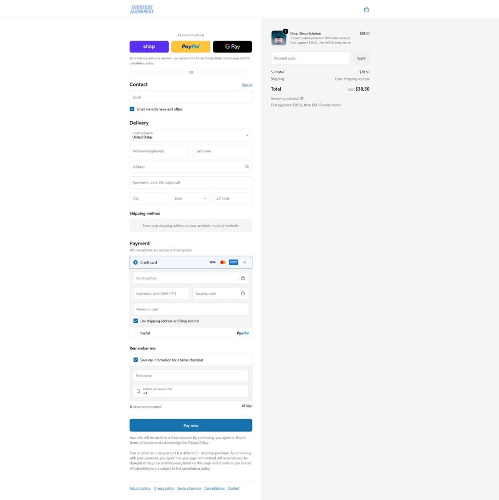
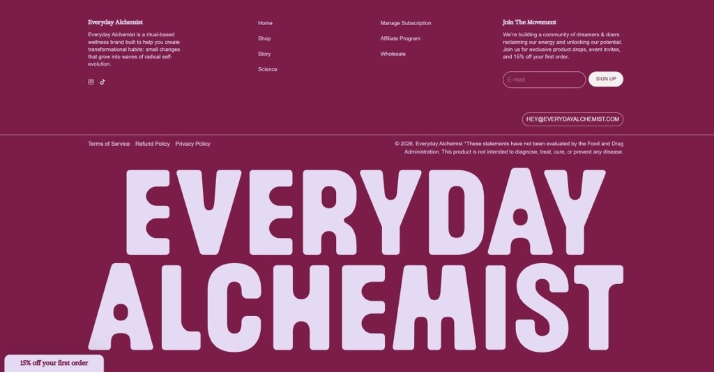
Everyday Alchemist is a ritual-based wellness brand selling science-led supplements, led by its Deep Sleep Solution, a melatonin-free sleep formula built around multiple forms of magnesium plus calming amino acids and adaptogens. The website design is clean and product-forward, with a strong hero message, simple “Shop” flow, and supporting navigation into Story and Science pages for deeper context.
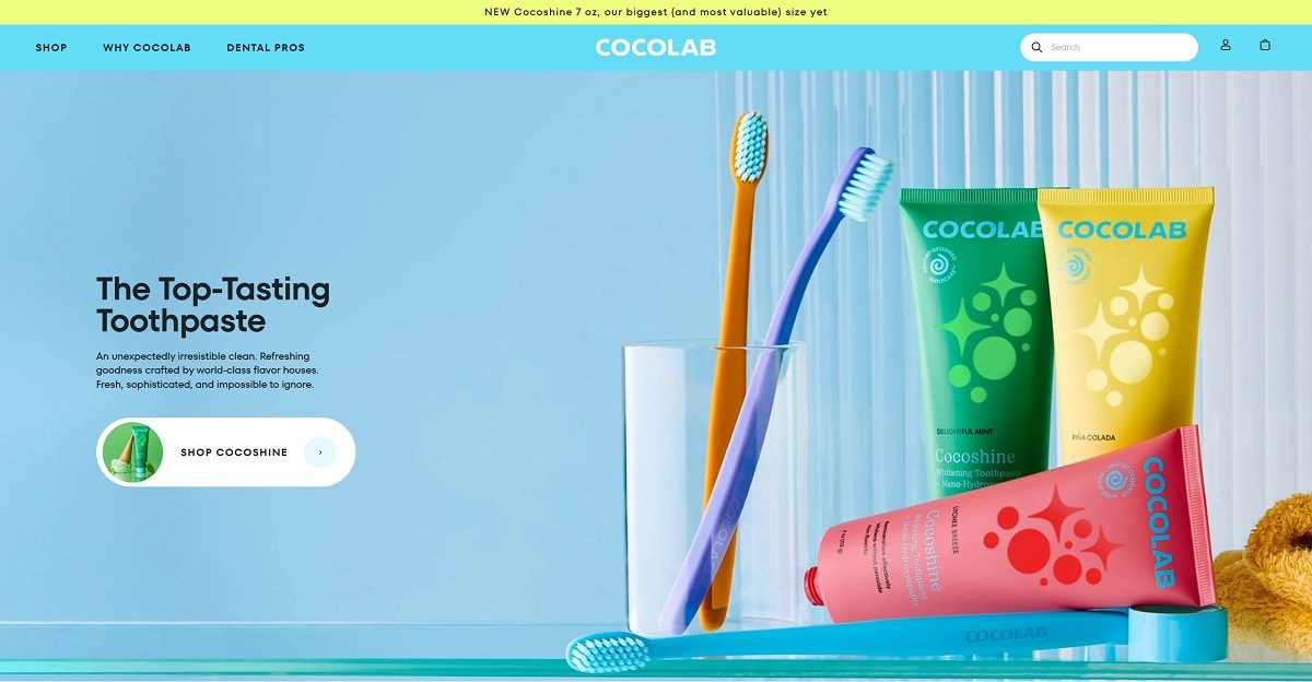
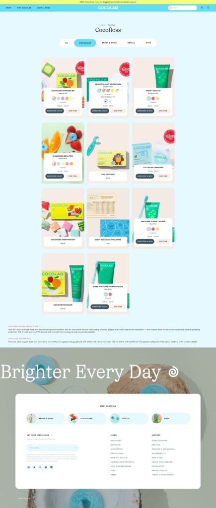
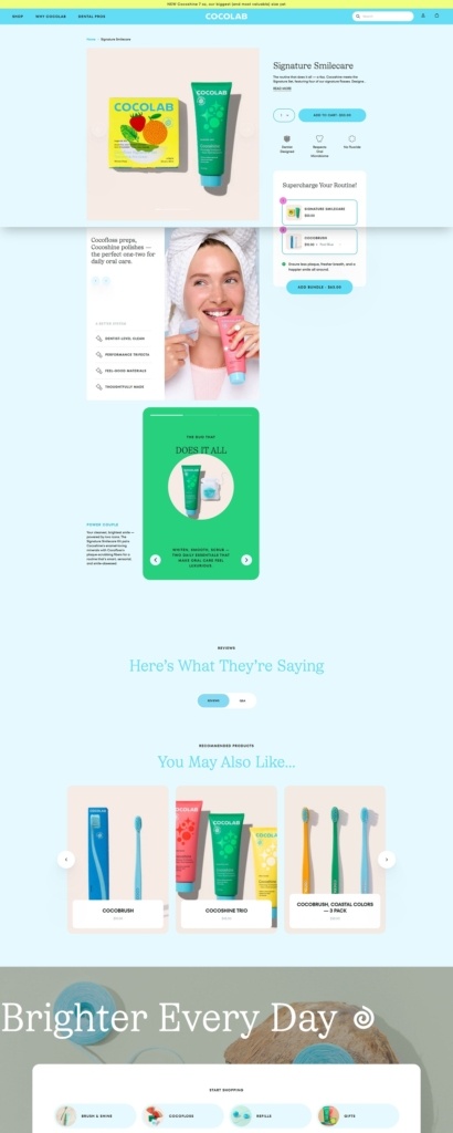
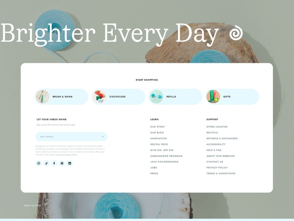
Cocolab is an oral care brand selling textured, flavoured dental floss, whitening toothpaste, toothbrushes, and bundled routine sets, with refills and gifts as supporting lines. The website design is bright and product-first, using bold hero messaging, large product photography, and a shop layout organised around clear collections like “Cocofloss,” “Brush & Shine,” “Refills,” and “Shop by Fragrance.”
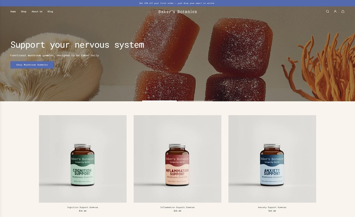
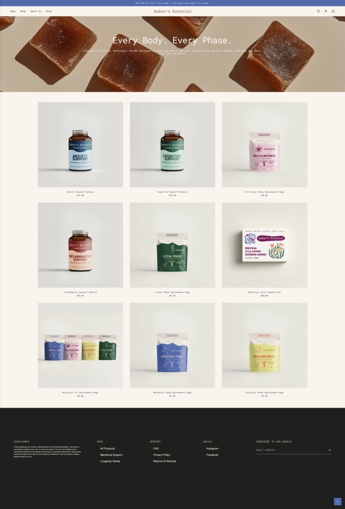
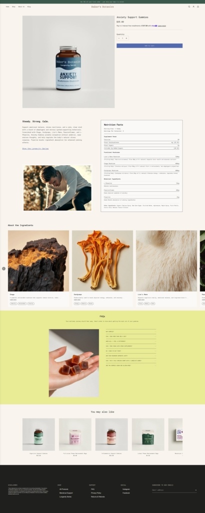
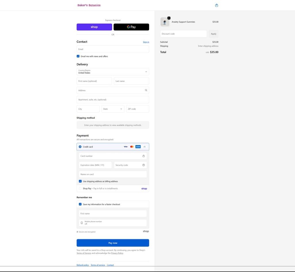
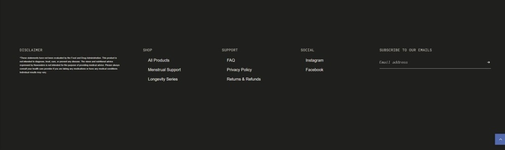
Baker’s Botanics sells functional supplement gummies built around mushrooms and botanicals, with product lines that include nervous system support blends and a menstrual-cycle “phase” system. The website design is clean and wellness-led, using large lifestyle imagery, clear top navigation, and scannable sections like “How it works” and “cycle phases” that guide visitors from education into product cards.
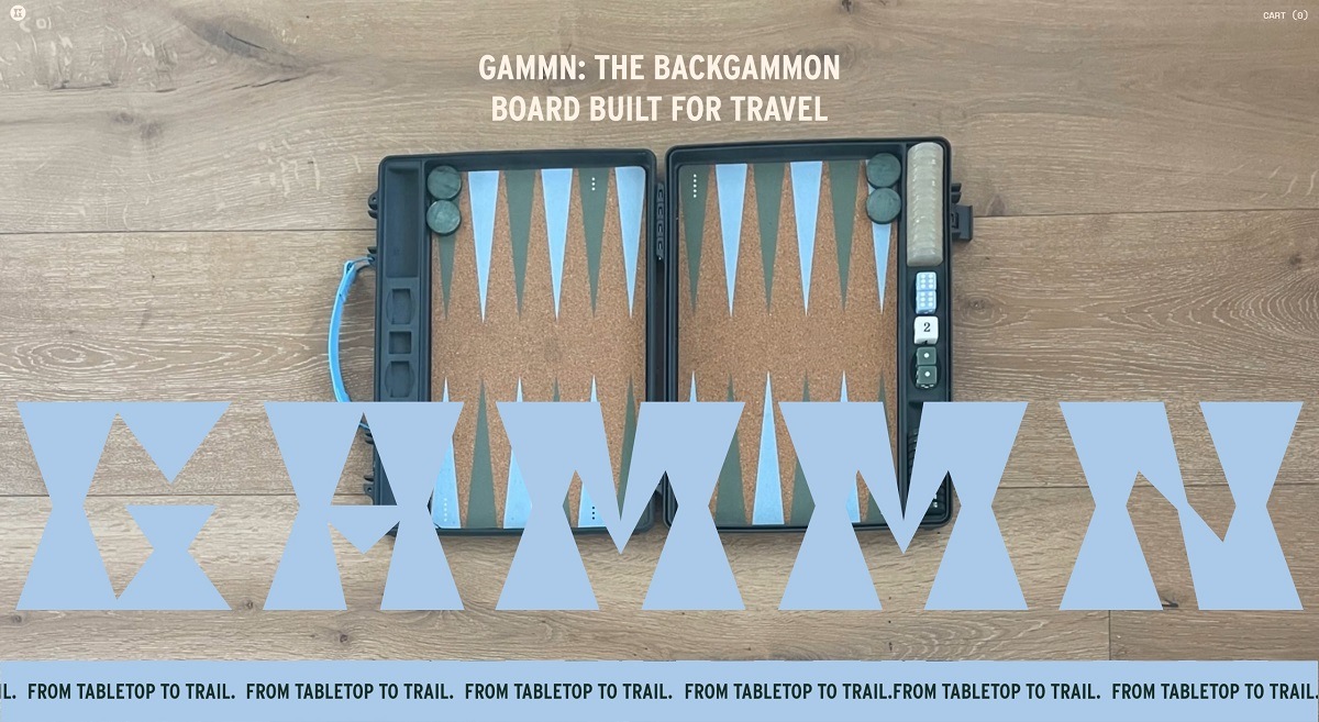
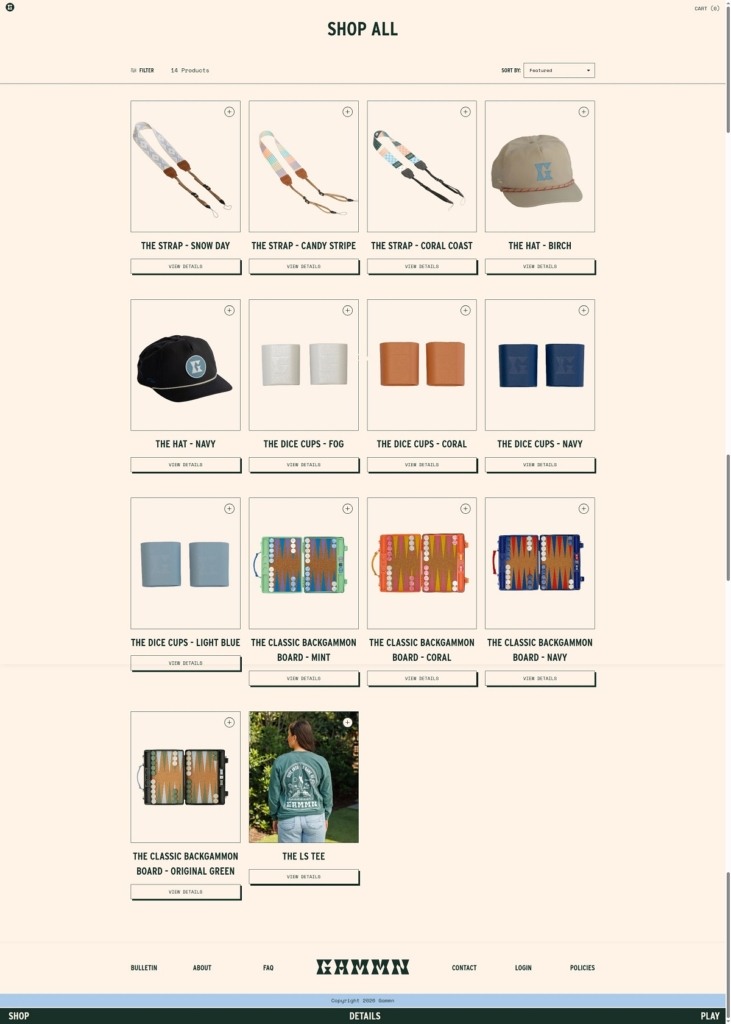
GAMMN sells one thing well: a travel backgammon set built around a cork playing surface and a polystyrene shell, sold with straps, dice cups, a cap and a long sleeve tee as the supporting range. The Classic Backgammon Board runs $124 in Original Green, Navy, Coral and Mint, with a Sorbet colourway at $148, and the whole catalogue is nineteen listings. The audience is the traveller and the host rather than the tournament player. Built on Shopify with a custom theme.
Website Design
Cream ground, forest green type. The body sits on a warm cream with near-black green text, and the accents are a pale sky blue, a coral and a bright red used for buttons and marquee runs. Nothing in the palette is a default.
Condensed caps over a monospace body. Headings, footer links, filter labels and pull quotes are set in Interstate Condensed in upper case, loaded from Typekit, while body copy runs in Space Mono. The pairing gives short labels a signage quality against text that reads like a manual.
One long scrolling homepage. Rather than route to category pages, the home page runs the board, the strap, an extras row, a six-panel feature grid, a review carousel, the play guide, the founder story and the blog in a single vertical sequence.
Shopping Experience
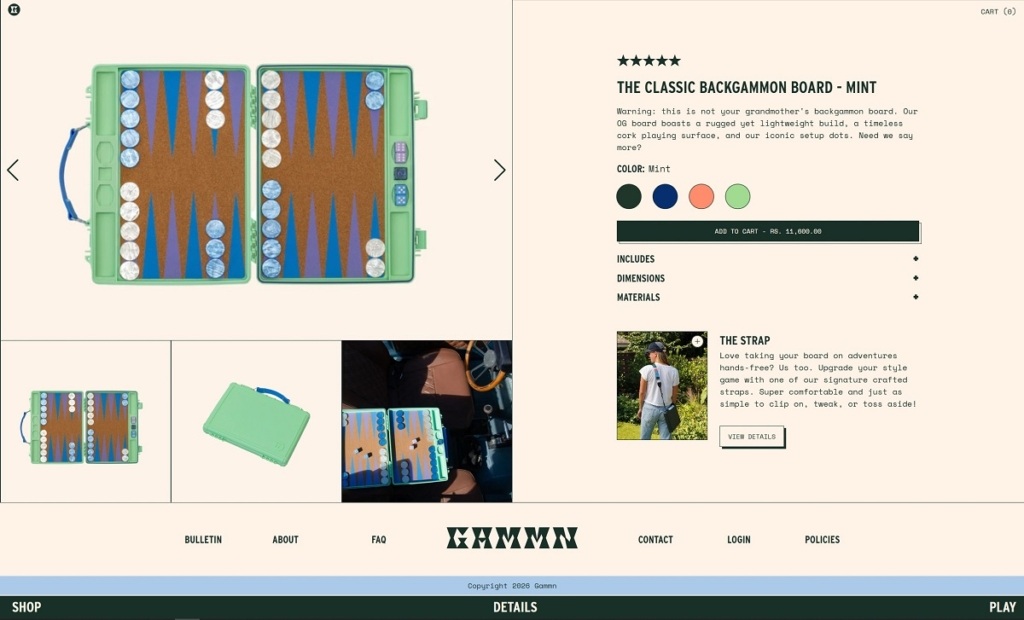
The buy box is on the homepage. Colour swatches, the Includes list and an Add To Cart button all sit inline in the first section, with the price updating per colourway and Original Green marked Soldout in place.
Specs replace long descriptions. Each board block lists what is in the box, thirty checkers, four dice, a doubles cube, a removable shoulder strap and an instruction manual, then closed and open dimensions in inches, a weight in pounds, and materials given as high impact polystyrene and cork.
Variants also exist as standalone products. Alongside the master board listing, each colourway is published as its own product, which gives colour-specific landing pages but doubles the catalogue.
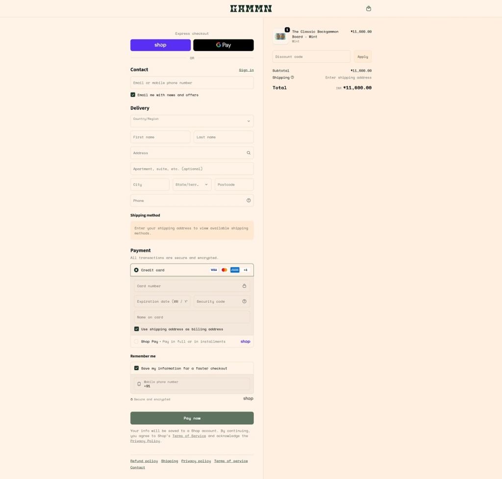
Cart is a drawer. The panel shows subtotal, the line “Taxes and shipping calculated at checkout”, and a split between View Cart and Checkout.
Brand Storytelling
Founders named and dated. The Our Story block introduces Ashley and Wyatt as acquaintances who became backgammon partners, and frames the product as the board they wanted for their own trips.
A joking register throughout. Product copy opens with “Warning: this is not your grandmother’s backgammon board”, and the feature grid describes the cork surface as “sexy (and sustainable)”.
Reviews kept short. The testimonial carousel runs three or four line quotes with a first name and last initial, no ratings and no review count.
Notable Features
A Play section that teaches the game. The Quick-Play Guide is offered in two versions, one For visual learners and one For Rule Followers, in mobile, desktop and printable PDF formats.
A blog with its own name. Bulletin is filed under People and Places, Tips and Tricks, and News, and covers hosting, drink pairings and the history of the game.
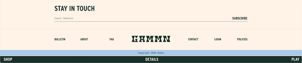
A three-word navigation. The header carries only Shop, Details and Play, which suits a one-product catalogue but hides the accessories behind the homepage scroll.
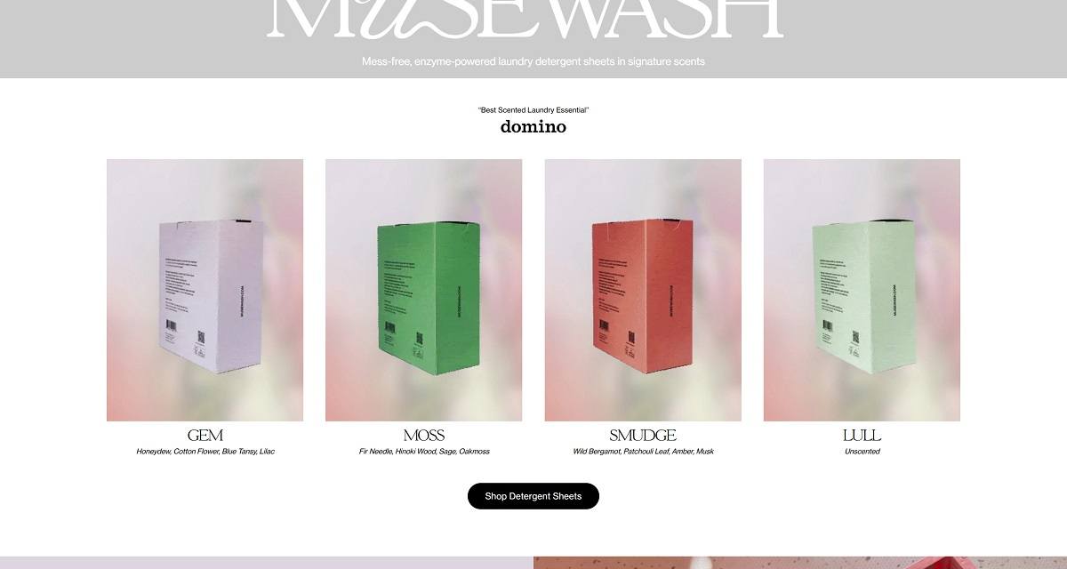
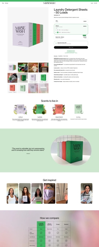
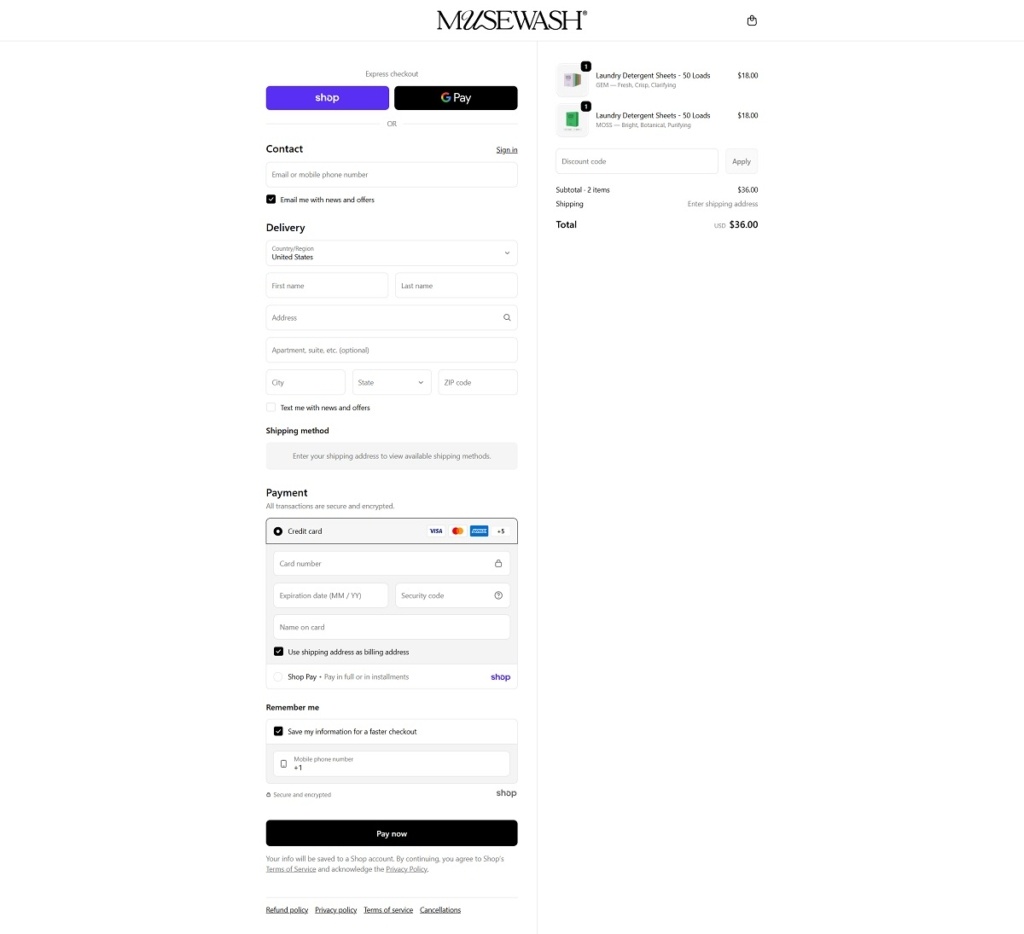
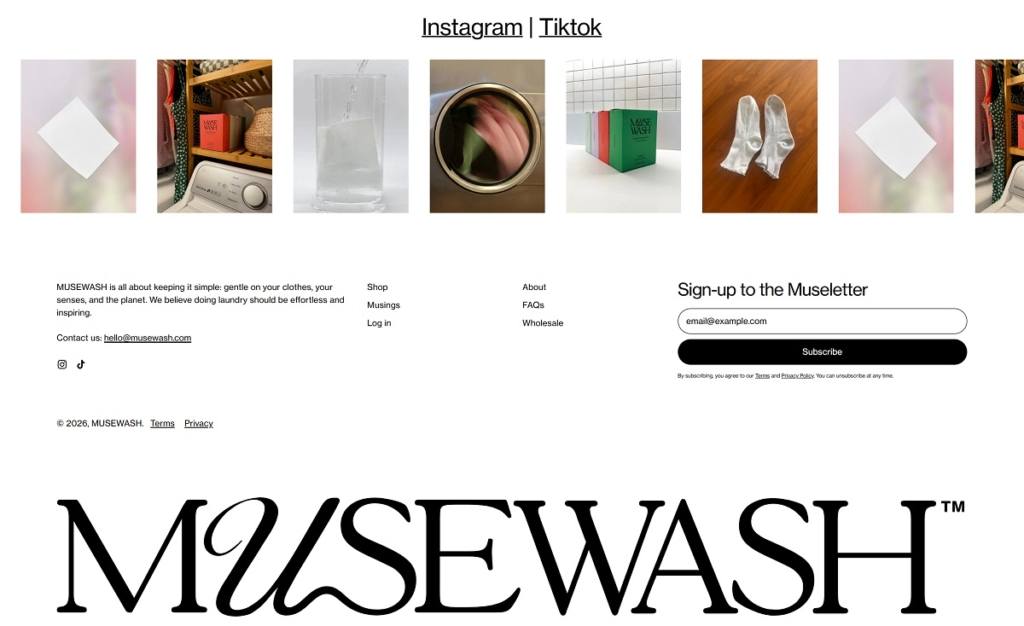
Muse Wash is an eco-focused laundry brand selling enzyme-powered detergent sheets in a few signature scents, designed to work in any machine, including HE and cold-water cycles. The website design is clean and product-forward, using large scent-led tiles, minimal navigation, and clear shop calls to action that move visitors straight into the core product pages. It also supports quick evaluation with a simple competitor comparison section and scannable benefit callouts around ingredients, performance, and packaging.
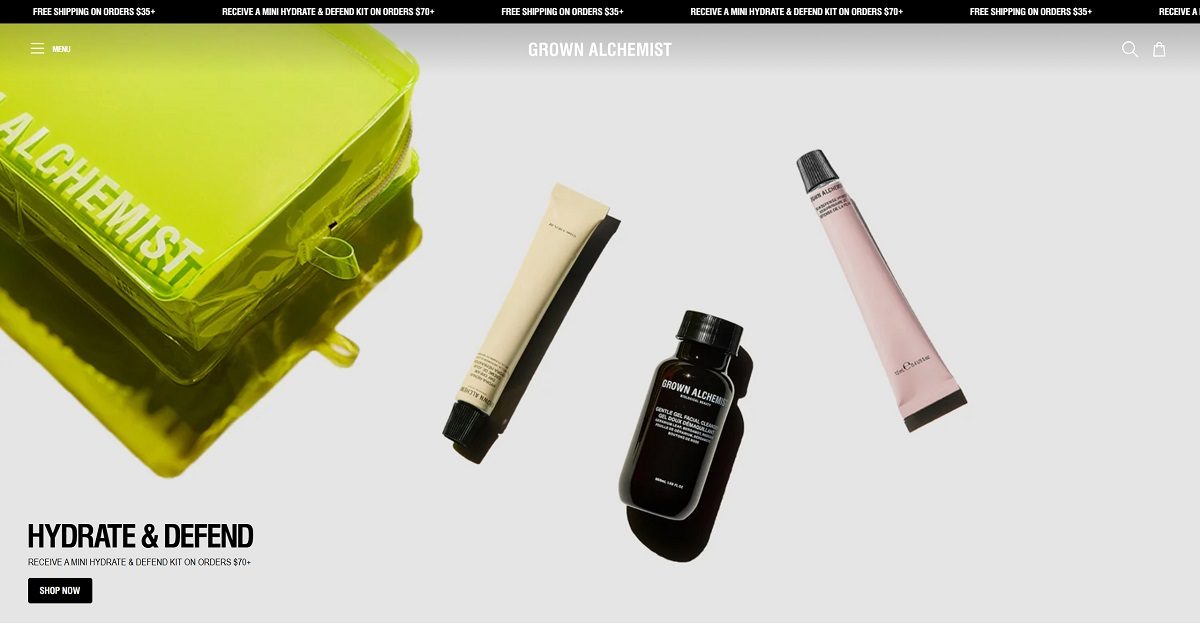
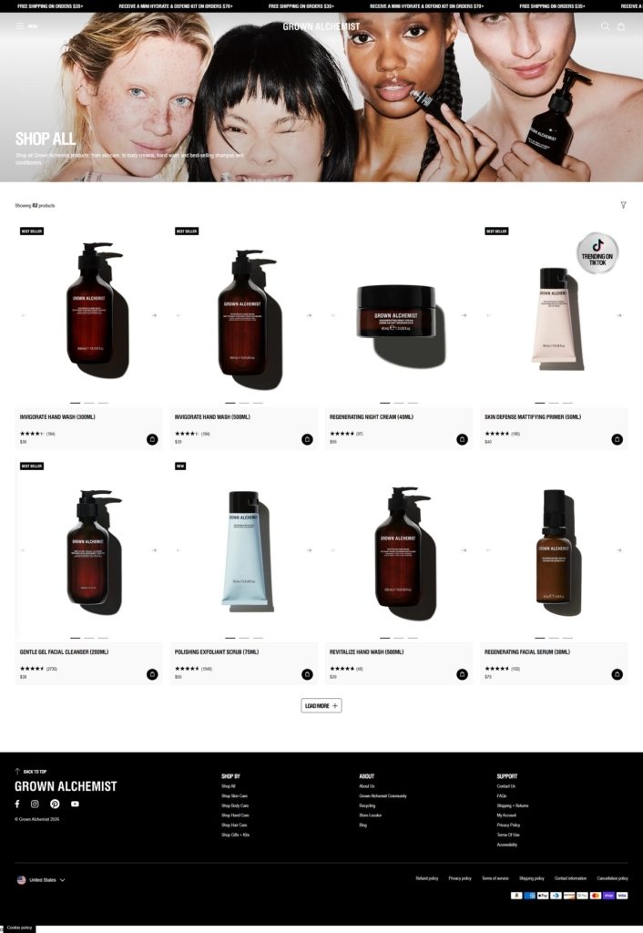
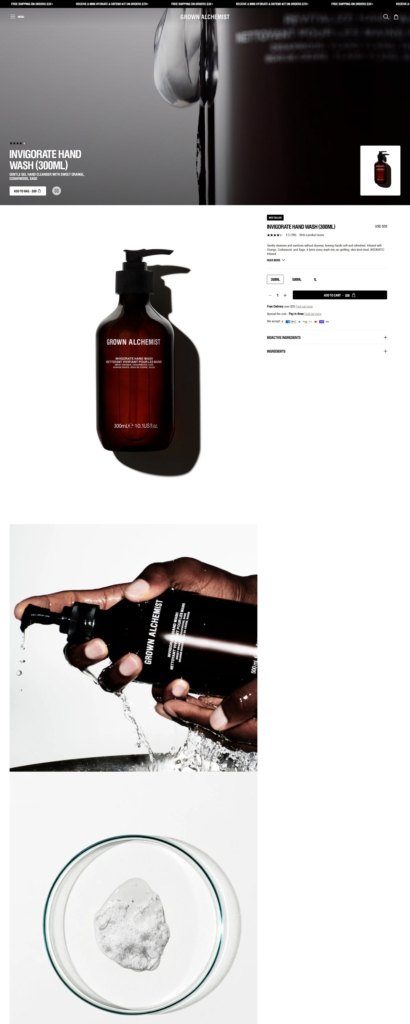
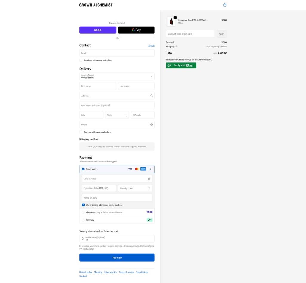
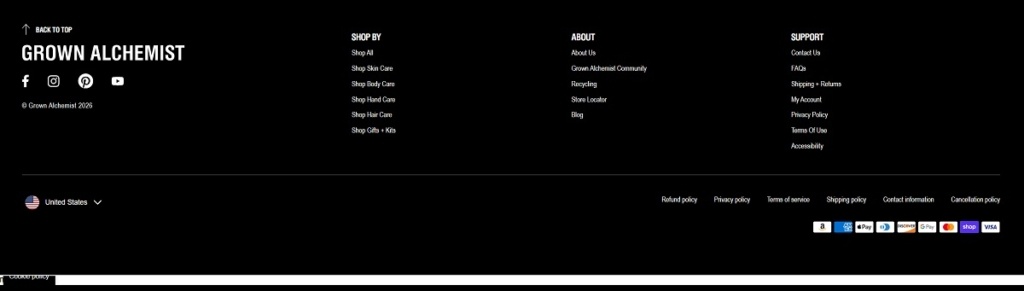
Grown Alchemist is a premium beauty brand selling skincare, haircare, body care, and hand care products, alongside gift sets and kits. The website design is minimalist and high-end, using clean typography, generous whitespace, and large product photography. Navigation is category-led and shop-forward, making it easy to browse collections and move from discovery to product pages.
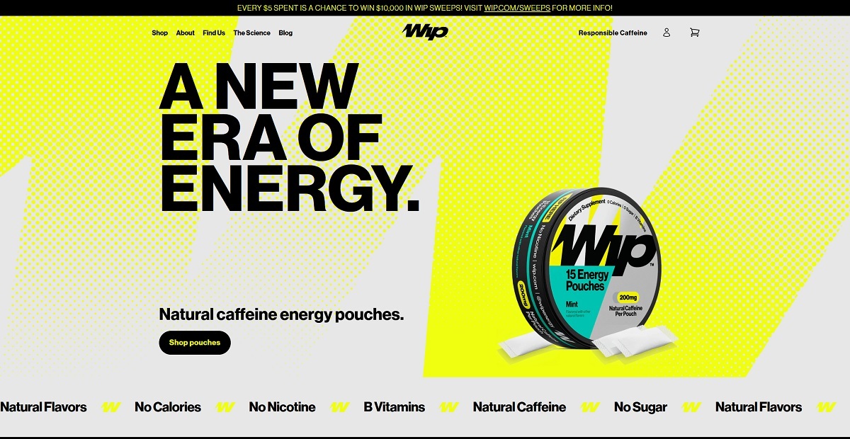
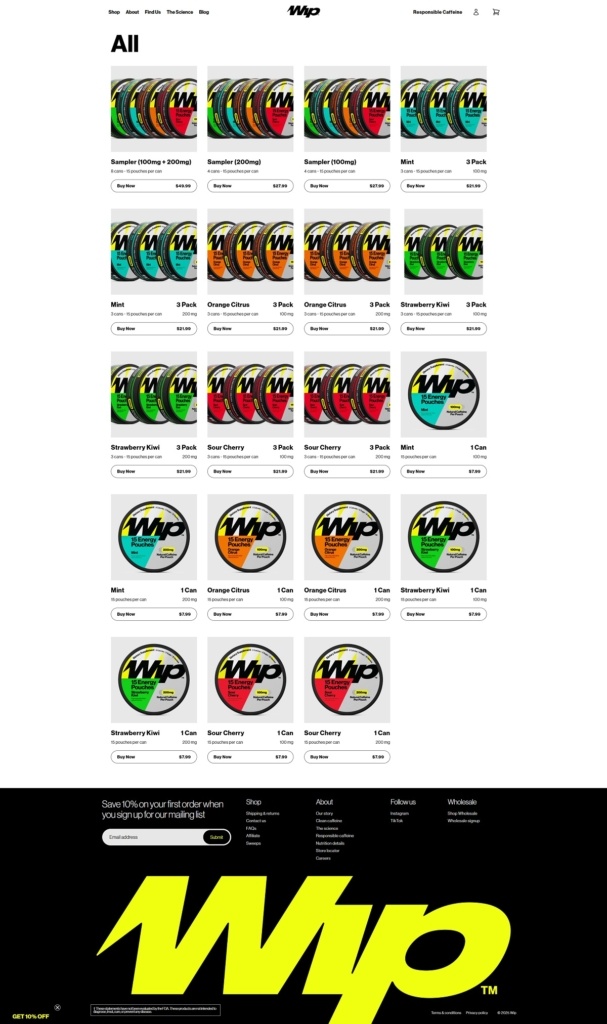
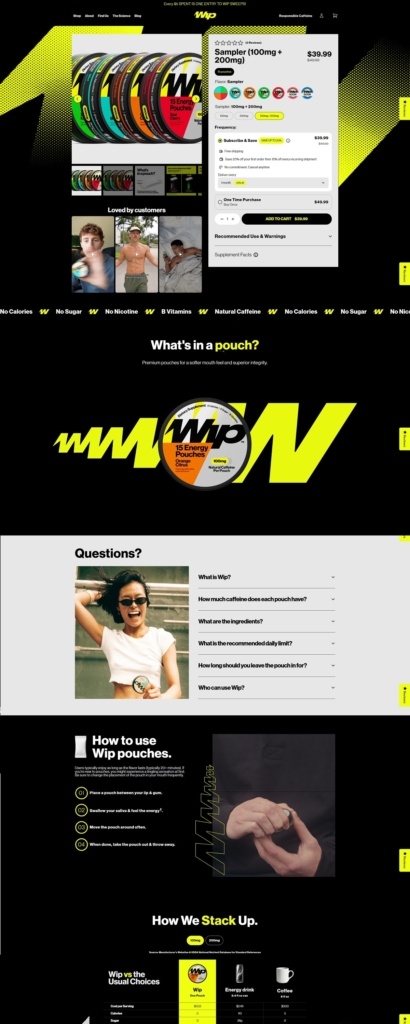
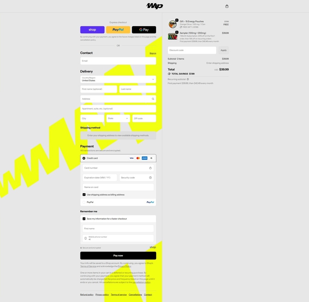
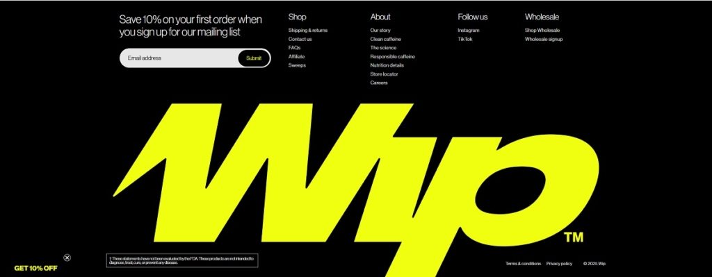
Wip.com is an ecommerce site for Wip energy pouches, selling natural-caffeine pouches in flavours like Sour Cherry and Strawberry Kiwi, plus sampler packs and multi-pack bundles. The website design is bold and minimalist, with an oversized hero headline, quick “Shop pouches” calls to action, and a homepage that jumps straight into flavour tiles and product cards. It also includes education and discovery pages while keeping navigation tight and commerce-first.
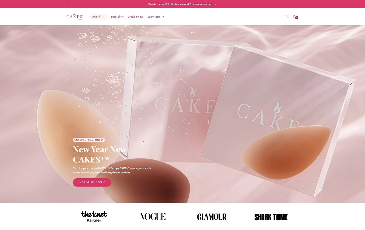
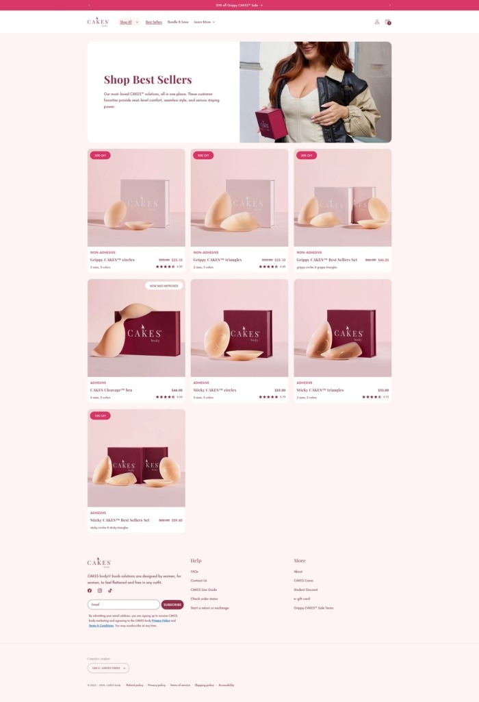
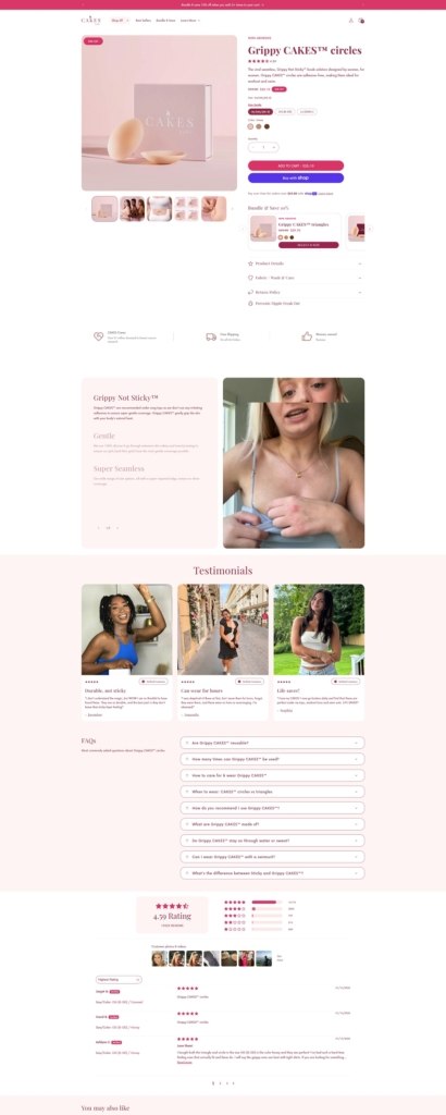
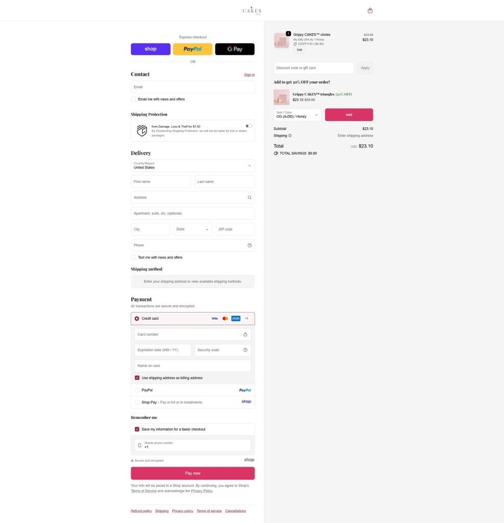
CAKES Body is a brand focused on reusable silicone nipple covers, including non-adhesive “Grippy” styles and adhesive “Sticky” styles, alongside bundles and related support pieces. The website design is bold and product-led, using oversized headlines, large lifestyle imagery, and category-driven navigation to move visitors quickly from the homepage into best sellers and shop collections.
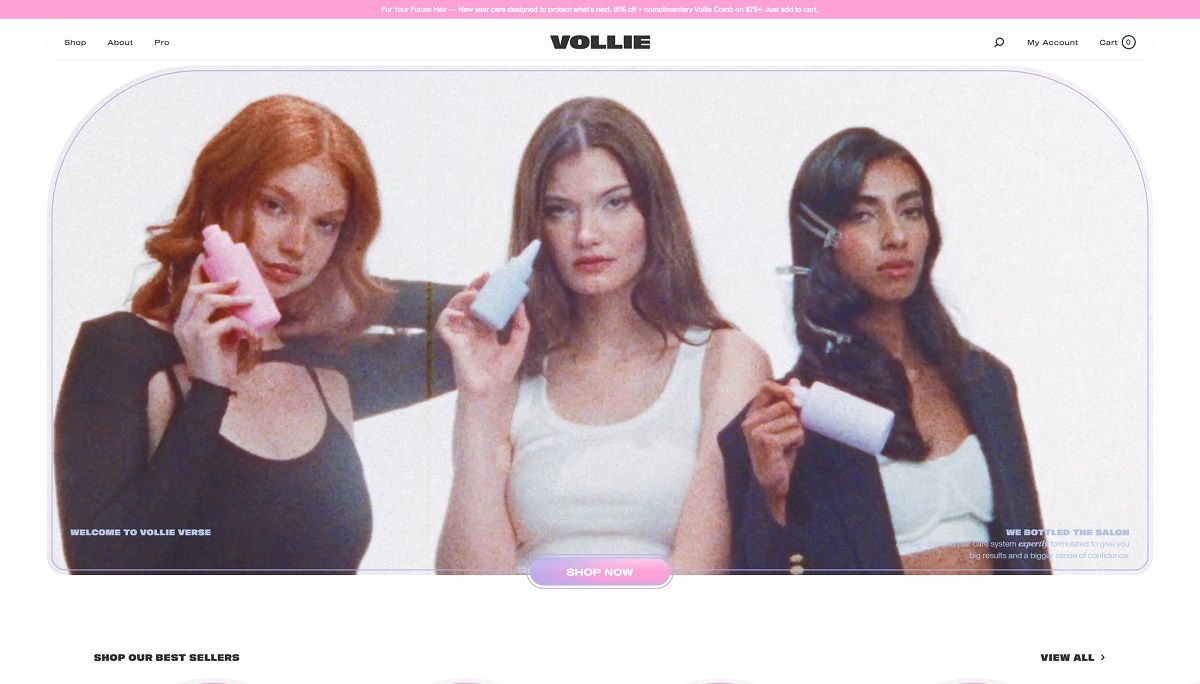
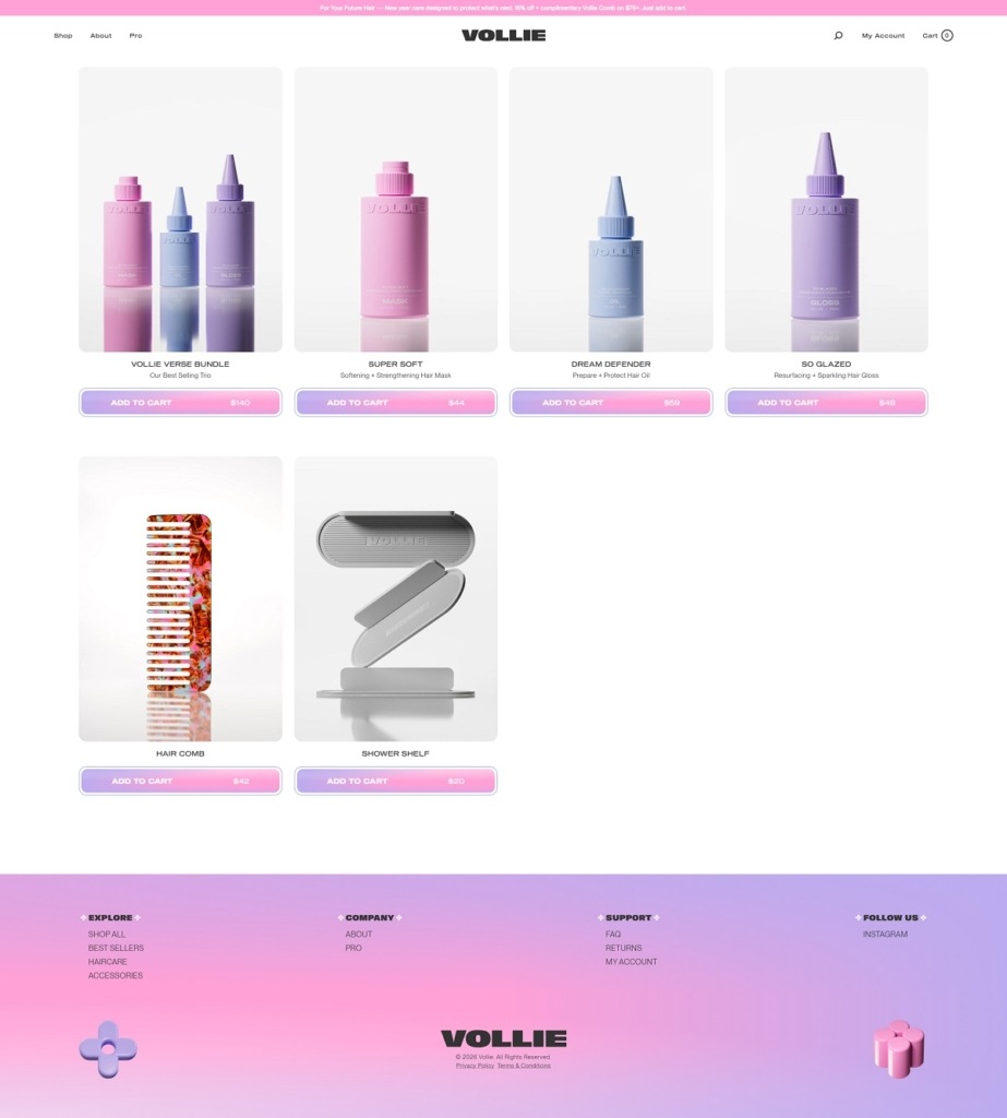
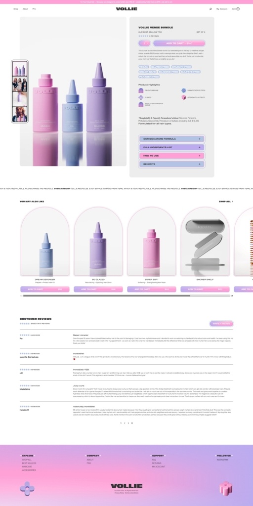
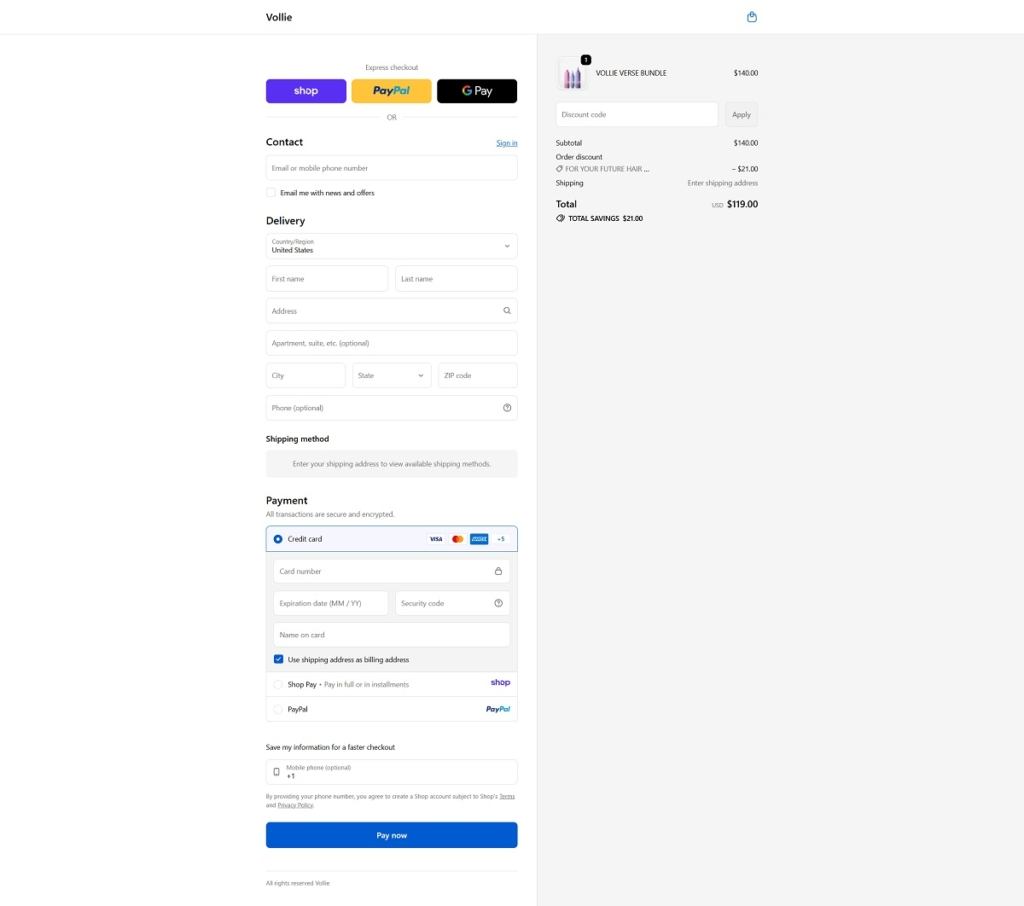
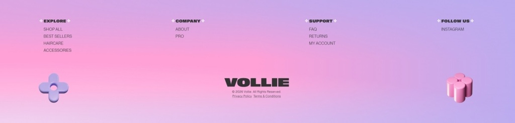
Vollie is a salon-inspired haircare brand selling a small, curated lineup focused on treatment and shine, including a softening and strengthening hair mask, a pre-water protective hair oil, and a resurfacing hair gloss, plus bundles and a few accessories. The website design is clean and premium, built around bold headlines, generous whitespace, and large product and lifestyle visuals that keep the shopping path simple. It leans on benefit-led callouts and ingredient highlights within product pages to make the value props easy to scan without feeling crowded.
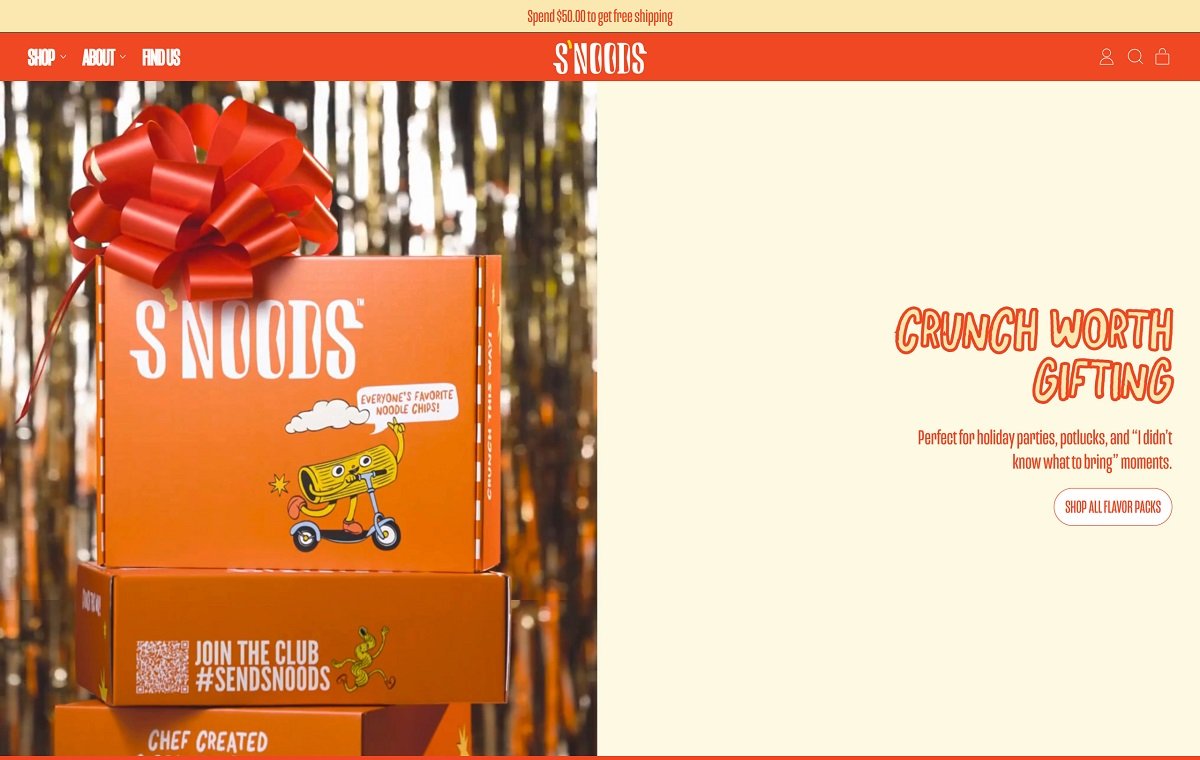
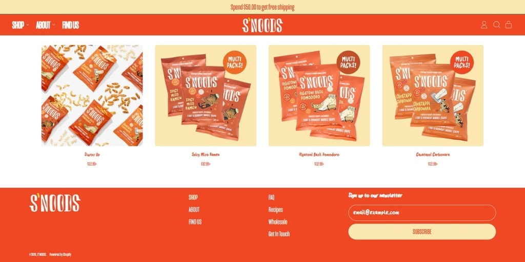
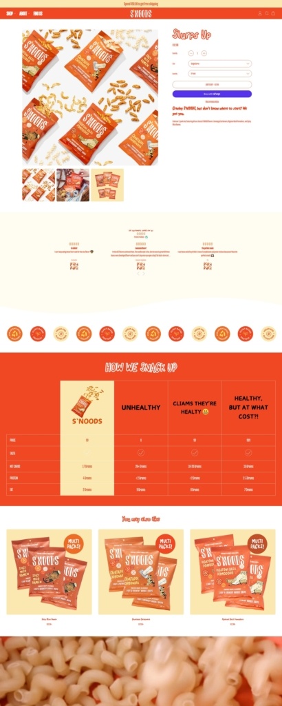
Eatsnoods.com is the ecommerce site for S’NOODS, a snack brand selling “noodle chips” in globally inspired flavours such as Spicy Miso Ramen, Rigatoni Basil Pomodoro, and Cavatappi Carbonara, alongside variety packs and seasonal drops. The website design is bold and playful, with large typography, punchy copy, and a simple top navigation that funnels quickly into Shop, About, and Find Us. It also supports retail discovery with a dedicated store locator while keeping the shopping experience clean and Shopify-native.
S’NOODS Shop Page Example
S’NOODS Product Page Example
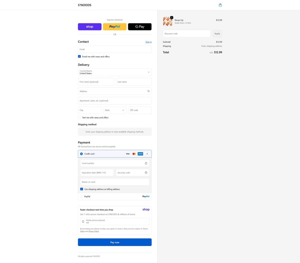
S’NOODS Checkout Page Example
S’NOODS Footer Example
Join our community for the latest trends and ecommerce tips.

 By Jibin Kumar