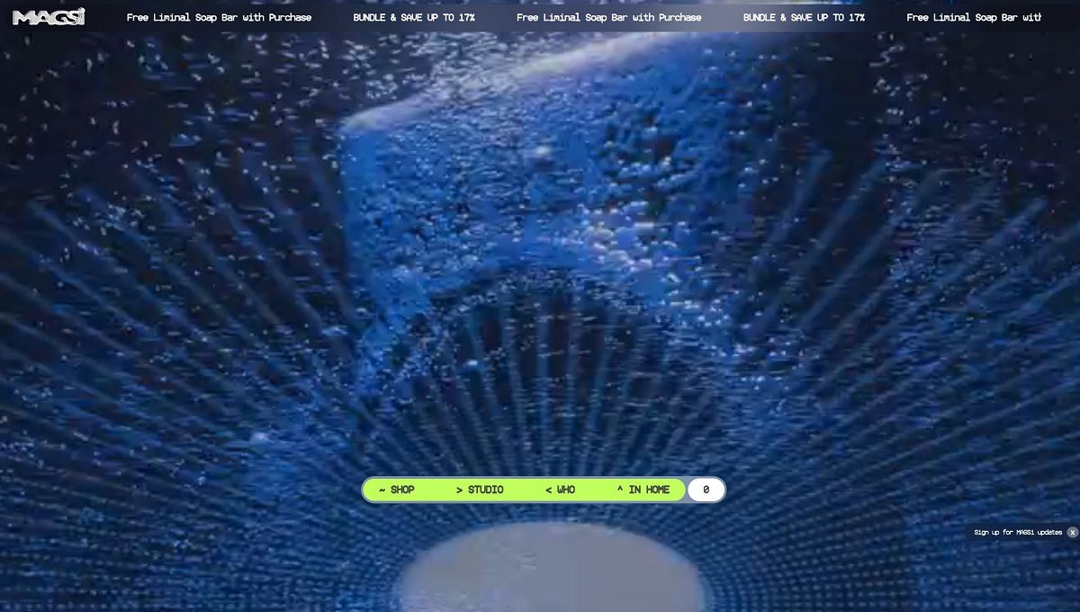
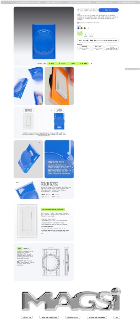
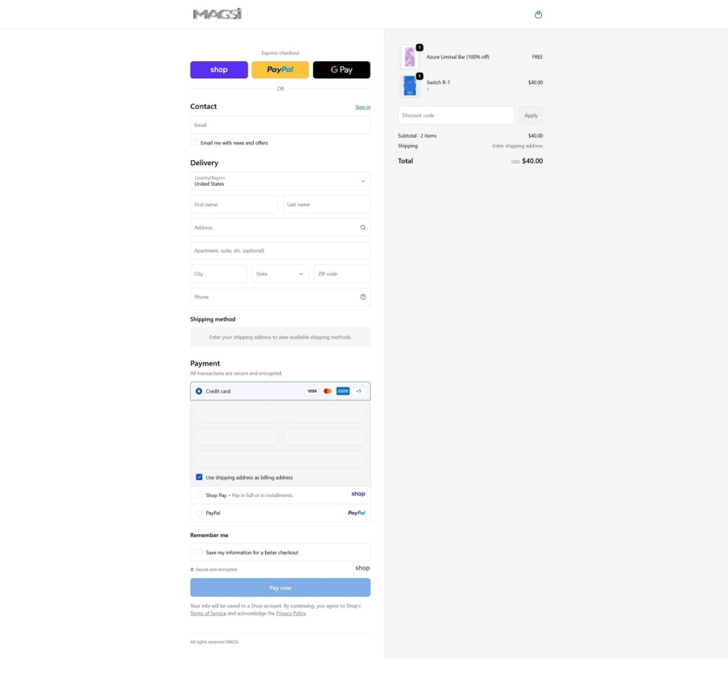
MagsiDesign offers decorative, renter-friendly light switch covers and colourful “liminal bars” that upgrade ordinary switches into intentional design elements. The website features a clean, modern e-commerce layout with simple navigation, bold product visuals, and benefit-focused copy that highlights ease of installation and aesthetic impact. Overall, the design supports quick browsing of colour options and product details while reinforcing a lifestyle-oriented approach to small interior-design upgrades.
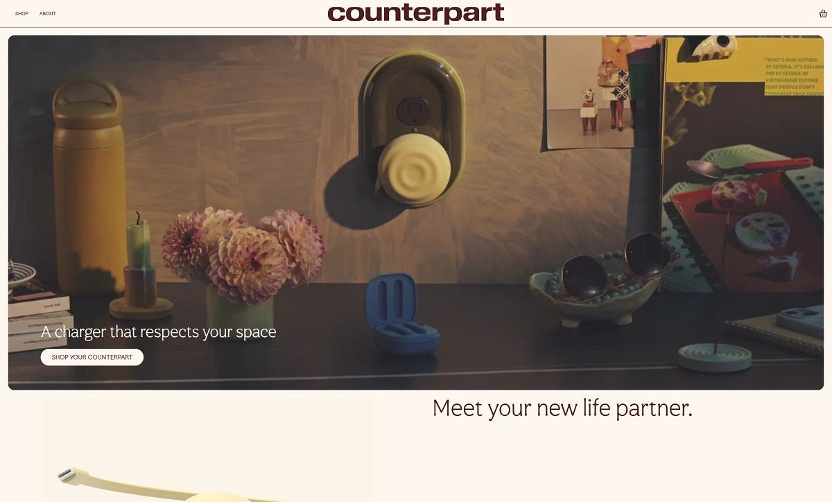
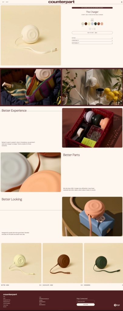
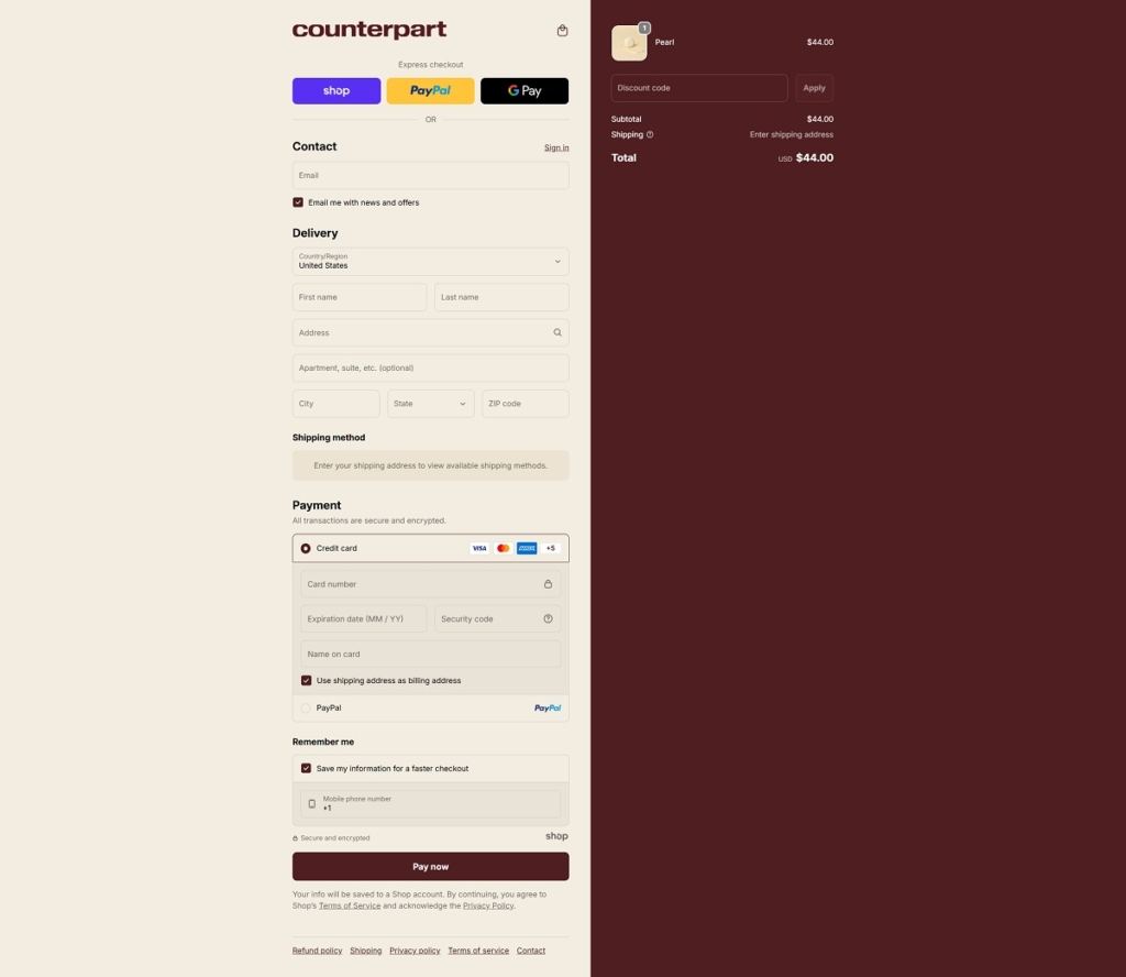
WithCounterpart sells a curated range of premium USB-C chargers and cables designed to be compact, durable and more sustainable than legacy charging gear. The website uses a clean, direct e-commerce design with simple navigation, clear product categories, bold visuals, and benefit-focused copy that highlights performance and environmental impact. The overall layout makes it easy to browse, compare and purchase tech accessories with minimal friction.
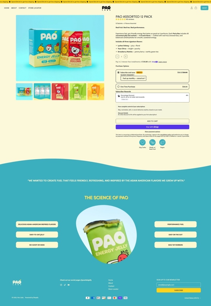
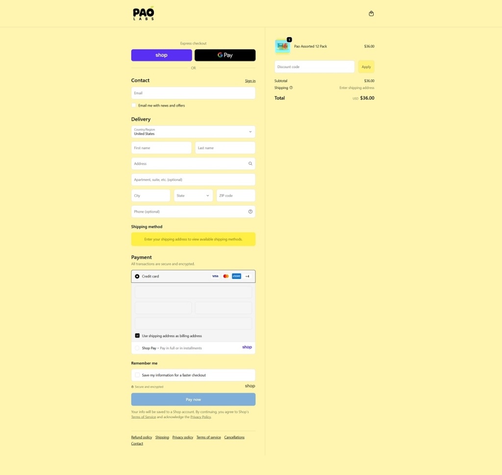
Pao Labs sells energy fuel jellies — chewable, jelly-textured endurance fuel sachets with real fruit and brewed tea flavours like yuzu citrus, lychee oolong and strawberry matcha, designed for runners and endurance athletes. Their website uses a clean, modern e-commerce layout with clear product categories, large product photography and benefit-focused messaging that explains texture, ingredients and performance-oriented use. The overall design emphasises simplicity and readability, making it easy to browse flavours, learn about nutritional features and make purchases.
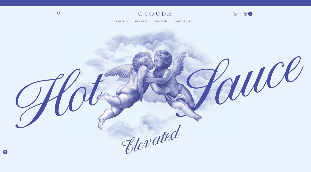
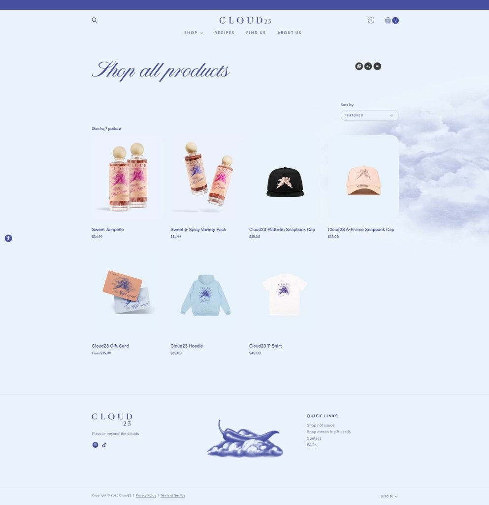
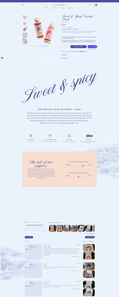
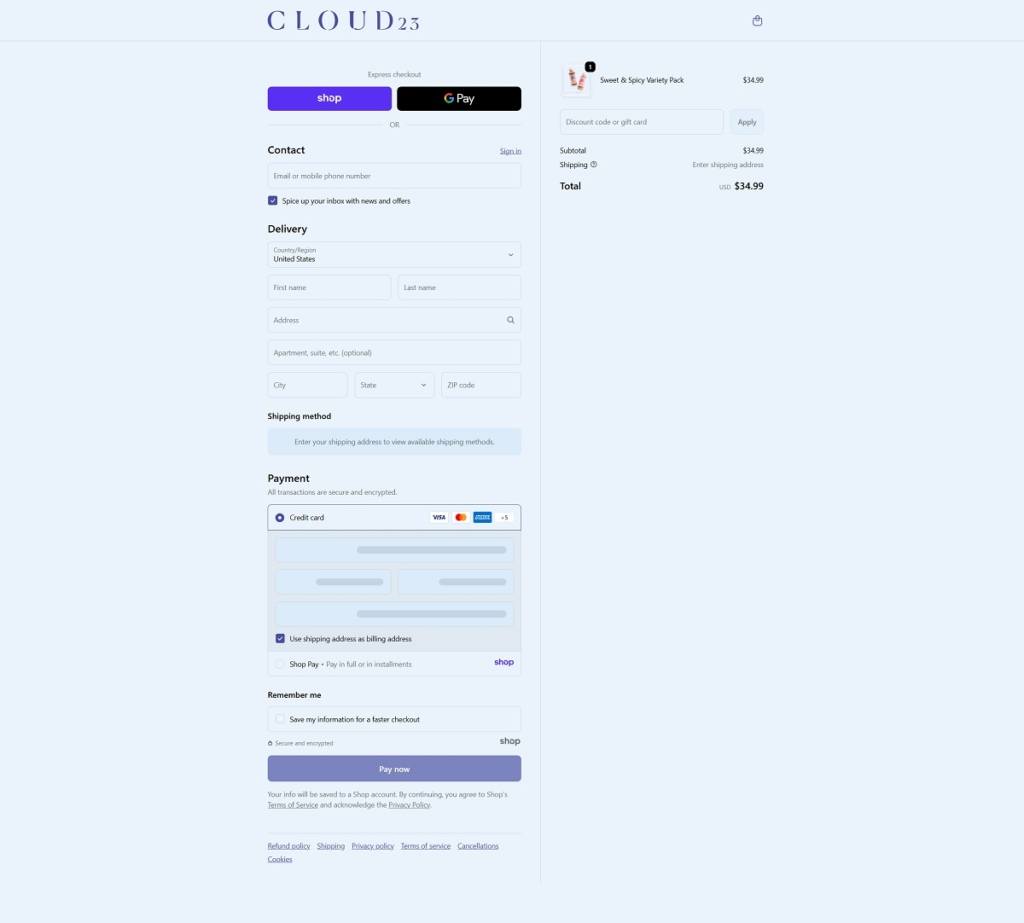
Cloud23 is an online store offering premium organic hot sauces and condiments designed to add bold flavour to meals with a focus on quality, real ingredients and creative taste profiles. The website uses a clean, contemporary e-commerce layout with clear navigation, large product photography and recipe content that highlights usage ideas and flavour inspirations. The overall design supports easy browsing and emphasises the brand’s artisanal positioning.
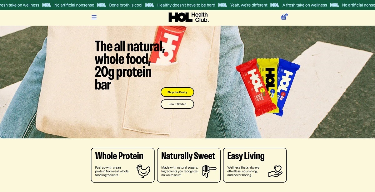
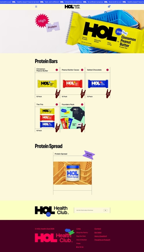
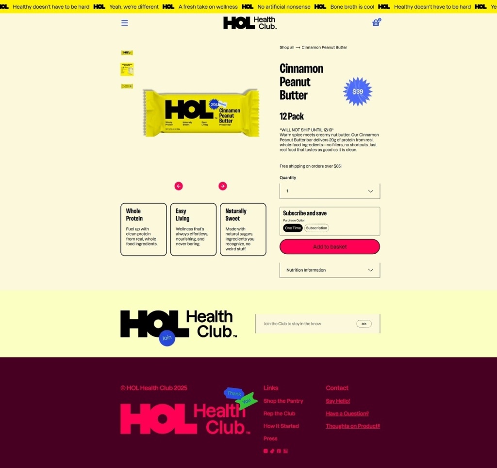
HOL Health Club sells all-natural, whole-food protein bars that deliver 20 g of protein per bar using real ingredients like peanuts, dates, honey and chicken bone broth, with no artificial additives or preservatives. The website uses a clean, direct e-commerce design with clear navigation, simple typography and bold product imagery that highlights flavours and ingredient transparency.
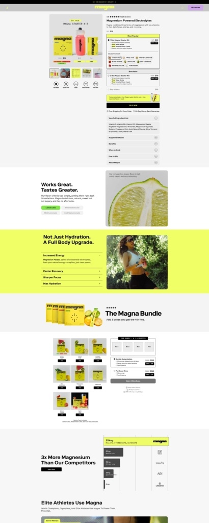
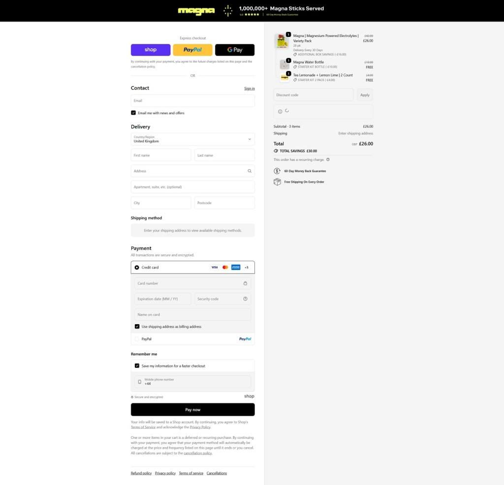
Drink Magna offers magnesium-powered electrolyte hydration powders formulated to support focus, energy, recovery and efficient hydration, with multiple flavour options and starter kits available. The website uses a clean, direct e-commerce layout with clear category sections, bold product visuals, and benefit-driven messaging highlighting ingredients and functional effects.
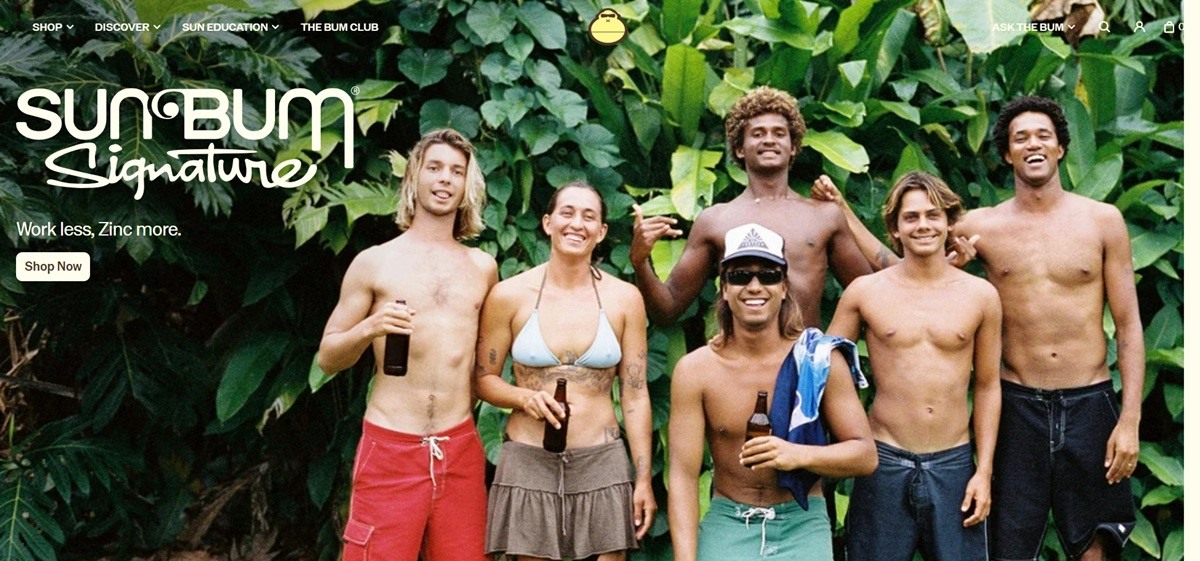
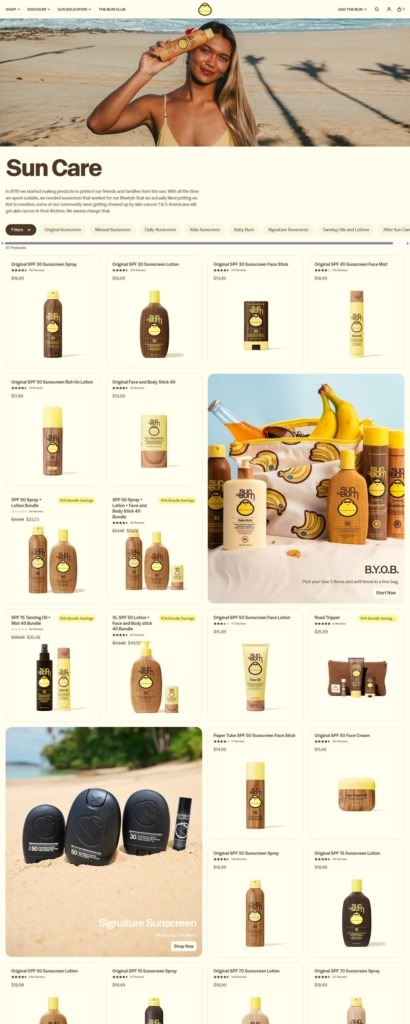
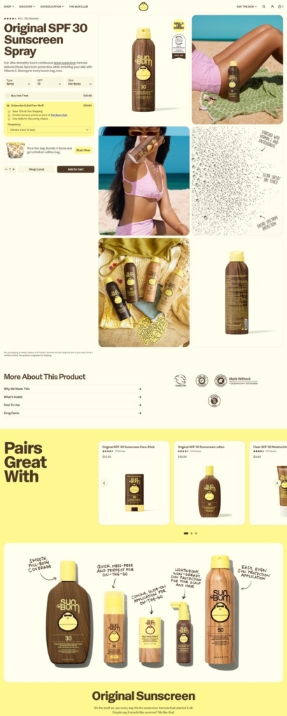
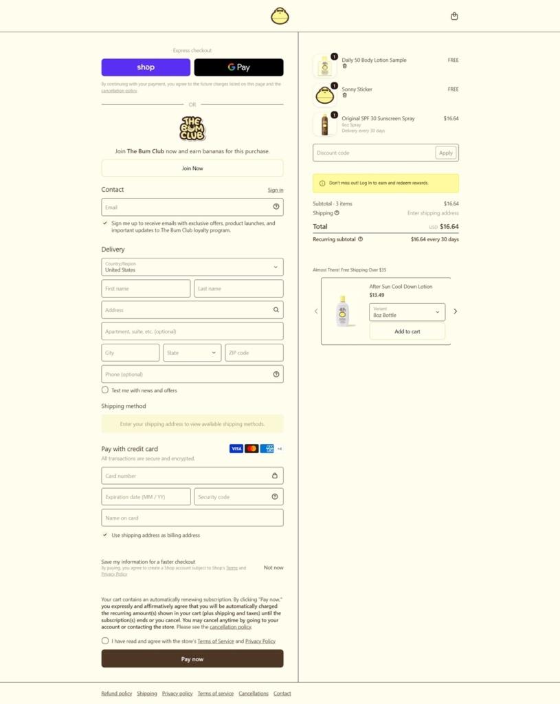
Sun Bum is a sun and beach care brand selling sunscreen, hair care, lip balm and beach-branded merchandise, with dedicated baby and kids lines alongside its core adult sunscreen range. The catalogue spans SPF 15 to 70 across roughly 67 sunscreen listings, plus bundling and subscription options. Built on Shopify.
Website Design
Sunshine yellow on cream. The palette centres on a bright yellow, roughly #F7DF00 to #FEEA00, for buttons and highlights, over cream and off-white backgrounds (#FFFEEE, #FFF78F), with a warm brown, #4E3625, used for body text and an orange, #F37021, reserved for hover states.
A custom display face named Sonny. Headlines are set in a typeface called Sonny, falling back to Helvetica Neue, matched to the brand’s mascot character of the same name.
Beach lifestyle photography throughout. Product shots are supplemented with lifestyle imagery of beach scenes and tour events, including a “Smells Like Summer Tour” and a “Bum Rush Tour,” keeping the browsing experience closer to a beach brand than a clinical skincare site.
Shopping Experience
A large, filterable sunscreen range. The sunscreen collection lists 67 products with filters for SPF, from 15 through 70, waterproof rating, and trust attributes including cruelty-free, gluten-free and vegan, each showing a live product count.
Build-Your-Own-Bag bundling. A “B.Y.O.B.” feature lets shoppers pick five items and receive a free bag, run alongside 15 separate pre-built bundles.
Subscription flagged at the collection level. The collection grid marks 50 of the 67 sunscreen products as subscription eligible before a shopper opens the product page.
Sort and filter run alongside each other. Shoppers can sort by featured, relevance, best-selling or price while simultaneously filtering by SPF, waterproof rating and product form, including full size, travel size and an XL pump option.
Brand Storytelling
“Trust The Bum” as the recurring line. The brand states it makes better products because “when you make products to protect the ones you love, you make ’em better,” tying the tagline directly to a family-first claim.
A named mascot carries the tone. Sonny appears across the site, including a “Sonny’s Porch” content series, giving the brand a consistent character-led voice rather than a faceless product catalogue.
Notable Features
A Sun Education content section. A dedicated Sun Education area sits in the main navigation alongside Shop and Discover, kept separate from the blog.
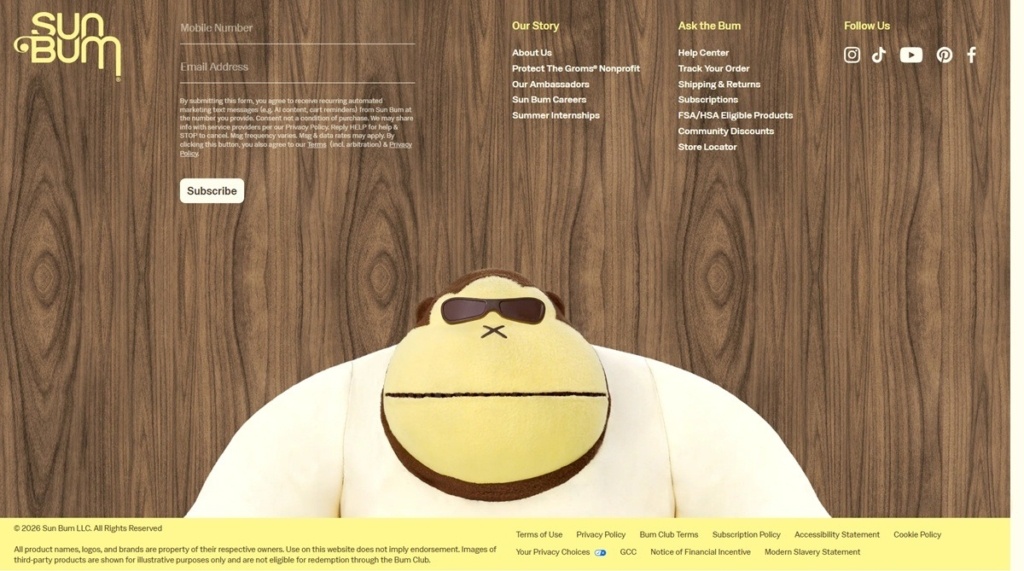
A Modern Slavery Statement in the footer. Alongside standard Terms, Privacy and Accessibility links, the footer also names a Modern Slavery Statement, a policy not present on the other entries in this batch.
The Bum Club and Ask The Bum sit in the main menu. A loyalty programme and a named customer service channel are both given top-level navigation slots rather than being reached only through the footer or a help widget.
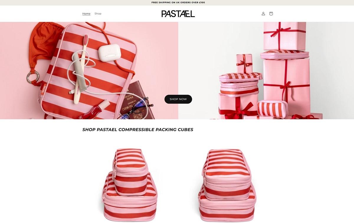
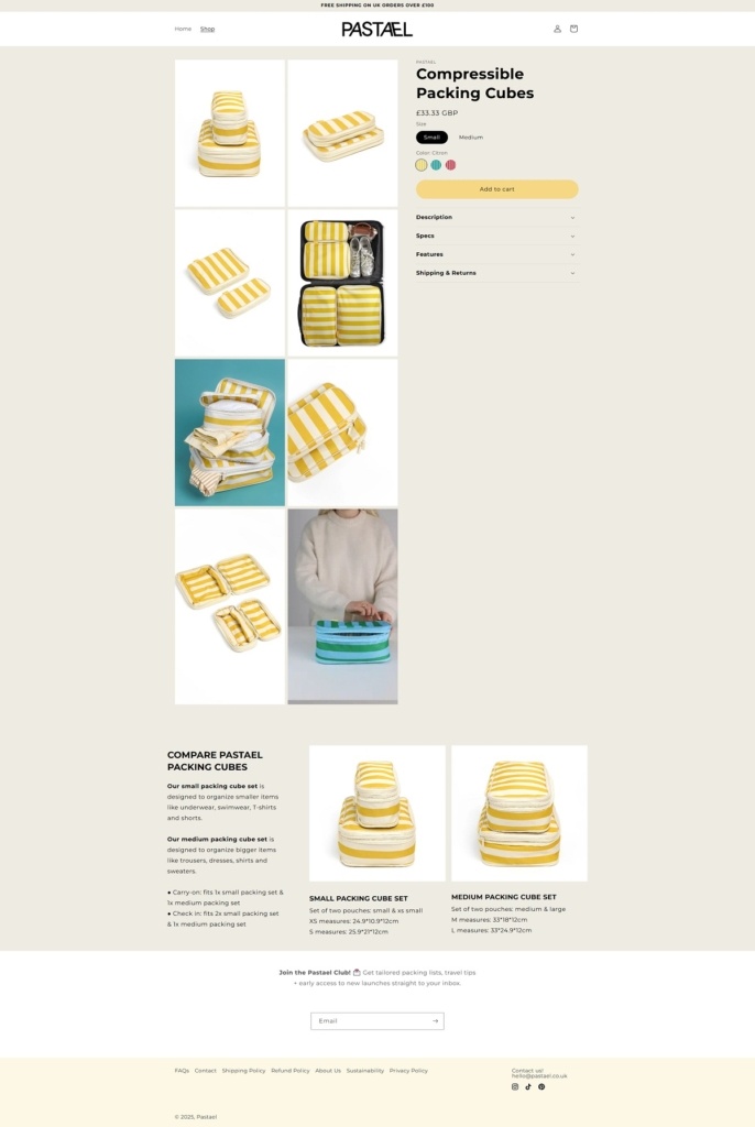
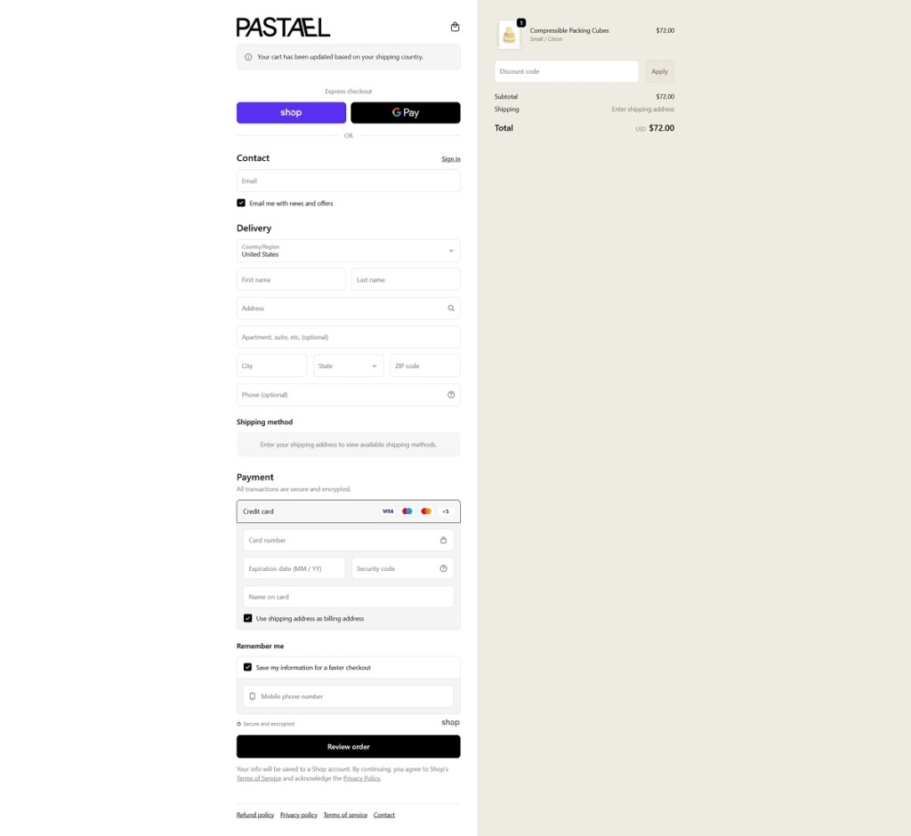
Pastael sells compressible packing cubes (small and medium sizes) designed to keep clothes organised while saving space in luggage. The website uses a clean, modern e-commerce layout with clear product sections, straightforward pricing, and benefit-led copy that quickly explains how the cubes work.
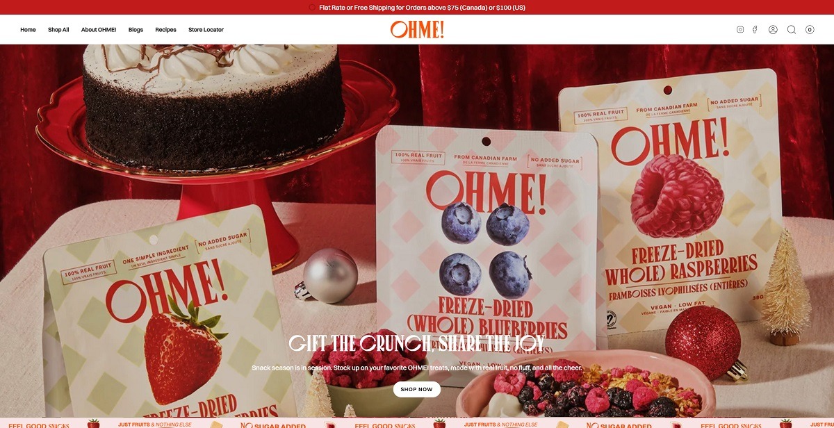
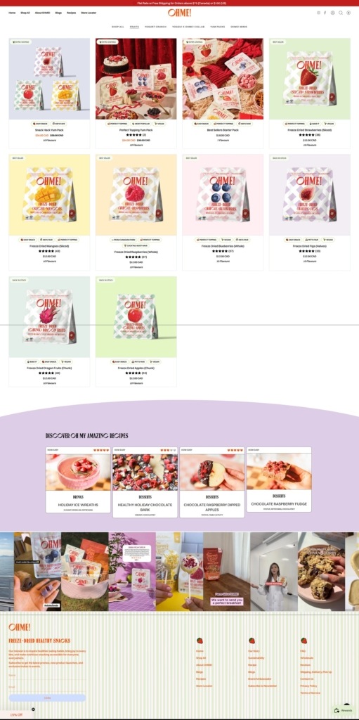
OHME! Foods is a Canadian snack brand selling freeze dried fruit and freeze dried yogurt crunch, plus multipacks, minis, reusable bags and gift cards. The catalogue runs to about twenty items, most single bags at $12.99, a three pack snack size at $16.49 and bundles up to $99.99. The pitch is stated as a rule rather than a claim, “Nothing on the label you need to Google”, supported by a badge strip: no sugar added, no preservatives, non-GMO, vegan certified and made in Canada. The store runs on Shopify.
Website Design
Orange against pastels. The named palette pairs a hot orange #ff4313 and a deeper #e33526 with soft grounds: beige #fff5e9, cream #ffeff1, blue #cfddff, lilac #e3e8ff, yellow #ffcd8a and light yellow #fff5bd, over near black #1a1a1a text. Sections alternate grounds, so the page scrolls as a run of pastel bands with the orange reserved for logo, buttons and calls to action.
Canopee over Switzer. Headings are set in Canopee, with Switzer Medium for body copy and subheadings and Switzer Bold for navigation. The logotype and headings read as a high contrast serif, while everything at small size stays a plain grotesque.
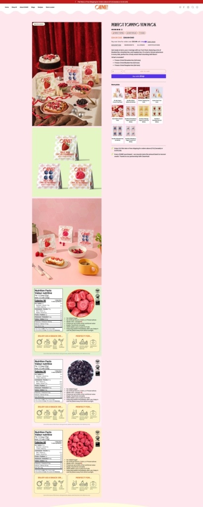
Set dressing in the product photography. Bags are shot in built scenes rather than on plain grounds, styled against curtains, cake stands and table settings with fruit loose beside the pack. Product pages run several of these scenes in sequence, each on a different pastel field.
Shopping Experience
Subscription is offered on the card, not the cart. Every product card carries a one time price and a Subscribe and Save price side by side, $12.99 against $11.69, with three intervals and three rates: every four weeks at 10% off, every eight weeks at 8% and every twelve weeks at 5%. Size variants and a Quick add button sit on the same card.
Nutrition panels are part of the page. Product pages place a bilingual English and French nutrition facts table next to a close up of the fruit, repeated once per item in a multipack, with certification marks alongside.
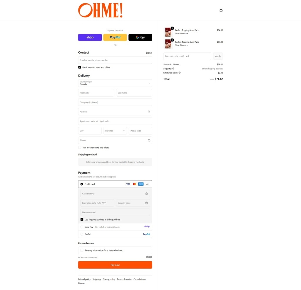
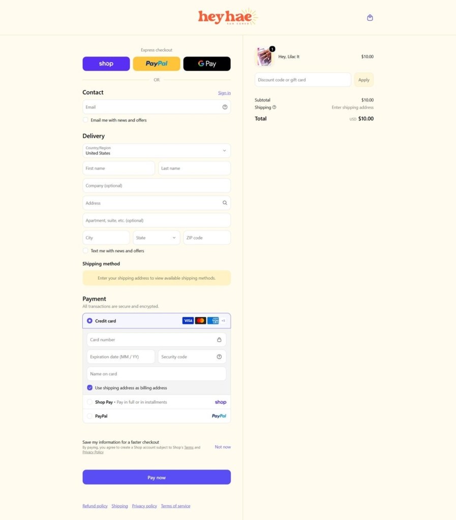
A two currency checkout. The cart drawer states free shipping over $75 across Canada and $100 across the US. Checkout is Shopify with Shop Pay, PayPal and Google Pay as express options, card payment below, estimated taxes on their own line and the total labelled in CAD.
Brand Storytelling
Facts framed as a game. A homepage block headed 2 TRUTHS AND A LIE asks the reader to spot the false freeze drying claim, then reveals it. A second block reduces the proposition to an equation, one bag of OHME! equals one pint of fruit minus the weight.
Use cases before benefits. A section titled ways to ohme! sorts the product into occasions, Netflix and Chill, Dinner Parties, Toppings, Snacking and Baking, and the homepage review quotes describe behaviour rather than taste.
Notable Features
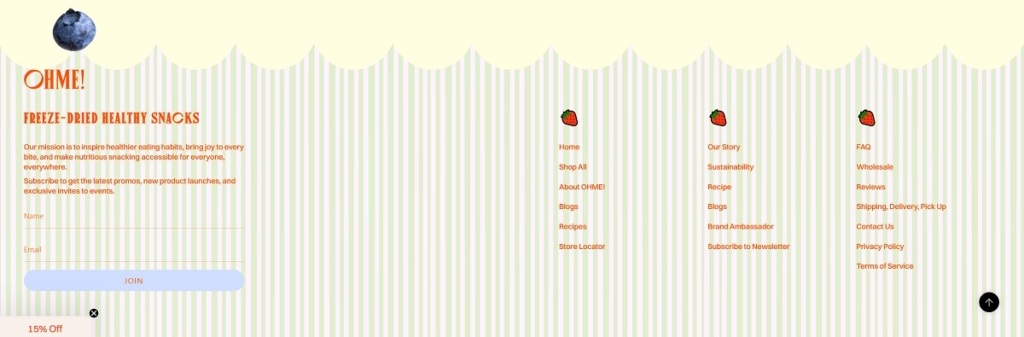
Editorial and retail run alongside the shop. The Journal, Recipes and a Store Locator sit in the primary navigation next to Shop, and the footer adds wholesale, event sponsorships and a brand ambassador programme.
Restock notifications on every variant. Where a size is unavailable the card swaps to an inline email capture rather than hiding the option.
Yum Packs and Minis as their own categories. Multipacks and small format bags are separate menu entries, not variants buried on one product page.
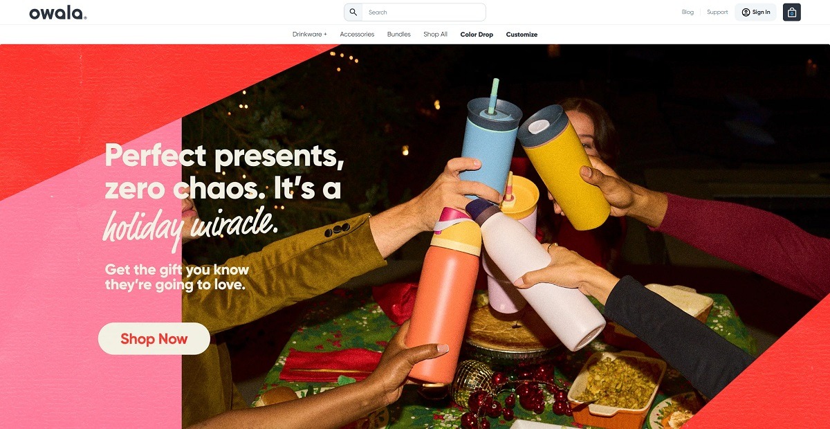
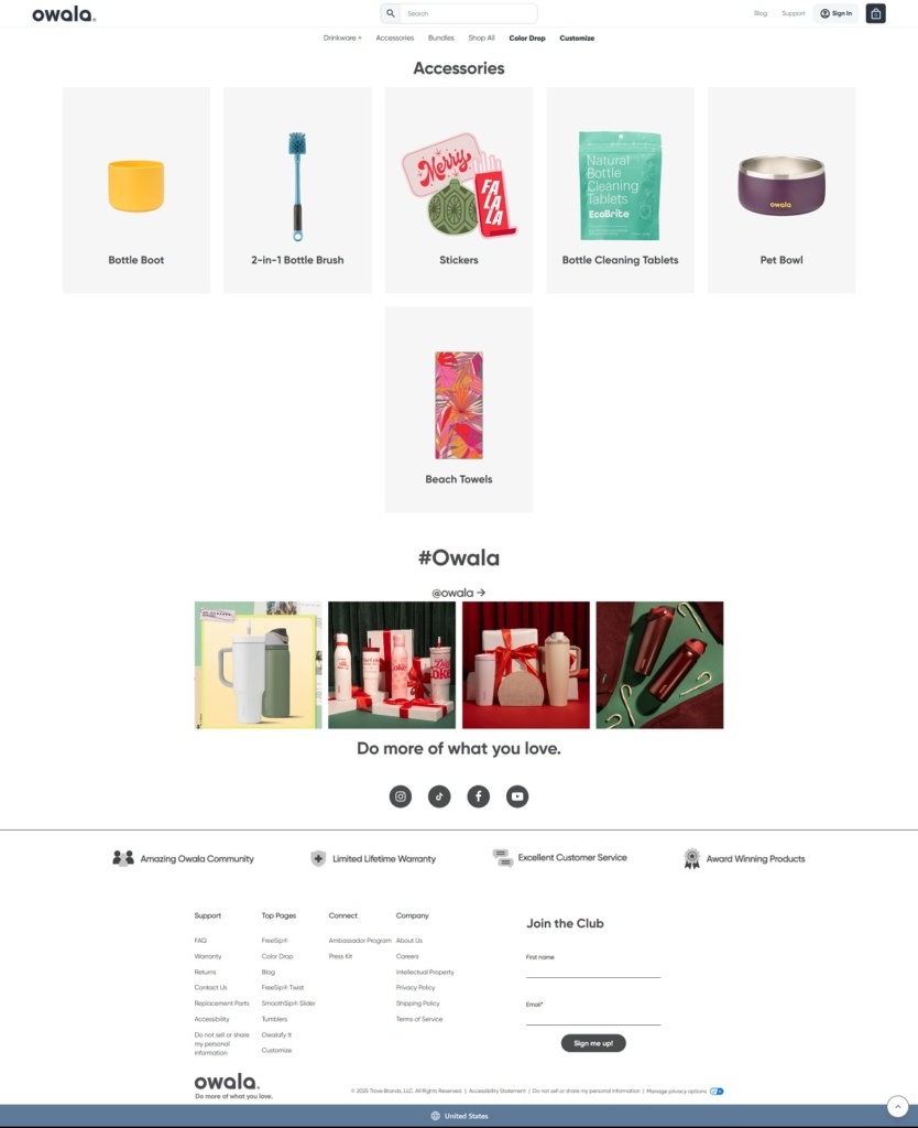
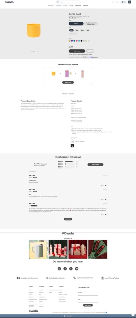
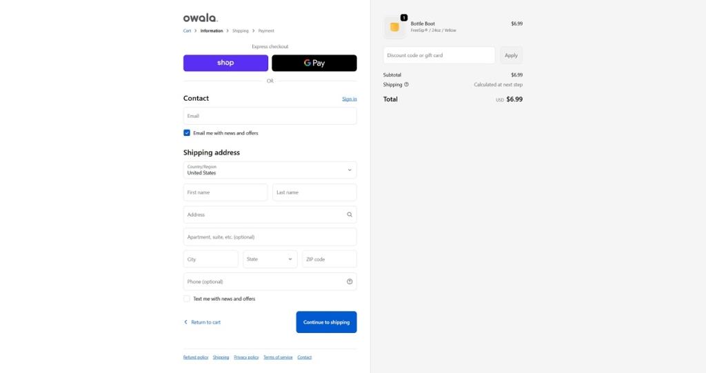
Owala Life’s website features a bright, modern e-commerce design with clear navigation, bold product photography, and simple layouts that make it easy to explore options. Their products are innovative, everyday hydration gear — insulated water bottles and tumblers with splash-proof lids, easy-drink spouts, and colourful, functional designs.
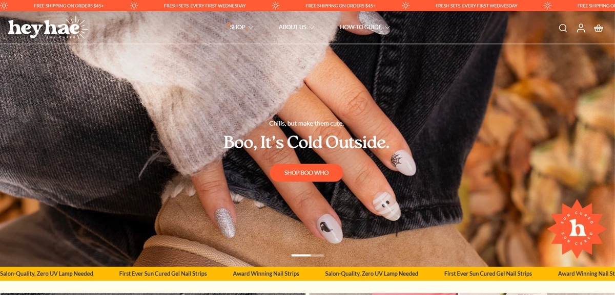
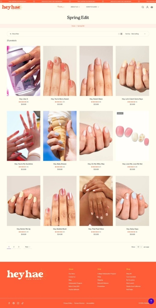
Heyhae is a Los Angeles brand selling sun-cured gel nail strips and the small kit that applies them, positioned as a salon alternative that needs no UV or LED lamp. The catalogue runs to roughly 157 items: single sets between $10 and $13, curated and build-your-own bundles from around $26 to $46, care essentials and gift cards. Each set ships as 28 strips with a prep pad, nail file and wooden stick. The brand also lists stockists through Target. Built on Shopify.
Website Design
Sun orange on ivory. A warm orange carries the brand against an ivory page ground and a near-black text tone, with a sunflower yellow for scroll states and hover fills. The footer inverts to orange, and a deep green appears in secondary panels.
DM Sans over Lato, with Playfair for accents. Headings are set in DM Sans, body copy in Lato, and a serif is held back for display lines. Section headings mix sentence case with all-caps lockups such as “HOT GHOUL SUMMER”.
Product names as a running joke. Every design is titled as a greeting, from “Hey, Clean Girl” and “Hey, Matcha Girly” to “Hey, Caught in your web”, carrying the brand voice through the grid without extra copy.
Shopping Experience
Three ways into the same catalogue. The shop menu offers a standard route through Shop All, Best Sellers, What’s New and seasonal edits, a By Color route split into six colour families, and a By Pattern route covering gradient and marble, glam and glitter, solid and French.
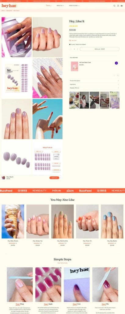
Bundling handled as a product type. Build Your Own Bundle and Pre-Bundle Sets sit next to the singles, with named collections such as Best Seller Edit and The Trend Edit priced as units rather than as a checkout discount.
Add to cart from the grid. Cards carry an inline Add to cart control with a Sold out state, so browsing and buying happen on one page.
Application taught on the product page. Below the buy box a four-step sequence covers prep, apply, cure and file, giving a cure of a few minutes in sunlight or about five seconds under an LED lamp. Pattern type, kit contents, ingredients and shipping and returns sit in accordions above it.
Brand Storytelling
Sunlight as the whole proposition. The homepage repeats the single mechanism in several registers: “Skip the Salon. Cure in the Sun.”, “First Ever Sun Cured Gel Nail Strips” and “Just you and the sun.”
A comparison table against the alternatives. A “Us vs Them” block scores Heyhae against classic lacquer, gel polish and press-ons on five rows, including no UV lamp needed, nail-safe removal and a price under $15 a set.
Notable Features
A fixed release cadence in the announcement bar. The top strip pairs free shipping over $45 with “FRESH SETS. EVERY FIRST WEDNESDAY”, turning launches into a schedule shoppers can plan around.
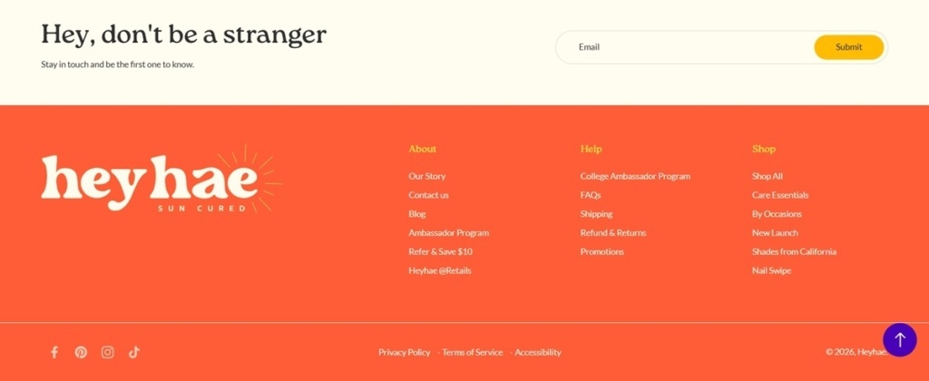
Two ambassador programmes. The footer separates a general Ambassador Program from a College Ambassador Program, alongside a Refer and Save $10 link.
A how-to section in the main navigation. Application tips and a full guide sit as a top-level destination beside Shop and About Us.
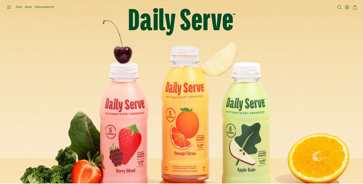
Daily Serve is a ready-to-drink beverage formulated to provide phytonutrients equivalent to five servings of fruits and vegetables, along with 12 essential vitamins and minerals and 5 g of fibre per bottle. It is designed for direct consumption, requiring no mixing or preparation. Their website features clean, modern design with bold product imagery, simple navigation, and clear messaging about taste and functionality.
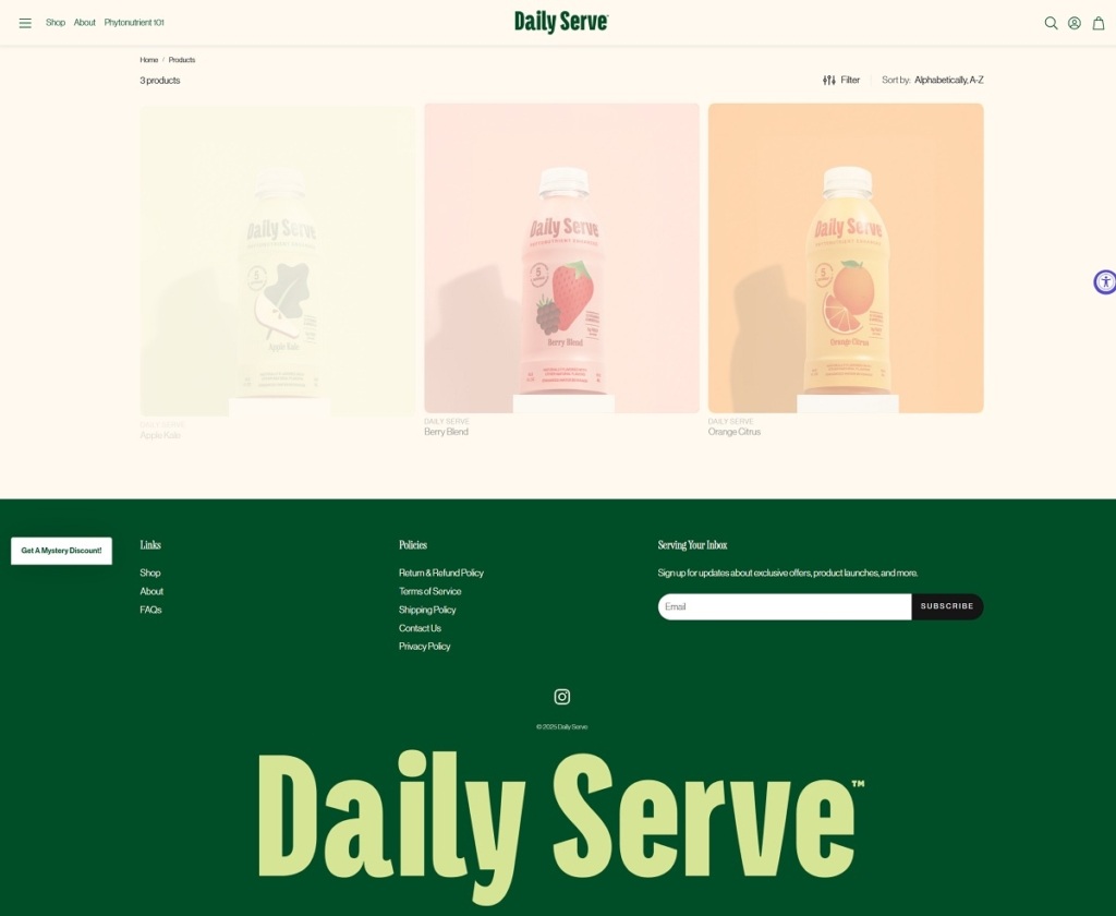
Daily Serve Shop Page Example
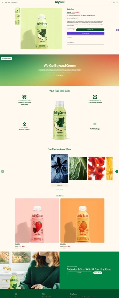
Daily Serve Product Page Example
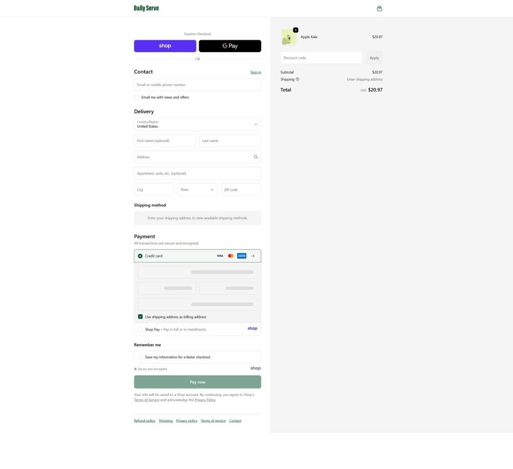
Daily Serve Checkout Page Example
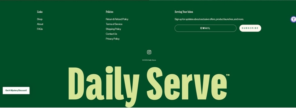
Daily Serve Footer Example
Join our community for the latest trends and ecommerce tips.

 By Jibin Kumar