Rami Kim is a Los Angeles based artist, maker and an award winning animator whose practice is focused mainly on sculptural and functional ceramic objects. With her background in animation, her work is whimsical and poetic. Her inspiration comes from organic shapes, nature, feelings, and people. She currently works out of her studio in Glendale, CA.
The School of Life is a global organisation helping people lead more fulfilled lives. You can find us online, in stores and in 10 welcoming spaces around the globe.
Colour is Claire Ritchie’s language and she uses it in a visually striking, definite and feel good way. Claire’s artwork draws people in to feel better about the person they are.
Claire designs and makes a selection of artwork, accessories, clothing and homewares made in small batches, brought to life through colourful and bold prints.
All products are designed and made by Claire herself in her Brisbane home studio.
Claire studied Clothing Production and Fashion & Textile Design in her hometown Perth, Western Australia before moving to the east coast in 2013 with her sewing machine and a string of vibrant fabrics in tow. In 2018, she packed up her beloved Melbourne studio and headed north for a sunny change of pace.
Several years of sewing to her own creative beat and always staying true to her values of treating our beautiful environment with care underpins what Claire Ritchie is all about. Claire challenges consumers to shop more carefully, to buy high quality items and treat them with care. She hopes her thoughtfully designed items will inspire people to shop with the same thoughtfulness.
HEMLEVA sells handmade, nature-inspired jewelry and small accessories, earrings, pins, keychains, suncatchers and stickers, designed and run by a single Seattle maker, Samantha Leung, since 2013. The Shopify store organizes stock into New, Sale and About to Sell Out collections alongside the regular category pages.
Website Design
A warm neutral ground. Pages sit on a soft off-white background rather than pure white, with black text and a terracotta accent reserved for the newsletter button and similar calls to action.
An italic serif for titles. Section titles, the cart drawer heading and footer labels are set in Crimson Pro, a light-weight italic serif, while the body copy around them stays in a plain sans-serif for contrast.
Close, hand-held product photography. Earrings and pins are shown worn, held between fingers or laid against dried flowers and wood, rather than photographed flat on plain grounds.
Shopping Experience
Category pages built for browsing. The Earrings collection opens with a short intro line, then a scrollable photo grid mixing on-model shots, packaging and detail crops rather than a strict product-card layout.
A quick-view style product panel. Clicking a piece opens product details, price, a Single or Pair option where relevant, a quantity field, Add to cart and a purple Buy with Shop button, with a Description accordion below covering materials and care.
Materials stated per item. Listings note plating, base metal, post material and whether the piece is hypoallergenic, alongside a symbolic meaning for the design.
Shopify checkout with express options. Shop Pay and Google Pay sit above the standard delivery and card fields, and the confirm button reads Pay now in black.
Brand Storytelling
A single maker, named directly. The site attributes the shop to Samantha Leung rather than a team, and reviews reference her by name for communication and turnaround.
A nature and symbolism thread. Individual pieces carry a stated meaning, such as a flower symbolizing luck or new beginnings, tying the botanical name HEMLEVA back to each product description.
Playful content alongside product pages. The journal is split into a lifestyle section and one titled "air plant dating profiles," an unusual, lighter format for a jewelry brand's blog.
Notable Features
An AI training opt-out notice. The footer states that no part of the site may be used to train artificial intelligence systems, alongside the standard copyright line.
A long, categorized footer menu. Links are grouped into practical pages (FAQs, shipping, accessibility), community pages (collaborate, giving back, press) and shopper tools (stockists, wholesale, printable gift cards), rather than one flat list.
Printable cards for last-minute gifts. A dedicated page offers printable gift cards for shoppers who need something to hand over before physical shipping can arrive.
A currency selector next to the newsletter form. A flag icon beside "USD $" sits in the footer, suggesting the store also serves shoppers browsing in other currencies rather than assuming a single market.
All the ways to Say is a specialized paper goods brand based in France, founded in 2015 by Claire Leina, an illustrator, art director, and young mom. She develops original collections, works on the color and designs combinations, and focus on the highest quality materials available to create the finest products. She’s helped by her husband Jean-Charles, who manage the development of the company, and their little daughter, Tess, who is in charge to laugh and give them hugs when they need it. Our envelopes are made from recycled paper and all paper goods are assembled with love in the studio. We hope that our products will help you to share love and joy, connect and reach out to others ♥︎
Our hand-drawn patterns and delectable colors will express your style, but these bandanas / handkerchiefs / scarves will be there for you to keep your hair up, serve as a bib for your kiddo, a napkin for your next picnic, or a snazzy pocket square. The uses are endless!
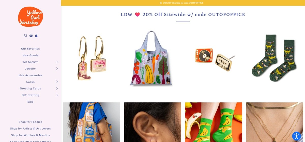
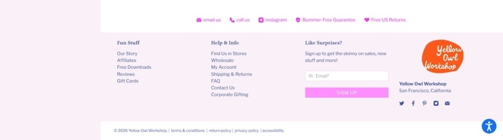
Yellow Owl Workshop is a San Francisco craft and lifestyle brand selling tote bags branded Art Sacks, jewelry, socks, greeting cards, DIY kits and hair accessories, founded by Christine and priced mostly between $14 and $28. Built on Shopify.
Website Design
Cooper BT for headings, Libre Franklin for body. The site pairs a rounded serif, Cooper BT, for headings with Libre Franklin, a plain sans, for running text and interface labels, giving headlines a friendlier, handmade quality against a neutral body font.
A periwinkle, mustard and pink palette. Color runs a periwinkle blue (#4754a0) against a mustard yellow (#f4c031) and a hot pink accent (around #fb95f2), a saturated, craft-store palette distinct from the neutral tones common elsewhere in this set.
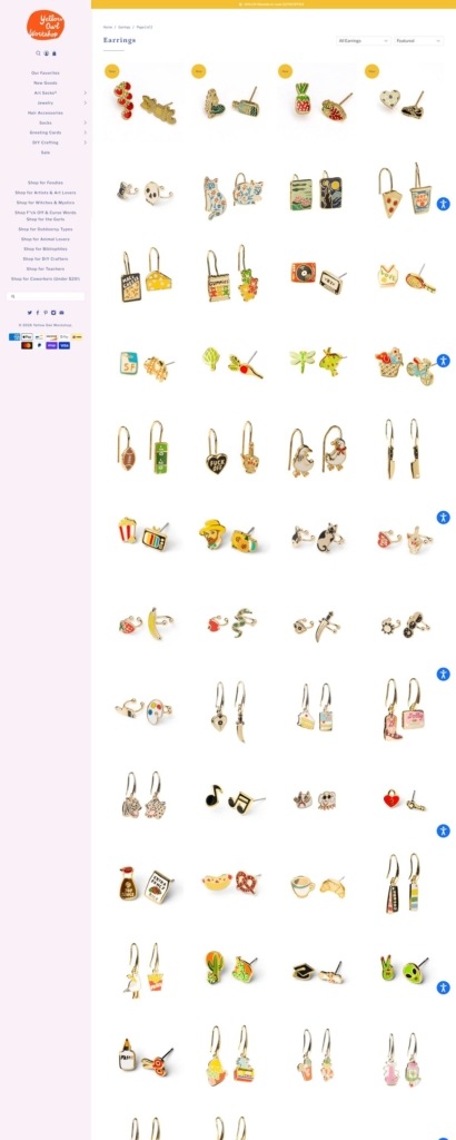
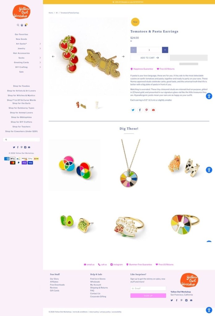
Quick-view layered onto the product grid. Collection pages use a dense grid with a quick-view option on hover, letting shoppers preview a product without leaving the category page.
Shopping Experience
Curated collections built around a buyer type. Alongside standard categories like Art Sacks and Jewelry, the site groups products into audience-based collections for foodies, artists, teachers, animal lovers and bibliophiles.
Free shipping and returns stated together. Free shipping applies above $50, paired with a named “Bummer-Free Guarantee” covering free US returns, presented as one combined promise rather than two separate policies.
Restock alerts on sold-out items. Out-of-stock products offer an email notification signup rather than simply showing as unavailable, keeping demand visible for items still in production.
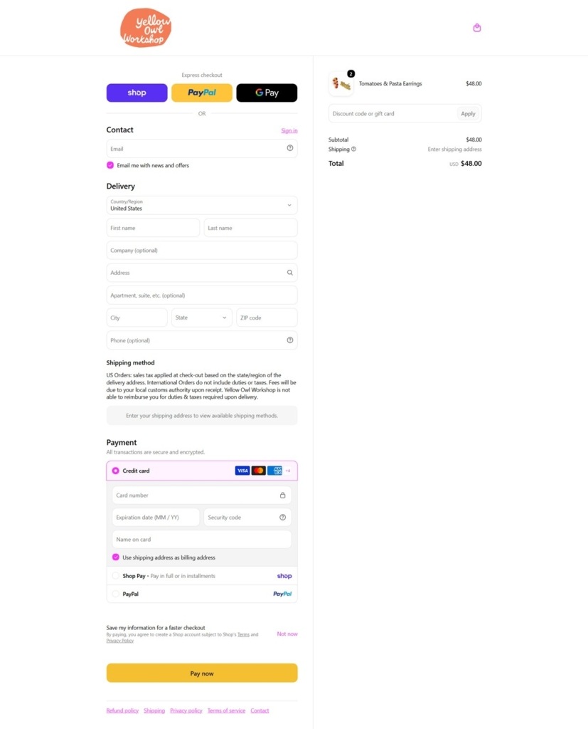
A full wallet set at checkout. Payment options include Apple Pay, PayPal and Shop Pay alongside standard card entry, letting mobile shoppers check out from the product grid without a full account setup.
Brand Storytelling
A named founder voice throughout. Copy is written in the first person from founder Christine, including a line about personally being particular about quality standards, giving the site a single, consistent voice rather than a brand-team tone.
Playful, informal naming. Some collections and product names lean cheeky, extending the founder’s first-person voice into the site’s navigation and category labels rather than keeping it to an About page.
Notable Features
Corporate gifting called out separately. Alongside wholesale, the footer links a dedicated corporate gifting page, positioning bulk, non-retail buyers as a distinct audience from individual shoppers.
A DIY kits category beside finished goods. The store sells make-it-yourself kits in the same navigation as finished jewelry and totes, letting one catalogue serve both ready-to-buy and craft-it-yourself customers.
Newsletter signup paired with social reach. The footer combines an email signup with links to Instagram, Facebook, Pinterest and X, giving the brand multiple ongoing channels beyond the storefront itself.
Wholesale kept in the same footer column. A wholesale program link sits directly beside the corporate gifting and social links, treating trade buyers as another footer-level audience rather than a separately promoted program.
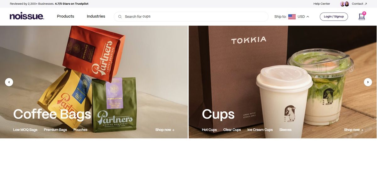
noissue sells custom, low-minimum packaging (tissue paper, mailer boxes, stickers, cups, bags, tape and takeout containers) to small and independent brands, stated on-site as “Custom Packaging That’s Sustainable and Eco-Friendly.” The homepage footer copyright reads “noissue 2026,” confirming the storefront is current; the site is a JS-rendered custom build that returns little content to a plain fetch, so this description draws on the gallery screenshots, cross-checked against colors and copy pulled from the live page source. Built on a custom Next.js storefront, not Shopify.
Website Design
Cream ground, ink-purple wordmark. Pages sit on a warm off-white (#F7F1EC family) rather than pure white, with the lowercase “noissue.” wordmark and body text in a dark purple-navy (#2c1847). A hot pink (#ff379c) marks the one saturated accent, used on the newsletter Subscribe button.
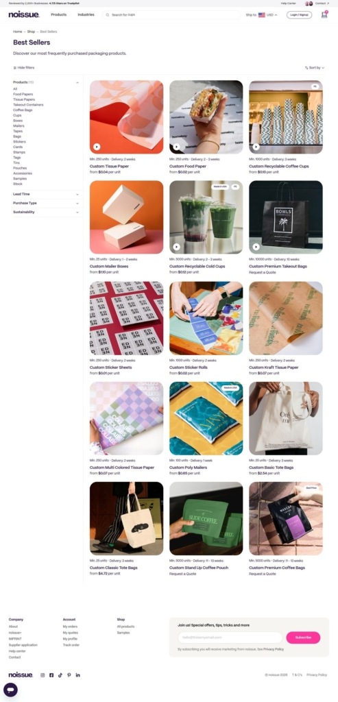
Photography-led product cards. Category pages lead with large product photography, in some cases with a video-preview icon overlaid on the thumbnail, ahead of any text; the name and starting price sit below the image rather than over it.
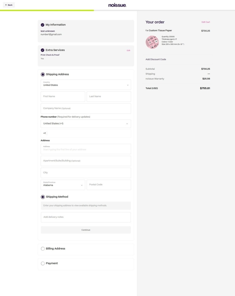
A lime progress bar at checkout. Where the rest of the interface stays muted, checkout uses a bright lime-green bar to mark progress through the steps, a deliberate departure from the cream-and-purple palette elsewhere.
Shopping Experience
A left-hand filter rail. The Best Sellers listing filters by Products (Food Papers, Tissue Papers, Takeout Containers, Coffee Bags, Cups, Boxes, Mailers, Tapes, Bags, Stickers, Cards, Stamps, Tags, Tins, Pouches, Accessories, Samples, Stock), Lead Time, Purchase Type and Sustainability, reflecting a B2B-leaning catalogue built around production specs.
Per-unit pricing on every card. Cards state a minimum order quantity, a delivery estimate and a per-unit price, for example “Min 250 units – Delivery 1-2 weeks – Custom Mailer Boxes – from $1.30 per unit,” so cost expectations are set before a click.
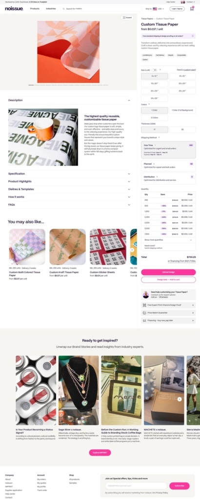
A configurator-style product page. The Custom Tissue Paper page walks through size, color count, sides and thickness before showing a live quantity-and-price table, with an Upload Design button and a live chat prompt offering expert help.
Standard Shopify-style checkout, custom-built. The checkout carries My Information, Extra Services (a stated Print Check and Proof add-on) and Shipping Address steps, with subtotal, shipping and a “noissue Warranty” line itemized before total.
Brand Storytelling
Sustainability named directly in the tagline. Rather than a separate mission page, “Sustainable and Eco-Friendly” sits in the primary headline copy itself.
Customer projects as content. A “Ready to get inspired?” section on the product page links out to brand-story articles about how other businesses used the packaging, blending inspiration content into the purchase path.
Brand-agnostic tone. Copy stays procedural and specification-led (sizes, minimums, lead times) rather than narrative, consistent with a supplier serving many other brands rather than selling a single lifestyle.
Notable Features
Financing shown at the price table. The product page states an “or financing from” monthly figure beneath the total, a detail aimed at larger bulk orders.
Live chat as a persistent element. A chat bubble stays fixed in the corner across category, product and checkout pages.
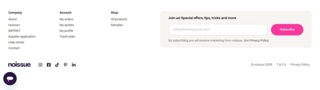
Multi-channel footer. The footer links Instagram, Facebook, TikTok, Pinterest and LinkedIn together with Company, Account and Shop navigation columns.
Lillian Farag is a free form and free-spirited artist, with a love for all things playful and expressive. Pulling inspiration from colors found in life and nature, she adds her own twist and perspective to each aspect of her work.
Along with offering unique hand-painted leather accessories and products, Lillian Farag works on collaborations with both leading industry and boutique brands including:
Papyrus, Urban Outfitters, Anthropologie, Talking out of Turn, Flagpole Swim, Pepper Home, Daydream Society, Barnes & Noble, and Mead Cambridge for Target.
manebí espadrilles are handmade using century old techniques, which make each pair different and unique. our espadrilles have a spanish soul as they are made by expert craftsmen in la rioja and an italian touch as they are designed in milan.
Stay Home Club is a lifestyle brand for people who have no life. We’re devoted to offering genuinely original apparel, accessories and printed goods to like-minded customers around the world. Our products feature a mix of in-house designs and the work of contributing artists.
Stay Home Club has been run and designed by Olivia Mew out of Montreal, Canada since 2012. What started as a one-woman-basement-business now operates out of a beautiful studio in St.Henri with 5 people working hard to ship and generally facilitate your orders. We even offer local pickup for Montrealers.
Hi, we are a bunch formed by cute little animals who want to make themselves known to the whole word, for that, we have created some products using our images, as cushions, cases, tote bags, place mats and prints. Thus is born the brand: MON.
Join our community for the latest trends and ecommerce tips.