Archives: Websites

eCommerce Websites

A WAYS AWAY

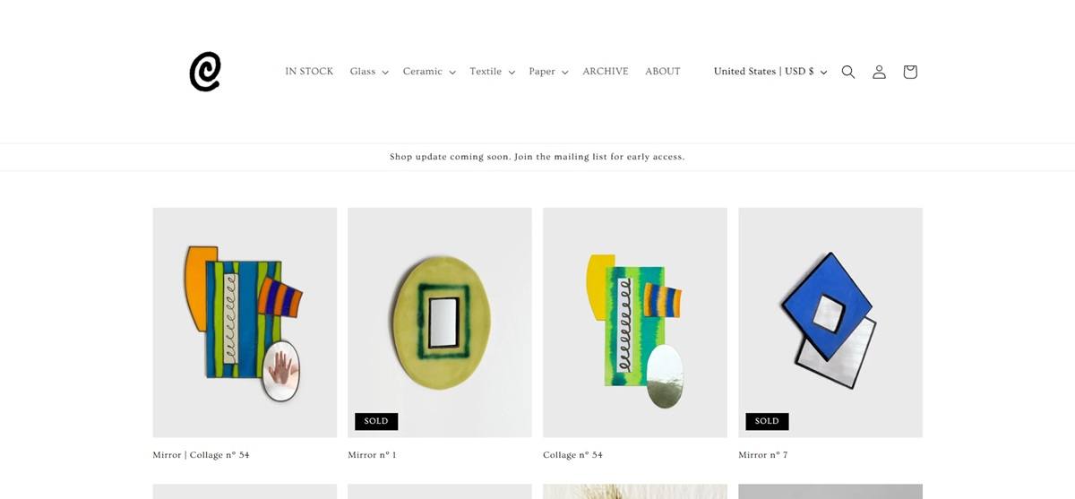
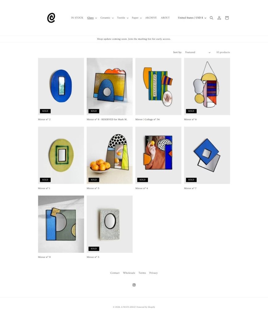
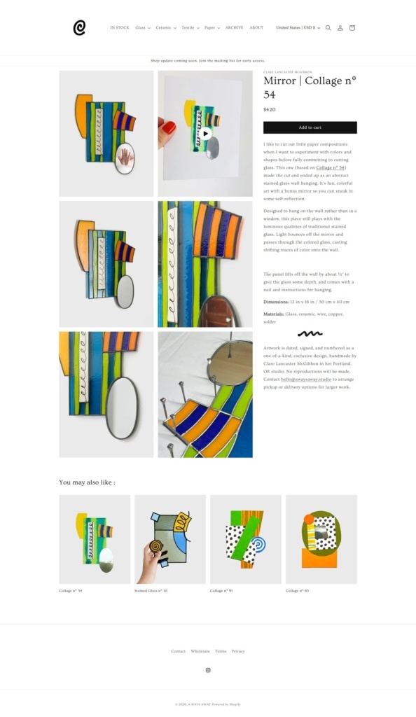
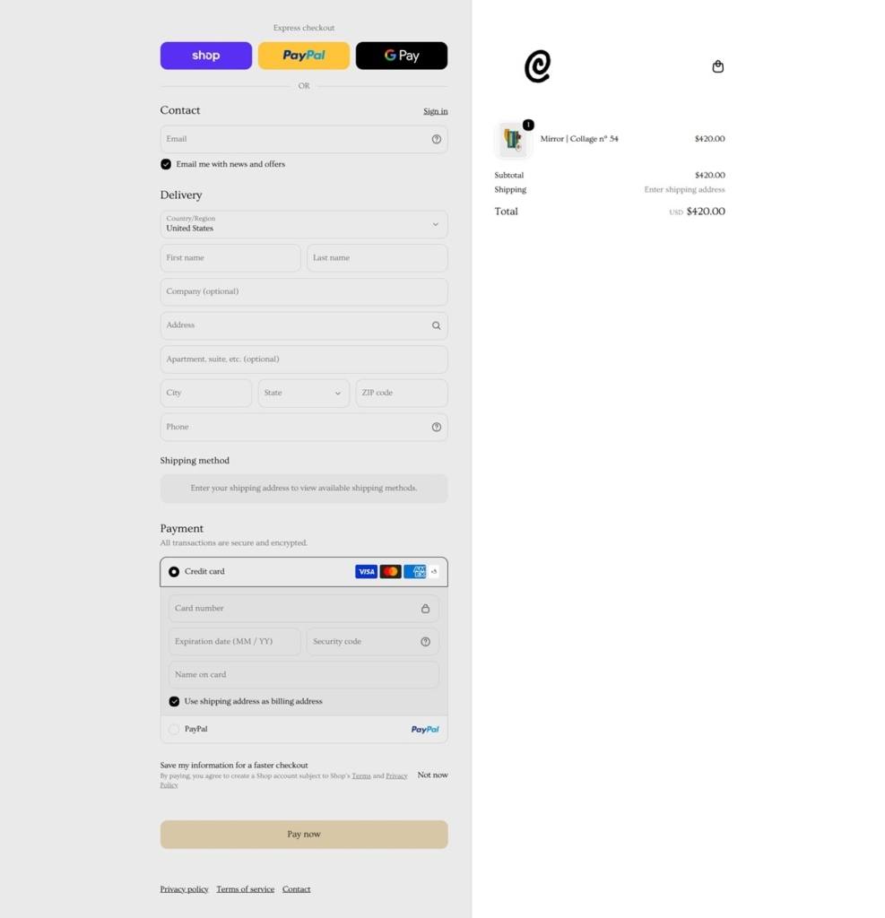
A WAYS AWAY was founded by Clare McGibbon in Paris, France in 2011. Currently based in Los Angeles, A WAYS AWAY is a place to find vibrant DIY content and a collection of handmade ceramics and goods, ranging from home decor to jewelry. Clare’s work has been featured in the Washington Post, Apartment Therapy, Elle Decoration Sweden, Real Simple and Mollie Makes, amongst others. Keep up with her latest projects, DIY videos, and inspiration on Instagram.

Apprvl

Apprvl was founded in the summer of 2014 by Megan Mussari through her intuitive curiosity in natural dyes and desire to make quality products by hand.

With a background in the fashion and textiles industry, Megan saw and felt first-hand the harsh effects of synthetic dyes in mass production. In an effort to find friendlier alternatives, her studies and explorations in natural dyeing began. Through these endeavors, Megan was able to focus on the Japanese tradition of Shibori indigo dyeing. These methods provide structure while also allowing for experimentation in an effort to broaden knowledge, skills and inspirations. Apprvl is run from Megan’s artist studio in Brooklyn, New York.

Apprvl is a constant search and exploration inspired by natural movements. Our collection of unique goods are handmade & hand dyed in NYC from natural dyes and fibers. By embracing the beauty of human error within the dyeing process, each design is truly one of a kind.

Seasonly

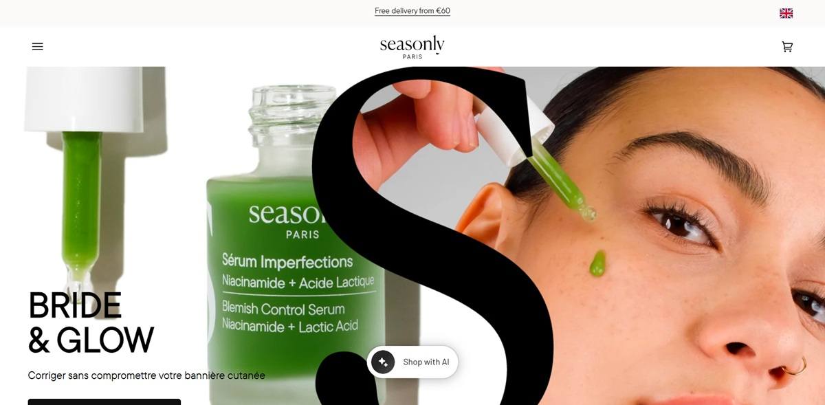
Seasonly is a French skincare brand selling facial oils, serums, creams and cleansing sets formulated with at least 95 percent natural-origin ingredients, alongside massage accessories and subscriptions. The range includes products like TensioLift Oil, Night Oil, Tan Boost Oil and a Duo Notox Cream and Oil set, built around a “skin building” concept that stimulates facial muscles rather than only treating the surface. Seasonly also runs ten physical Skin Studios offering facialist-led massage treatments, and states its homepage tagline as “your skin changes, so should your routine.”

Website Design

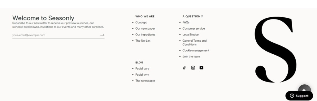
A cream ground with a serif brand mark. The site sits on a warm off-white, and the footer carries an oversized serif capital “S” as a standalone logo device, echoed in the wordmark set in Adobe Caslon Pro, a classic serif used for the “seasonly” logotype.

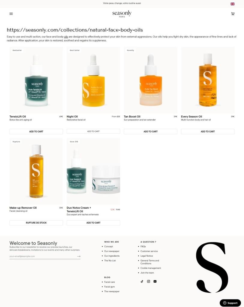
Bottle colour as the accent system. Rather than a fixed brand palette applied across the interface, colour comes mainly from the product bottles themselves, teal green for the TensioLift line, amber and orange for the oils, set against plain white product cards.

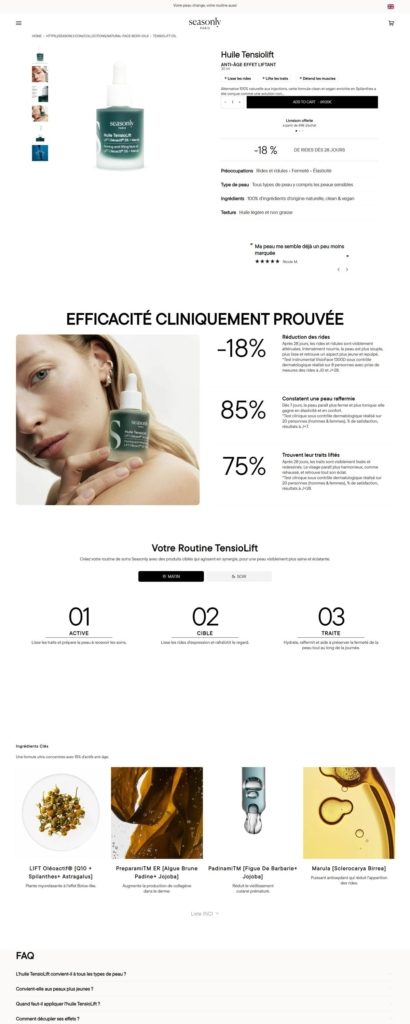
Clinical proof laid out as data. The TensioLift product page breaks results into large percentage figures, such as reductions in wrinkle depth after 28 days, set beside a black-and-white portrait rather than styled lifestyle photography.

Shopping Experience

A simple grid with inline add-to-cart. The oils collection lists products in a four-column grid, each card showing a Bestseller or Novelty tag, name, short description and price, with an Add to Cart button built into the card so shoppers do not need to open the product page to buy.

Routine-building on the product page. Below the buy box, the TensioLift page walks through a three-step routine, Active, Target and Treat, and lists the individual named ingredients such as Lift Oleoactif and Padinami with a short claim for each.

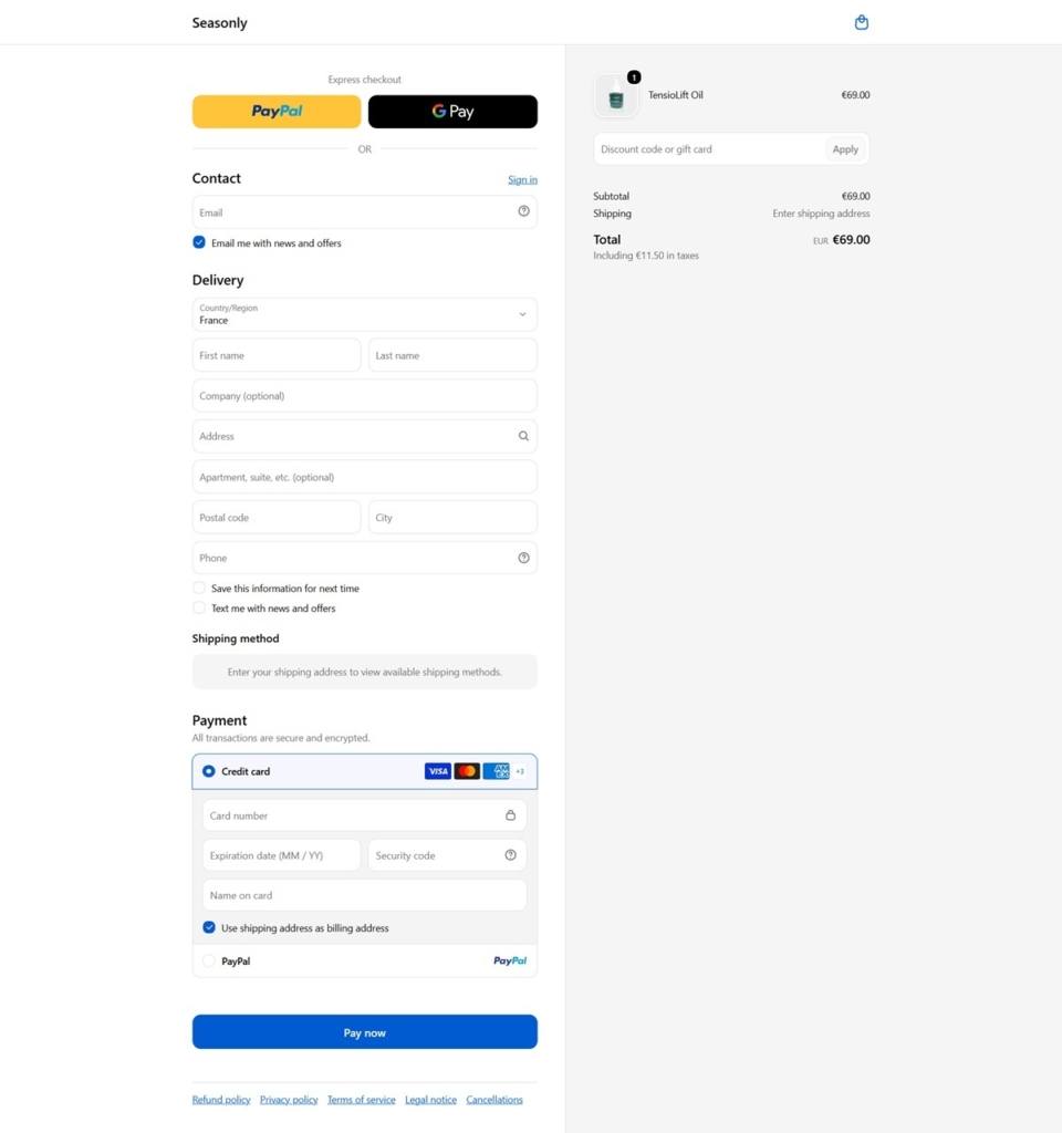
A French-first, multi-region checkout. The checkout defaults to France with pricing in euros and tax shown separately in the order summary. Express options are limited to PayPal and Google Pay, without Shop Pay, and the Pay Now button uses a plain blue rather than a custom brand colour.

Brand Storytelling

A research claim as the core pitch. Homepage and product copy repeat figures like “150,000 faces analysed” and “1,000 formulas tested” to frame the brand as lab-backed rather than purely botanical.

Journal-style content in the footer. The footer lists a newspaper and blog section with categories like Facial Care and Facial Gym, extending the skin-building concept into ongoing editorial rather than confining it to product pages.

Notable Features

Skin Studio appointments sold alongside products. The site promotes its ten physical Skin Studios and facialist treatments through the same navigation as retail products, blending an e-commerce catalogue with service booking.

A stated ingredient exclusion list. The footer links to a page called The No-List, naming what Seasonly leaves out of formulas, positioned as its own destination rather than buried in an ingredients FAQ.

Seasonly Shop Category page example

Seasonly Product page example

Seasonly Checkout page example

Seasonly footer example

Heist Studios

Unimpressed with how the underwear industry portrayed women, we assembled a team of the most celebrated (and mischievous) garment innovators to take it on. By looking at how people move, actually move, we make garments that are break-through in their design, manufacturing techniques and materials. By looking at what was needed, not what was done, we created something radically different with our first product. But we’re not stopping there. With our growing team of material scientists, designers and inventors, we’ll continue to make more essential pieces that serve us, not those looking at us.

gentle thrills

Gentle Thrills is a Los Angeles based shop selling wearable drawings and illustrated stationery: patches, pins, apparel, hair accessories, purses, keychains, paper goods, tarot decks, pet products and zodiac posters, all designed by founder Isa Beniston. The site’s own description reads “wearable drawings and happy stationery designed in los angeles, california.” Collections are grouped under headings such as Accessories, Apparel, Paper Goods, Tarot, Pets, Zodiac Posters, Buttons, Bundles, Just Restocked and Sale. Built on Shopify.

Website Design

A pink accent on a black and white base. The interface runs black text and navigation on a white ground, with a single soft pink used for accents and highlights rather than a full color system.

Karla and Roboto for type. Body and heading text pair the sans-serif Karla with Roboto for secondary copy, keeping the reading experience plain so the illustrated products carry the visual weight.

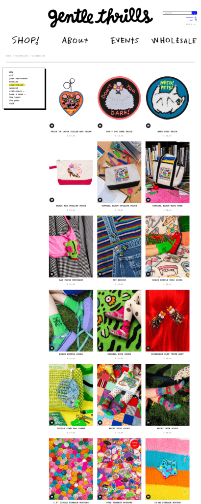
Illustration-led product photography. Products are shown as flat, hand-drawn graphics rather than styled lifestyle shots, and the site headline “MORE IS MORE” is displayed prominently, matching a dense, maximalist grid of patterns and characters.

Shopping Experience

A category grid with quick view. The collections pages use a quick view option on each product tile, letting a shopper preview an item without leaving the grid.

Everyday price points. Items seen on the site range from a 16 dollar patch to a 42 dollar utility pouch and a 62 dollar tarot mini tote, consistent with a small-goods and accessories catalogue.

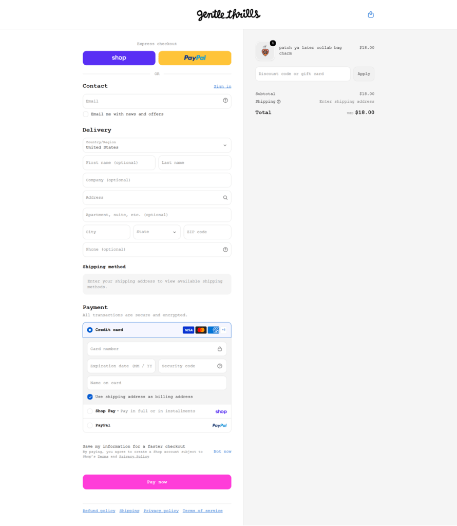
Shop Pay, Apple Pay and PayPal at checkout. The standard Shopify express payment set is enabled, giving returning shoppers a one-click path alongside conventional card checkout.

A footer built for wholesale too. Beyond shipping, returns and refund policy links, the footer lists Wholesale, Stockists, Size Chart and Events, pointing to a business that sells beyond its own site.

Brand Storytelling

A founding story told in first person. The site states: “gentle thrills was founded in 2015 by artist isa beniston. our products are inspired by the treasures we find while secondhand shopping. your purchase supports not only our small business but also our network of manufacturing partners in the u.s. and abroad.”

A repeated philosophy. “MORE IS MORE” functions as both a design principle and a stated brand attitude, reinforcing the busy, pattern-heavy presentation of the catalogue.

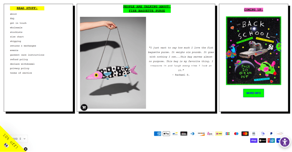
Customer voice used as copy. A product page quotes a review reading “this bag serves almost no purpose. this bag is my favorite thing. i treasure it and laugh every time i look at it,” matching the self-aware, humorous tone of the rest of the site.

Notable Features

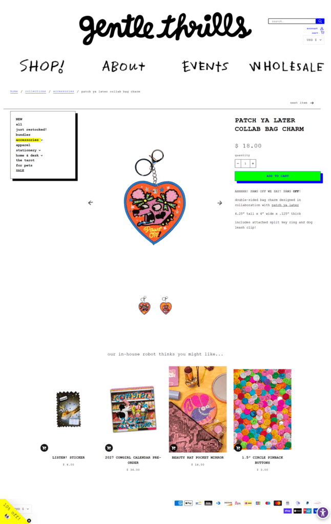
A named collaboration collection. A “Patch Ya Later” collaboration collection sits alongside the regular categories, distinct from the core in-house range.

hCaptcha on the newsletter form. The email signup at the footer is protected by hCaptcha, a detail more common on stores that have dealt with signup spam.

A New New New category. Recent arrivals get their own standing collection page rather than being folded into the general shop grid, alongside a separate Sale category for markdowns.

A full multi-currency checkout. A currency selector in the footer lets a shopper switch pricing across several dozen currencies, from US dollars and euros to less common options.

gentle thrills Shop Category page example

gentle thrills Product page example

gentle thrills Checkout page example

gentle thrills footer example

Eleonor Bostrom

I’m a Swedish ceramic artist sharing my time between Stockholm and San Francisco. My work is focused on sculptures with function and sculptural utility goods. I’m also available for freelance illustration work.

Big Bud Press

Big Bud Press is a Los Angeles label selling size-inclusive, unisex everyday clothing across tops, bottoms, jumpsuits and accessories, with sizing running from XXS to 2XL. The brand states its manufacturing is ethical and local, and sells through five physical stores, two in Los Angeles plus Chicago, New York and Palm Springs, alongside its Shopify site.

Website Design

A mauve and cream palette. The site’s color variables set a mauve-purple, #625375, as the primary color, paired with a pale cream ground, #FFF9D9, and a darker mauve, #3b2a52, for hover states, a quieter combination than the bold prints used on the clothing itself.

Muted text on a bright base. Body text runs in a mid gray, #616161, with a lighter gray, #908f85, for secondary copy, keeping the interface chrome subdued so the product photography and prints carry the color.

No custom brand typeface exposed. No font-family or @font-face declarations were retrievable from the page source, so typography here is described only by what renders: clean, unadorned sans-serif labels throughout the interface, left to carry less visual weight than the printed graphics on the clothing itself.

Shopping Experience

Garment-type navigation. The main menu organizes by Tops, tanks, tees, button-ups, long sleeves, hoodies and jackets, Bottoms, work pants, cargo pants, jeans, shorts, overalls and sweats, plus Jumpsuits and Accessories such as totes, pouches, socks, hats and bandanas.

A wide price range tied to garment weight. Basics run about $55 to $70, bottoms $155 to $178, and pre-order pants as high as $198, while small items like plushies start from $28.

Restocks and pre-orders drive urgency. A current promotion reads “New animal prints and restocks Sept 17,” alongside a limited pre-order run for the Rainbow Magic Waters print and a repeating Porthole Tanks style offered in multiple colorways.

Brand Storytelling

Inclusivity stated as sizing, not slogans. The size range, XXS through 2XL, and unisex cut do the positioning work directly rather than through separate marketing copy.

Manufacturing named plainly. The brand describes its production as “ethical and local,” a claim backed by a real, listed five-store retail footprint rather than an online-only presence.

A direct-address mission statement. Copy reads “we work hard to make a product you can feel confident in,” addressing the shopper in first person rather than third-person brand language.

Notable Features

Blog content in the footer. Editorial or blog links sit alongside standard policy links in the footer navigation.

A five-city retail network. Named stores in Chicago, Los Angeles (two locations), New York and Palm Springs are listed, giving the online catalogue a physical counterpart.

Print-led limited runs. Named prints such as Rainbow Magic Waters and Porthole Tanks are treated as their own mini-collections rather than folded into a general new-arrivals grid, each shown across multiple garment styles and colorways.

Big Bud Press Shop Category page example

Big Bud Press Product page example

Big Bud Press Checkout page example

Big Bud Press footer example