We make treasures for those who long for beauty, wonder and spectacle.
Animaux Speciaux


eCommerce Websites
We make treasures for those who long for beauty, wonder and spectacle.
Sudtipos was founded in 2002 as a collective of graphic designers passionate about type. Since the beginning,
Online boutique for organic / animal-friendly clothing; yoga; bath & spa; paper. We bring a little smile, inspiration & luxury.
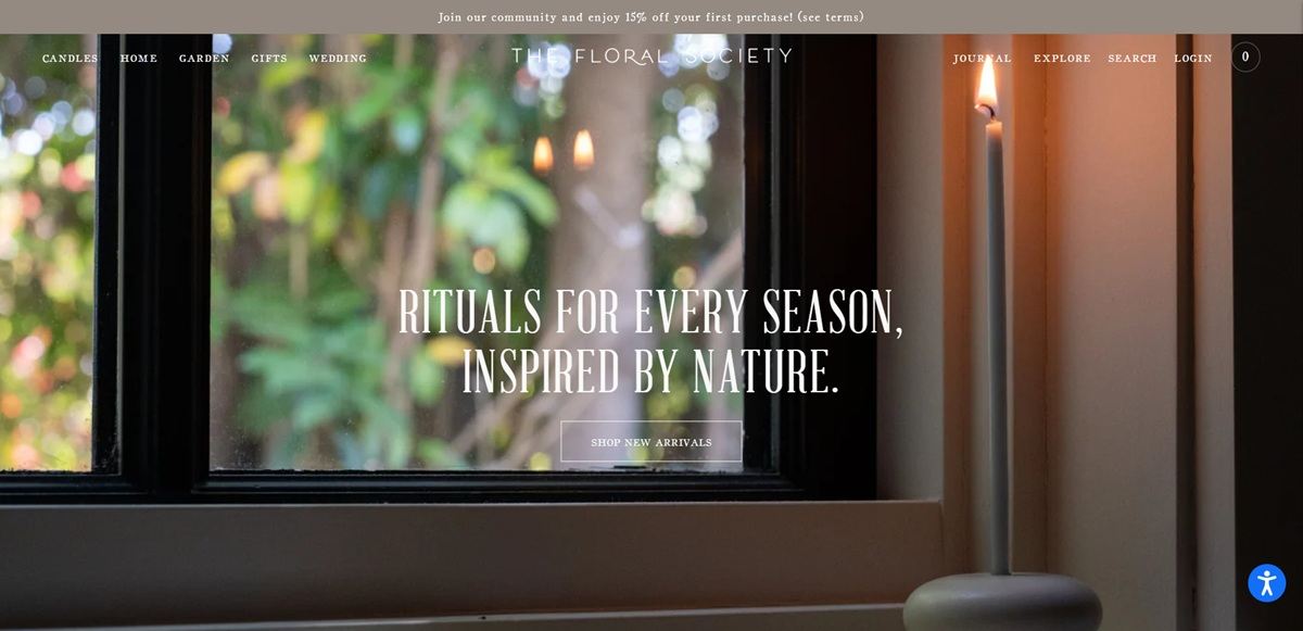
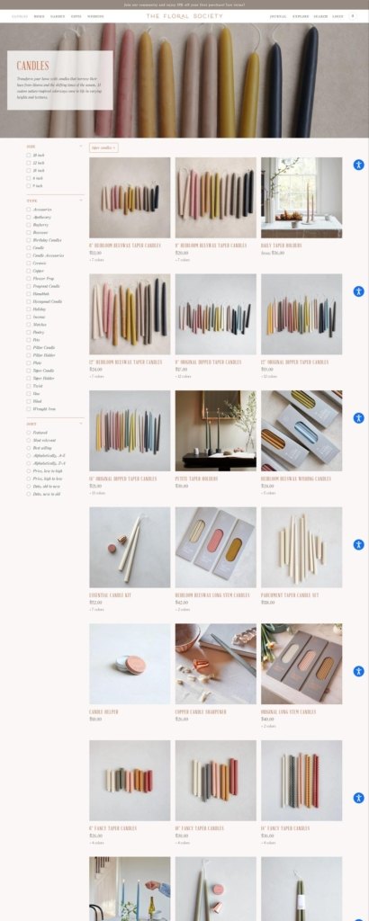
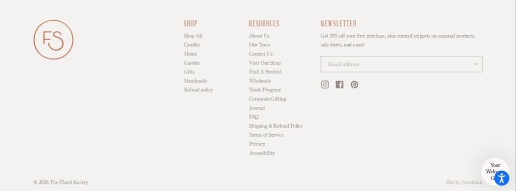
The Floral Society is a US home, garden and tabletop brand that makes floral tools, candles and objects for the home and runs a bricks and mortar shop at 161 Main Street in Beacon, New York. The Shopify store holds roughly 380 products between $2 and $450, mixing about 190 own-label items with stock from other makers. The homepage states the remit in one line: “Rituals for every season, inspired by nature.”
Terracotta, green and taupe. The accent is a terracotta #c97450 with a deeper #9c5030 for hover, set against white and a warm grey #f4f2f1. Body text is a soft taupe #5b524c rather than black, icons are #958a82, and a forest green #375543 appears in supporting elements. Borders are the terracotta at twenty per cent opacity, so rules read as tinted rather than drawn.
Four display faces, all serif. Coldstyle, Coldstyle Italic and a small caps cut, ColdstyleSC, sit alongside AbrahamLincoln, with Bodoni Moda and Crimson Text behind them. The small caps face handles section labels.
Still life over model photography. Product imagery is shot as arrangements on plain grounds, and hero blocks pair one photograph with a short line of copy and a single link.
Six axes, one catalogue. The menu runs Candles, Home, Garden, Gifts, Wedding and Books, each opening a sub-tree. Gifts is cut two ways at once, by recipient (For The Host, For The Gardener, For The Decorator) and by price (Gifts Under $100), while Home splits into Vases, Tabletop, Pantry, Apothecary, Books, Handmade, Canvas and Wearables.
Own-label and stocked goods in the same grid. Roughly half the catalogue is branded The Floral Society, with a Designed by TFS collection separating the in-house line, while the rest comes from third party vendors including publishers, calligraphers and small studios. The grid does not distinguish them, so the shop reads as a single edit.
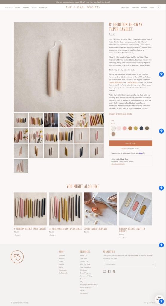
Product pages lead with dimensions. Copy is short and factual, giving materials, any certification and per-variant measurements in inches, followed by the price and a variant selector.
Two offers held above the fold. A rotating announcement bar carries fifteen per cent off a first purchase and free shipping over $150, with the contiguous US restriction in the same line.
The Beacon shop is a homepage block. The physical store gets its address, telephone number and Thursday to Sunday opening hours on the front page with a Visit Us link, rather than being buried in a contact page.
Collaborators get their own copy. Partner brands are introduced with a paragraph of their own story before their products appear, treating stocked lines as guests rather than filler.
Trade and corporate channels in the main navigation. A Wholesale Trade Program and Corporate Gifting sit under Explore and a Find A Stockist link runs in the footer, so wholesale and retail share one site.
A seasonal shop that comes and goes. A Holiday Shoppe collection sits in the Explore menu beside the permanent categories.
Currency switching without matching shipping. The footer offers a very long currency list while the shipping offer is limited to the contiguous US, so prices convert further than parcels travel.
Alberta Ferretti is style, femininity, elegance, sensuality and glamour. Her passion for fashion begins when she was very young and inaugurates a career full of personal achievements, style and business.
Christian Louboutin was created in 1992 when the designer opened his first boutique at 19 Jean-Jacques Rousseau in Paris. An artist and craftsman with a true passion for shoes, his designs are unique and instantly recognisable, thanks in part to their signature, trademarked red lacquered soles. Christian Louboutin’s collections for both women and men combine wit, glamour, elegance and technical proficiency like none other.
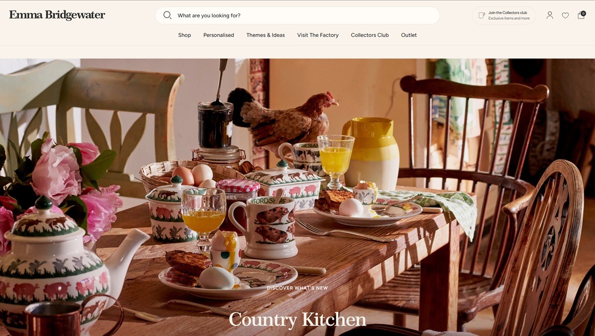
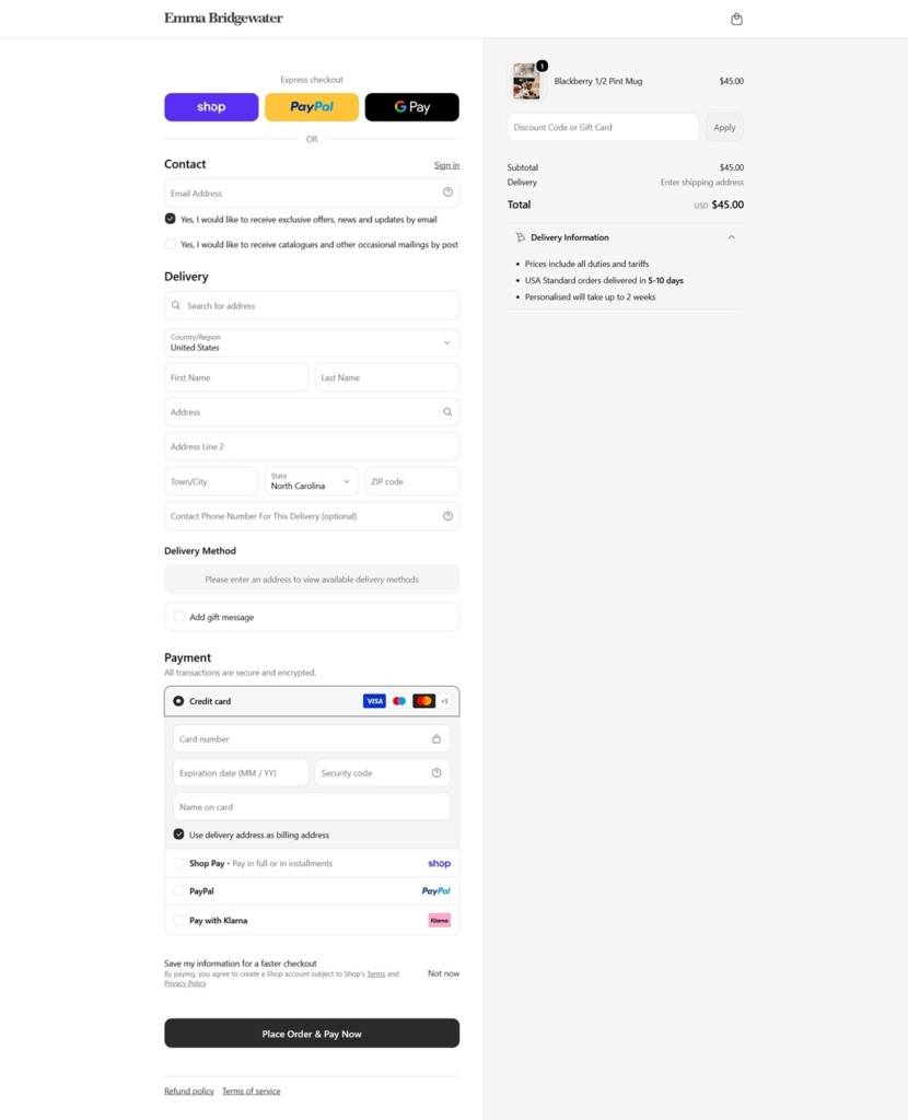
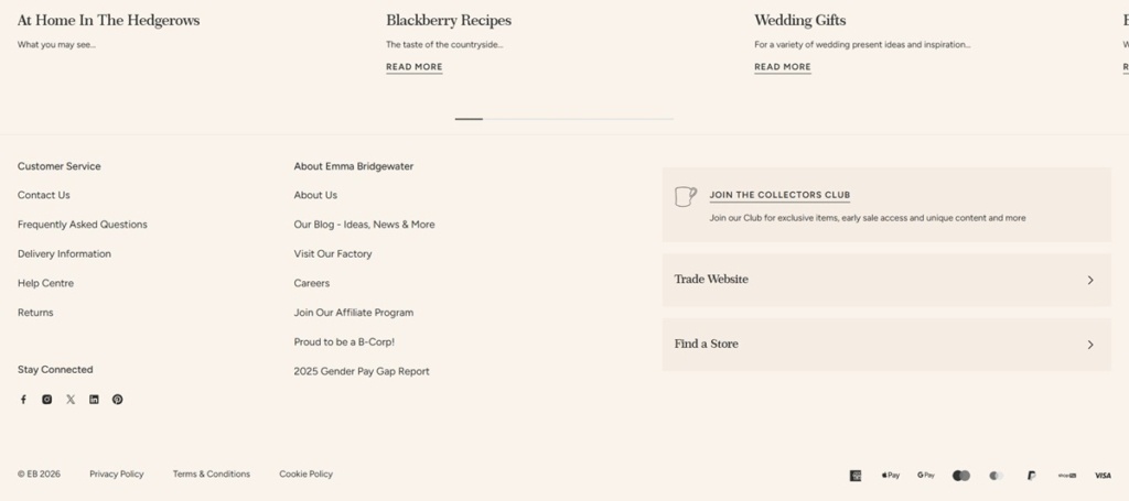
Emma Bridgewater is a British pottery and homeware brand selling handmade earthenware mugs, plates, bowls, teapots and enamelware alongside personalised gifts and seasonal decorations. All pieces are cast, sponged and hand-decorated at the company’s own factory in Stoke-on-Trent, and the range is sold to gift buyers and home-decor collectors through a Shopify storefront. The company states it is “Proud to be a B-Corp” and publishes gender pay gap reporting in the footer.
A warm cream and coral palette. The site runs a cream family from a near-white ground through darker cream accents, set against a single coral tone and a deeper sale red. Neutral text uses a near-black grey rather than pure black, which keeps the overall feel soft rather than stark.
Figtree for the interface, a display serif for headings. Body copy and navigation run on Figtree, a rounded sans-serif; a separate custom display face, Century 751 Semi, is loaded for larger headings, giving the page a handwritten-adjacent character in its titles against the plainer sans-serif elsewhere.
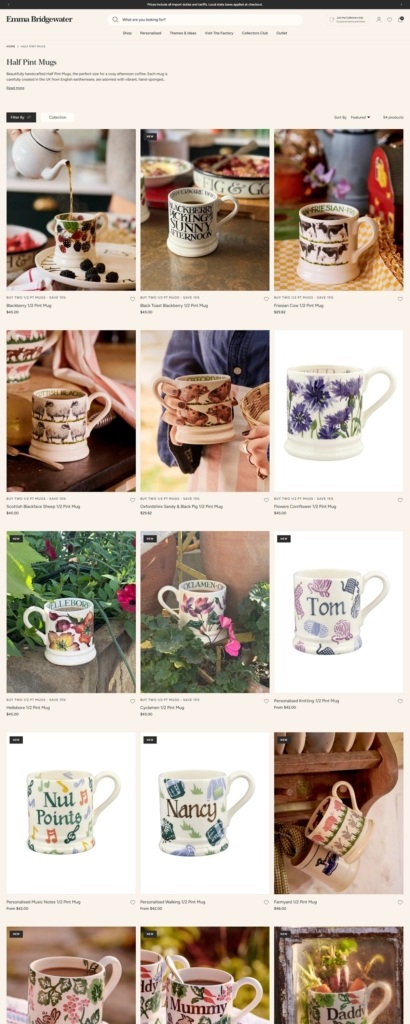
Pattern-led photography. Product shots are catalogue-style on white, but collection banners lean on the painted spongeware patterns themselves as the graphic device, so colour and print carry the page rather than lifestyle photography.
Category pages split by product type. The shop is organised into Mugs, Tableware, Kitchenware and Home & Living, plus a separate Personalised Gifts section and an Outlet for seconds and discontinued lines.
Multibuy pricing on the grid. Collection pages surface set pricing directly, for example “Save 20% on Sets of 4 Plates & Bowls with our Multibuys,” so bundling is visible before a shopper opens a product page.
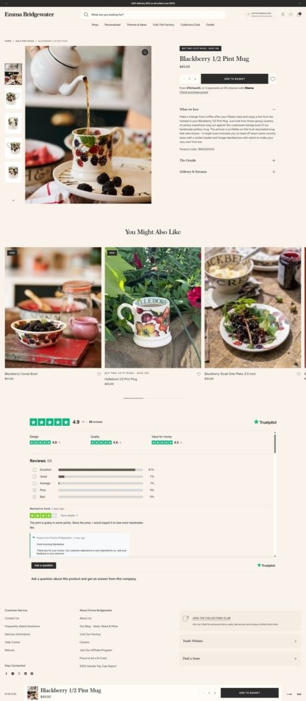
Personalisation built into product options. Many items carry customisation choices, from initials to short messages, selected on the product page itself before the item is added to the basket.
Free delivery threshold stated in the shop. A GBP 50 minimum for free UK delivery is shown in-page rather than buried in a policy document, alongside standard mug pricing in the mid-twenties to low-thirties in pounds.
The factory as the story. Rather than founder narrative, the site foregrounds the production process itself: “Discover the handmade craftmanship that goes into our products,” with pages describing casting, sponging, decorating, glazing and firing in sequence.
Visit the Factory as a standalone offer. Tours, a decorating studio and an afternoon tea experience are bookable directly from the main navigation, turning the factory into a destination rather than a background fact.
Collectors Club membership. A named loyalty tier offers early access to sales and dedicated news, positioned for repeat buyers rather than one-off gift shoppers.
Seasonal merchandising up front. At the time of research the homepage led with Halloween-themed ranges, alongside newer pattern launches such as Jenny Bloomfield, Autumn Splatter and Grapevine shown next to long-running classics like Polka Dot and Toast & Marmalade.
A dedicated Collectors Club journal. Blog-style content covering design stories and recipes sits alongside the shop, extending the site beyond a pure transactional catalogue.
We make unique gifts for men. All of our creative gifts for people who have everything are made by hand in England. They contain our luxurious handmade cosmetics, packed with natural ingredients and bursting with goodness.
Nicole Farhi has developed a reputation for producing some of the finest luxe, laid back designs. The use of innovative techniques and fabrics has established the house as the go-to for understated elegant knitwear, tailoring and separates.
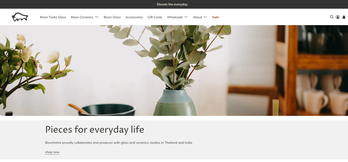
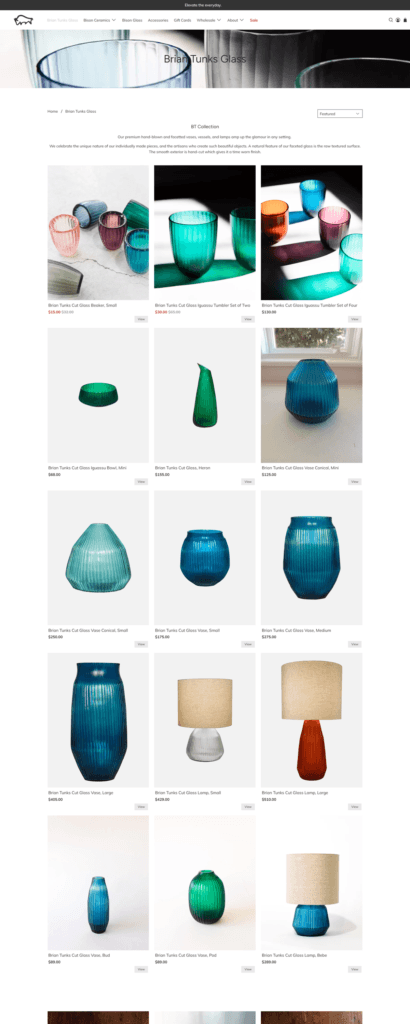
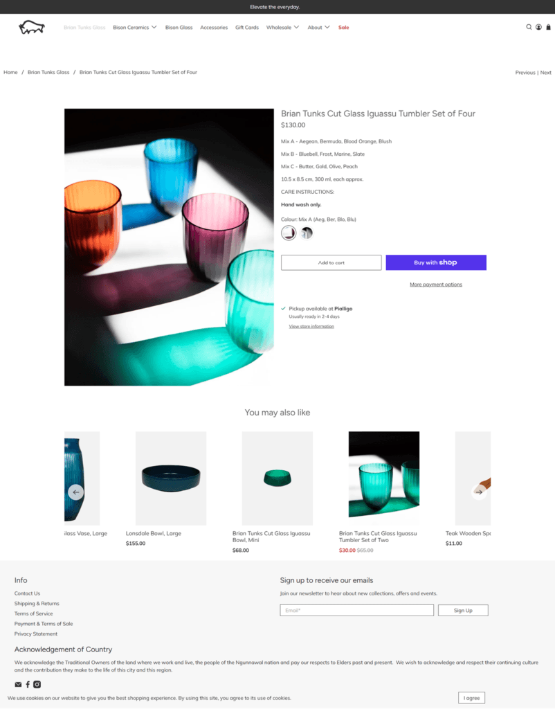
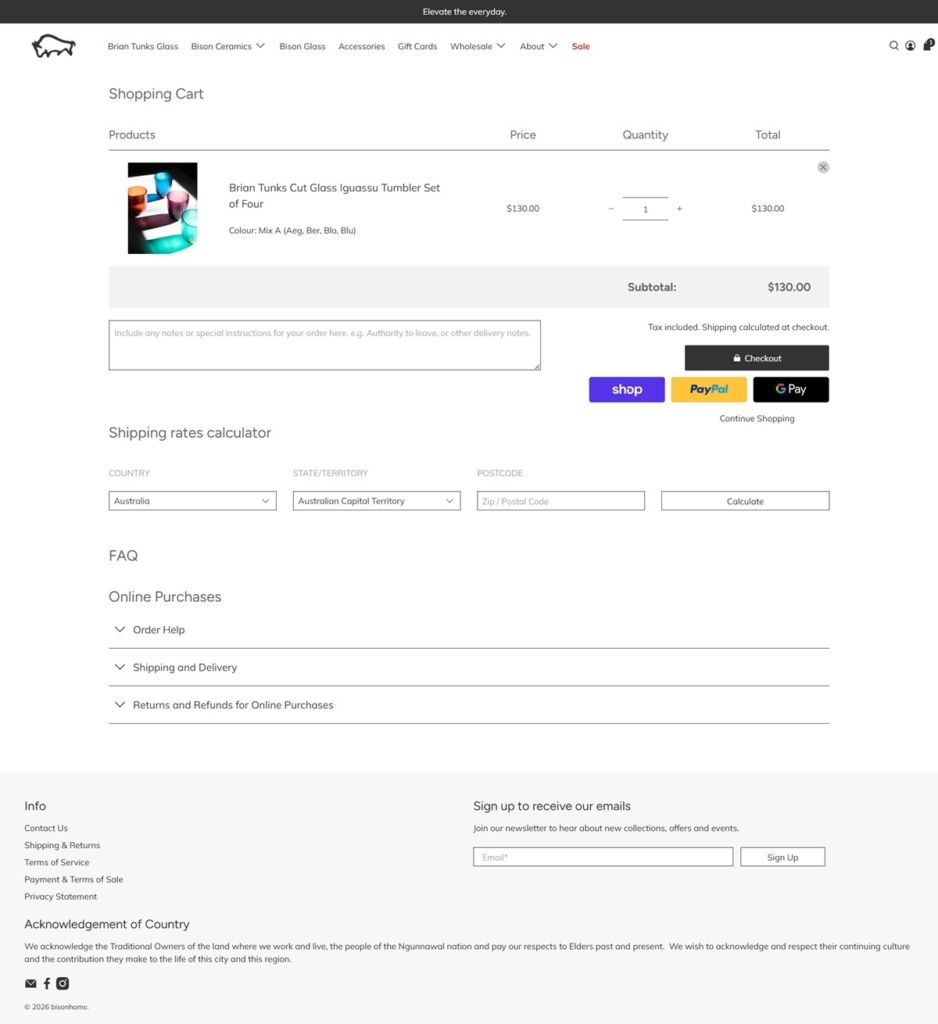
bisonhome is an Australian homewares brand selling ceramics, glassware and tableware, founded by Creative Director Brian Tunks. The site states the studio has been designing and producing “for over 26 years,” working with glass and ceramics studios in Thailand and India. The range spans platters, bowls, coffee and tea ware, vessels and vases, a pet bowl line called For Furry Friends, and glassware, with stoneware prices seen from about 10 to 155 dollars. The tagline reads “Elevate the everyday.” Built on Shopify.
Lato and Muli for type. Body and interface copy run in a pairing of Lato and Muli, two plain sans-serifs, keeping the type system neutral rather than decorative.
A grey and white base, color used once. The site otherwise runs on near-black text, white grounds and light grey borders, but the homepage’s “Colour Therapy” section heading is set in a single dusty mauve, the one deliberate departure from the greyscale system.
Editorial blocks on the homepage. Rather than opening straight into a product grid, the homepage runs two named sections, “Colour Therapy” and “The Art of Entertaining,” each pairing a photograph with a short piece of brand copy before linking through to the shop.
A collection structure split by material and use. Products are grouped under Brian Tunks Glass, Bison Stoneware, Bison Glass, Platters and Plates, Bowls, Coffee and Tea, Vessels and Vases, Accessories, and the separate For Furry Friends line, alongside Kitchen and Serving groupings.
Everyday pricing. Prices on the stoneware collection run from around 10 dollars for small pieces up to 155 dollars for larger items, consistent with a tableware and homewares range rather than one-off design pieces.
Standard stock and sale labeling. Product tiles carry Sale, Sold out and In stock states, with percentage-off badges reading “Save up to” a given amount on discounted lines.
Search, account and gift cards in the header. Alongside the cart, the header exposes a shop search tool, login and account access, and a Gift Cards link treated as its own product category.
Sharing framed as the founding idea. The Art of Entertaining section states plainly: “For over 26 years bison has designed and created objects known for their beauty and utility. Sharing is in our DNA.”
Color positioned as emotional, not decorative. The Colour Therapy section reads: “Colour is transformative. It can take you back to childhood, destinations near and far and give great comfort,” tying the brand’s design choices to memory rather than trend.
A named creative director. Attributing the founding to Brian Tunks by name and title gives the brand a single creative voice rather than an anonymous studio identity.
A pet-specific product line. For Furry Friends sits as its own navigation item alongside the tableware categories, extending the brand’s ceramics into pet bowls rather than treating pets as an afterthought.
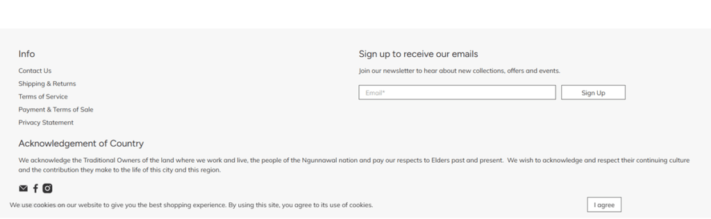
An Acknowledgement of Country in the footer. The site includes a formal acknowledgement of the Ngunnawal nation as Traditional Owners of the land where the business works, an addition not common on ecommerce footers.
Wholesale alongside retail. A dedicated Wholesale link sits in the main navigation next to consumer categories, serving trade buyers from the same site as individual shoppers.
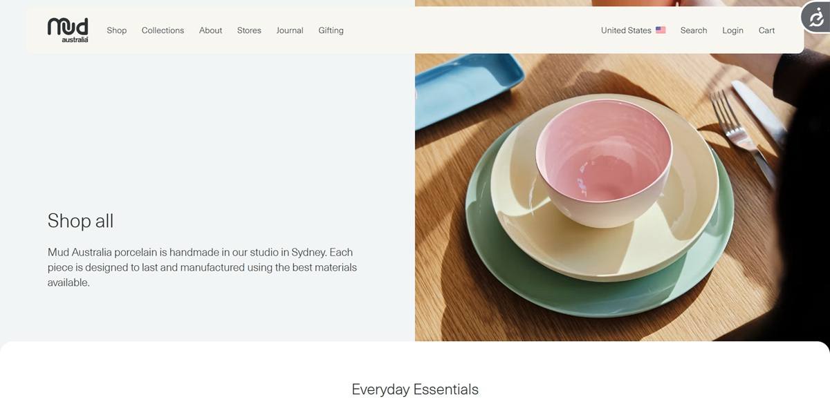
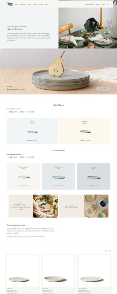
Mud Australia sells handmade porcelain homewares from its Sydney studio: dinnerware, servingware, drinkware, cookware, lighting and home decor alongside linen and cutlery. Founded in 1994 by Shelley Simpson, it serves households and trade buyers through this site and fourteen stores in Australia, the United States, the United Kingdom and Canada. Pieces are “designed to last” and made from porcelain clay sourced from Limoges in France. The front end is a custom Nuxt build, with Sanity behind the editorial pages and BigCommerce running the regional storefronts.
A near-black and warm stone palette. Text and buttons sit at #101820 against a warm off-white close to #f8f6f1, with sand at #e4e0d9 for panel grounds and mid grey at #63666a for labels. No interface colour competes with the glazed colour of the products.
One typeface, two weights. Neue Haas Unica Pro carries the whole site, Light for body copy, Medium for navigation, product names and buttons. Headings run large but at a low weight, so titles stay quiet next to the photography.
Full-bleed image, spaced text. Category tiles run edge to edge with a caption and one link, while text columns stay narrow. Photography alternates between objects on plain grounds and styled table settings.
Colour is the main filter. Shop All opens with a single control, “Filter available items by colour”, in place of a faceted sidebar. Cards state range depth in words, as in “Available in 19 colors”.
Price and range depth on the card. Cards carry name and price together, from USD 35.00 for the small Pebble Bowl to USD 195.00 for the Water Jug, with the colour count beneath.
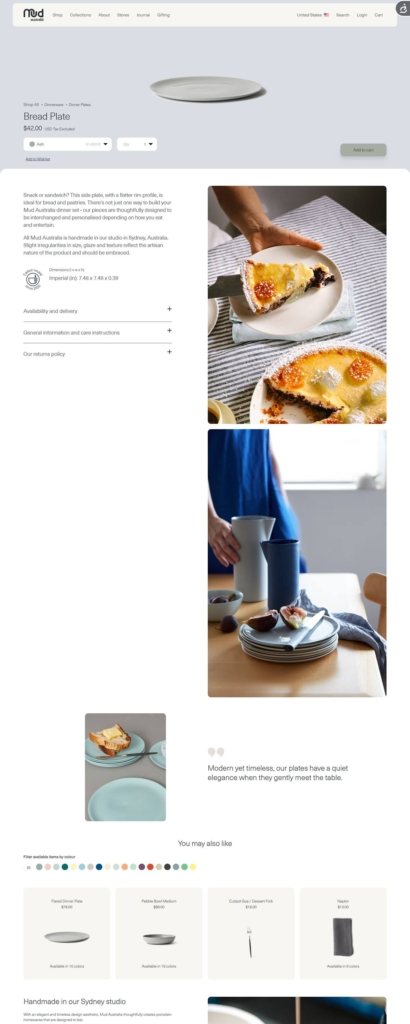
A short product page. The buy box gives a From price, a tax note reading “USD Tax Excluded”, a colour selector, a quantity field and Add to cart. Below sit dimensions and volume in imperial units, then accordions for delivery, care and returns.
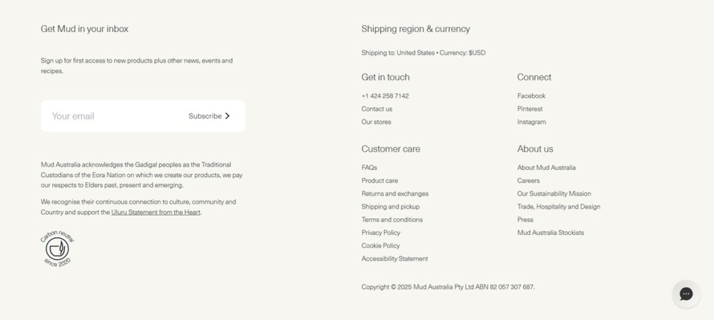
Region set before currency. A switcher pairs shipping destination with currency, and the US, Canadian and UK sites each run their own catalogue and pricing.
Process is the argument. A panel on every product page explains that pigment is tinted into the body at slip stage for colour depth, that clear glaze goes only on the interior, and that the exterior is left as a vitrified stone-like surface.
Objects get origin stories. The Pebble Bowl is credited to a lighting prototype that broke in two during firing. Irregularities in size, glaze and texture are presented as the artisan nature of the product, not as faults.
Gift registry as its own product. A registry runs on its own subdomain with Create and Find entry points, beside a corporate gifting guide and gift vouchers in the Gifting menu.
A journal in five formats. Recipes, News, People, Ideas and Visual Essays each have their own stream, and recipe posts surface in the product areas too.
Stores and commitments in the chrome. Fourteen locations are listed by suburb and city in the header menu, and the footer states carbon neutrality achieved by the end of 2020 beside an acknowledgement of the Gadigal peoples.