Archives: Websites

eCommerce Websites

YOUNG IN THE MOUNTAINS

Young in the Mountains sells fine jewelry built around Montana sapphires, recycled gold and American-mined inlay stones, covering engagement rings, wedding bands, necklaces, bracelets and earrings. The brand states it is “Conscious At Every Step Of The Supply Chain” and positions itself on sourcing transparency and handmade production, selling through a Shopify storefront aimed at commitment jewelry buyers as well as everyday-wear customers.

Website Design

A slate, peach and teal palette. The site’s colours pair a dark slate grey with a soft peach tone and a deep teal, alongside a coral accent and a muted sage green, a warmer and more varied palette than the black-and-white base many jewelry sites default to.

Nimbus Sans across the interface. Body copy and navigation run on nimbus_sans_ext, with a related dotted variant used in specific detail elements, keeping type consistent across the site rather than mixing a separate display face into headings.

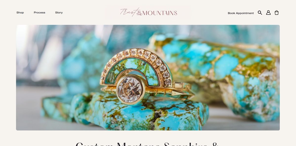
Stone and material detail in photography. Product imagery focuses on the inlay work and stone setting itself, close enough to show material texture, consistent with a brand whose positioning rests on sourcing and craftsmanship rather than lifestyle staging.

Shopping Experience

Shop organised by occasion and by material. The Shop section is subdivided into commitment jewelry, general jewelry styles, exclusive viewings, bestsellers and stone types, giving more than one entry point into the same catalogue.

Limited pricing visible outside collections. One clear price point seen on the pages reviewed is a moon phase pendant at $560.00; most items require opening a collection to see pricing rather than showing it on entry pages.

A try-at-home ring option. Engagement shoppers can request a ring crown to try sizing at home before committing to a purchase, reducing in-person or blind-fit risk for a commitment purchase.

Appointment booking for custom work. A booking system lets customers schedule consultations, paired with a “Let’s Dream Something up!” custom design prompt for bespoke pieces.

Brand Storytelling

Sourcing stated as the core claim. “Unmatched Creativity & Integrity In Sourcing” and “Handmade by Artists” anchor the brand’s positioning, tying the American-mined stones and recycled gold to an explicit ethics narrative rather than leaving it implied.

Customer stories invited at checkout. Buyers are encouraged to submit personal narratives connected to their purchase, folding customer sentiment directly into the brand’s storytelling material.

Notable Features

Detailed material-specific care guides. Jewelry care content is split by material type rather than offered as one generic guide, reflecting the mixed use of gold, gemstones and inlay materials across the range.

Heirloom renovation service. Beyond standard repair and resizing, the site offers to rework heirloom pieces, extending the relationship with a customer beyond the original sale.

Gift cards offered directly. A standard gift card option sits alongside the custom design and appointment services in the site’s commerce offering.

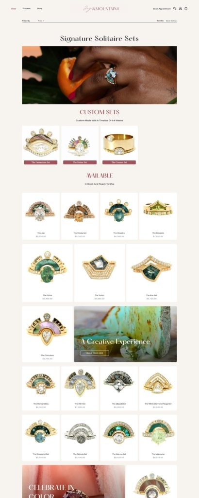
YOUNG IN THE MOUNTAINS Shop Category page example

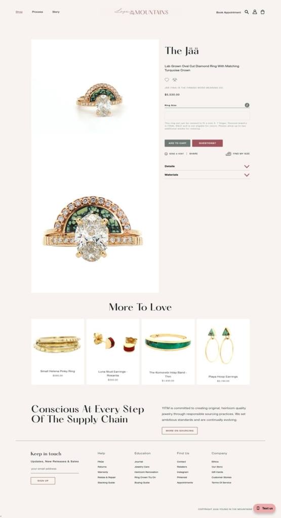
YOUNG IN THE MOUNTAINS Product page example

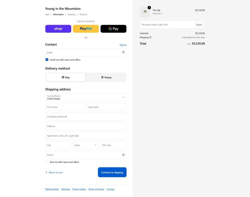
YOUNG IN THE MOUNTAINS Checkout page example

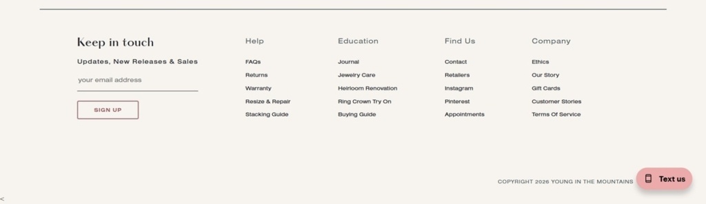
YOUNG IN THE MOUNTAINS footer example

Swiss Typefaces

We are a type design company known for our innovative views, creative approach and the high quality of our typefaces. We create and distribute typefaces, based in Vevey, Switzerland on the shores of the Swiss Riviera. We gained international success using our unique design skills and particular aesthetic.

Hawkins New York

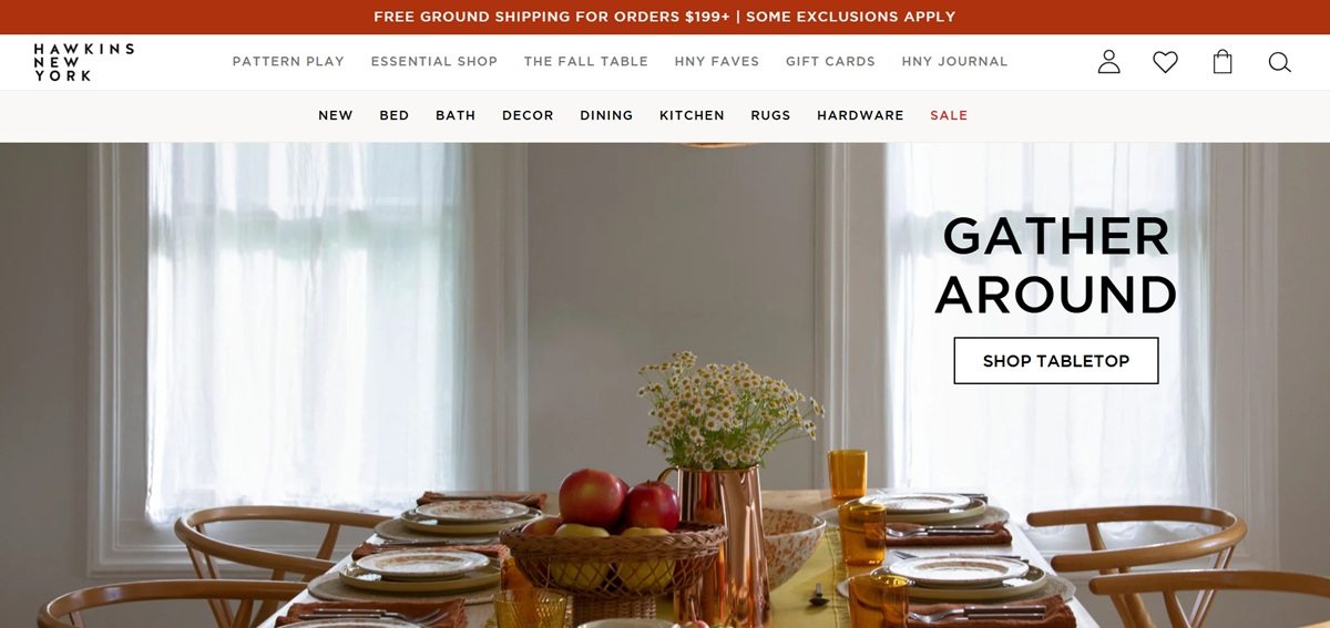
Hawkins New York sells home goods designed in Hudson, New York, spanning bedding, bath, tabletop, kitchen, decor, rugs and hardware. The site describes the range as “modern home decor, stonewashed linen bedding, and responsibly made home goods” made “for everyday use”, and mixes own-label pieces with stocked makers including Sabre, Jacobsen Salt, Bloomingville and Piecework. It runs on Shopify with a custom front end.

Website Design

Two weights of Gotham. The theme self-hosts only Gotham Light and Gotham Medium. One geometric sans in two weights carries headings, navigation, prices and body copy, so hierarchy comes from size and case rather than contrast between families.

Warm off-white grounds. Backgrounds sit at #f9f8f6 and #ecece2 rather than white, with text at #111111 and secondary copy in slate greys #3d4246 and #636363. Accents are sparing: a pale peach #f7e4d7 for panels, a deep red #a3110d for markdowns.

Product shots in two registers. Items are photographed flat against plain grounds for colourway comparison, then shown again styled in rooms. Alt text names both the object and its pairing, as in “Splatterware mugs set of 4 in blush and terracotta”.

Shopping Experience

Category drawers, not a flat menu. Bed, Bath, Decor, Dining and Kitchen each open a drawer split into a Shop All link, a column of subcategories and three promoted entries such as “BESTSELLER: GINGHAM” or “NEW IN: LIGHTING”. Rugs, Hardware and Sale sit outside that as direct links.

Colourways sold as variants. The Splatter tabletop range appears once per pairing across six options, so every card carries a swatch row and sets are priced by the four.

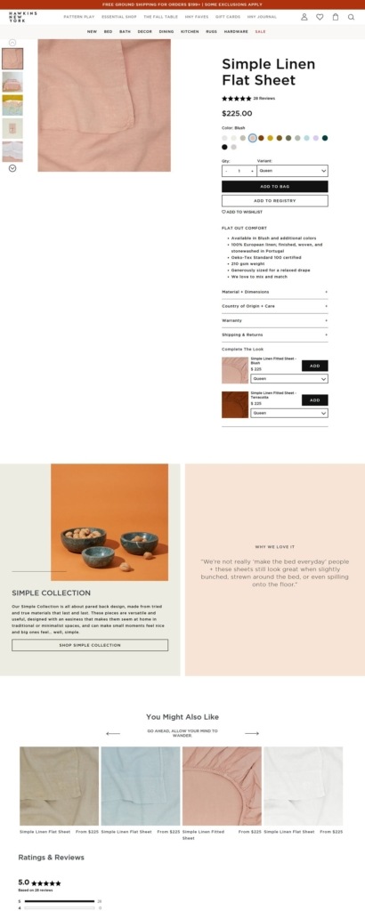
Product pages lead with a joke, then the specification. A short headline like “BERRY GOOD” sits above bulleted use cases, then accordions cover Material and Dimensions, Care, Country of Origin, and Shipping and Returns. The buy box holds a quantity field, Add to Bag, Send as a Gift and Add to Wishlist, with a back-in-stock email capture for sold-out variants.

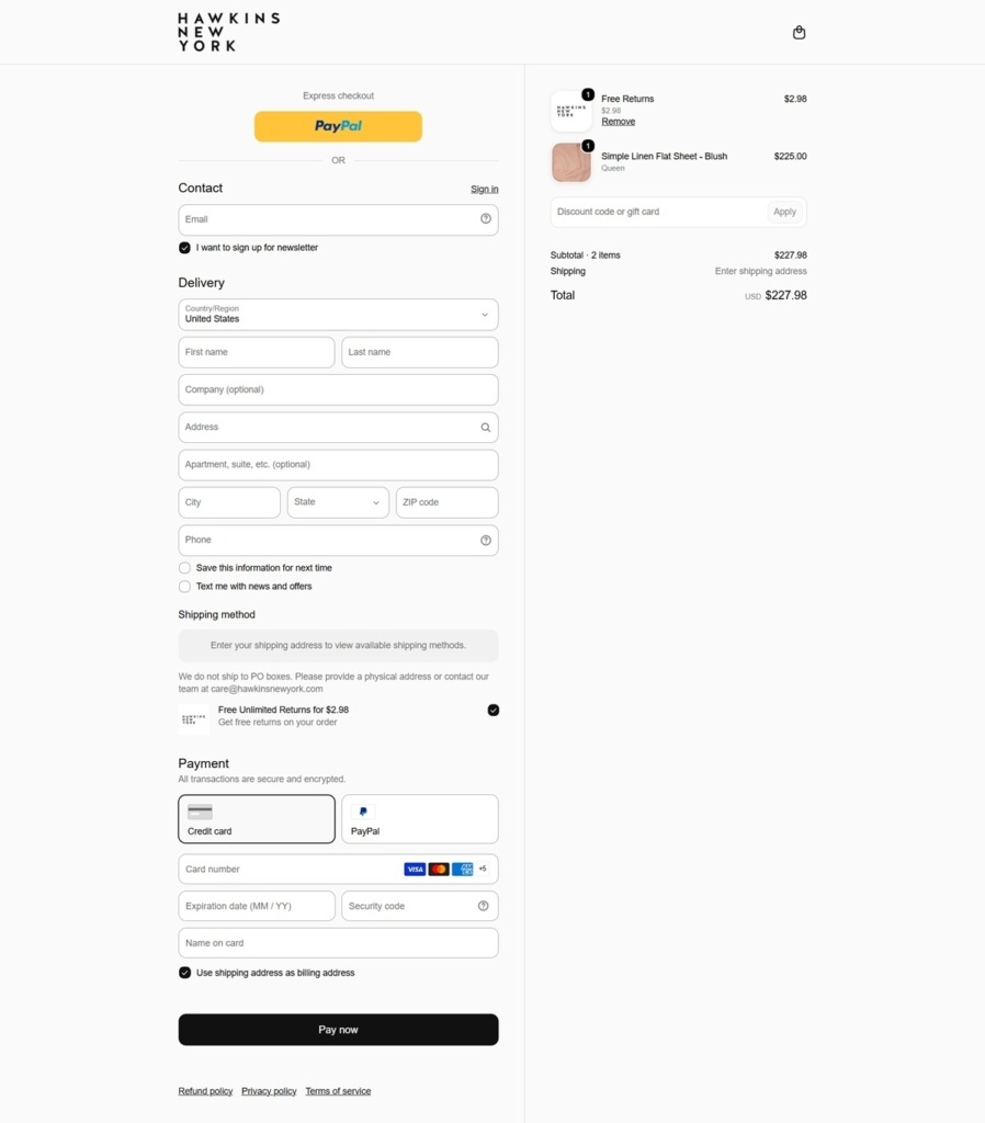
Delivery terms stated on the page. Standard shipping is quoted at $8.00 to $18.99 and is free over $199, with expedited options priced at checkout. A Checkout+ option charges a one-time $2.98 fee for unlimited 30-day returns, against standard returns where the label cost comes off the refund.

Brand Storytelling

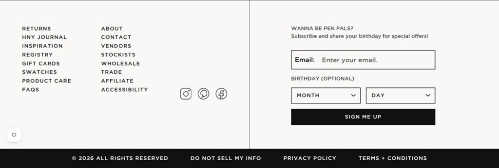
A chatty register throughout the interface. The empty cart reads “Aw, your cart looks so sad. Why not fill it with something?”, the newsletter block asks “WANNA BE PEN PALS?” and collects a birthday, and the 404 page opens “Oh nooooooo.”

Rooms rather than a catalogue. Homepage sections run under “GATHER AROUND”, “New For Now” and “Freshly Picked”, and a customer photography strip is credited handle by handle under “Hawkins, in context.”

Notable Features

Registry built into the shop. A gift registry runs alongside the wishlist, with its own management page and a cart-level prompt to add a gift note.

Swatches before purchase. Footer utilities put Swatches and Product Care next to FAQs, so material decisions get their own route.

Trade kept separate. Vendors, Stockists, Wholesale, Trade and Affiliate each get a footer entry of their own, outside the consumer path.

Wms & Co.

Wms and Co. sells Japanese and European homewares, stationery and desk accessories, including custom rubber stamps in traditional wooden, self-inking and cast bronze formats, minimalist planners and paper goods, ceramics, woven baskets, home scents and portable solar lanterns. The brand describes its products as everyday objects elevated by design under the line Exquisitely Practical Tools for your Desk and your Life, and offers free US standard shipping over 150 dollars. Built on Shopify.

Website Design

A near-black and white system. The palette runs a near-black text and UI color, #000000 to #1c1b1b, against a white ground, with a mid gray #7B7B7B and a pale gray #d4d2d1 for secondary text and dividers, and a single red #e22120 reserved for sale callouts.

One typeface, two jobs. Both headings and body copy run in Certeau, a single sans-serif family, so the site reads as one continuous typographic voice rather than a display and body pairing.

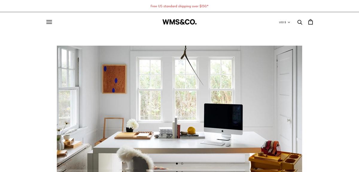
Two hero banners. The homepage opens with paired image banners of styled desk setups linking into the Desktop and Workspace collections, followed by an Our Latest Additions grid of eight new items and thematic blocks such as Back to Work Sale, Danish Design, Japanese Minimalism, Ceramics and Forest Bathing.

Shopping Experience

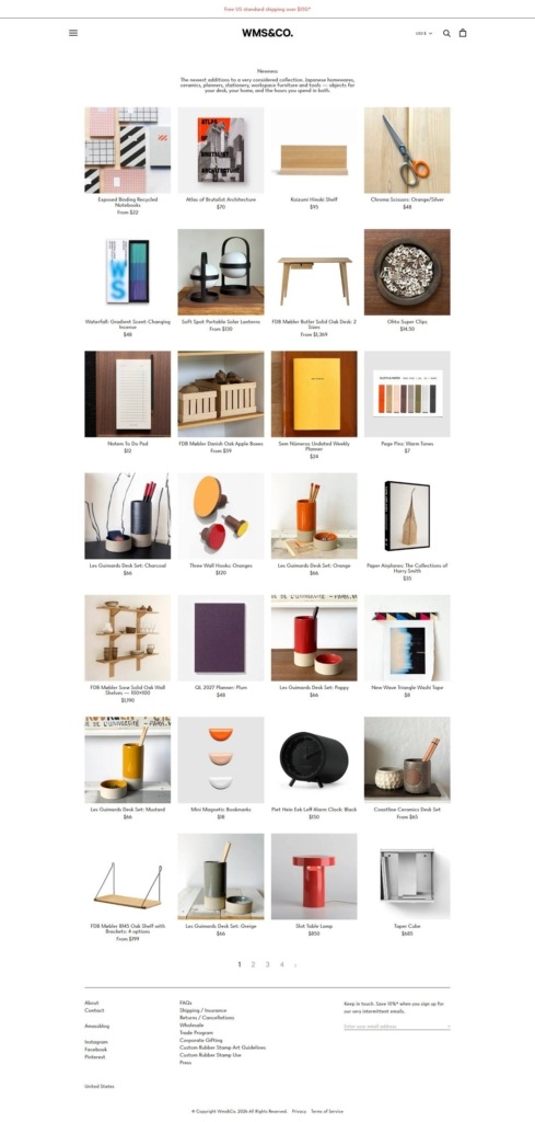
Eleven-way navigation. The menu splits the catalogue into The Full Collection, Newness, Favorites, Desktop, Workspace, Making Tools, Planners and Paper, Books and Objects, Home Scents, Custom Stamps and Sales, with curated edits like The Bibliophile and The Naturalist layered on top.

Custom stamps as a standalone service. The Custom Stamps collection is presented as a dedicated design and personalization line, separate from the ready-made catalogue, spanning traditional wooden, self-inking and cast bronze bodies.

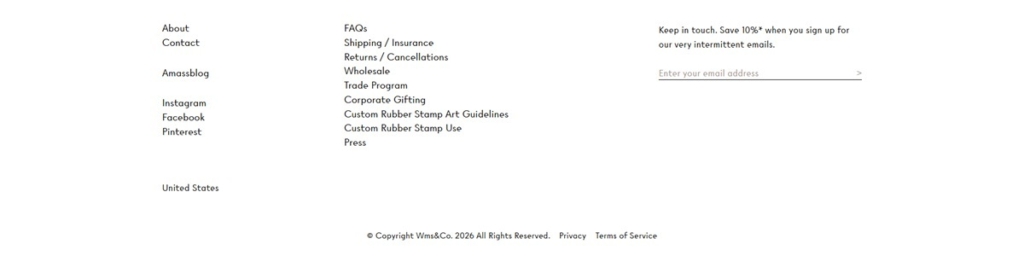
Trade and gifting channels. Alongside retail, the footer lists Wholesale and Corporate Gifting as separate programs, positioning the store for business buyers as well as individual shoppers.

Newsletter incentive. Email signup offers 10 percent off in exchange for what the copy calls very intermittent emails, a lower-pressure framing than a standard subscribe prompt.

Brand Storytelling

Offline as a selling point. The brand positions its paper goods and desk objects as providing a deliciously offline experience, framing physical stationery as a deliberate break from screens rather than a neutral product category.

Press and name endorsements. A testimonial section quotes Martha Stewart and Jenna Lyons alongside mentions in Vogue, T Magazine, Monocle, The New York Times and Wallpaper, used as the primary credibility signal on the homepage.

Notable Features

Amassblog as editorial content. A named in-house blog, Amassblog, extends the site beyond product pages into design and lifestyle writing.

Curated thematic edits. Beyond category and brand browsing, the store groups products by aesthetic idea, Danish Design, Japanese Minimalism, Forest Bathing, functioning as an editorial layer over the catalogue.

Corporate and wholesale channels. Separate wholesale and corporate gifting programs sit alongside the consumer storefront, extending the business beyond single-item retail.

Wms & Co. Shop Category page example

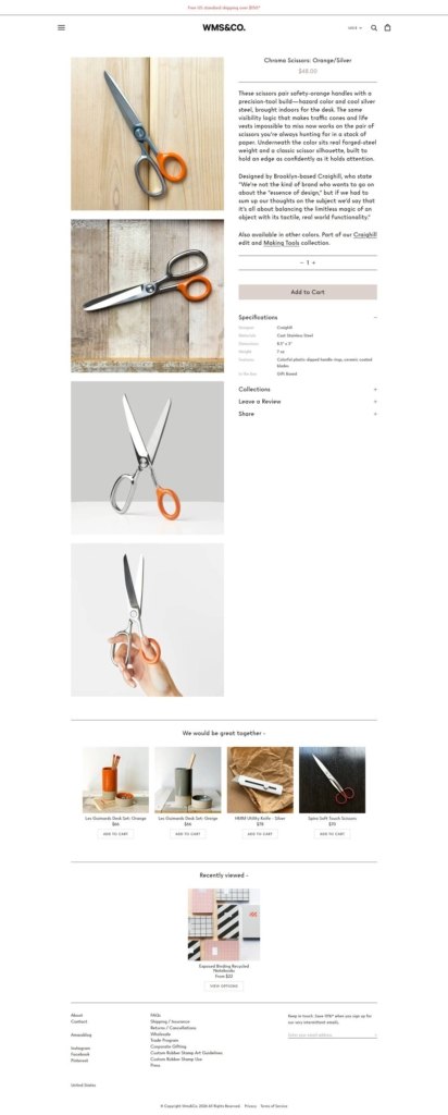
Wms & Co. Product page example

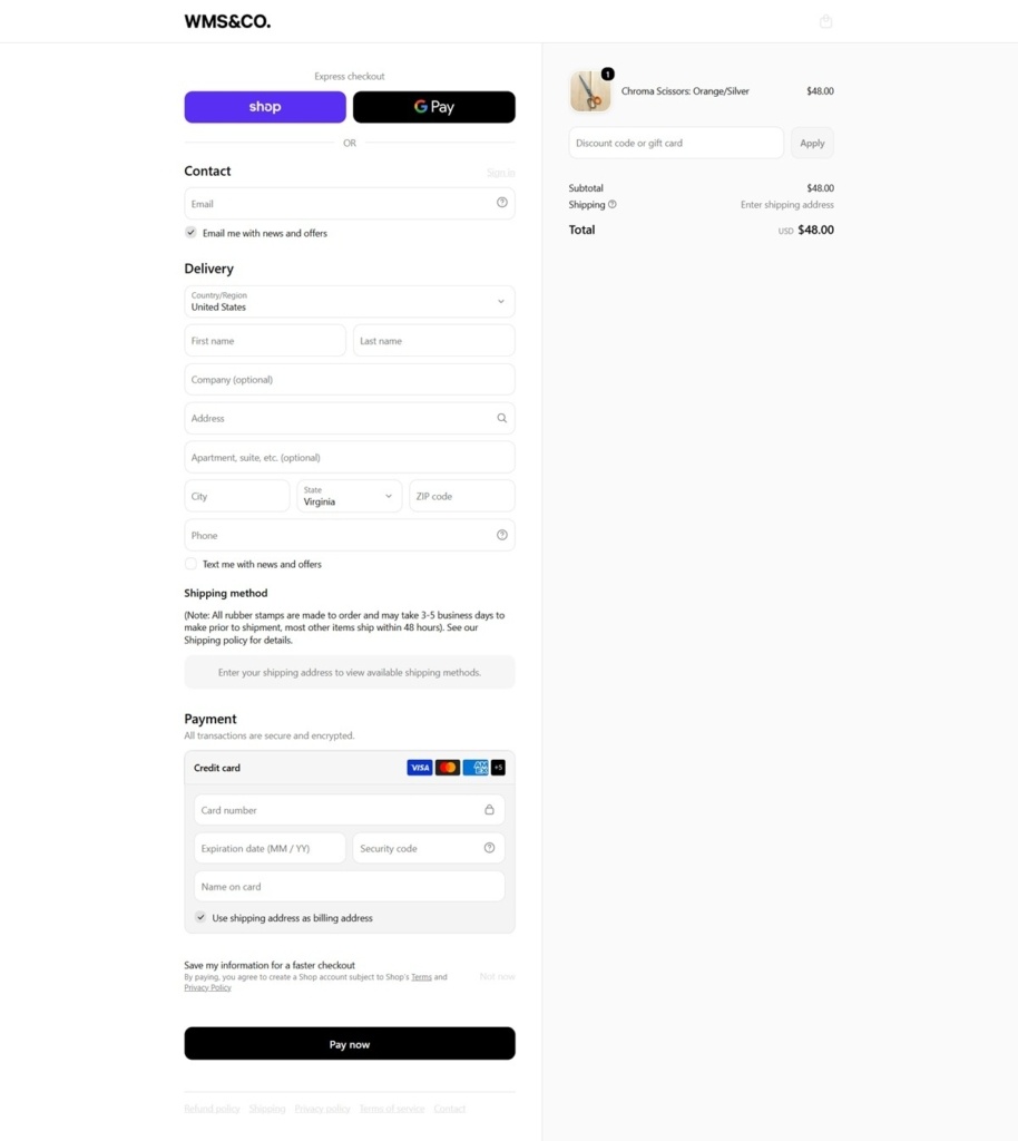
Wms & Co. Checkout page example

Wms & Co. footer example

Farmhouse Pottery

At Farmhouse Pottery, we are old-world potters with simple tools and strong beliefs in process and authenticity. We believe the farmers, craftsmen, and makers are the core of our communities, and that farm-to-table isn’t a foodie trend, but rather the rediscovery of a more sustainable lifestyle and value system. Through our craft and in our daily lives, we’re reconnecting others to this lifestyle and defining its place in the modern day.

Light In The Attic

Light In The Attic first became a player in the Seattle music scene by producing live concerts by rising artists like Saul Williams, Interpol, Peanut Butter Wolf, and The Walkmen. Many of LITA’s shows were sold-out affairs, and the production side of the label’s business quickly gained a reputation in the Emerald City.