TRIGEMA Inh. W. Grupp e.K. with its headquarters in Burladingen, was established in 1919 and is Germany’s largest manufacturer of sportswear and casual fashion.
TRIGEMA


eCommerce Websites
TRIGEMA Inh. W. Grupp e.K. with its headquarters in Burladingen, was established in 1919 and is Germany’s largest manufacturer of sportswear and casual fashion.
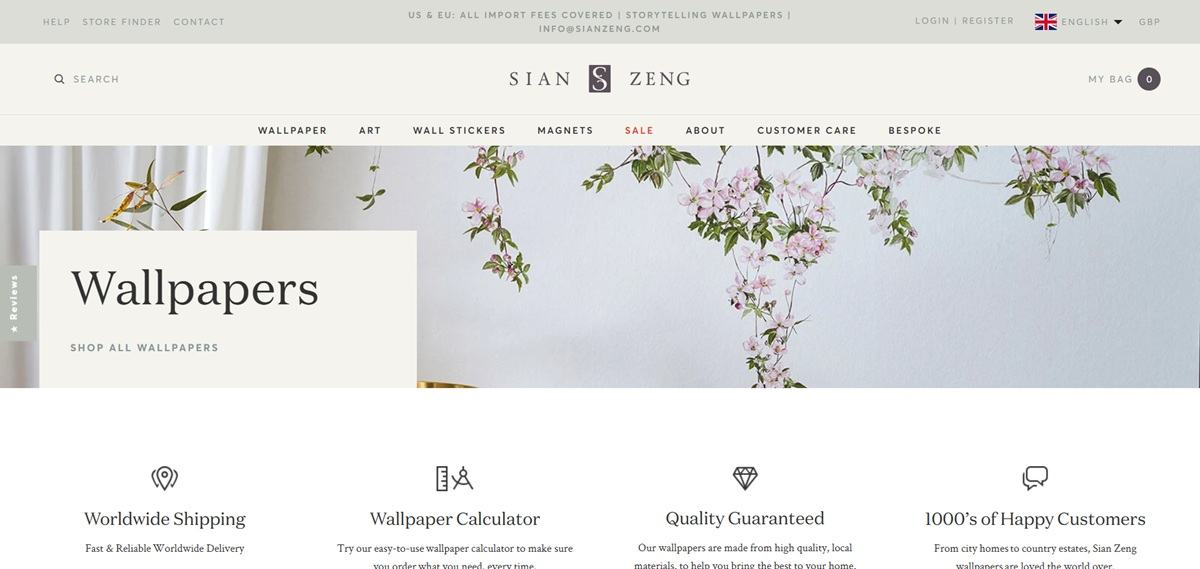
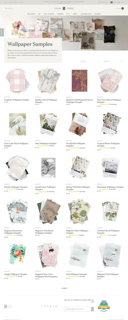
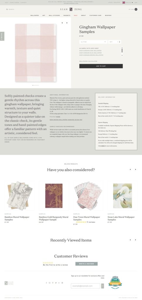
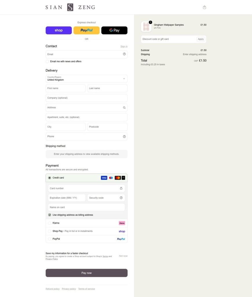
Sian Zeng sells artisan wallpaper, including classic, mural, peel-and-stick and magnetic formats, alongside original paintings, art prints, wall stickers and magnets, organized into more than twenty themed collections such as Bamboo, Clouds, Dinosaur and Jungle. The London studio positions its work as "storytelling wallpapers," and it runs on Shopify with GBP, USD and EUR currency options and import fees covered for US and EU customers. A trade account application sits alongside the consumer shop.
Averta for structure, DomaineText for statement. Body copy and interface text run in Averta, a rounded sans-serif, while larger headings switch to DomaineText, a serif, with Crimson Text appearing as a second serif elsewhere on the page. No brand color palette could be confirmed from the site's CSS; the visible tones lean toward soft, muted greens and creams drawn from the wallpaper photography itself rather than fixed interface colors.
Product imagery as the color source. Because the palette is not fixed in the interface, color arrives almost entirely through the wallpaper designs themselves, letting collections like Bamboo Mural or Clematis set the tone of each page they appear on.
Media logos as a credibility strip. Elle, the Guardian and the Sunday Times appear as a row of press logos on the homepage, a common device for establishing outside validation above the fold.
A calculator built into the shop. A wallpaper calculator tool helps shoppers work out how much they need for a room, addressing a practical sizing problem specific to wallpaper rather than leaving it to guesswork.
Format as a first filter. Classic, mural, peel-and-stick and magnetic are treated as distinct product formats within the Wallpaper section, so the shopper chooses installation type before browsing by design.
Trade sits apart from retail. A separate trade account application and dedicated trade contact channel exist alongside the consumer shop, indicating a business-to-business sales path distinct from direct purchase.
"Storytelling wallpapers" as the stated identity. The brand describes its own designs with that specific phrase rather than a generic design-quality claim, tying the product directly to narrative themes like Woodlands or Mountains.
A customer gallery and inspiration room. Real installations are shown through a dedicated gallery section, letting the wallpaper be seen in finished rooms rather than only as flat swatches.
Review volume stated as a number. The site cites 109 verified reviews at a 96 percent five-star rating, giving the trust signal a specific figure rather than a general "loved by customers" line.
Free magnets tied to a specific product. A promotion ties free magnets to magnetic wallpaper purchases, a cross-sell specific to that one format rather than a sitewide discount.
Blog content in the main navigation. A blog section with recent posts sits inside the About area, connecting editorial content to company information rather than running it as a separate section.
Worldwide shipping stated as a benefit tile. Among four homepage benefit tiles, worldwide shipping, the calculator, a quality guarantee and customer testimonials are called out as the site's core practical selling points.

A fabric nothing short of revolutionary. A fiber more absorbent than cotton… with a touch softer than silk… and a unique fibril structure that’s cooler than linen. The Bensly Menswear collection is coming soon…
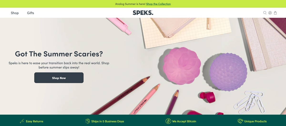
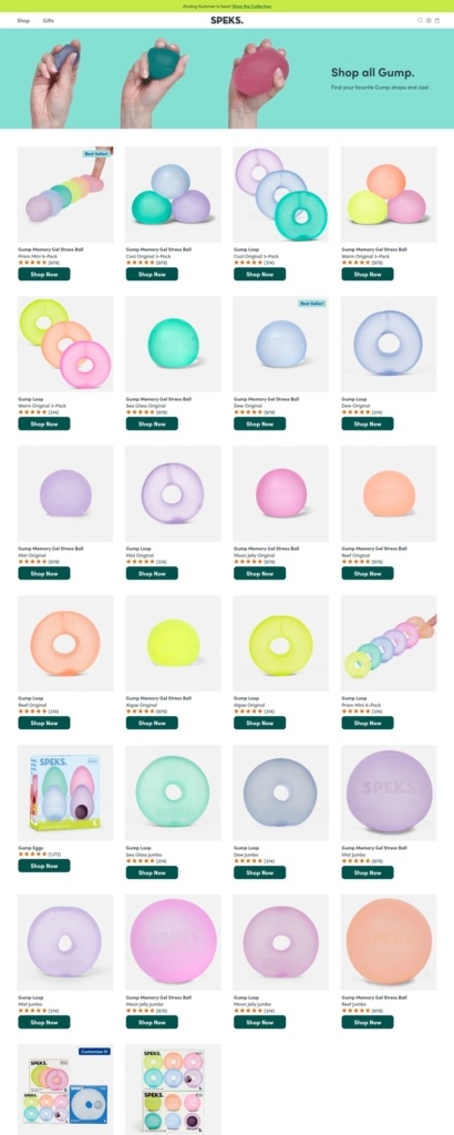
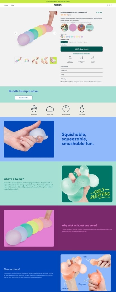
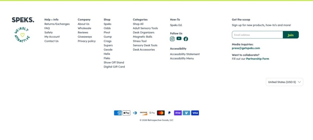
Speks sells sensory and fidget products built around rare-earth magnetic balls, alongside putty, squish toys and quiet-click items, sold under sub-brands including Supers, Crags, Odds, Gump and Blur. The site positions itself for neurodivergent shoppers in particular, describing the range as “sensory tools, not toys” aimed at ADHD, anxiety and overstimulation rather than as novelty desk toys. It runs on Shopify with region and currency selection for international buyers.
A deep green and burnt orange palette. Core backgrounds run a dark forest green alongside a bright orange used for calls to action, set against pale sage and off white grounds. Black and white handle text and borders, keeping the two brand colors doing the work of accent and contrast.
Inter across the interface. Body and interface text is set in Inter, a neutral grotesque, with heading, subheading and secondary type styles layered through CSS variables rather than a separate display face, giving the site a consistent, system-like typographic voice.
Color-led product presentation. The homepage runs a dedicated “shop by color” section alongside standard featured-product and best-seller blocks, treating the magnetic balls’ color range as a browsing axis in its own right.
A line-based navigation. Top navigation splits by product line, Magnetic, Squish, Putty and Quiet, plus dedicated Gifts and Best Sellers entries, so a shopper can browse by material and function rather than by a single flat catalog.
Visible pricing throughout. Featured items show both regular and sale prices on the grid, spanning roughly $8 to $35 and up, with stock-status indicators built into the theme.
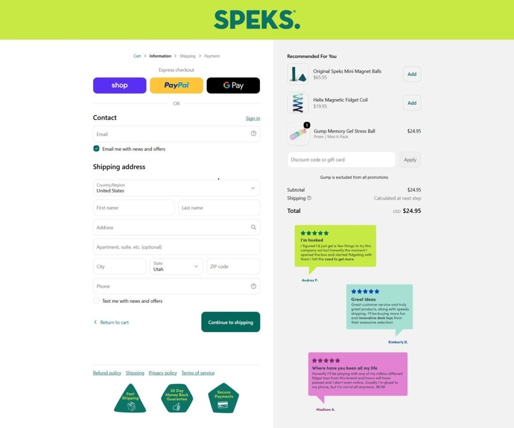
Bundle options on product pages. Several items are offered as bundles rather than single units only, and a Shop Pay and PayPal express checkout sit ahead of standard payment fields.
Gift-specific browsing paths. A dedicated gift guide breaks the catalog down further, including birthday gifts, gifts for him or her, and a sub-$30 price band, aimed at shoppers buying for someone else rather than for themselves.
Therapeutic framing over play framing. Homepage copy leans on the line “small resets for an overstimulated world,” and customer testimonials reference use in therapy, academic and high-stress work settings rather than casual fidgeting.
New-product drops kept visible. Recent releases, such as a new Gump item, are called out directly on the homepage rather than folded quietly into the catalog, giving the brand a running sense of a product line still being built out.
A Stamped reviews layer. Verified buyer reviews appear on product pages through a Stamped widget, reinforcing the therapeutic claims with first-person accounts rather than brand copy alone.
International currency switching. A region and currency selector is built into the header, serving the brand’s international customer base without forcing a separate country-specific site.
Safety and support information kept separate from marketing. Order and shipping policy, safety information and a returns portal are each given their own linked page rather than being folded into general FAQ copy, treating them as reference material for an already-informed buyer.
We are Printing New York, your expert printing store for everything from large format printing to business cards and banners; we have you covered.
fi’zi:k is a racing brand. It represents beauty, speed, passion, freedom for enthusiast cyclists who identify with the feeling of the fire of competition.
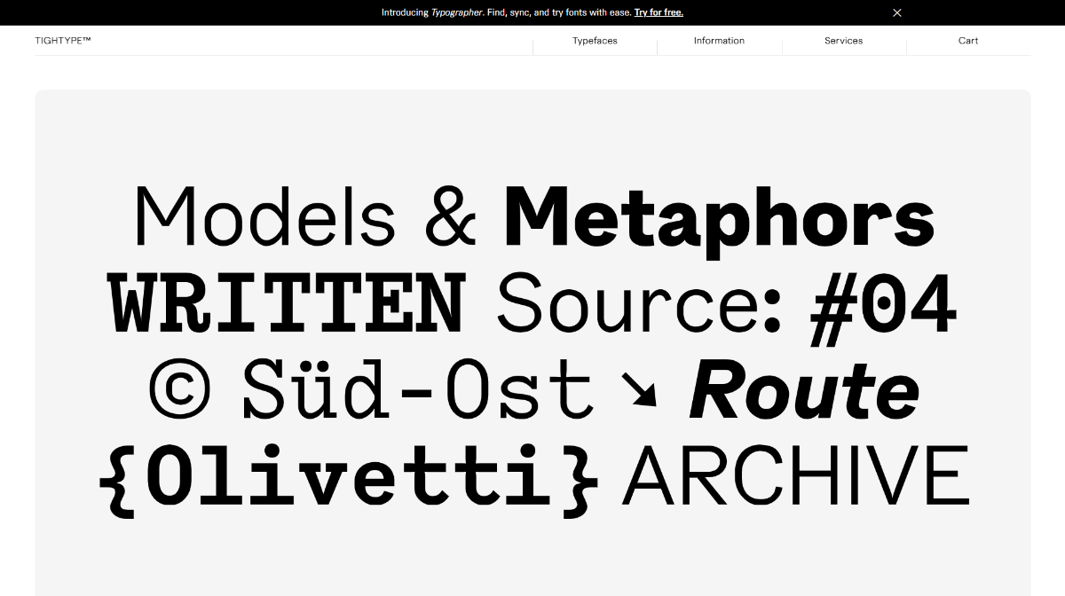
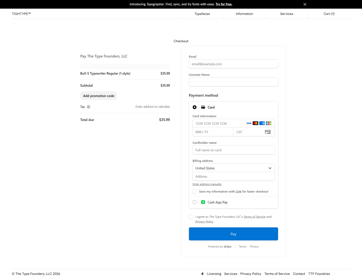
TIGHTYPE, billing legally as The Type Founders, LLC, is an independent type foundry established in 2015 that sells its own digital typefaces, among them Bull-5, Habitas, Macan, Moderat and their Mono, Rounded and Serif variants, directly to designers and studios. Fonts are licensed per style for web, app or desktop use rather than sold as flat files. Checkout runs on Stripe, with card payment and Cash App Pay.
A grid that is the type specimen. The Typefaces page sets each family name in its own typeface inside a light grey rounded card, so Bull-5 renders as a slab-serif block, Exposit as stenciled caps, and Fleya as a display serif, with no separate photography needed to sell the product.
Macan as the house voice. The interface itself, navigation, labels, buttons, runs in Macan, one of the foundry’s own grotesk families, so the site is a working demo of its own catalogue rather than a neutral system font wrapped around the products.
Small, dense, monochrome. Body text sits around 10 to 13 point with thin hairline borders and 12 pixel card corners, and the palette stays black, white and light grey throughout, a restrained system built to keep attention on the letterforms.
Specimens instead of lorem ipsum. A typeface page such as Bull-5 Typewriter shows the face set in real phrases, Gae Aulenti, Le Corbusier, Museum of Modern Art, Standard A4, rather than filler text, letting a buyer judge the font in an editorial context.
Three license types, three pricing bases. Web licenses are priced by monthly pageviews and delivered as WOFF or WOFF2, app licenses by number of app titles as OTF or TTF, and desktop licenses by number of users, each restricted against embedding, modifying or sublicensing.
A licensee name field at checkout. Alongside the standard Stripe card fields, checkout asks for a Licensee Name separate from the cardholder name, reflecting that the purchase is a software license rather than a physical or purely personal-use good.
A stated design philosophy. The Information page describes the foundry’s approach directly: to provide “visually strong typefaces for people who value contemporary type design.”
An open door to collaborators. The same page invites designers, magazines and publishers to get in touch for project inquiries, positioning the foundry as available for commissioned or collaborative work beyond retail licensing.
A legal identity kept separate from the shop name. Checkout and the licensing FAQ both bill under The Type Founders, LLC, and a dedicated FAQ entry addresses buyers who bought through MyFonts, Creative Market or Fontspring, showing the foundry sells through its own site and third-party distributors at once.
An extensive self-serve licensing FAQ. Questions cover using fonts in Canva or Figma, adding a Tax ID at checkout, requesting refunds and invoices, and updating a licensee name after purchase, reducing the need for direct support contact.
Automatic renewal on ongoing licenses. Web and app licenses renew automatically unless canceled, with reminder emails sent before the renewal date, while desktop licenses are a one-time purchase.
A cross-sell for a companion tool. A site-wide banner promotes Typographer, a separate font management and sync tool from the same team, ahead of any product content on the page.


Style, beauty, and inspiration for a creative life. Founded by Garance Doré.
Met Helmets, specialist in bike helmets for road, mountain bike, recreational and sports cycling, skating, skateboarding and BMX.
At menfashion .com we give fashion forward men quick access to the finest, premium-quality, designer clothes for men.
KALK is a lifestyle brand of jewelry accessories for a different woman, spontaneous and feminine.
An online destination forcontemporary accessories.


