MyBag is an online handbag and accessories boutique dedicated to offering luxury designer handbags and bags for all occasions. Alongside the hand selected range of handbags, MyBag also stocks complimentary accessories including sunglasses, purses and jewellery.
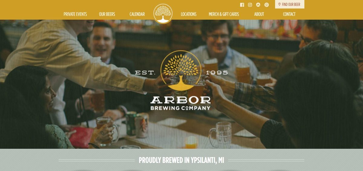
Arbor Brewing Co. is Ypsilanti, Michigan’s hometown craft brewery, operating since 1995 across three locations, the Session Room, Corner Brewery and Plymouth Taproom, with a BentoBox-built site covering beer menus, food menus, online ordering and a separate merchandise shop. Alongside year-round, rotating IPA and seasonal beers, cider and wine, the merch shop sells apparel, drinkware, outdoor gear and gift cards, aimed at both regular taproom visitors and out-of-state fans buying online.
Website Design
A tap-room palette. Pages use a cream ground (#ffefc7) with a dark forest green (#154b22) and a warm orange (#ffb548), plus a lighter green accent, closer to a beer label than a typical ecommerce white.
Montserrat paired with Spartan. Both typefaces are geometric sans-serifs pulled from Google Fonts, used together for headings and body text rather than a serif or script, keeping the interface plain and legible across menu-heavy pages.
Location-first layout. The homepage leads with location cards for each of the three sites before any beer or merchandise content, reflecting the brewery’s identity as physical taprooms first and an online shop second.
Shopping Experience
Ten merch categories. The store organizes products into apparel, headwear and cold-weather accessories, personal gear, baby and kids items, pet gear, drinkware and beer accessories, outdoor lifestyle gear, games, a pride collection and collectibles, a wider split than most single-brand merch shops.
Everyday goods pricing. Items run from socks at $13 and a water bottle at $18 to t-shirts around $30 to $34 and a coach jacket at $65, with a cooler at $35, keeping the range closer to taproom souvenirs than apparel-brand pricing.
Food and drink menus run separately from the shop. Beer, cider and wine appear on dedicated menu pages by location, distinct from the merchandise cart, and food items, starters through desserts, priced $3 to $24, carry dietary tags for vegan and gluten-free options.
Brand Storytelling
Founding year used as a credibility marker. The site states plainly that Arbor Brewing has “been a pioneer in the craft beer industry since opening our first location in 1995,” anchoring the brand in its Ypsilanti origin.
Three locations treated as distinct identities. Rather than a single generic menu, the Session Room, Corner Brewery and Plymouth Taproom each get separate location pages and menus, acknowledging that offerings differ by site.
Notable Features
Online ordering alongside ecommerce. “Order Online” sits in both the header navigation and footer, separate from the merchandise cart, covering food and drink pickup or delivery rather than shippable goods.
Private event booking as a primary nav item. Private Events has its own top-level link, positioning the brewery as a venue-for-hire alongside its retail functions.
Load-more pagination on the merch grid. Rather than numbered pages, the shop uses a “Load More Products” button to reveal additional merchandise within each category.
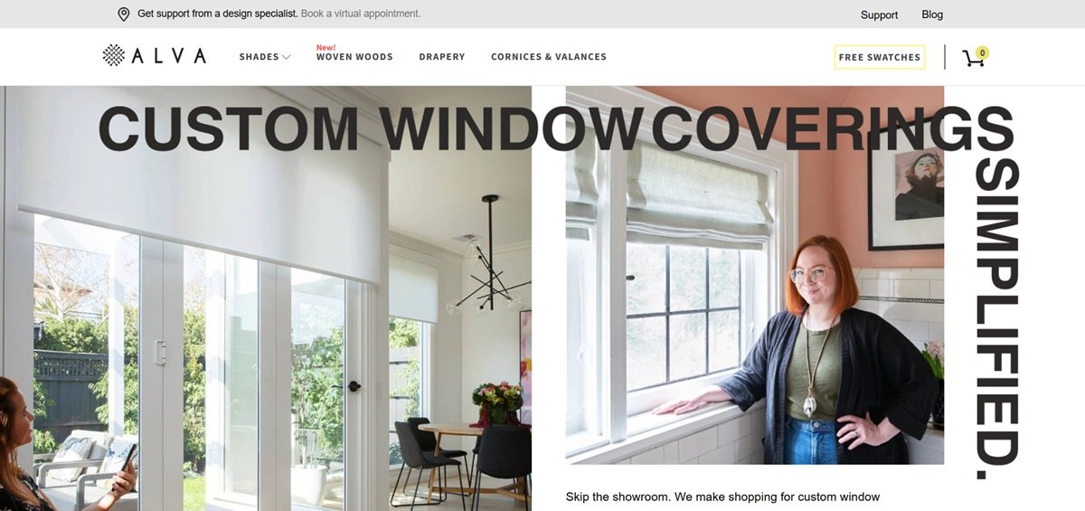
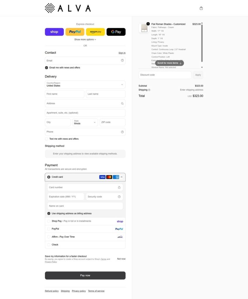
Alva sells made-to-measure window treatments, roman, roller, solar and zebra shades, woven wood shades and drapery, plus a motorized line called Alva IQ, positioned as a direct-to-consumer alternative to a traditional window-covering showroom. The site leads with a free fabric swatch program and ships from its own Shopify storefront.
Website Design
A warm, muted palette. The site’s stylesheet defines a taupe, #afa196, alongside a soft yellow-green, #ede171, and a brighter coral red, #ff4e4e, reserved for sale or attention elements, all set against a plain white ground.
Three fonts, three jobs. Google Fonts serves Merriweather, a serif, alongside Roboto and Source Sans Pro, a pairing that reads as serif for headings and pull quotes with the two sans faces carrying interface labels and body copy.
A step-by-step homepage rather than a category grid. The homepage is built as a named three-part sequence, Find Your Style, Get Free Samples, Make It Yours, structuring the page as a process rather than a straight product listing.
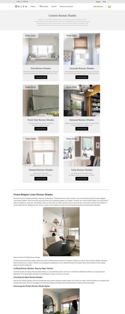
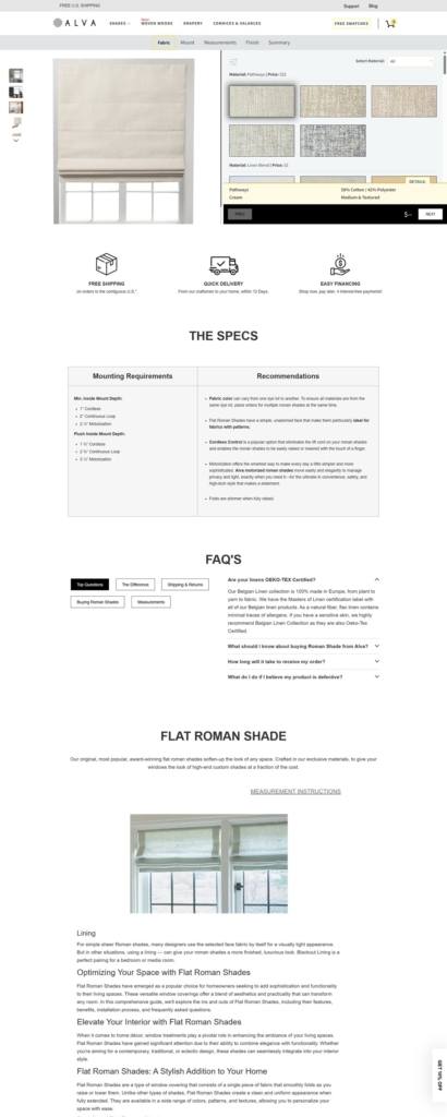
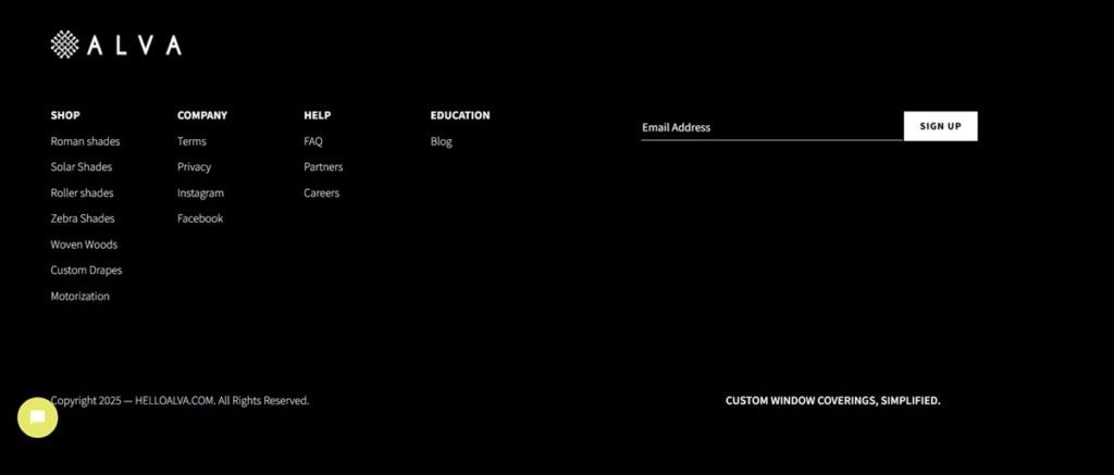
Product categories organized by shade mechanism. Roman, roller, solar, zebra and woven wood shades each get their own top-level entry rather than being grouped under a single “Shades” catch-all, alongside separate Drapery and Cornices and Valances sections.
Shopping Experience
Free swatches lead the funnel. Shoppers can request up to ten free fabric swatches, delivered in four to five days, with free US shipping on the swatch order itself.
No prices, but a full guarantee stack. No prices appear on the homepage; instead the page leads with a “100% Happiness Guarantee” and free shipping, shifting the pitch from cost to risk removal.
Virtual design appointments alongside self-serve shopping. A bookable virtual design appointment sits next to the standard browse-and-swatch path, for shoppers who want guidance before choosing fabric.
Brand Storytelling
A cost and quality positioning stated directly. The site describes itself as “the ultimate hack to designer shades and blinds for a fraction of the cost.”
Material-level claims, not general sustainability language. Copy names a proprietary lining, ConsciousCotton, and references biophilic design principles specifically rather than a broad eco statement.
Verified-buyer testimonials. Customer reviews on the page carry verified-buyer badges rather than appearing as unattributed quotes.
Notable Features
An Instagram hashtag as community proof. The brand promotes #STARTWITHALVA as a tag for customer photos.
Installation support built into the funnel. Video installation guidance is offered alongside the product, addressing a common post-purchase concern for made-to-measure shades ordered without a showroom visit.
A motorized product line sold as its own category. Alva IQ, the motorized shade option, is presented as a distinct line rather than a checkbox add-on to the manual shades.
A named three-step process anchors the whole page. Find Your Style, Get Free Samples and Make It Yours are used as the organizing structure for the homepage rather than as a one-off explainer graphic, repeating the same three steps in the main navigation.
Rotopol is a publishing house for graphic storytelling touching upon the borders of what illustration and comic art can accomplish. Our range of products lets the reader discover books produced in high quality as well as artists with personal styles and stories.
Paul Valentine sells stainless steel jewelry with 18k gold plating, covering necklaces, earrings, rings, bracelets, anklets and watches, marketed as water resistant and hypoallergenic for everyday wear. The catalogue spans everyday staples through Best Sellers, Most Gifted and New In collections, plus engravable pieces for personalization and an Outlet section. Built on Shopify, with free delivery offered on orders over 100 euros.
Website Design
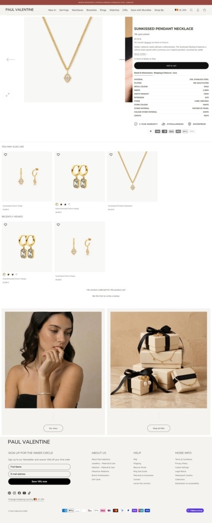
Warm neutrals with a rose gold accent. The site sits on a white background with taupe brown body text, near-black buttons, and a rose gold tone reserved for secondary text and price highlights, a palette that echoes the gold plated jewelry itself rather than competing with it.
Montserrat headings over Maven Pro body text. Headings run in Montserrat, a geometric sans-serif, while body copy uses the softer Maven Pro, giving product names more visual weight than the descriptive text beneath them.
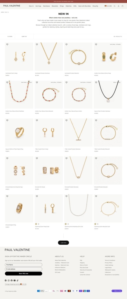
Close product photography. Listings favor tight shots of pieces on plain or skin-toned grounds, letting the metal finish and stone settings read clearly rather than relying on styled lifestyle scenes. Model shots are kept to a minimum, so the jewelry itself stays the focal point of nearly every image on a collection page.
Shopping Experience
Deep sub-categorization by piece type. Necklaces alone split into Chokers, Layered, Bead, Initial, Birthstone, Chain and Engravable Necklaces, with a similar breakdown for Bracelets and Rings, letting shoppers narrow by specific style rather than browsing one long list.
Engraving as a standing option. Engravable Necklaces and Engravable Bracelets sit as their own collections rather than a checkbox on select products, positioning personalization as a core part of the range.
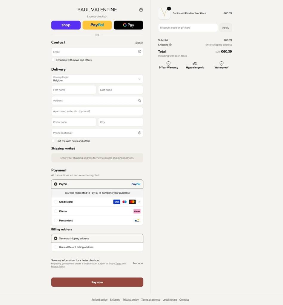
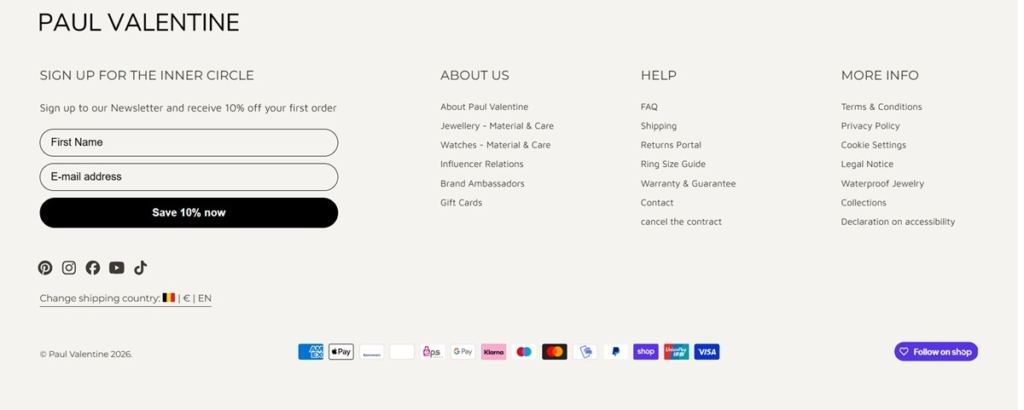
A full express checkout suite. Apple Pay, Google Pay, Shop Pay, PayPal and Klarna all appear as payment options, giving shoppers several one click and installment routes to complete a purchase.
Brand Storytelling
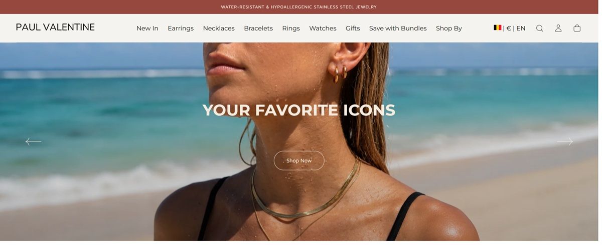
Durability stated in the header. The banner across the top of the site leads with Water Resistant and Hypoallergenic Stainless Steel Jewelry before any product imagery loads, putting material claims ahead of styling in the first thing a visitor reads.
Everyday wear over occasion pieces. The Daily Essentials collection sits alongside Best Sellers and Most Gifted in the main navigation, framing the jewelry as something worn continuously rather than reserved for special occasions.
Notable Features
An Outlet collection. A dedicated Outlet section offers discounted pieces separate from the main catalogue, giving price sensitive shoppers a distinct path without discounting the core range's listed prices.
Free delivery threshold in the announcement bar. Free delivery on orders over 100 euros is stated at the top of every page rather than only at checkout, setting shopper expectations before they begin browsing.
Gift focused merchandising. A Most Gifted collection curates pieces by popularity as gifts specifically, separate from Best Sellers, treating gift buying as a distinct shopper intent from general browsing.
Coffeebar is an Italian-inspired cafe brand with ten locations across five regions, including Reno, Nevada and Truckee and Redwood City, California, selling hand-roasted coffee, tea, merchandise and gift cards online alongside a coffee subscription. In-store the menu extends to breakfast, lunch and bakery items, but the website itself is built around the roastery side of the business.
Website Design
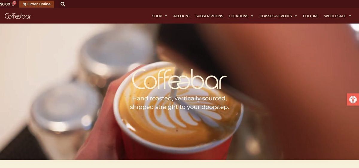
Burgundy against cream. The site’s colour system runs a deep burgundy as the primary tone and a warm cream as the secondary background, with an orange used as the accent colour for buttons and highlights. Smaller accent hues, a green, a coral and a muted gold, appear in supporting graphics.
Georgia paired with Montserrat. Headings and display text favour Georgia, a serif, while Montserrat, a sans-serif, carries body copy and interface labels, a fairly conventional serif-and-sans split.
Elementor-built page sections. The homepage is assembled from stacked, full-width Elementor sections, a subscription pitch, a locations block, a culture section, each with its own background treatment rather than a single continuous layout.
Shopping Experience
Subscriptions framed as the main shop action. The site’s own description of the offer, choose your favorite roast, how much and how often, and we will ship it straight to your door, puts the subscription flow ahead of one-off purchases in the shop copy.
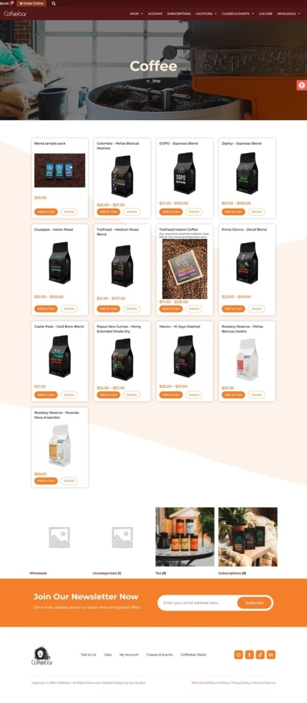
Shop limited to four categories. The online shop is organized into just Coffee, Gift Cards, Merchandise and Tea, a small, tightly scoped catalogue compared to the full in-cafe menu.
A separate ordering platform for cafe pickup. Square handles in-store and pickup ordering as a distinct system from the coffee shop, splitting retail purchases from cafe transactions rather than running both through one cart.
Brand Storytelling
A stated identity line. The brand describes itself directly as a radically-inclusive Italian cafe experience, a positioning phrase that appears prominently rather than being left to inference from the menu.
Sourcing made part of the pitch. Copy emphasizing vertically sourced beans and connecting the dots between farmer and guest ties the subscription product to a sourcing story, not just a flavor description.
Notable Features
Classes and events as their own section. A dedicated Classes & Events area sits in the main navigation alongside Shop and Locations, treating in-person education as a standing part of the business rather than an occasional post.
A wholesale channel listed openly. Wholesale is given its own navigation entry rather than being handled through a separate inquiry-only page, signaling that Coffeebar sells to other businesses as well as consumers.
Ten locations mapped by region. The Locations section groups ten cafes into five regions rather than listing them as a flat address list, useful given the brand’s spread beyond a single city.
Culture given its own navigation entry. A Culture section sits in the main menu alongside Shop and Locations, a slot most cafe sites would use for a general About page, signaling that Coffeebar treats its internal culture as public-facing content.