By Catalin Zorzini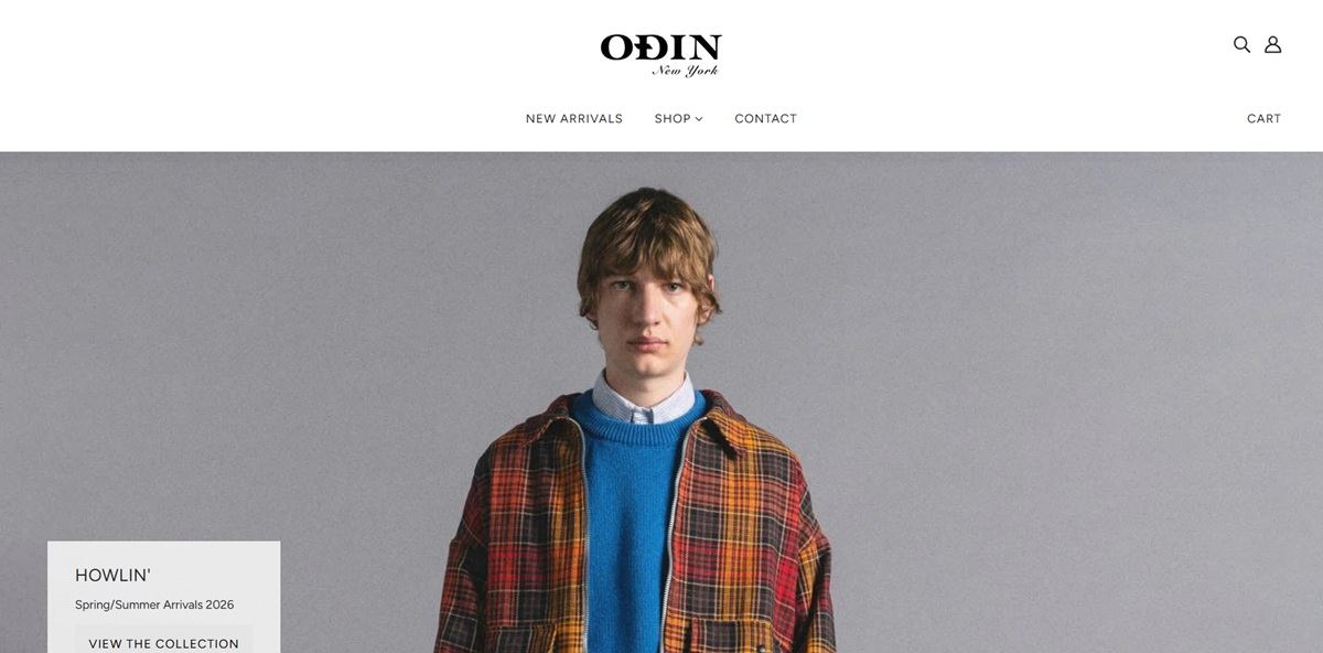
Odin New York is a Manhattan menswear boutique and fragrance house that sells its own label alongside a stocked roster of outside brands. The catalogue runs to roughly two hundred items: the ODIN eau de parfum line and home fragrances, shirts, knitwear, tees and trousers from labels such as HOWLIN’ and Escuyer, plus bags, incense, wooden toys and a PUMA collaboration. One store backs the site, on Greenwich Avenue, open seven days a week. Built on Shopify using the Blockshop theme.
Website Design
Greyscale with one navy. The theme tokens are almost entirely neutral: near-black text at #272727 on white, panels in #f7f7f7, a light grey footer and hairline borders at #ebebeb. The only saturated colour is the navy behind sale badges, with sold-out badges in dark grey.
Figtree as the only typeface. Navigation, section headings and product cards all run in the same sans, with headings set small and upper case so the wordmark stays the largest type on the page.
Editorial rows alternating with product rails. The homepage runs a full-width lookbook image, then a horizontal scroll of products, then another image. Collection promos sit between them as single photographs with a one-line caption and a View link.
Alt text written as description. Lookbook images carry long alternative text describing pose, garment and setting rather than a filename, which is unusual on a fashion storefront.
Shopping Experience
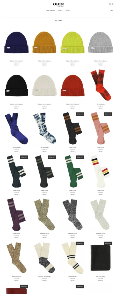
Vendor name printed under every product. Each card shows the title, the brand beneath it and the price. For a multi-brand shop this does most of the navigational work that a filter panel would otherwise handle.
Collections organised by label, not by category. The shop menu lists brands as its top level, so a shopper browses by maker first and garment type second.
Sold out items stay on the shelf. Discontinued and out of stock pieces keep their place in the grid with a badge, and their product pages swap the add-to-cart button for a back-in-stock email capture.
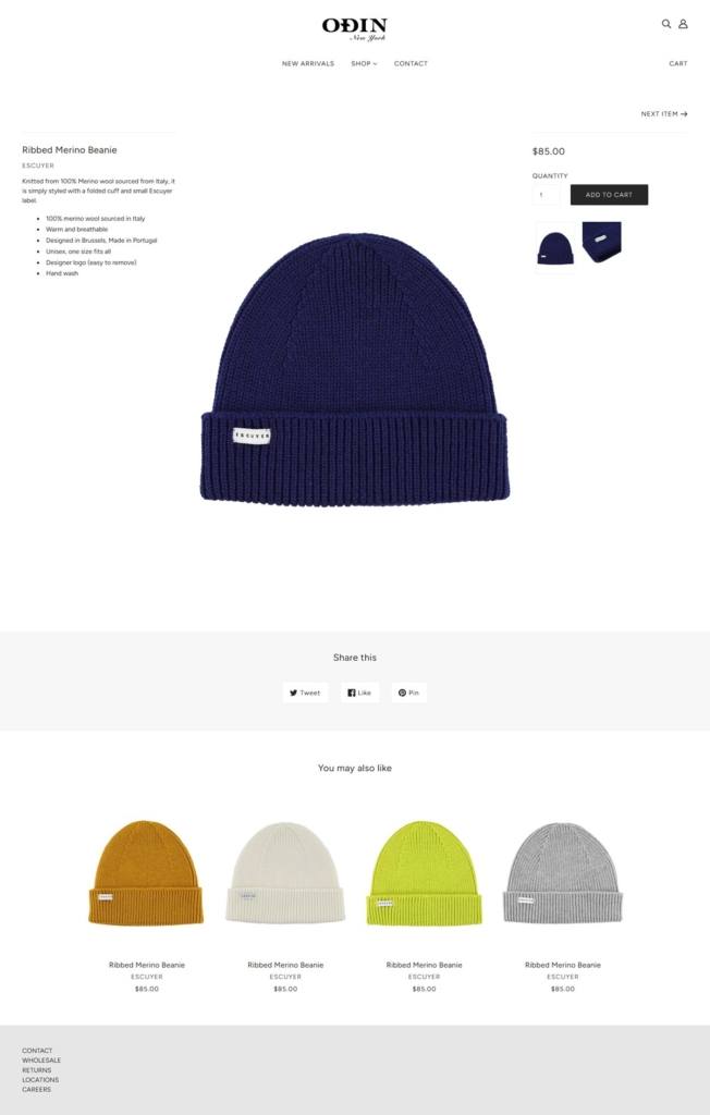
Short product pages, longer fragrance pages. Clothing pages carry a variant selector, a quantity field, an add-to-cart button and a brief description. Fragrance pages expand into a note pyramid split across top, middle and base, a volume in millilitres and a caveat that international shipping is not offered on fragrances and candles.
Brand Storytelling
The fragrance line is numbered before it is named. Scents are sold as 01 Sunda, 02 Owari, 03 Century and so on, promoted under the heading A Journey in Scent, which frames the range as a series rather than separate products.
Copy written as travel writing. Fragrance descriptions read as geography: spice trade routes, juniper from the Himalayas, sandalwood from the West Indian shores.
Notable Features
A collaboration lookbook as a homepage section. The PUMA collection gets its own editorial block shot on location at Coney Island, sitting inside the store rather than on a separate microsite.
A wide price ladder in one grid. Incense strips at $17.00 sit in the same catalogue as outerwear approaching $600.00.
Wholesale, careers and store hours in the footer. The trade and recruitment routes are given the same weight as returns and contact.
Odin New York Shop Category page example
Odin New York Product page example
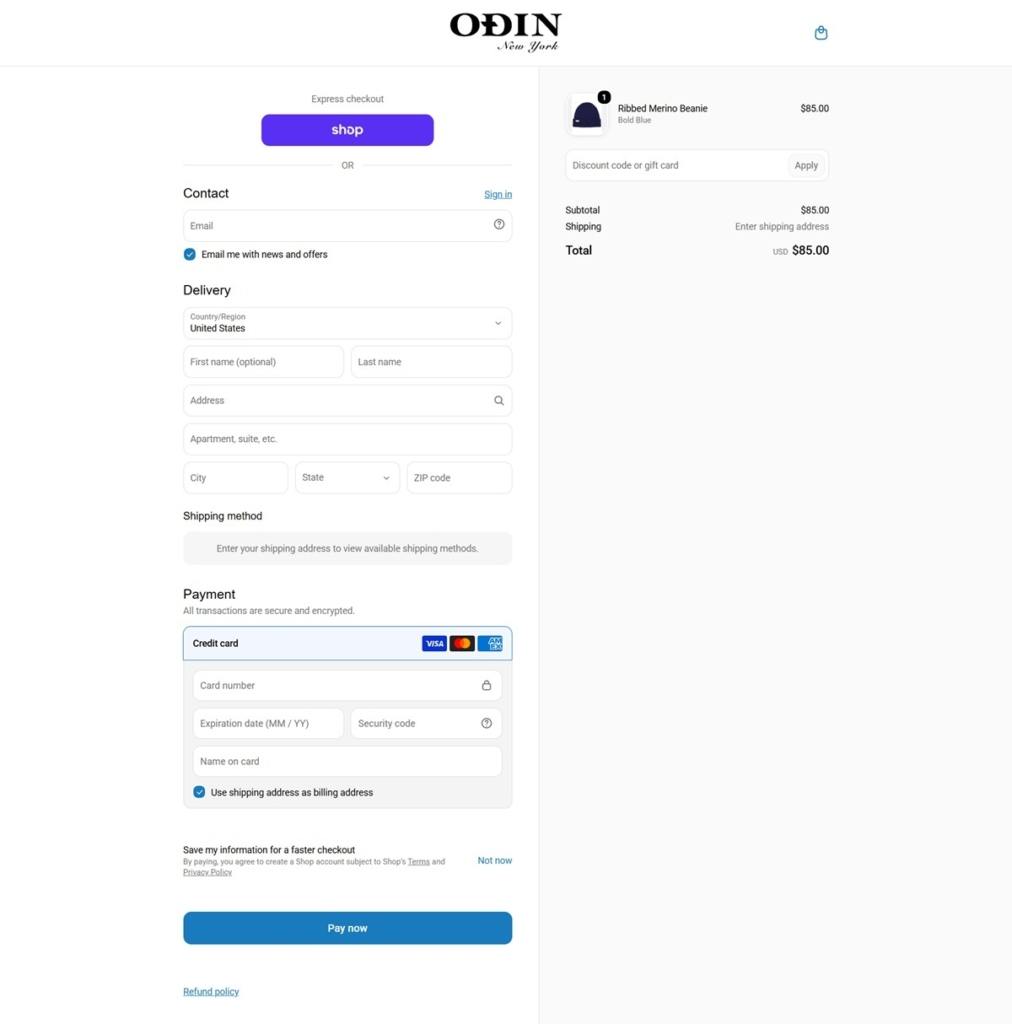
Odin New York Checkout page example