Creating a well-edited collection of contemporary designers and independent labels for men and women since 1996.
Need Supply Co.


eCommerce Websites
Creating a well-edited collection of contemporary designers and independent labels for men and women since 1996.
Since 1910, our spring has been quenching a thirst for local and good. Meticulously crafted, all natural, truly beautiful drinks from the idyllic Daylesford region (Victoria, Australia).

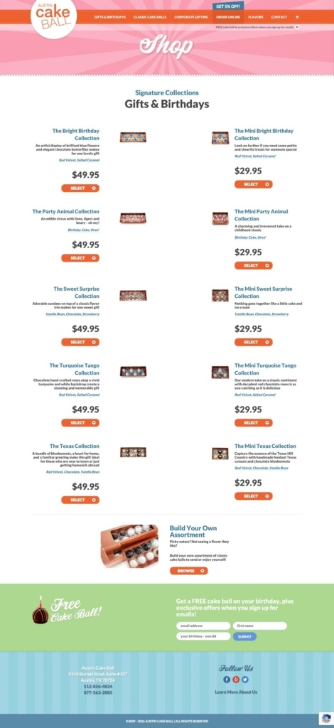
Austin Cake Ball is an Austin, Texas bakery selling boxed collections of bite-sized cake balls for birthdays, gifting and corporate orders, with local pickup, local courier delivery and nationwide FedEx shipping. Collections are sold in full and mini sizes, and the site markets custom-logo orders for offices.
A candy-pink banner over an orange nav bar. Every page opens with a diagonal-striped pink header behind a white circular logo mark, sitting above a solid orange navigation bar with the main menu links in white capitals.
Lato for text, a script face for accents. Body copy and product descriptions are set in Lato, while section titles such as “Shop,” “Follow Us” and “Free Cake Ball!” switch to a cursive script face for a handwritten, bakery feel.
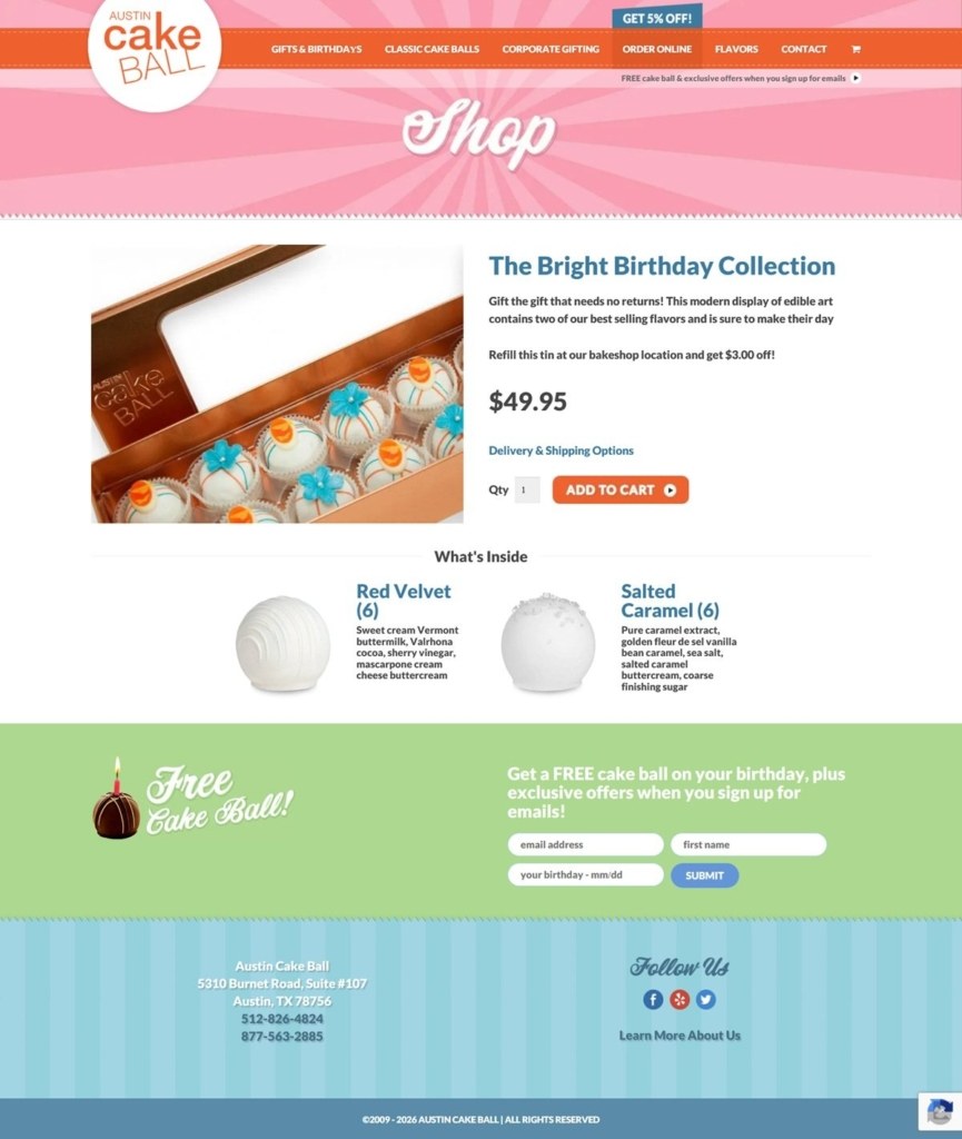
Warm, styled product photography. Cake balls are shown staged inside an open gift box lined with satin ribbon rather than on a plain background, with a visible brand stamp on the box lid in one shot.
Paired full and mini pricing. The Gifts & Birthdays category page lists five named collections, such as The Bright Birthday Collection and The Turquoise Tango Collection, each in a full size at $49.95 and a mini size at $29.95, with an orange Select button on every card.
A build-your-own option beneath the grid. Below the collections sits a “Build Your Own Assortment” promo with its own Browse link, aimed at shoppers who want to pick flavors individually.
A flavor breakdown on the product page. The Bright Birthday Collection page pairs one large product photo with price, quantity and an Add to Cart button, then a “What’s Inside” section listing each flavor by name, such as Red Velvet and Salted Caramel, with its own short ingredient description.
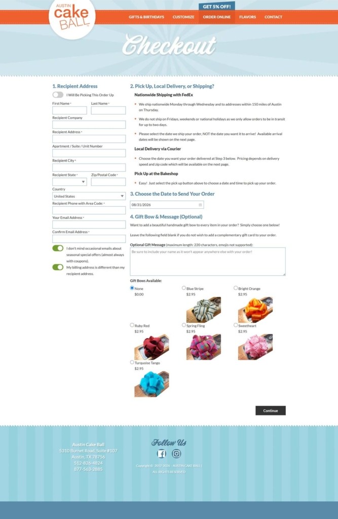
A four-step order form instead of a single checkout page. Checkout is split into Recipient Address, a Pickup, Local Delivery or Shipping choice, a date picker for the day to send the order, and an optional Gift Bow and Message step offering seven named bow styles priced at $2.95 each.
Birthday-tied email capture. A green banner on both the shop and product pages reads “Get a FREE cake ball on your birthday, plus exclusive offers when you sign up for emails,” linking the newsletter signup to a specific occasion rather than a generic discount.
A refill incentive on the product page. The Bright Birthday Collection copy adds, “Refill this tin at our bakeshop location and get $3.00 off,” pointing shoppers back to the physical bakeshop.
Delivery timing built into checkout. The order form includes a live date field for choosing exactly when the order should ship or arrive, ahead of any payment step.
A priced gift-bow add-on grid. Seven bow colors and styles, including Blue Stripe, Bright Orange and Sweetheart, are shown as a visual swatch grid with individual pricing rather than a simple checkbox add-on.
Consent toggles for marketing and billing. The checkout form uses two separate toggle switches, one for occasional marketing emails and one for a different billing address, rather than standard checkboxes.

Workstead is a design studio, founded in 2009 by Stefanie Brechbuehler and Robert Highsmith. … Workstead’s aim is to design responsible, context driven works that create a sense of place for both the objects they contain and the people that experience them.
A chic design-it-yourself home decor shopping experience.
Ace Records is one of the leading reissue record companies and strives to bring you great sounding, well-packaged releases.
Made, collected, and enjoyed in San Antonio.
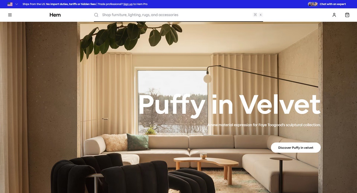
Hem sells design-led furniture, lighting, rugs and accessories organized into categories such as shelving, tables, sofas, chairs, lighting, tableware, rugs and outdoor pieces. The tagline is direct: “Imaginative designs of obsessive quality.” Named designer work runs through the catalogue, including the Bookmatch bench by Philippe Malouin, a Puffy lounge chair collection by Faye Toogood, and an upcoming Min Chair by Max Lamb. A trade program, Hem Pro, sits alongside the consumer shop. Visitors choose private or trade status and a region before entering. Built on a custom storefront rather than a template theme.
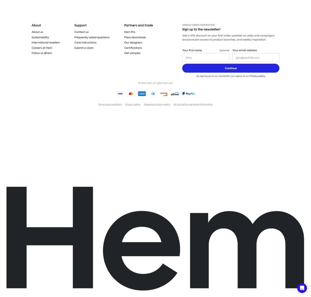
Charcoal type on plain white. Hem’s own CSS names the near-black text color as #242427 against white and off-white grounds, with a rounded geometric wordmark, “Hem,” set large in the footer. Category and filter type is small and grey, keeping attention on the product photography.
A gloss-and-matte color language. The site’s own stylesheet labels its accent colors by finish rather than name alone, pairing gloss and matte versions of green, red and yellow, which map onto the fabric and lacquer finish options shown on product pages.
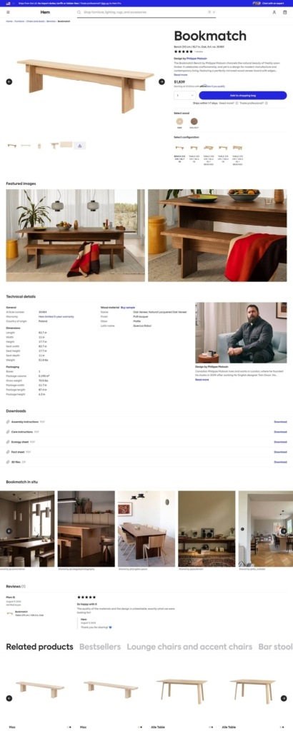
Products photographed in situ, not just isolated. The Bookmatch bench page pairs a plain studio shot with lifestyle photography of the same bench in a dining room, and a further row of customer-submitted “Bookmatch in situ” photos beneath the technical details.
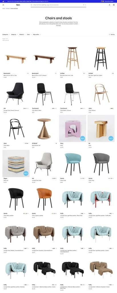
A dense catalogue grid with heavy filtering. The Chairs and Stools category lists by Categories, Design by, Material, Color and Ships within, four items across, each card showing wood or upholstery variant plus price, for example the Bookmatch bench at $1,839.
Configuration on the product page itself. Wood and finish are chosen with swatches before Add to Shopping Bag, and a Select Configuration row switches between bench lengths. A short designer bio and portrait sit beside the technical specification table.
Downloads most furniture sites skip. Assembly instructions, care instructions, an ecology sheet, fact sheet and 3D files are each offered as direct downloads beneath the product dimensions.
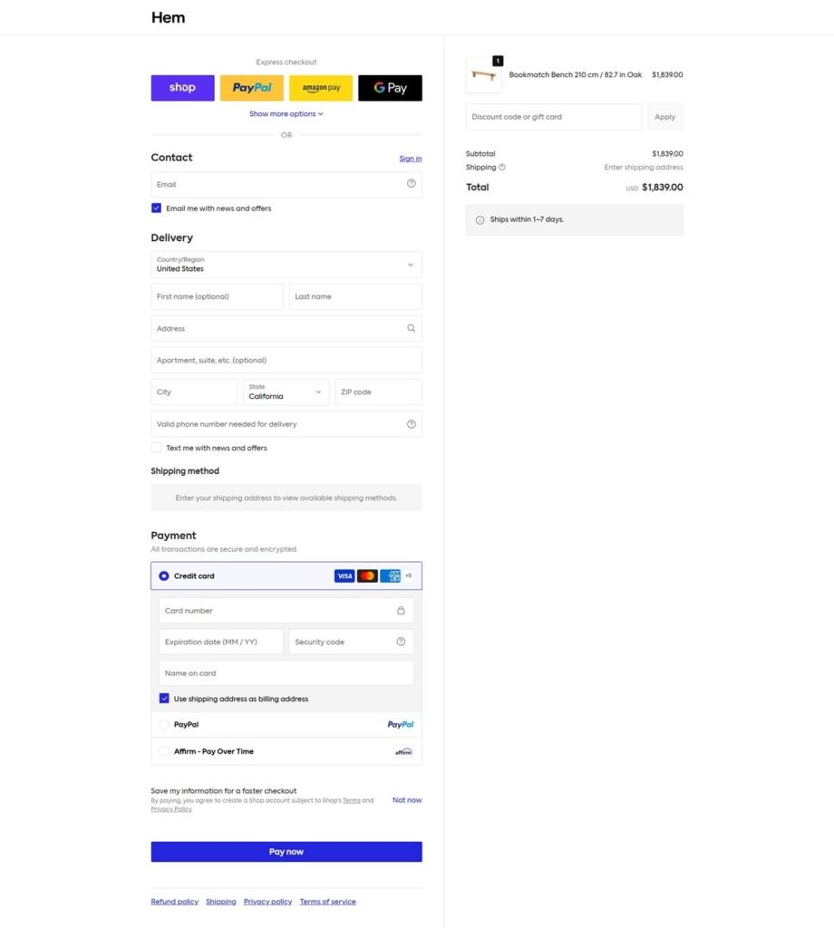
Checkout in Hem’s own blue. Express options are Shop Pay, PayPal, Amazon Pay and Google Pay, with Affirm financing offered as a payment method. The Pay Now button uses the brand’s blue rather than a default theme color.
Designers are named, not anonymous. Product pages credit the individual designer with a short bio and portrait, tying pieces like Bookmatch and Puffy to a person rather than treating them as house-brand SKUs.
A trade track runs beside retail. Hem Pro is pitched separately in the footer, offering real-time stock visibility, trade discounts and a dedicated account manager to design professionals.
Region and customer-type gating at entry. Before any product appears, visitors confirm private or trade status and pick a region among Canada, Europe, the UK, the US and others.
Sustainability and certifications documented. A dedicated Sustainability page and per-product ecology sheets sit alongside standard care and assembly documentation.
International reseller network. The footer links to international resellers separately from the direct store, positioning Hem as sold through both channels at once.
OVO Things are a selection of home and clothes items at their best.
Outdoor Voices is an active lifestyle brand that believe in freeing fitness from performance and embrace activity with ease, humor, and delight.
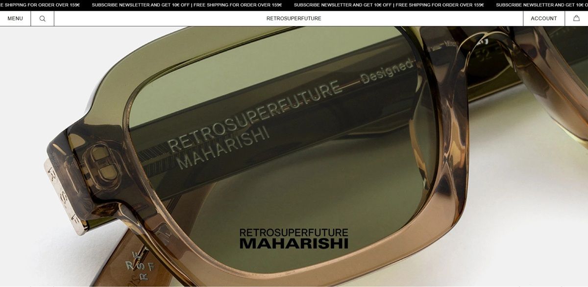
Retrosuperfuture designs sunglasses and optical frames in Milan, selling its own eyewear lines alongside named collaborations with Marni and MM6 Maison Margiela, direct through a Shopify store since 2007. The site localizes currency and shipping by country automatically, showing prices in euros for European visitors.
Black, white and one accent color. The interface runs almost entirely in black and white, with a magenta-toned accent reserved for select badges and highlights rather than used throughout.
One sans-serif for everything. Headings, product names and body copy all run in Helvetica or Arial, so type never shifts style between a campaign headline and a spec sheet.
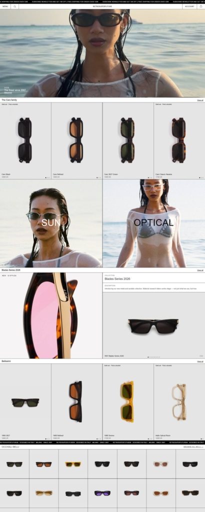
Full-bleed campaign photography. The homepage opens on a single large water-themed model shot, then splits into two panels labeled Sun and Optical, each carrying its own photograph rather than a shared product grid.
A scrolling brand line in the footer. "Retrosuperfuture, Designed in Italy, Milano, Since 2007" repeats as a moving ticker above the copyright line, rather than sitting as static text.
Collections organized by named series. Rows on the homepage are grouped under titles like The Caro Family, a Blades Series and Bellissimi, each flagged with Sold out, Find a dealer or New where relevant, ahead of a larger general grid.
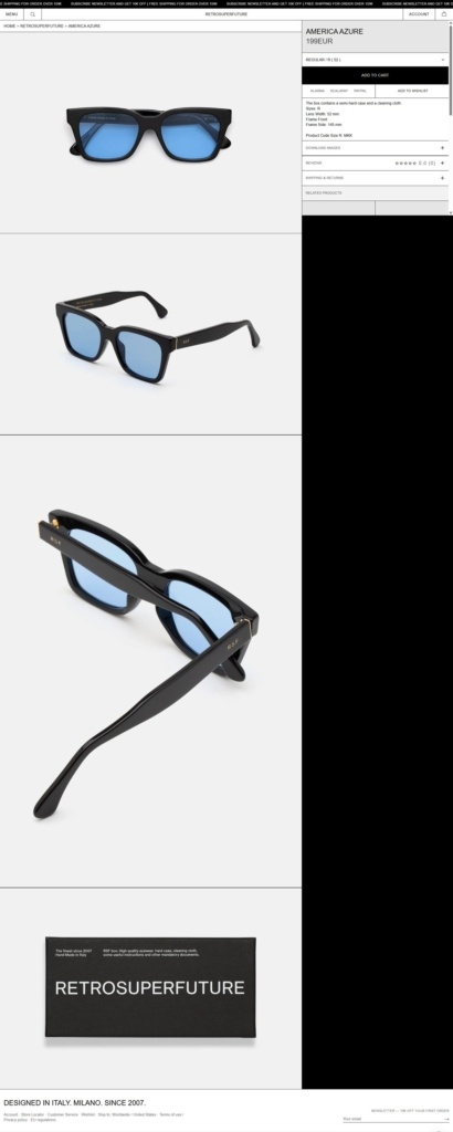
A spec list instead of a long description. Product pages give lens width, frame width and frame side measurements alongside a product code, rather than marketing copy about the design.
Packaging stated up front. A line under the price confirms the box contains a semi-hard case and a cleaning cloth, so shoppers know what ships before adding to cart.
Reviews and shipping kept in expandable sections. A star rating with review count and a shipping and returns panel both collapse by default, keeping the main product view focused on the frame itself.
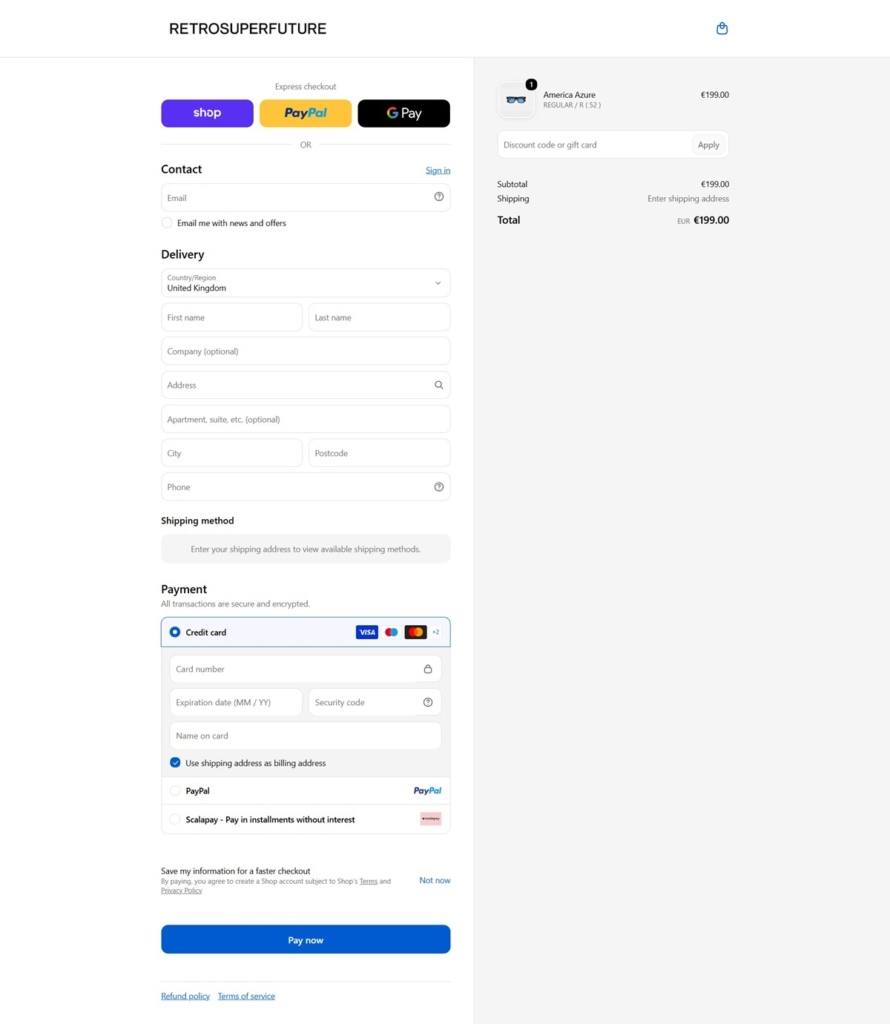
Checkout with an installment option. Shop Pay, PayPal and Google Pay sit above the standard fields, and Scalapay is offered as a pay-in-installments method alongside the credit card form.
One line, repeated in two places. "Designed in Italy. Milano. Since 2007." appears as the footer headline and again inside a branded graphic on the product page itself.
Collaborations named in the main navigation. Marni and MM6 Maison Margiela sit as their own header tabs next to the core Retrosuperfuture line, positioning the brand alongside established fashion houses rather than only promoting them as guest capsules.
A stated founding claim. The meta description reads "The finest since 2007. Hand Made in Italy," tying manufacturing origin directly to the brand's age.
A flat-euro newsletter incentive. The signup offer states 10 euro off a first order rather than a percentage discount.
A store locator alongside the online shop. The footer links to physical retail locations, treating the website as one of several ways to buy rather than the only channel.
Sun and Optical treated as equal categories. Both the homepage split and the header submenu give sunglasses and prescription frames the same visual weight, rather than favoring one line over the other.

Ageless elegant design guided by classic British horological principles.


