BOUGUESSA is a fashion brand, combining straight-lined designs with elegant sophistication.
BOUGUESSA


eCommerce Websites
BOUGUESSA is a fashion brand, combining straight-lined designs with elegant sophistication.
Bastide is a luxurious, natural beauty and lifestyle brand from Aix-en-Provence, France.
LOQ is a womens footwear brand, aiming to redefine classics for the modern day woman.
Bold travel goods and accessories for those goingplaces.
MARCUS HANUY is a Berlin-based urban luxury brand born out of a shared appreciation and passion for high-end merchandise and meticulous design. Discerning buyers will embrace the label’s sleek and elegant design and unique hardware pieces combining handmade craftsmanship with streetwear elements.
POLAR Pen is a single product store run by INDIEDESIGN Ltd for a pen and stylus assembled from rare earth neodymium magnets, designed by Andrew Gardner. The shop lists ten items: pen kits in GOLD, SILVER, Gunmetal and a GOLD/SILVER pairing at $29 and $44, spare magnet packs at $8.99, chrome ball sets at $5 and $6.99, and an ink refill insert. Five of the ten are currently unavailable. The site runs on Shopify and states that all prices are in USD.
Montserrat on black and white. The type is Montserrat throughout, set against a black and white base with mid grey, #bebebe, for rules and secondary text. Two reds, #d02e2e and #f73939, mark sale pricing and alerts. A five item header. Navigation is Hello, Shop, Tricks&Builds, Story and a cart counter, repeated as a sticky bar. There is no search and no mega menu.
Demonstration over description. The homepage is organised around what the pen turns into rather than what it is, with two long sections ending in “PLAY – Compass Build” and “PLAY – Revolver Build” links.
The whole catalogue on one page. The Products listing holds all ten items in a single grid with no filters, no sort control and no pagination, each card showing the price and, where relevant, a struck through original.
Sold out stated in the price slot. Unavailable items read “Currently Sold Out :(” where the price would sit, with the old price beside it, so the grid mixes buyable and unbuyable products without separating them.
Short product pages. The GOLD Pen & Stylus page carries a “Version 2.0” label, “$29” struck from “$44.00” with “ON SALE!”, one paragraph of copy, a kit contents line reading “14 gold magnets, two caps, one clip, one tip, and a black ink refill”, a free shipping note, a single Default Title variant and Add to cart.
A wide payment set for one currency. The footer lists american express, apple pay, bancontact, diners club, discover, google pay, ideal, master, paypal, shopify pay and visa, then states “All prices in USD” with no currency switcher.
A magazine quote does the pitch. The longest block of copy on the homepage is an extract credited to WIRED Magazine, describing the pen sliding “undetected into even the most oppressive fun vacuums”.
Tricks treated as a content section. Tricks&Builds is a nav item in its own right, listing Compass, Revolver, Orbit, Ghost Pen, Spring, Motor and Magnetic North alongside Pen Basics and an unboxing.
A safety notice in every footer. A warning about swallowed magnets and intestinal injury appears on every page, next to a Learn More link.
A question as the headline. The homepage asks “Is the Pen truly mightier than the Sword?”, answers with “Both Functional & Fun”, then splits into Functional and Fun panels.
Build guides sit inside the shop. Instructions for reconfiguring the product are part of the storefront rather than a separate support site.
An unresolved theme error. A Shopify Liquid error prints at the foot of every page: “Liquid error (layout/theme line 433): Could not find asset snippets/spurit_uev-theme-snippet.liquid”.
The BestSelf Co. started as a project between two entrepreneurs, Cathryn and Allen, who were on a journey to creating a life they loved, through building their respective businesses and being able to quit their day jobs.
Backpacks, bags, apparel and accessories made in Colorado, USA.
Nora is the first smart and non-invasive snoring solution that’s designed specifically to stop snoring before it wakes your sleeping partner.
Huckberry is an independent online retailer and magazine for adventurous guys. Over a million strong trust us as their leading retailer and resource for emerging brands, gear, and lifestyle inspiration.
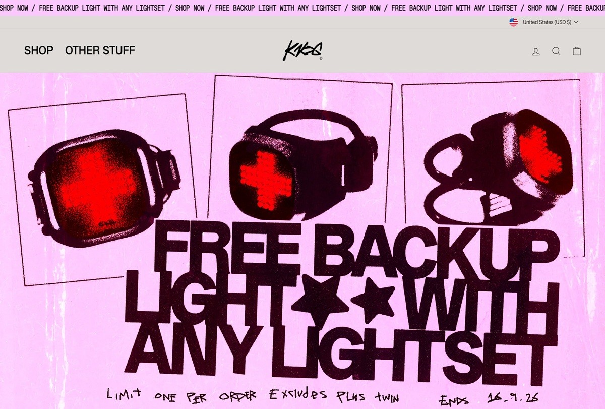
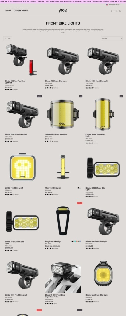
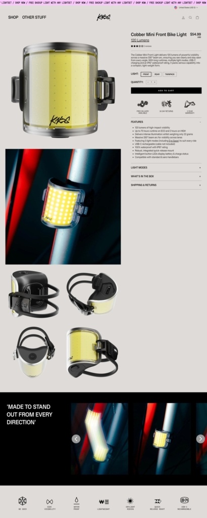
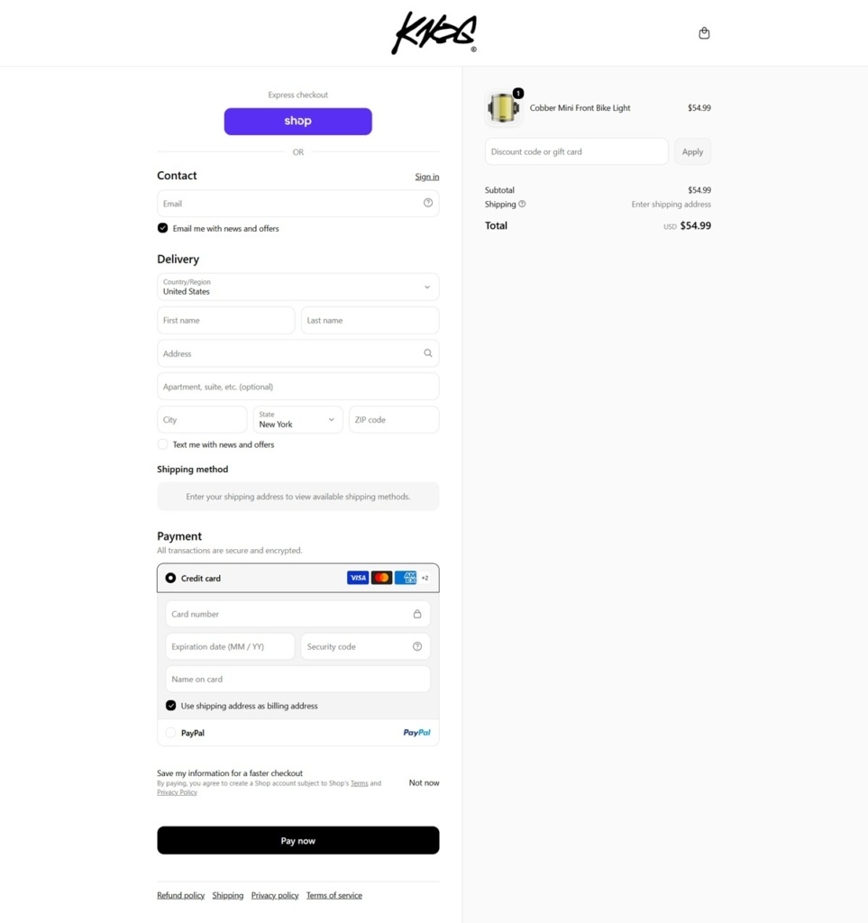
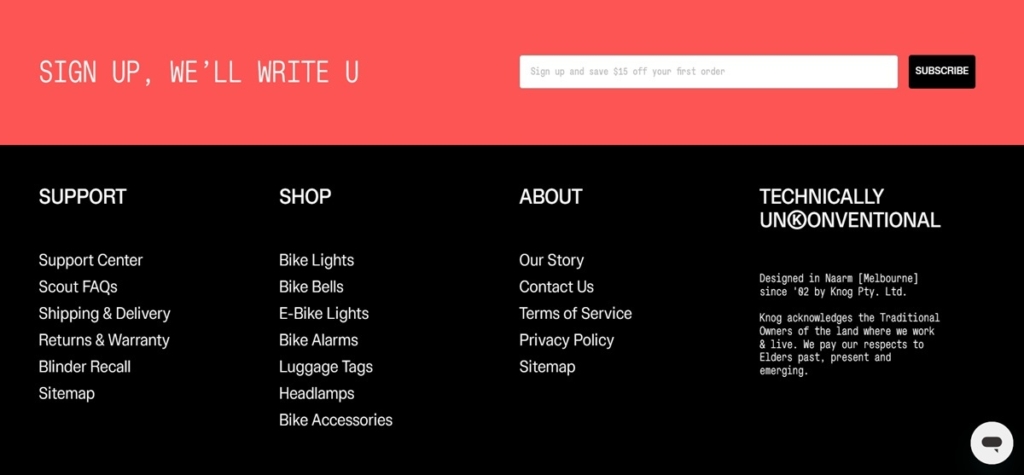
Knog sells bike lights, bike bells, the Scout bike and travel alarm range, running headlamps and outdoor accessories, aimed at commuters, road and mountain cyclists, runners and campers. The brand calls itself “Technically UnKonventional” and notes it has been “Designed in Naarm [Melbourne] since ’02.” Built on Shopify, with the .com.au address now serving the same global storefront as knog.com.
A warm tan ground instead of white. The base background sits on a beige, closer to sand than grey, with body copy in flat black and a coral-red used only for the cart indicator. It is a narrower palette than most Shopify storefronts, which lean on white or brand-color blocks.
A custom typeface for everything. Both headings and body text are set in “Knog Sans,” a proprietary face rather than a licensed webfont, giving the store one voice across product names, navigation and long-form copy.
Activity-led homepage sections. Below the hero, the page splits into “Cycling,” “Alarm & Finders” and “Run + Outdoor” blocks, then a further activity grid: commuting, mountain biking, bikepacking, camping, hiking, running, fishing. The structure sorts by what the shopper is doing rather than by product type alone.
Prices sit on every card. Bestsellers show cost directly on the grid, for example the Oi Prima bell at 49.99 and the Scout Bike alarm at 94.99 in Australian dollars, so comparison happens before a click.
A safety recall notice on the homepage. A dedicated recall banner sits among the merchandising blocks rather than buried in a support page, an unusual placement that puts compliance information at the same level as bestsellers.
A currency selector for over 40 regions. Pricing and delivery adjust by country from a header control, consistent with a brand shipping worldwide rather than from a single storefront.
The tagline does double duty. “Technically UnKonventional” appears near the top of the homepage and is reinforced by the Melbourne founding date, positioning the brand as engineering-led rather than fashion-led.
Guarantees are named, not just listed. The warranty is branded “Pinky Promise” for a 2-year cover, paired with plain free delivery and 30-day return terms, so the trust messaging carries the same voice as the product names.
A free-item promotion drives the hero. The homepage leads with a free backup light offer tied to any lightset purchase, a bundling incentive rather than a straight discount.
Support named as “Killer Service.” Copy describes “a team of real humans [+ 1 robot],” an attempt at personality inside what is otherwise a standard FAQ and warranty footer link set.
A dedicated outlet and spare-parts section. Both sit in the main navigation rather than the footer, letting repeat buyers reach discounted or replacement stock without searching support pages.
First Draft Co. is a brand of premium sketchbooks that feature high quality paper and textured covers that are reminiscent of hardcover books.


