UNIQLO is a clothing apparel company, which was originally founded in Yamaguchi, Japan in 1949 as a textiles manufacturer. Now it is a global brand with over 1000 stores around the world.
UNIQLO UK


eCommerce Websites
UNIQLO is a clothing apparel company, which was originally founded in Yamaguchi, Japan in 1949 as a textiles manufacturer. Now it is a global brand with over 1000 stores around the world.
The Cool Club is a collection of designs with serious class.
Design, function, and culture from our little shop at 954 S. Broadway, Los Angeles,
Bataleon Snowboards is an innovative snowboard manufacturer.
Lemuria is a project which intends to explore forms deeply in order to create innovative, functional and trasformable clothes.
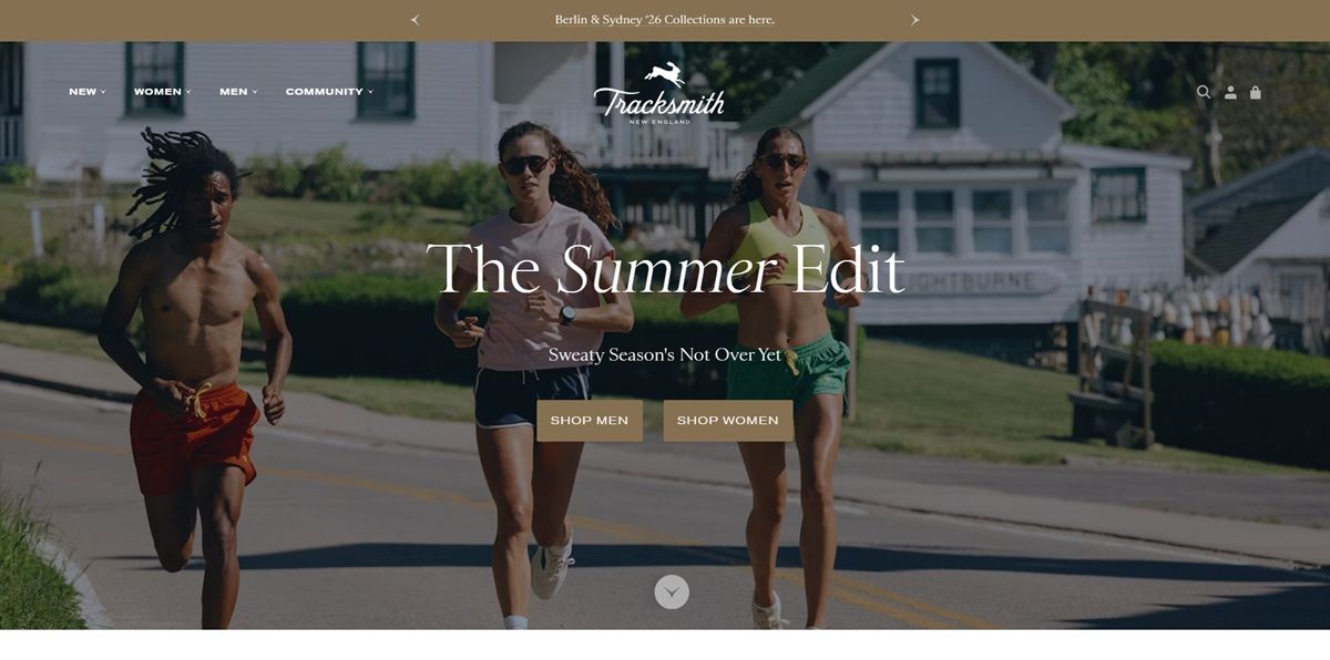
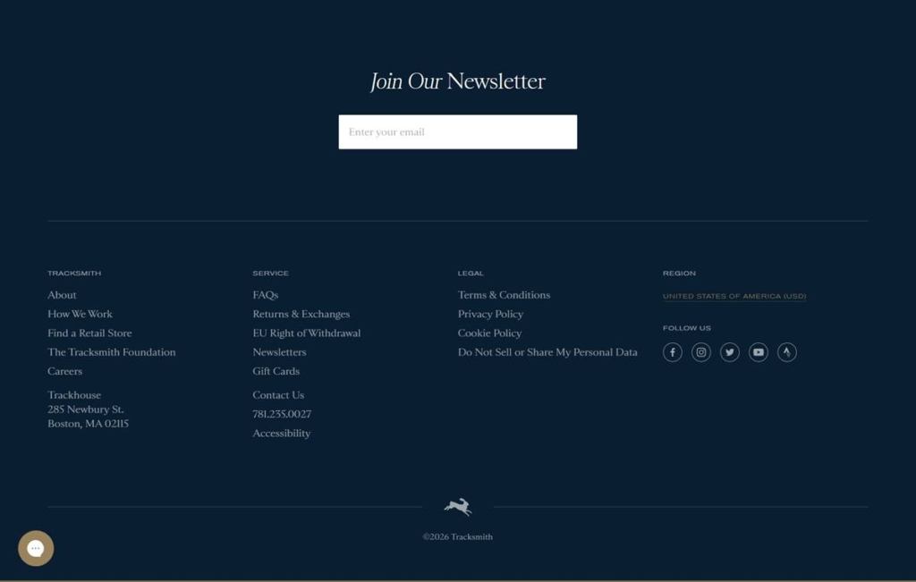
Tracksmith is an independent running apparel brand built for competitive and everyday runners, selling technical apparel, footwear and accessories for men and women. The range spans racing singlets, shorts, base layers and socks alongside the Eliot Runner training shoe. Positioning centers on running culture rather than general fitness, with copy such as “Race Day is Sacred” and a stated belief that running is better in community; the brand also funds youth track access through the Tracksmith Foundation. The storefront runs a headless build, an Astro front end over a Shopify checkout.
A navy and tan palette. The site pairs a near-black navy ground with a warm off-white, with a muted gold used for buttons, borders and the small hare logo mark. A red accent shows up sparingly, mostly on sale flags.
Serif logo, plain-set body copy. The wordmark and section headers such as “Join Our Newsletter” are set in an italic serif, while product names, filters and navigation run in a plain grotesque sans. The mix reads editorial rather than technical.
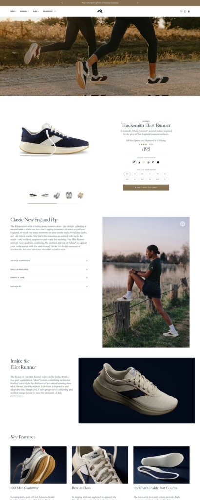
Documentary photography. Hero and story sections favor outdoor running photography shot in low light over studio product shots alone; the Eliot Runner product page pairs a plain grey product image with a lifestyle photo of a runner resting on a fence post.
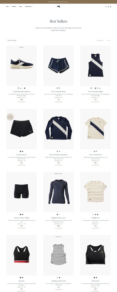
A dense three-column grid. Best Sellers lists products in rows of three, each with a star rating, price and Shop Now link, plus small dot icons marking available colorways.
Long single-product pages. The Eliot Runner page runs colour swatches and a size grid above an Add to Cart bar, then stacks editorial sections underneath, including “Classic New England Pop” and a Key Features strip with icon cards for guarantees and materials.
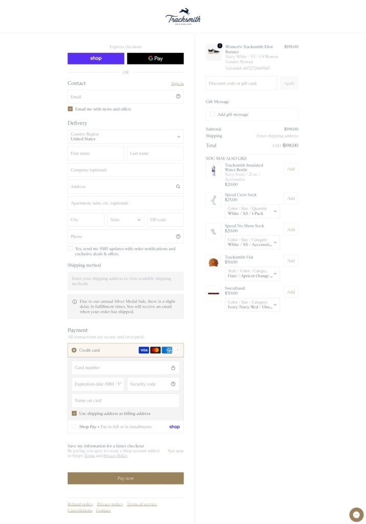
A tan-branded Shopify checkout. Express options include Shop Pay and Google Pay. A “you may also like” rail sits beside the order summary, and the Pay Now button carries the same tan used through the rest of the site.
Guarantees framed as brand values. A 100 Mile Guarantee and a note on shoe construction sit inside the product page itself rather than a separate policy page, tying craftsmanship claims directly to the purchase decision.
Community ahead of transaction. The primary navigation carries a Community tab addressing group runs and the Tracksmith Foundation alongside the shopping categories, positioning the retailer closer to a running club than a plain store.
Add-on merchandising in the cart. The checkout page recommends a matching hat, socks and a water bottle next to the order summary, encouraging a larger basket without leaving the payment flow.
An editorial footer. The dark navy footer sets its newsletter heading in the same serif as the logo and lists the Trackhouse retail address in Boston alongside the standard policy links.
Terra Nullius is a premium headwear brand.
Tinker Watches delivers well-made, modular watches at an attainable price.
MARIE SIXTINE sprang to life in 2010 with a mission to reinvent basic fabrics by adding a stylish touch that makes all the difference.
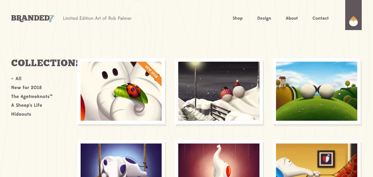
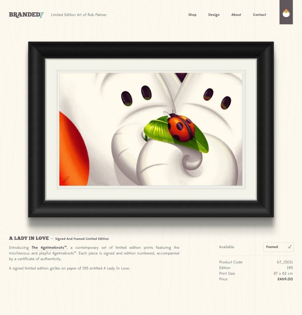
Branded7 is the online gallery and shop of London artist Rob Palmer, presenting signed, numbered, framed limited-edition giclee prints across named collections including Hideouts, A Sheep’s Life and The 4getmeknots. It is a single-artist storefront rather than a multi-brand shop, with pieces such as A Lady In Love priced at 469 GBP.
Cream ground with a deep maroon anchor. The stylesheet’s palette centers on a warm cream background against a near-black maroon used for the logo bar and key panels, with a muted sage-teal and a single orange accent reserved for status tags such as Sold Out and New.
Chunkfive for display, EdmondSans for text. Two custom webfonts are loaded: Chunkfive, a bold slab serif, for the wordmark and large headings, and EdmondSans in regular and bold weights for body copy and navigation.
A single work per page. Product pages give one print a full black-frame mockup, image only, before the title, edition detail and description appear below, rather than a merchandising grid built around it.
No self-serve cart observed. The live site and the original gallery capture both show a note directing buyers to a contact form for business enquiries; a product page lists a price and an Available status, but purchasing appears to route through direct enquiry rather than an add-to-cart and checkout flow.
Edition data stated per piece. Each print’s product page lists a product code, edition size, print dimensions in centimeters and price, treating the print like a numbered collectible rather than an open-run product.
Collections as filterable categories. A grid filter lets visitors narrow by collection, Hideouts, A Sheep’s Life, The 4getmeknots, using hash-based URLs rather than a full page reload.
A single quote as mission statement. The site closes on an Anatole France quote, if the path be beautiful, let us not ask where it leads, standing in for a conventional About section.
The artist named directly in the title tag. Rather than a brand name alone, the page title and meta description credit Rob Palmer by name throughout, keeping the storefront framed as one artist’s personal gallery.
A frozen copyright year. The footer reads Copyright 2017, and a New for 2018 collection label has not been updated since, suggesting the catalogue and site code have not changed materially in roughly nine years even though the domain and pages still resolve normally with live pricing shown.
Social links over checkout links. The footer pairs Instagram, Twitter, Facebook and Behance icons with the enquiry-based purchase note, positioning the artist’s social presence as the primary channel rather than a conventional storefront.
Newsletter as the primary funnel. A prominent newsletter signup asks visitors to be first to know about new releases across the three collections, functioning as the site’s main calls to action alongside the contact form.

Holzweiler luxury lambswool scarves and clothing line focus on exquisite qualities and materials
Lab Partners is a creative studio founded by Sarah Labieniec and Ryan Meis based San Francisco, CA.


