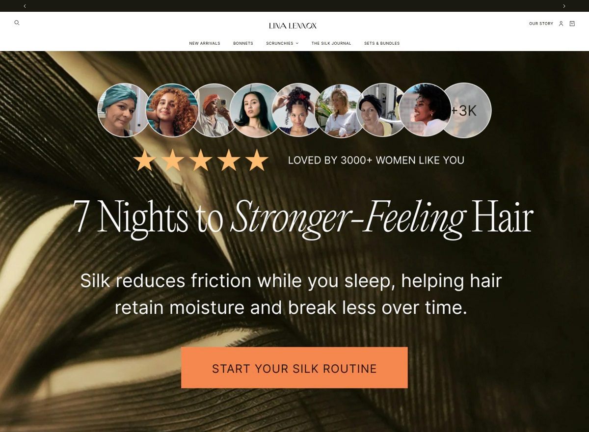
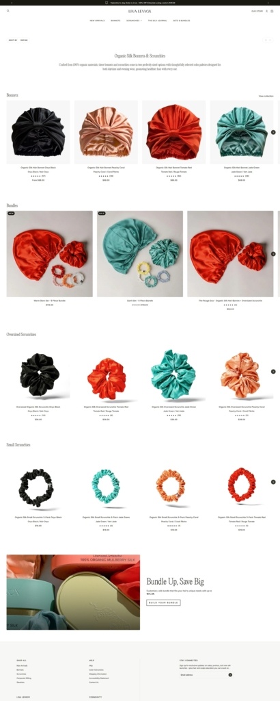
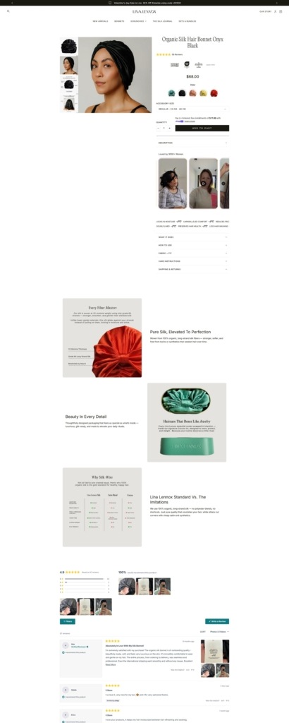
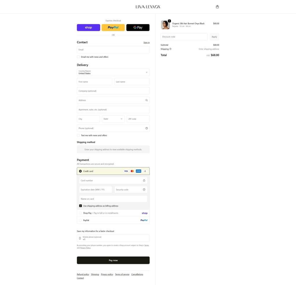
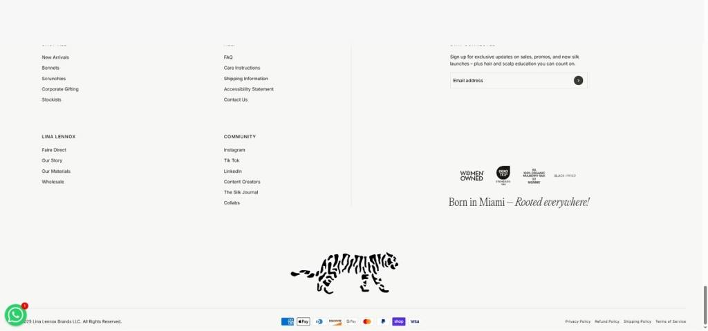
Lina Lennox offers premium hair accessories made from 100% organic mulberry silk, including silk bonnets, oversized scrunchies, and bundle sets designed to protect hair, reduce frizz and breakage, and support healthier styles. The website design is clean and product-forward, with large visuals, simple top navigation into categories like Bonnets and Scrunchies, and clear calls to action that guide visitors from lifestyle context into detailed product pages and collections.
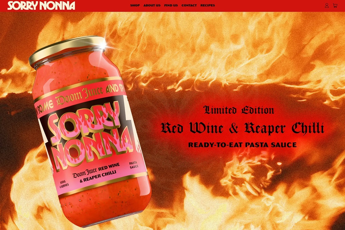
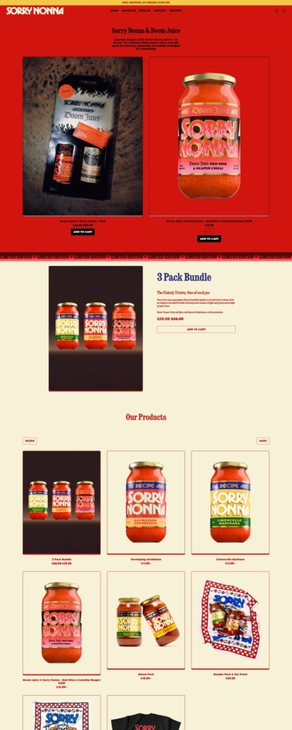
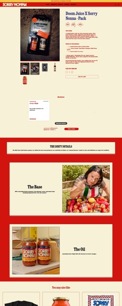
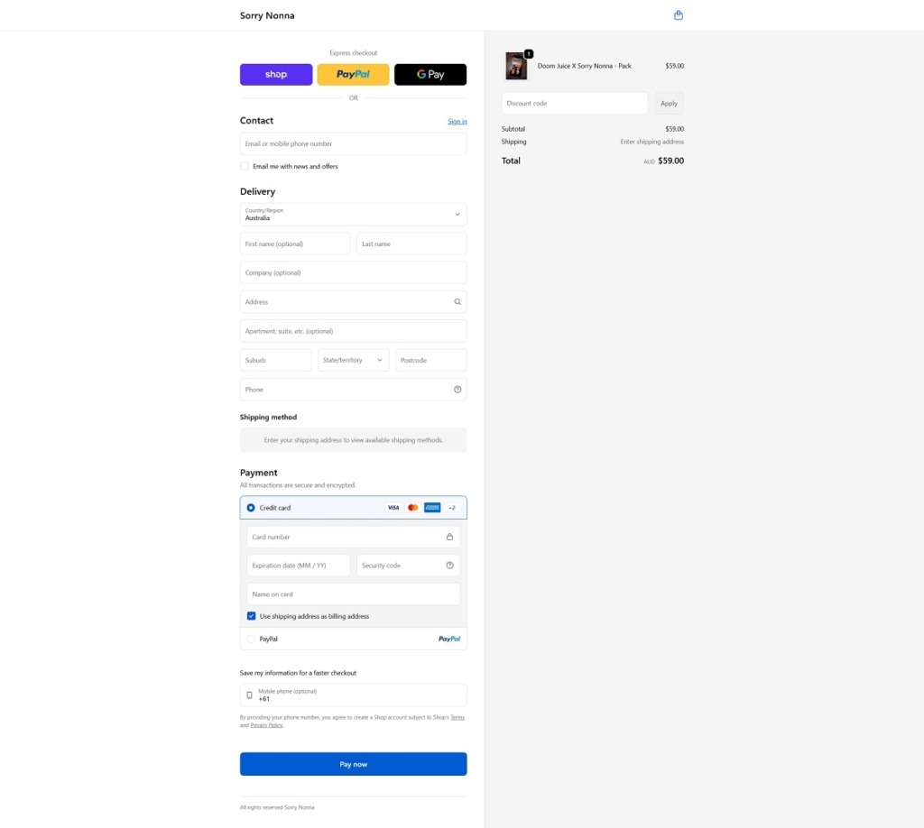
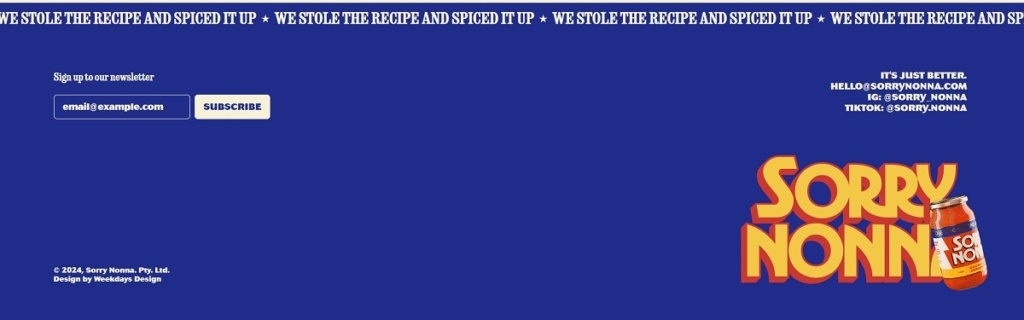
Sorry Nonna is a pasta and pantry brand selling dry pasta shapes along with complementary items like sauces and pantry bundles. The website design is clean and product-forward, with large food photography, simple category navigation, and clear calls to action that guide visitors into featured products and collections. Key product pages pair visuals with concise descriptions and ingredient highlights to support quick evaluation.
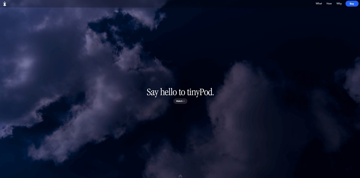
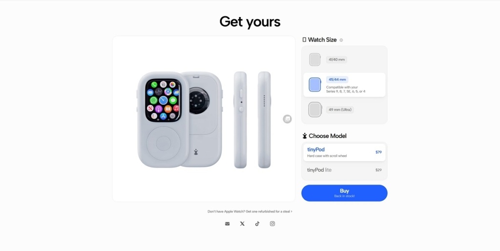
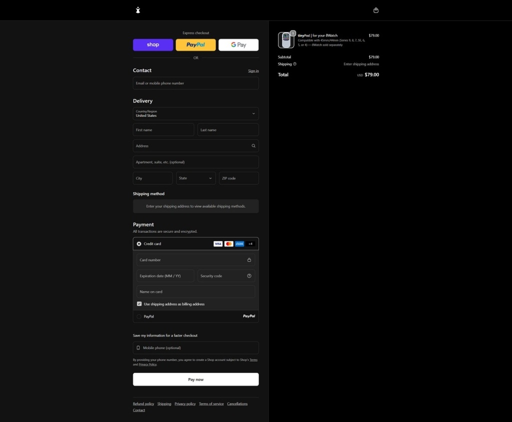
TinyPod offers hardware accessories that turn an Apple Watch into a pocket-friendly device with a physical scroll wheel case and a lighter silicone-style case, designed to let the watch feel more like a compact music player or communicator. The product range is small, focused on these two TinyPod variants sized for different Apple Watch models. The website design is tech-oriented and feature-driven, using large visuals, product shots showing functionality with an Apple Watch, and clear sections highlighting how the product works and its benefits.
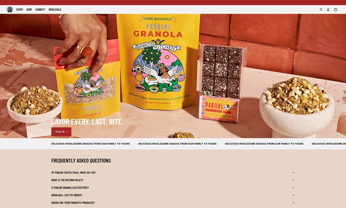
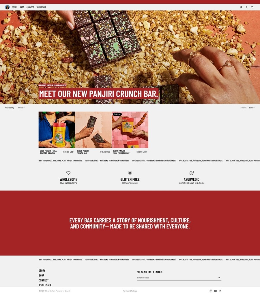
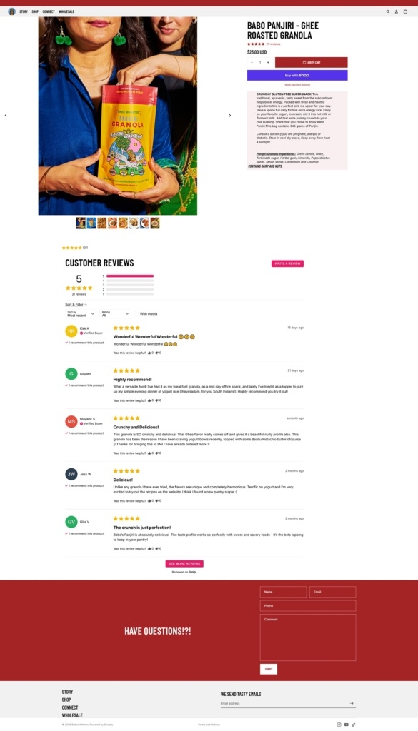
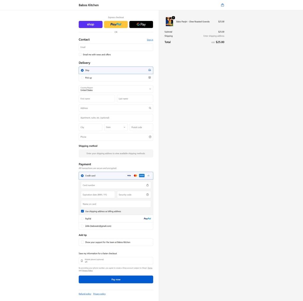
Babo’s Kitchen offers gluten-free Panjiri granola and related snacks like Panjiri crunch bars and mini bundles, rooted in traditional recipes and wholesome, real ingredients. The website design is clean and simple, with large product visuals, straightforward top navigation, and a shop-first layout that guides visitors from heritage and brand context into product pages.
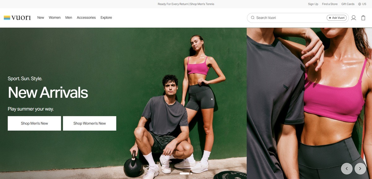
Vuori is a US activewear and lifestyle apparel brand selling men’s and women’s performance clothing, including leggings, shorts, hoodies, joggers, tennis wear and swim, on a Shopify storefront. The site states its positioning as “For every passion. Every pursuit. Every part of you,” and prices captured across the catalog run from about $68 to $198.
Website Design
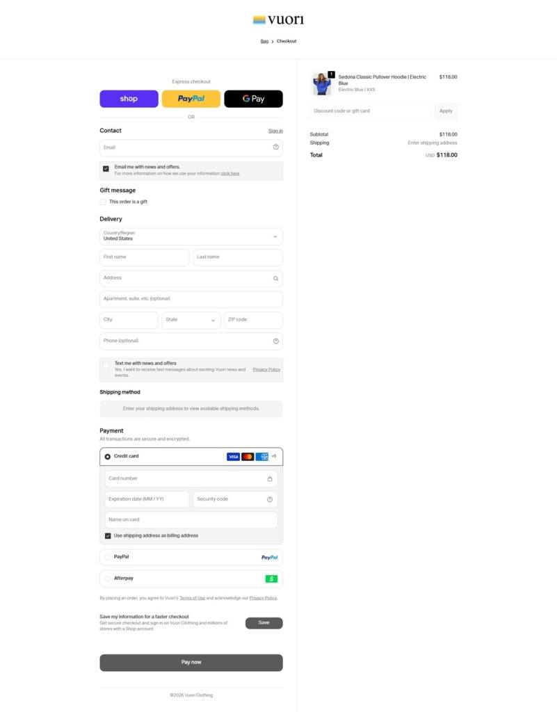
A serif wordmark against a sans nav. The logotype is a lower case serif “vuori,” while the navigation and body copy run in a grotesk sans face named in the site’s CSS as aktiv-grotesk. A small woven-look mark in blue and yellow sits beside the logo on the checkout page.
Colour comes from the product, not the chrome. Backgrounds stay a neutral off-white and grey throughout the shop, category and checkout views. The recurring colour in the captures, electric blue, forest green and burgundy, comes from the apparel itself rather than any accent panel or button colour.
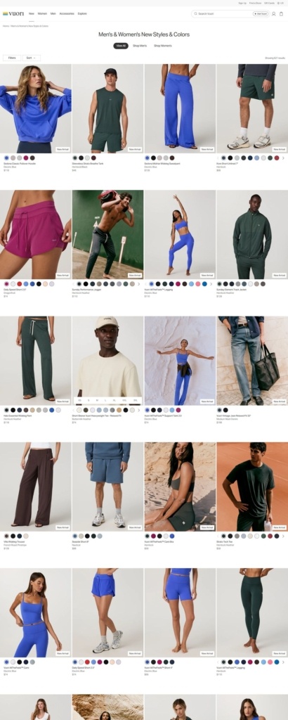
A mixed grid of lifestyle and studio shots. The category grid alternates plain studio product photography with action and lifestyle images, such as a model mid-stretch or shot outdoors, inside the same four-column layout rather than separating the two styles by section.
Shopping Experience
Filters, sort and colour dots on the grid. Above the category grid sit Filters and Sort controls. Each product tile carries a strip of small colour dots for the available shades and a New Arrival flag on select items.
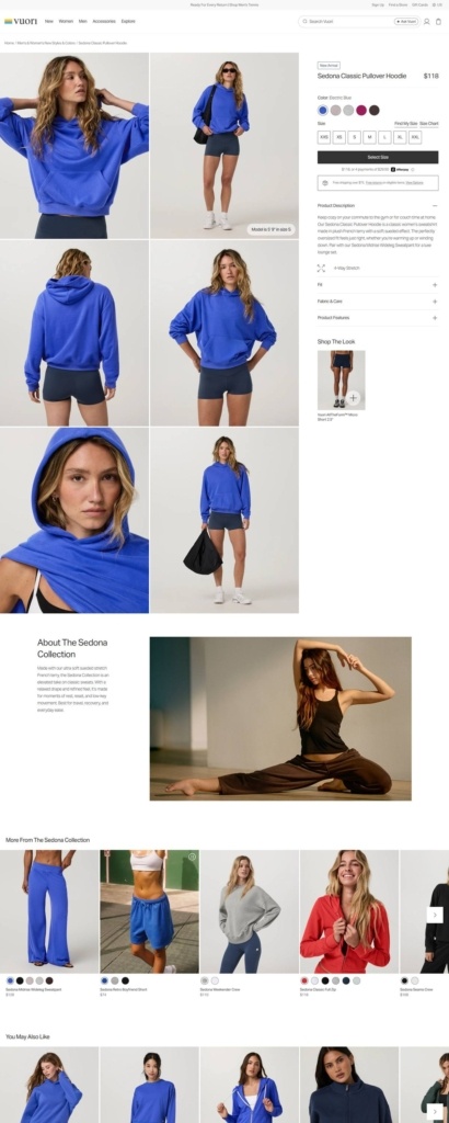
A long single product page. The Sedona Classic Pullover Hoodie page shows a six-image gallery, colour swatches, a full size grid and a Select Size button, followed by stacked accordions for Product Description, Fit, Fabric and Care, and Product Features.
Collection storytelling beneath the buy box. Below the accordions sits an About The Sedona Collection block pairing descriptive copy with a lifestyle photograph, then a Shop The Look panel, a More From The Sedona Collection carousel and a You May Also Like row.
Three express payment buttons at checkout. Shop Pay, PayPal and Google Pay appear above the standard delivery and card fields, with Afterpay listed as a further payment option beside card entry. A gift message checkbox and an SMS marketing opt-in sit within the delivery section, and the order confirms in USD with a dark Pay Now button.
Brand Storytelling
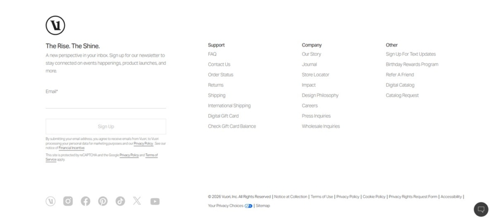
“The Rise. The Shine.” as the footer line. The footer opens with this tagline over a short note inviting newsletter signup for “events happenings, product launches, and more.”
Values-led company links. The Company column in the footer lists Our Story, Journal, Impact, Design Philosophy, Careers and Wholesale Inquiries alongside the standard support links, treating brand narrative and corporate information as one navigation group.
Notable Features
A loyalty and referral pair. The footer’s Other column lists a Birthday Rewards Program and Refer A Friend link alongside standard account features.
A print-style catalog offer. Digital Catalog and Catalog Request links appear in the footer, an addition not common among direct-to-consumer apparel sites of this kind.
A persistent chat bubble. A round chat icon sits fixed in the bottom right corner across the pages captured, and the footer links six social channels including TikTok and X alongside Instagram, Facebook, Pinterest and YouTube.
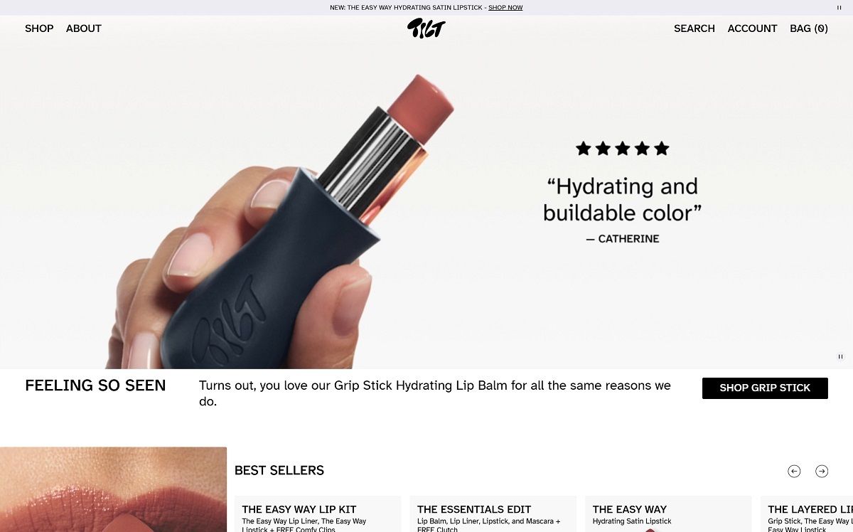
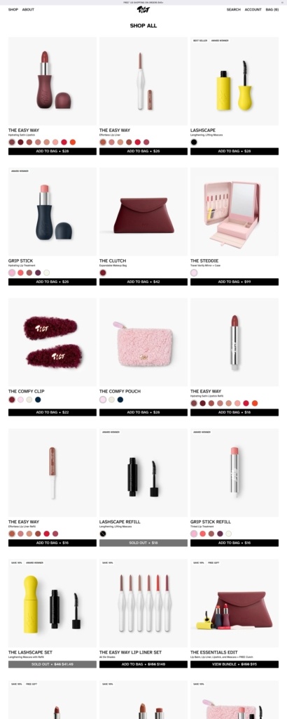
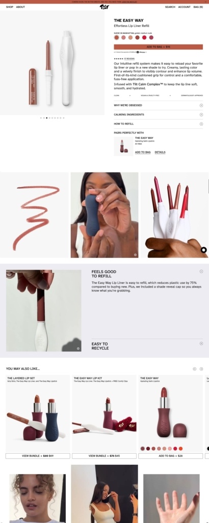
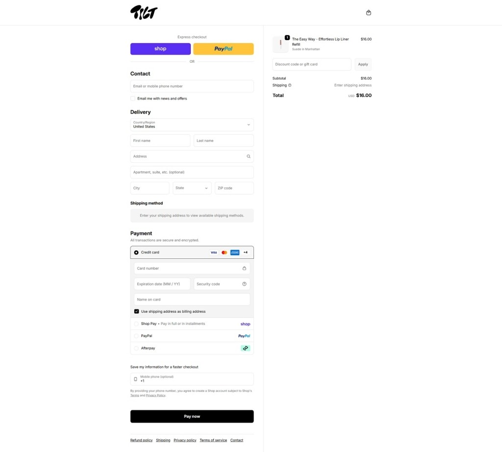
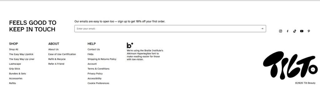
Tilt Beauty is an accessible makeup brand offering ergonomic, refillable cosmetics like Lashscape mascara, hydrating lip treatments, satin lipstick, and effortless lip liners designed to be easier to hold, open, and apply. The website design is clean and product-focused, with large product imagery, clear top navigation into core collections, and prominent calls to action that lead straight into featured products and bundles.
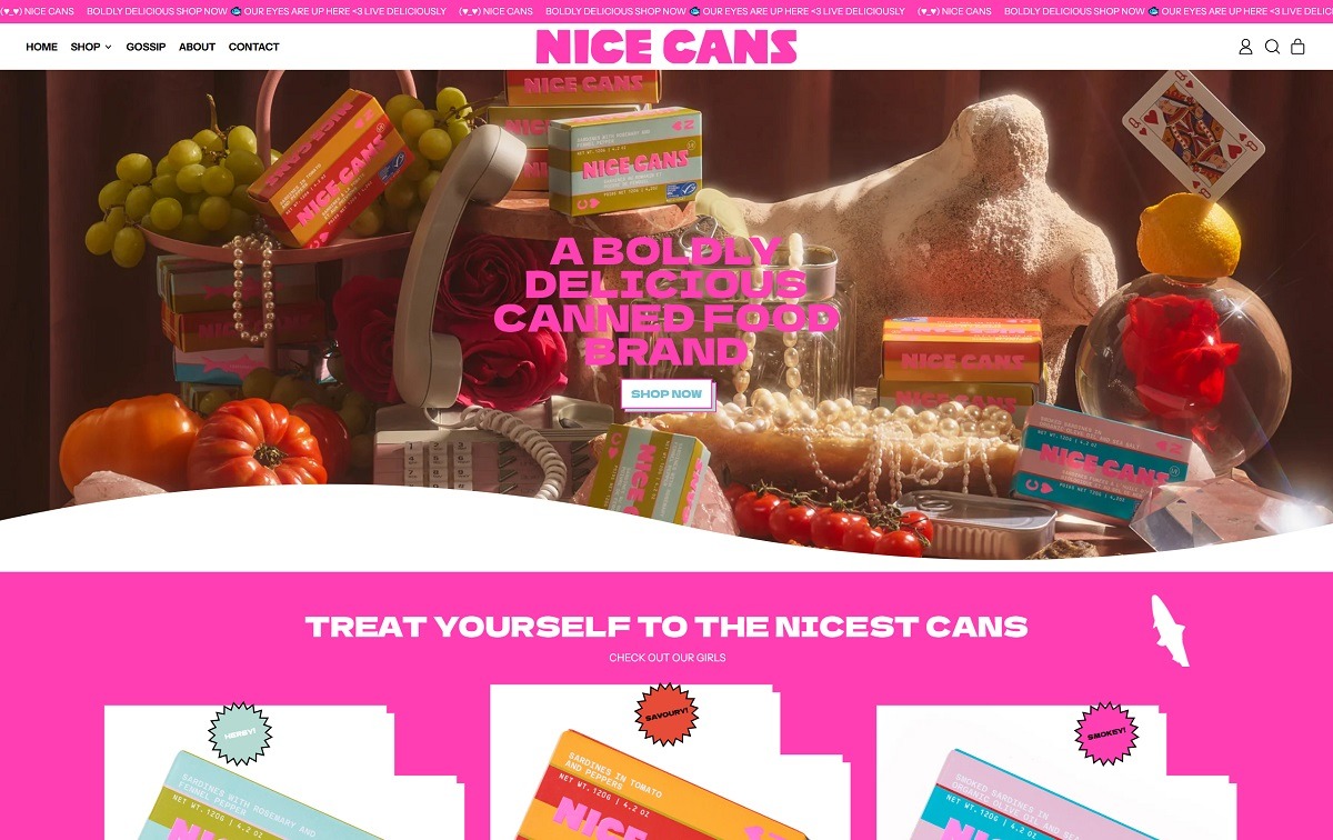
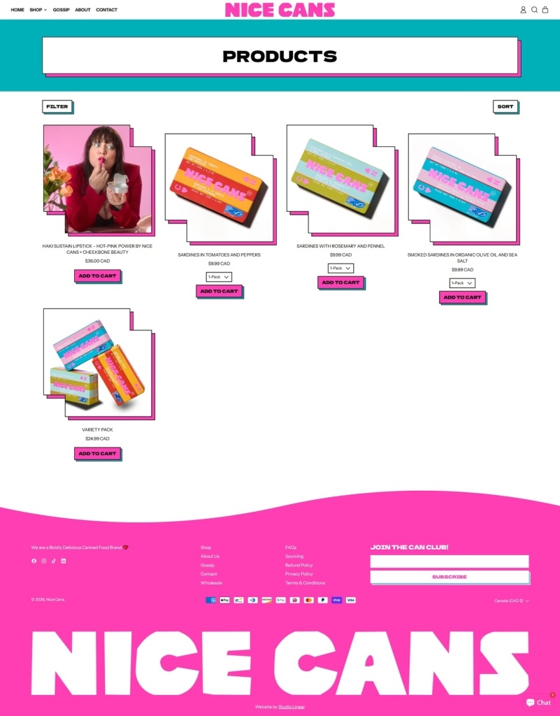
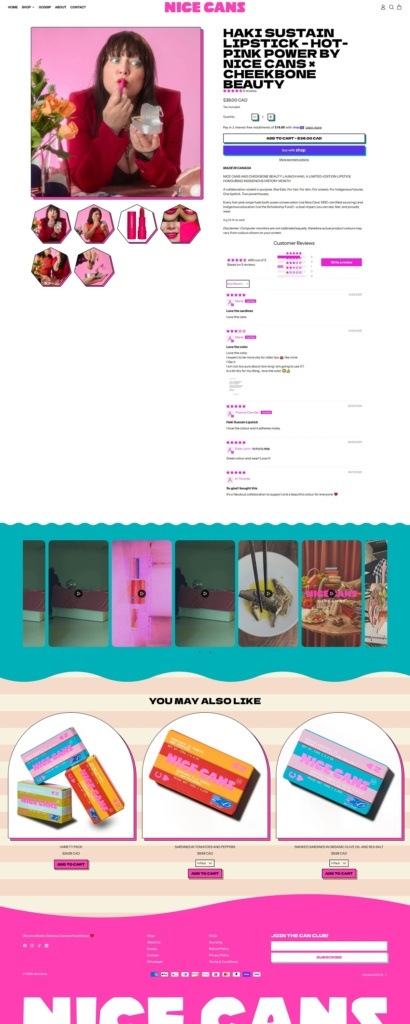
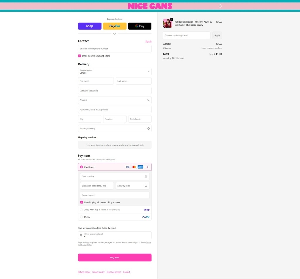
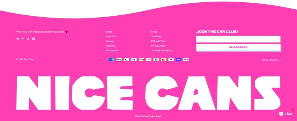
Nice Cans is a premium canned food brand offering boldly flavoured, sustainably sourced tinned seafood and other chef-driven pantry staples. The site’s design is playful and bold, with vibrant product imagery, cheeky copy, and simple navigation that puts product collections front and centre.
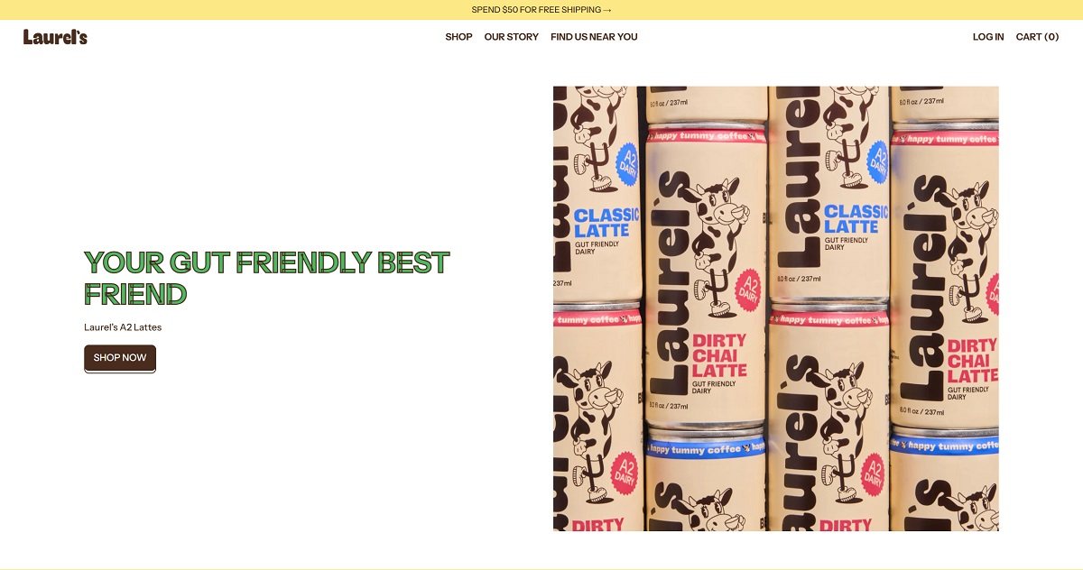
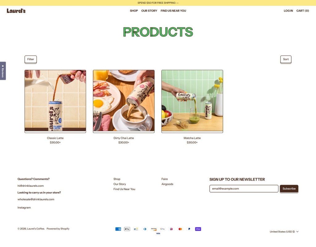
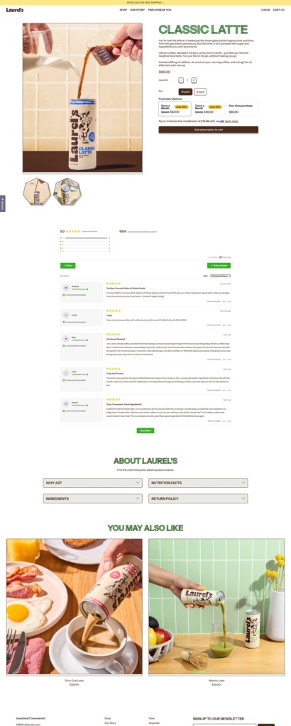
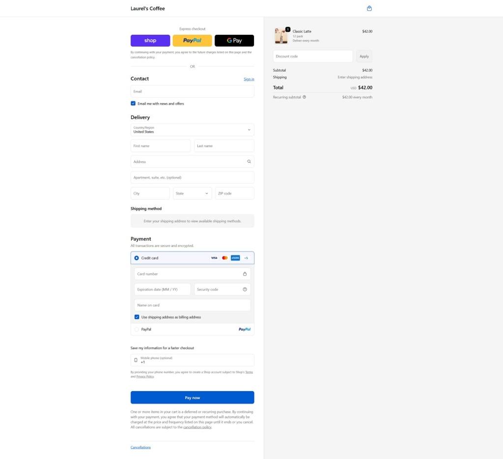
Laurels is a ready-to-drink beverage brand offering still, lightly flavoured functional drinks positioned around hydration and everyday wellness. The product range focuses on a small set of flavours presented in sleek, minimalist cans. The design aesthetic is clean and modern, using large product imagery, soft colour palettes, and a simple, shop-forward layout that keeps attention on the drinks themselves.
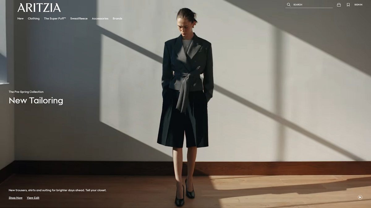
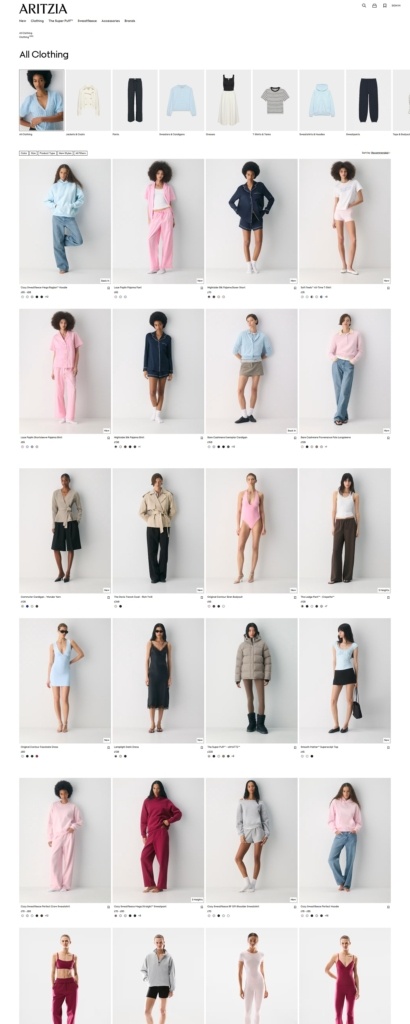
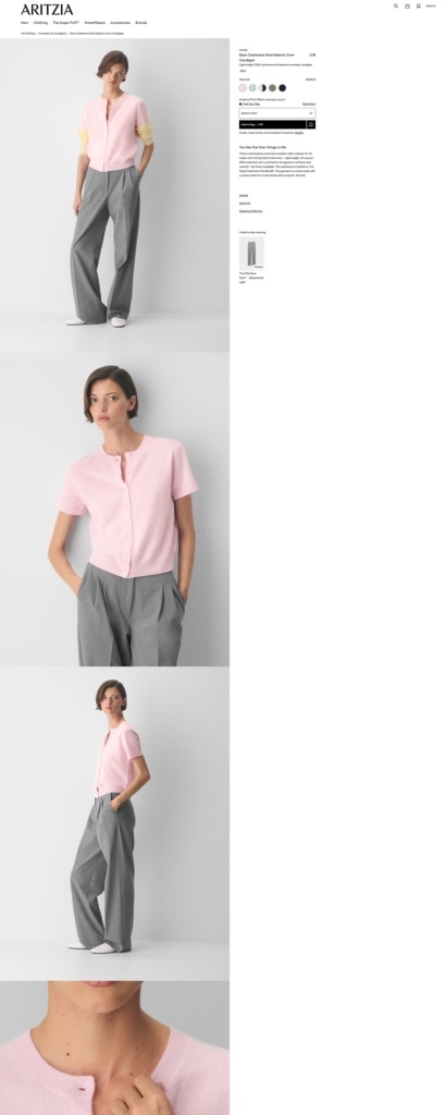
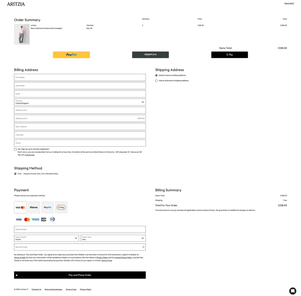
Aritzia is a women’s fashion retailer selling apparel and accessories across categories like activewear, blazers, dresses, jackets and coats, denim, knitwear, and pants, with in-house labels such as Wilfred, Babaton, and Tna alongside select third-party brands. The website design is clean and editorial, built around large product imagery and simple category-led navigation that gets visitors into product listings quickly.
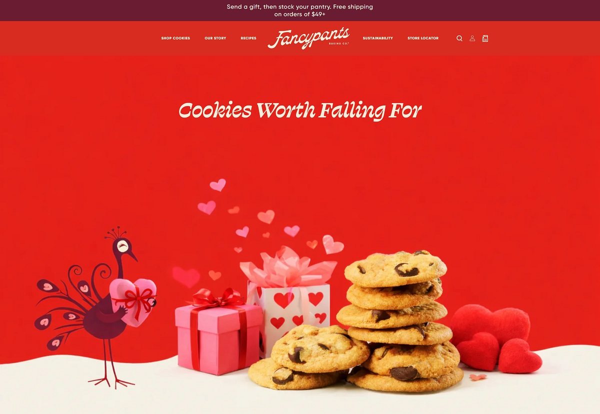
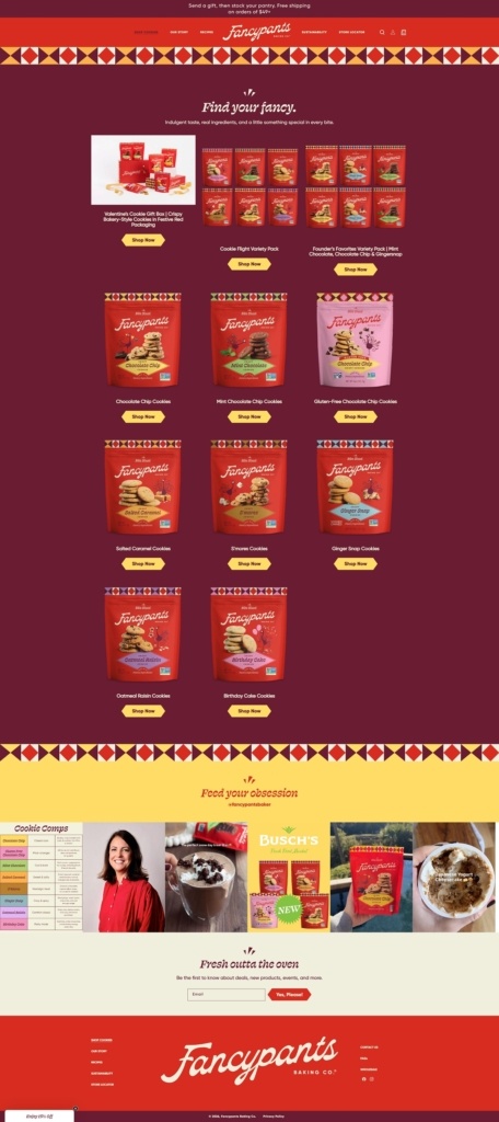
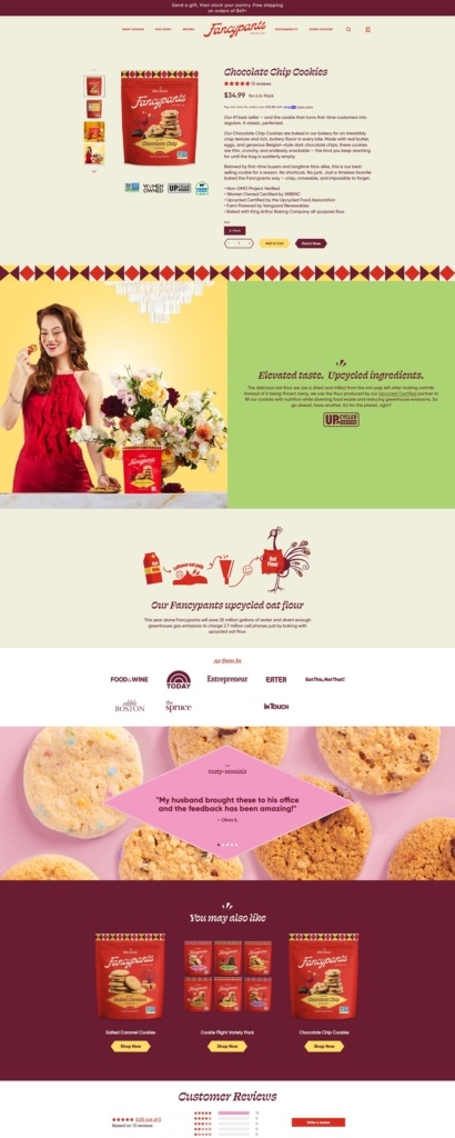
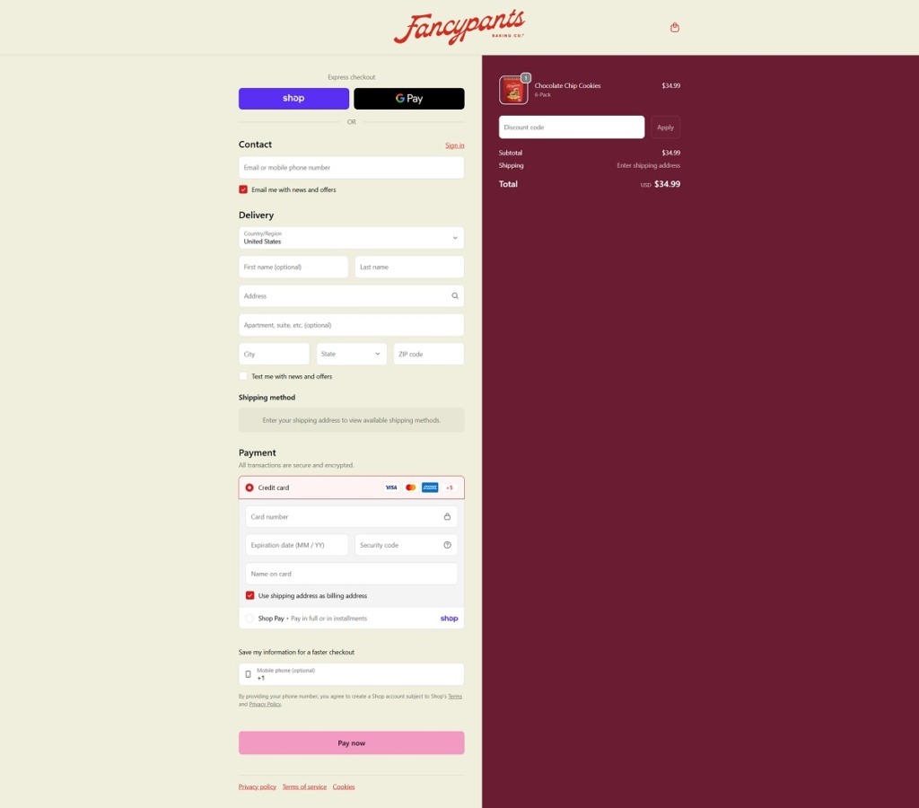
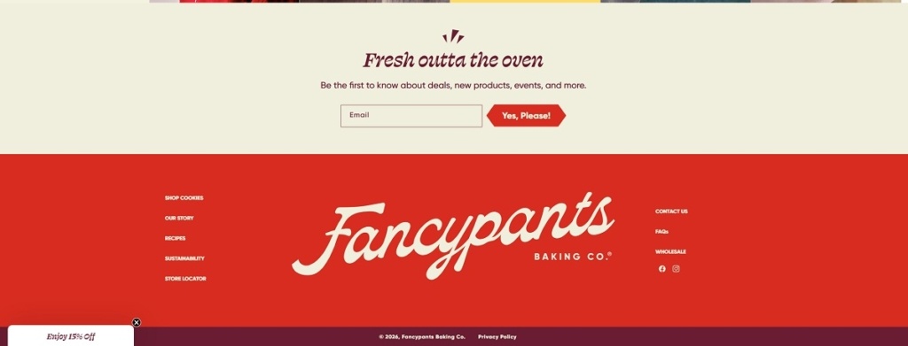
Fancypants Baking Co. sells packaged, crispy cookies in multiple flavours (like chocolate chip, salted caramel, birthday cake, and ginger snap), plus variety packs and bundles. The website design is bright and product-forward, with large pack photography, punchy headlines, and a simple shop flow that quickly routes visitors into the main cookie collections and best sellers.
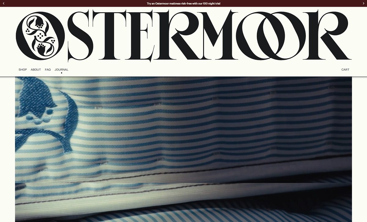
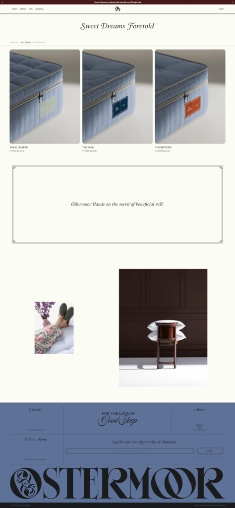
Ostermoor is an American sleep brand founded in 1853 in the Manhattan neighbourhood now called Nolita, selling three mattresses plus a down pillow, topper and duvet. The Elizabeth starts at 1,349 dollars, The Park at 2,195 and The Bedford at 3,549. The site pitches at buyers of a considered, higher end mattress rather than a budget bed in a box. Delivery is free within the contiguous United States. The store runs on Shopify with a custom theme credited to Parker Studio and built by Baggy.
Website Design
An off-white ground with four accent tones. The background is a warm off-white and text a soft near-black rather than pure black. Colour enters through a periwinkle blue for buttons and the footer panel, a deep crimson for the announcement bar and cross-sell blocks, a sand tan for detail sections and a muted sage.
A historic serif against a neutral sans. Display lines use an old style serif that renders a long s, so a mid-page line appears as “Must be an Ostermoor” with the archaic letterform in place. Untitled Sans handles navigation, prices, size labels and small body copy.
Photography split between object and interior. Mattresses are shot at a three-quarter angle on plain grounds with their coloured corner labels visible, while lifestyle imagery uses dark panelled rooms and daylight bedrooms.
Shopping Experience
A catalogue small enough to show on one screen. The shop page opens with tabs for Shop All, Mattress and Accessories, then three mattress cards with From pricing. There are no filters, because there is nothing to filter.
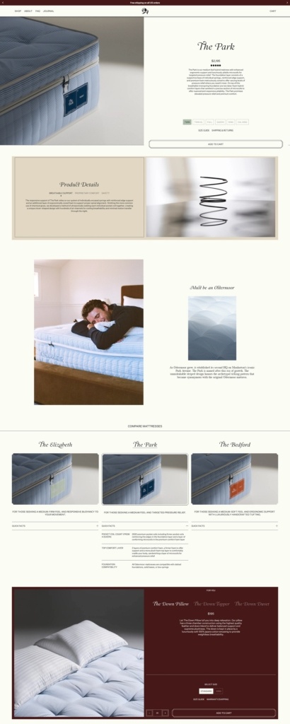
Split product pages with an inline size selector. Imagery sits left, with the name, price, star rating and a short paragraph to the right above size chips from Twin to California King. Size Guide and Shipping and Returns open as overlays, and a full width Add to Cart bar sits below.
A comparison table built into the product page. Below the details, all three mattresses appear side by side with quick facts rows on coil systems, comfort layers and foundation compatibility.
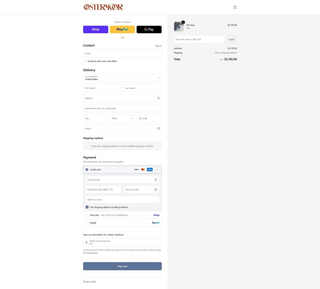
Cross-sell in a crimson panel. A tabbed block at the foot of the page switches between the Down Pillow, Topper and Duvet, each with its own size selector and Add to Cart. Checkout is standard Shopify with Shop Pay, PayPal and Google Pay across the top.
Brand Storytelling
The founding date does the work. The homepage runs the line “Doing things Differently, since 1853” and follows it with three claims: order by mail, doorstep delivery and a satisfaction guarantee from day one, and mattresses still built in America.
Press quotes instead of customer reviews. A scrolling band of pull quotes from Domino, Esquire and Architectural Digest sits where a review widget would normally go.
Notable Features
A 100 night trial with collection. Mattresses carry a 100 night trial and other items 30 nights. Returns are free, and the brand states it sends a courier and tries to donate or recycle the returned mattress.
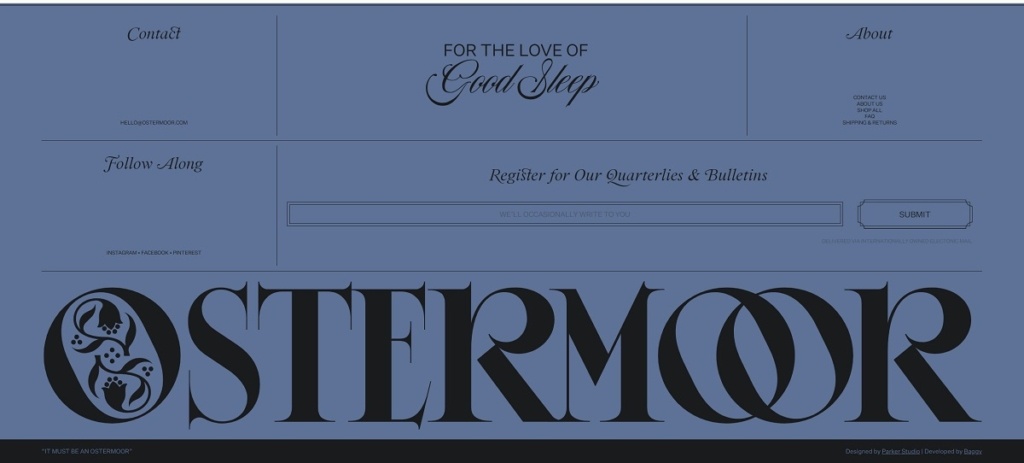
Period language carried through the interface. The newsletter is labelled Quarterlies and Bulletins, and the footer closes on the old slogan “It must be an ostermoor” above an oversized wordmark with a decorated initial.
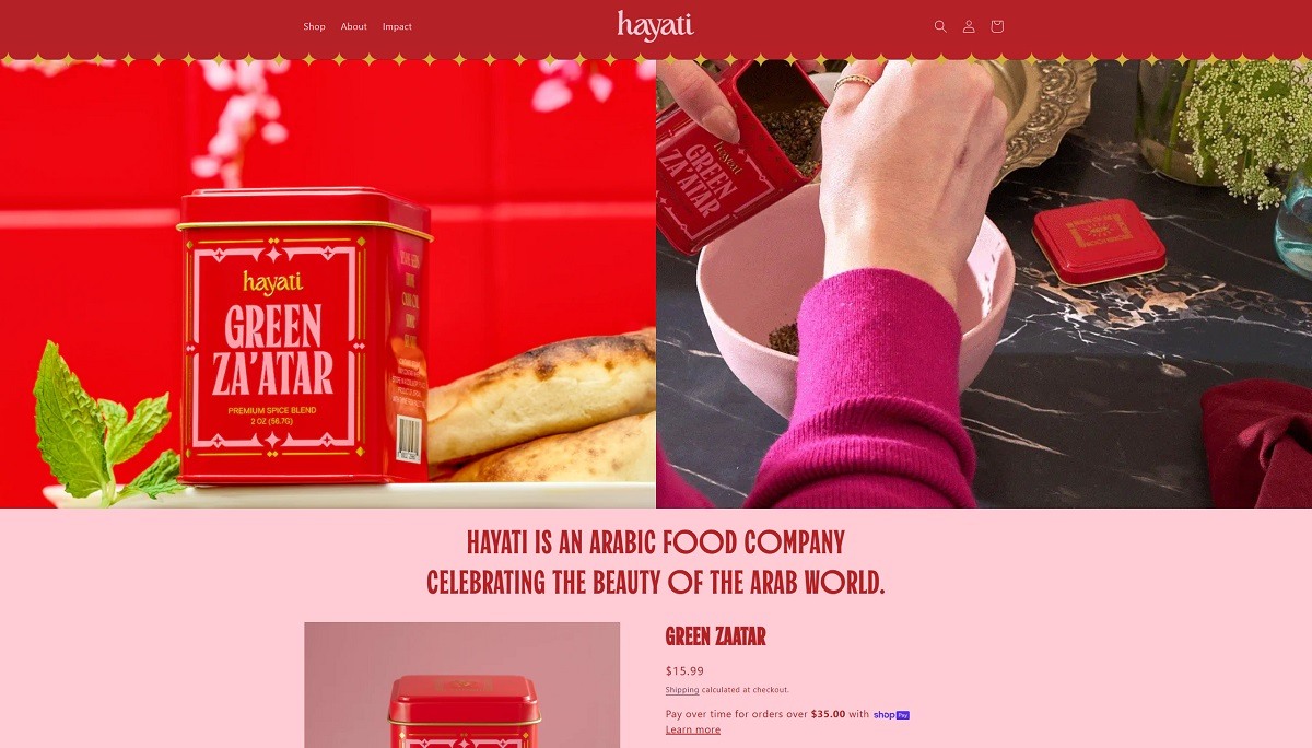
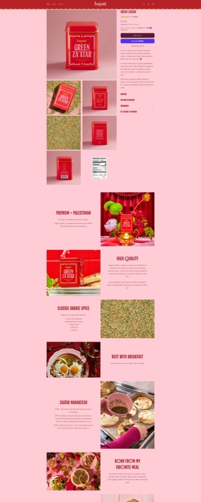
Hayati Goods sells premium Palestinian za’atar, a traditional Arabic spice blend of thyme, sesame seeds and sumac, directly from a Palestinian producer. The website design is clean and food-focused, with a simple navigation bar, large product imagery, and straightforward sections that guide visitors from cultural context into the single core product offering.
Hayati Product Page Example
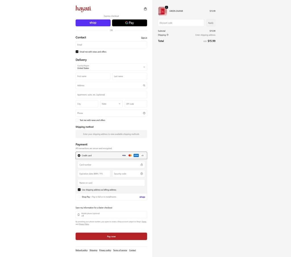
Hayati Checkout Page Example
Hayati Footer Example
Join our community for the latest trends and ecommerce tips.

 By Jibin Kumar