SVOI – an innovative space with Polish brands and Polish designers, which since 2016 brings together artists from the fashion world.
SVOI


eCommerce Websites
SVOI – an innovative space with Polish brands and Polish designers, which since 2016 brings together artists from the fashion world.
Nudie Jeans is a Swedish denim brand based in Gothenburg, Sweden founded in 2001 by Maria Erixon
So, what is Creepy Co., anyway? It’s deceptively simple! Creepy Co. is a company, but we’re also the company we keep; in essence, Creepy Co. is you! We make stuff we like for others like us. Plain and simple. Our mission is to keep plugging away at designing things, exchanging ideas, and making new friends–like you–along the way.
Act+Acre, a modern hair wellness brand that will make you think differently about the health and care of your hair.
Stickers and other things inspired by the Pacific Northwest.
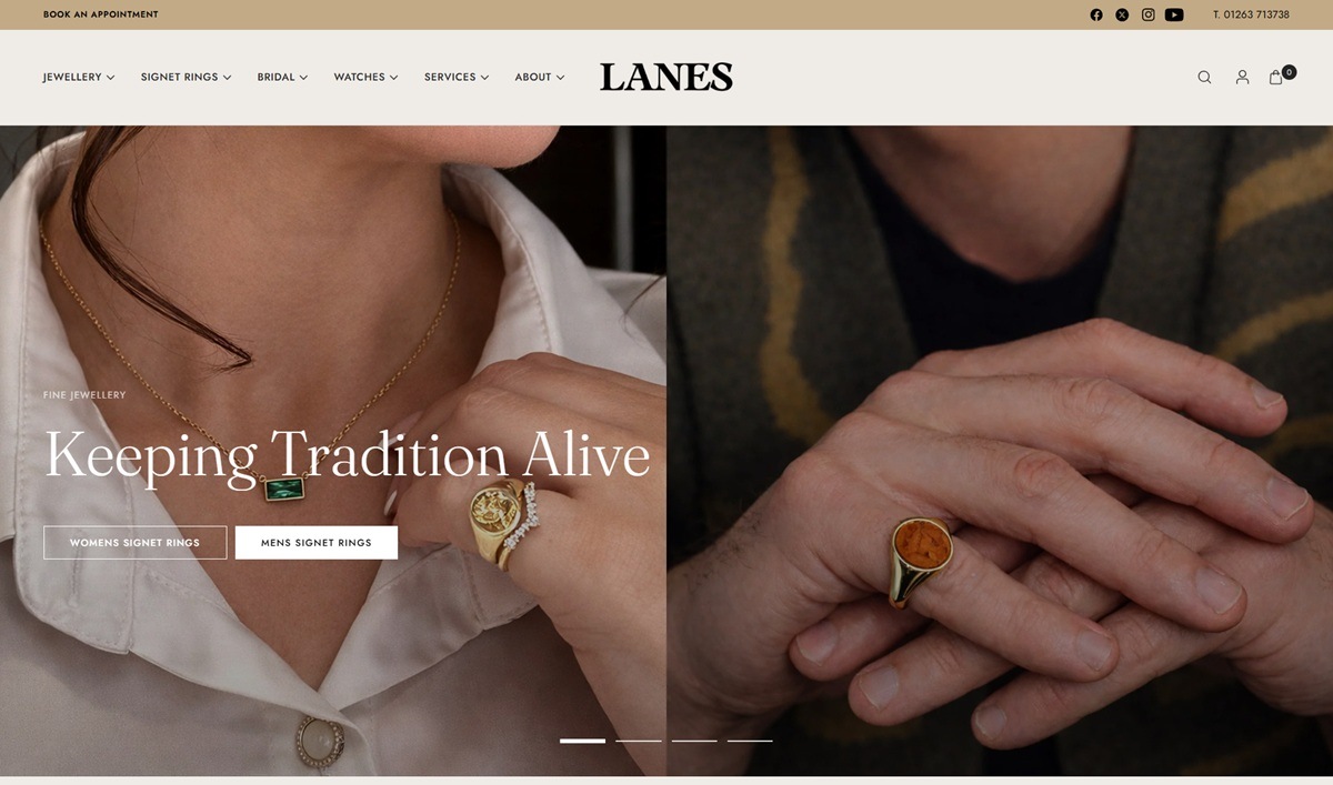
Lanes Jewellery is a family-run fine jewellery and pre-loved watch retailer based in Norfolk, England, selling engagement rings, wedding bands, signet rings, necklaces and earrings alongside pre-owned Rolex and Cartier watches. The catalogue runs from around 530 pounds for a wedding band to several thousand for diamond engagement rings, with bespoke commissions, engraving and watch repairs offered as services. The store is built on Shopify.
A cream and gold palette against black. Product pages sit on a warm cream ground close to #efebe7, with an accent gold around #c2aa86 used for the announcement bar and highlight text, while the footer switches to solid black with the same gold for headings and links.
Fraunces paired with Jost. Headings run in Fraunces, a high-contrast serif, against Jost for body copy and navigation, a pairing that reads as traditional in the display type and plain in the working text.
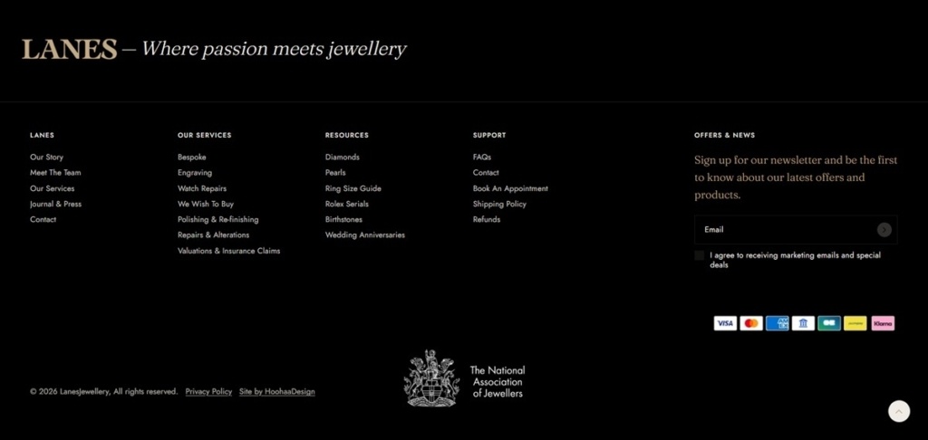
A crest in the footer, not the header. The header carries a wordmark alone, while a National Association of Jewellers crest appears low in the footer next to the “Site by HoohaaDesign” credit, keeping the trade-body signal understated rather than led with. Payment icons for Visa, Mastercard, Amex and Klarna sit in the same block.
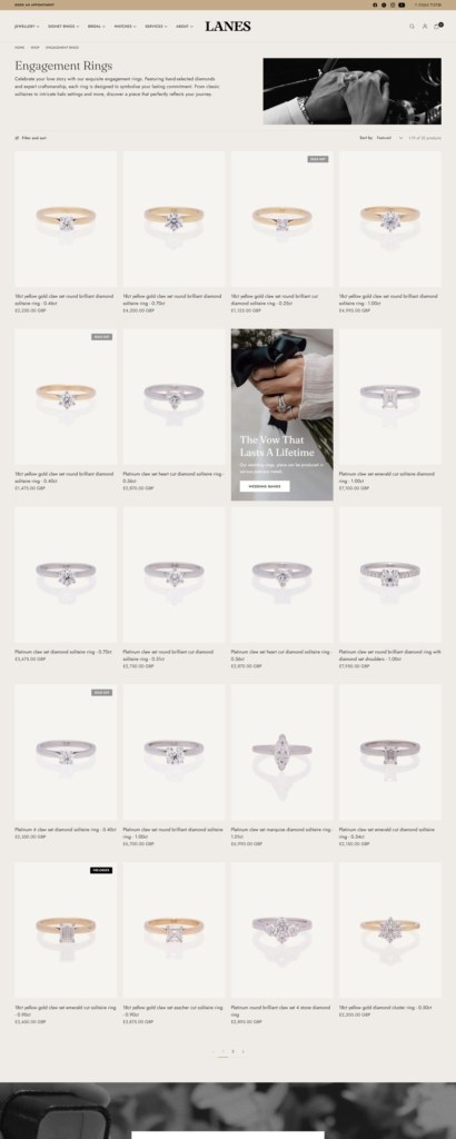
A promotional banner breaks up the grid. Inside the Engagement Rings category, a tall editorial panel reading “The Vow That Lasts A Lifetime” sits inline with the product cards rather than at the top of the page, interrupting the grid partway down.
Sale and best-seller tags on the cards. Individual rings carry small badges for sale pricing or best-seller status, layered over the product photography in the top corner of each card.
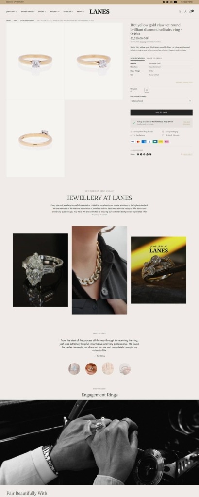
A jewellery-specific product page. Beyond the standard gallery and Add to Cart, each listing includes a ring size selector, a made-to-order note, and delivery and returns details, followed by a curated “You’ll Love” carousel of related pieces.
Heritage stated as a plain fact. The brand describes itself as family-run and dates its founding to 1981, using that history as the basis for its craftsmanship claims rather than styling.
Customer testimony sits mid-page. A quoted review appears directly below the cross-sell imagery on the product template, placed as supporting evidence for a purchase rather than confined to a separate reviews page.
Watches and jewellery share one storefront. Rolex and Cartier watch sales and repairs sit in the same navigation as the ring and necklace categories, unusual for a shop this size to carry both new fine jewellery and a pre-loved watch trade.
Booking an appointment is a persistent header action. A “Book an Appointment” link stays fixed in the header across the site, treating in-person consultation as a standing option alongside the online catalogue rather than a one-off contact-page request.
Through beautiful Swedish design, we inspire & empower people the world over, to live their best life, every day.
Energy Sistem is a Spanish consumer electronics company selling audio hardware direct to shoppers. The range covers wireless and wired headphones, Bluetooth and home speakers, sound towers, turntables, audio sunglasses, radios, media players, FM transmitters, microphones, power banks and chargers, with around 125 products listed at prices from 12,99€ for wired Urban Headphones to 149€ for the Classy Bluetooth speaker. The store runs on Shopify in Español, English, Português (portugal), Français and Italiano, under the line “Somos pura energía”.
Orange on a neutral base. The interface sits on white and near black, with one saturated orange, rgb(255, 86, 35), carrying slideshow controls, active text and promotional flags. A dusty pink, rgb(237, 190, 207), serves as an alternate button scheme.
Inter for the interface, Jost for display. Body copy, menus and product data are set in Inter, while Jost handles the larger display lines, separating the headline voice from the dense specification text below it.
Scrolling text bands. Several sections use repeating marquees rather than static headings. One runs “Innovación & Diseño” across the width, another repeats “#EmotionON”, and a third cycles three promises: “-20% BACK TO ROUTINE”, “Envío gratuito +30€ Península Ibérica” and “36 meses de garantía”.
Filtering built around specifications. The headphones listing filters on Bluetooth version, noise cancellation depth from -20 dB to -35 dB, charge time, battery life from 4 h to 100 h, output power and earphone type, plus voice assistant, FM radio, hands free calling and splash resistance, an availability toggle and a price range.
Prices shown as a pair. Discounted items carry both figures and the saving, as in “Precio de oferta 39,99€ / Precio normal 49,99€ / Ahorra 20%”. Colour options sit on the card itself, so ChicPods show Champagne, Violet, Space and Snow before the shopper opens anything.
Add to cart from the grid. Every card carries its own “+ Añadir a la cesta” button, and the drawer cart answers an empty state with “La cesta está vacía” and a Seguir comprando link.
A dated delivery estimate in the buy box. The product page prints an estimated delivery window beside the loyalty points line, then three reassurance items: 30 días de prueba, free shipping over 30€ and 36 meses de garantía.
Product pages read as spec sheets. Each runs Descripción de producto, then Características destacadas as a bullet list, then a Más funciones strip of short labels such as “25W power” and “Deep Bass”.
Sustainability given its own range. The Eco Audio section states that every product in it is made “con maderas procedentes de bosques sostenibles y materiales 100% respetuosos con el medioambiente”.
AuraConnection and MagnetLink. Aura speakers pair up to 100 units into one system, and the smaller AuraPulse clips magnetically onto the side of the larger AuraBeat for transport.
Club Energy Sistem. A loyalty programme offering a welcome gift, discounts, promotions and prize draws, with points per purchase surfaced inside the product page.
A support layer beside the shop. The footer carries Servicio Técnico, Firmwares, Manuales, FAQs, warranty terms, a downloadable catalogue and a dealer area, alongside the ESmart Connect app for touch control and equaliser settings.
Our company was born out of a passion for sharing amazing coffee, and this passion continues to drive us today.
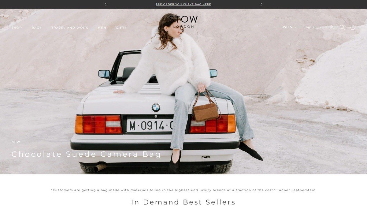
STOW London is a British luxury brand offering handcrafted bags and accessories, such as the Curve Bag and Hester Essentials Case, made in Spain. Their website features a clean, intuitive design, showcasing products with high-quality imagery and detailed descriptions, providing an engaging and user-friendly shopping experience.
Sourcing the finest artisan cheeses. Hand cut & delivered without hassle. From your weekly staple, gifts to friends or a wedding cheese, we can help.
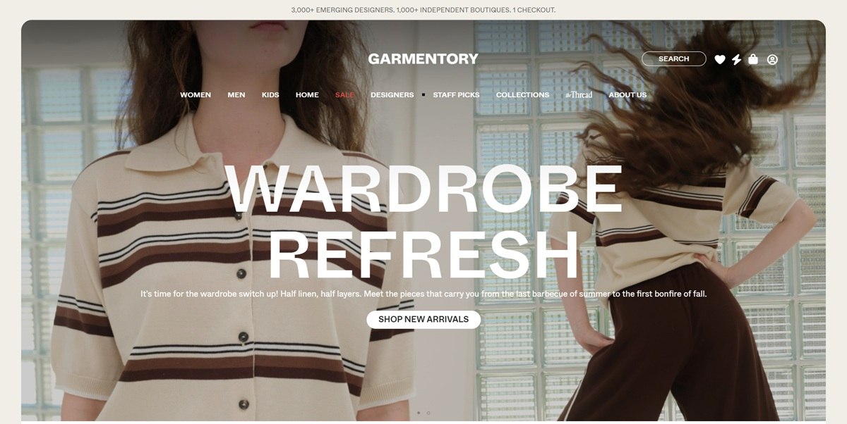
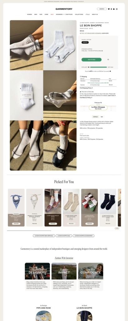
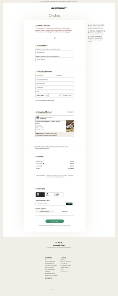
Garmentory is a fashion marketplace that aggregates roughly 3,000 emerging designers and 1,000 independent boutiques into a single storefront, selling women’s, men’s and kids’ clothing plus home goods through one checkout even though items ship from different sellers. Editorial content runs under a section called The Thread, and a rewards program returns 3 percent of purchases as store credit.
Whyte paired with Cardinal Fruit. Headings and interface text run in Whyte, a grotesque sans available in Medium, Book and an inktrap-cut display weight, while Cardinal Fruit, a serif, appears in an italic cut for editorial or quote treatment.
A market-stall palette. The site pairs a near-black charcoal and a warm off-white cream as its base with three accent colors used across badges and categories: a forest green, a brick terracotta and a mustard gold, giving the multi-brand catalogue a consistent but not overly branded frame.
Editorial modules over a rigid grid. The homepage is organized by department, Women, Men, Kids, Home, but interleaves Staff Picks, named collections such as Fall Home Refresh and Trail Mix, and customer testimonials, closer to a curated magazine layout than a single product grid.
One cart across many sellers. The defining mechanic, stated directly on the site, is “3,000+ emerging designers. 1,000+ independent boutiques. 1 checkout,” letting a shopper combine items from different vendors into one order despite each boutique handling its own fulfillment.
Rewards paid in store credit. A Garmentory Rewards program returns 3 percent of every purchase as credit, with additional bonuses when a purchase leads to referred sales, folding a referral incentive into ordinary shopping.
Discovery over search. Collections such as Fall Home Refresh and What We’re Loving suggest the shopping path leans on curated groupings and staff selections to surface products across thousands of small sellers, rather than a single deep category tree.
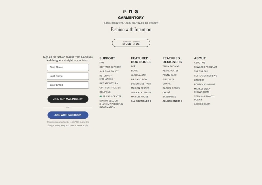
Fashion with Intention. The stated tagline frames the marketplace around supporting independent designers and boutiques, with messaging on sustainability and diversity threaded through the homepage rather than confined to an About page.
The Thread as an editorial layer. A dedicated content section, The Thread, sits alongside the shopping navigation, giving the marketplace a magazine component distinct from its vendor directory.
Boutique registration built into navigation. The footer carries a path for boutiques to register alongside the standard shopper-facing links, FAQ, shipping, returns, acknowledging the two-sided nature of the marketplace.
Featured boutique and designer directories. Beyond product collections, the footer and homepage separately surface featured boutiques and featured designers, letting shoppers browse by seller rather than only by category.
Career and legal links share the footer. Standard legal pages, privacy, terms, sit next to job listings, a detail consistent with a platform business rather than a single retail brand.