We believe that people want hard-to-find things that have a factual romance about them. Things that make their lives the way they wish they were.
The J. Peterman Company


eCommerce Websites
We believe that people want hard-to-find things that have a factual romance about them. Things that make their lives the way they wish they were.
Beyond product, La Ligne delivers playful, intelligent content that inspires.
A list of ever-growing list of products, plugins, software and resources for all types of business.
We make modern shoes for the modern woman: Ballerina flats handcrafted of Italian leather, and designed for the perfect fit.
Curve-friendly tops, bottoms and dresses.
Period products for people that believe in the power of their choices.
We sell sneakers! Nike, Adidas, Jordan, Vans, Puma, Converse, we’ve got it all.
Sharing inspiration for the home and garden.
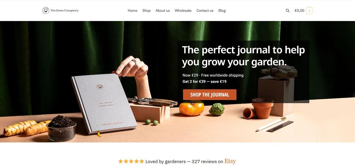
The Green Conspiracy sells a clothbound garden journal, printed in English and German editions, plus a two-pack bundle, a vegetable-pairing poster and small accessories like an enamel pin and a woven patch. The journal is positioned for apartment and urban gardeners planning edible growing seasons, priced from about 2 to 39 euros with running discounts on most items. The store runs on WooCommerce.
IBM Plex Sans over a white ground. Headings and body copy run in IBM Plex Sans, a technical grotesque, set against plain white pages with a charcoal (2f2e30) footer as the only large dark block on the site.
Red-orange as the single accent. A terracotta red-orange (c55527) marks every discount badge, the Add to Cart button and the checkout’s Place Order button, while sale prices themselves are shown in green rather than red.
Flat-lay product photography. The journal is photographed from above on a styled desk with tea, biscuits, a ruler and pencils in frame, hands holding the book open, rather than isolated on a plain background.
Percentage-off badges on nearly every product. The shop grid shows a red circular badge (43%, 15%, 21% or 33% off) on five of six products visible, with the original price struck through beside the discounted one.
A numbered feature list on the product page. The Pack of 2 Garden Journal page explains the product through seven numbered points, covering the annual planting calendar, monthly calendar, plant profiles, tips section, design space, notes pages and a section for journaling comments.
Material specifications as a bullet list. Below the feature list, a Details section gives A5 size, 200 pages, lay-flat sewn binding, 100g recycled paper, sewn clothbound hardcover, a bookmark and printing in Germany with offset ink on renewable and vegetable-based inks.
A three-step checkout with Link fast pay. Checkout shows Shopping Cart, Shipping and Checkout, and Confirmation as a progress bar, with a green “Pay securely with Link” option above the standard card fields.
Sustainability stated as a closing line, not a section. After the specifications, one sentence states the product is “100% recyclable and even compostable” and that the company aims to keep improving its environmental credentials, rather than a dedicated sustainability page linked from the product.
The problem framed before the product. The description opens by naming what the journal solves, removing the guesswork from gardening, before listing what the book contains.
Two related-product rows on one product page. A “Related products” carousel and a separate “Customers also bought” row both appear below the description, the first staying within Garden Journals, the second crossing into the poster category.
Out-of-stock badges left visible. The Woven Patch tile displays “Out of stock” directly on the product card rather than being hidden from the grid.
Wholesale as a top-level nav item. Wholesale sits in the main menu between Shop and Contact Us, alongside a matching link in the footer, addressing bulk buyers directly rather than through a hidden page.


AUrate aspires to break the rules of the status quo and infuse substance into the world of jewelry, both in terms of materials and meaning.
We make supplements from real food. No chemicals, no fillers—no exceptions.
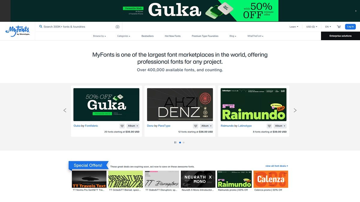
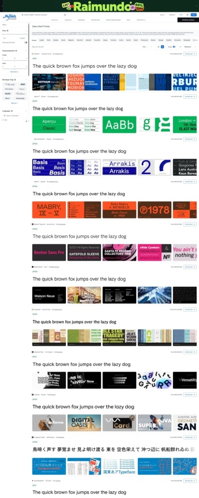
MyFonts is a digital marketplace for typefaces, serving graphic designers, branding studios, agencies, publishers, developers, and other customers who need professional fonts for commercial or personal projects. The catalog contains more than 400,000 fonts from independent foundries and established type companies, covering everything from serif and sans serif families to scripts, display faces, variable fonts, and highly specialized decorative styles. Because fonts are digital products with different usage rights, the site combines conventional ecommerce with extensive search, preview, comparison, and licensing tools.
MyFonts uses a restrained interface that keeps typography itself at the center of the visual experience. The surrounding design relies largely on neutral backgrounds, dark text, straightforward controls, and generous white space, allowing each typeface to supply its own visual character.
This is particularly important for a marketplace in which neighboring products can have radically different personalities. Instead of imposing a strong photographic art direction over the catalog, MyFonts presents type specimens, alphabet samples, promotional graphics, and editable previews as the primary imagery. Product grids consequently feel closer to a visual type library than a traditional retail catalog.
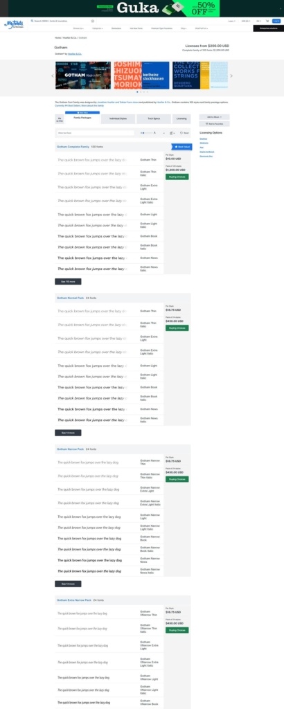
Typography is naturally used at multiple scales throughout the interface. Functional navigation and metadata remain comparatively understated, while font names and specimen text receive considerably more space. Product family pages expand this approach with large previews designed to demonstrate how a typeface performs rather than simply showing a static thumbnail.
The overall layout is information-heavy but modular. Product cards, filter panels, specimen areas, tabs, pricing controls, and licensing information are visually separated, helping organize a catalog whose individual products can contain dozens or even hundreds of styles.
Discovery is one of the most important parts of the MyFonts experience. Customers can search directly for a font or browse through categories, tags, foundries, styles, languages, and use cases. The dedicated font finder offers unusually granular filters covering price, font style, language support, foundry, weight, width, x-height, contrast, slant, and advanced typographic features such as ligatures, alternates, fractions, kerning, and shaping.
Visitors can also type their own text into previews, making the browsing process more practical for designers evaluating a font for a specific wordmark, headline, or project. Categories and tags extend beyond traditional typographic classifications into aesthetic and contextual searches such as logo fonts, editorial styles, particular historical periods, moods, cultural references, and professional applications.
Font family pages organize individual styles alongside family-package options. Customers can inspect glyphs, technical information, available weights and styles, and licensing before purchasing. Favorites can be saved into Albums, providing a useful comparison and shortlisting system during longer research sessions.
The conversion flow differs from physical ecommerce because selecting the product is only part of the purchase decision. Buyers must also choose the appropriate license.
MyFonts largely lets the type designers and foundries supply the personality of the marketplace. Individual family pages identify the foundry and present specimens that show each typeface in context, while foundry pages provide another way to browse related releases.
The site’s own tone is comparatively functional. Rather than building an elaborate lifestyle narrative around typography, it emphasizes breadth, discoverability, experimentation, and practical licensing information. This makes the platform feel more like a specialist design resource than a highly curated boutique.
Licensing is one of the site’s most distinctive ecommerce components. Depending on the font, customers can choose between uses such as Desktop, Company Desktop, Webfont, App, Electronic Document, Digital Ad/Email, and Server licensing. Explanations describe the intended use of each option directly within the purchase flow, while more detailed licensing information and EULAs remain accessible for customers who need them.
MyFonts also integrates AI-assisted font search alongside its conventional filters, giving users another route when they know the visual result they want but not the name of a suitable typeface.
Editable specimen text, detailed glyph views, extensive visual-property filters, Albums, sale pricing, family packages, and licensing controls turn what could be a simple download store into a specialized product-discovery system. The ecommerce design is therefore shaped less around imagery and lifestyle merchandising than around helping users evaluate, compare, license, and purchase typography with a high level of specificity.