Ed quickly found Mark King, a man who understood the business side of beer and liquor better than anyone around. In 2012, Ed and Mark produced their first cider, Gold Top. With each new release, they brought more newly-minted cider drinkers into the fold. To keep up with demand, they built a brand new, state-of-the-art facility in Southeast Austin, where most of Austin Eastciders is made today.
It’s that classic story of friends from high school who fall out of touch, reconnect while working at a craft beer bar and a speciality wine store in New York City, and eventually decide to open a wine bar that leads into a line of eating and entertaining essentials.
Molekule’s unique technology completely destroys all indoor pollutants instead of just collecting them on filters, bringing truly clean air into your home
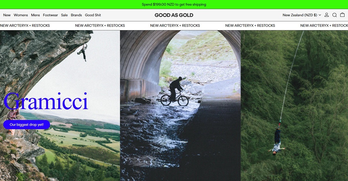
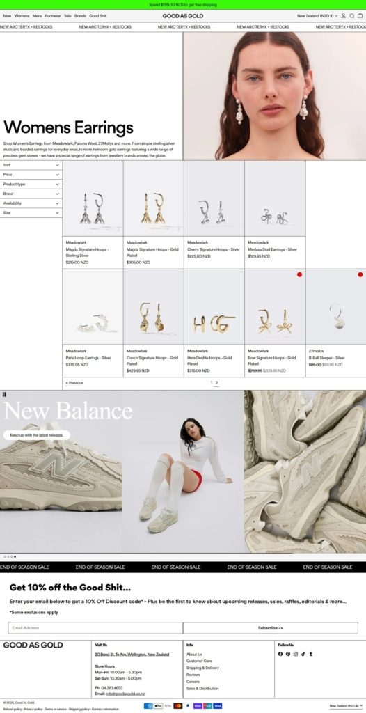
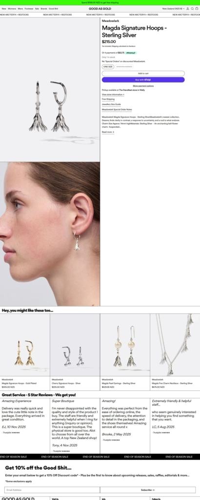
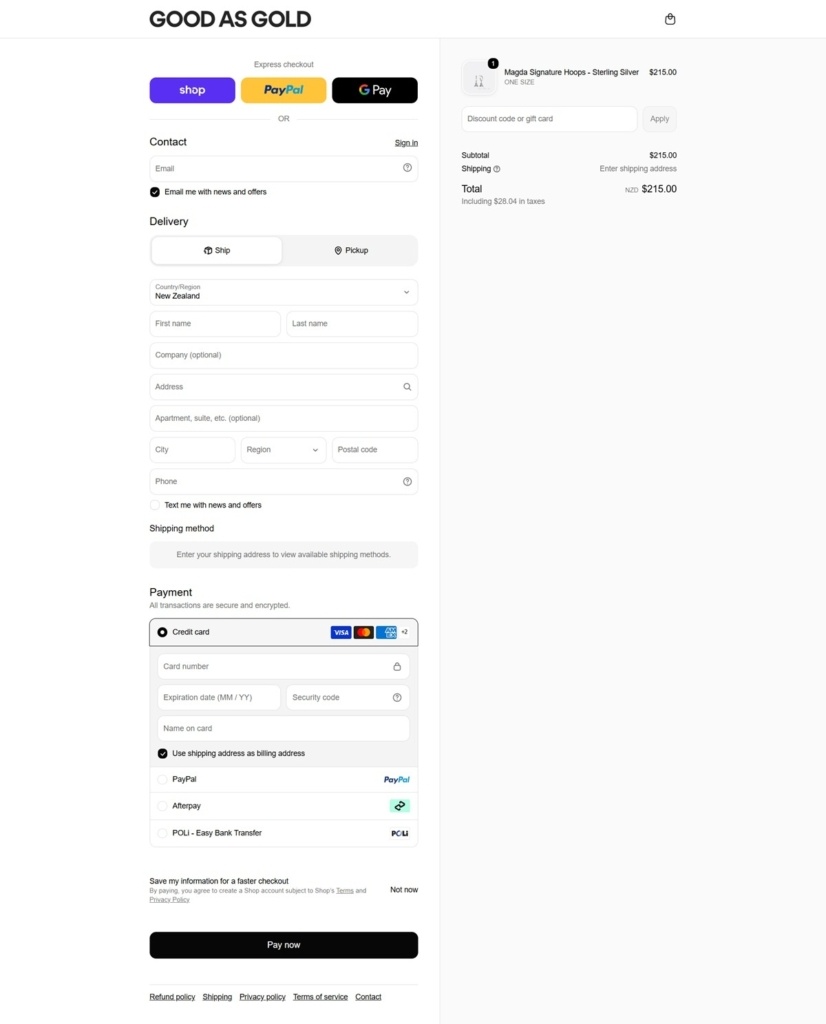
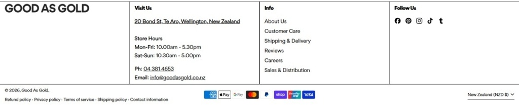
Good As Gold is a New Zealand multi-brand streetwear and fashion retailer, stocking footwear, clothing, accessories and jewelry from more than 50 labels including New Balance, VEJA, Nike, Salomon, Patagonia and Brain Dead, organized by category and by an alphabetical brand directory. The homepage states “Down to earth, creative people peddling exceptional service and product in store and online,” framing the business as a hybrid of physical shop and web store. Pricing runs in NZD, with free shipping over $199.00 NZD to shoppers in more than 25 countries. The site is built on Shopify.
Website Design
A neon, high-contrast palette. The site defines several color schemes rather than one fixed brand color: a bright green accent (RGB 58, 250, 8) on white, a lime green (RGB 0, 255, 0) on black, a magenta accent (RGB 213, 31, 249) with a lime secondary (RGB 160, 249, 31) on black, and a pale mint background (RGB 201, 252, 207) with a deep purple text color (RGB 130, 4, 145).
A single custom sans, weighted for hierarchy. Body and heading type runs on the Gordita family, used across Regular, Medium and Black weights rather than mixing in a separate display face, so hierarchy comes from weight and the neon color scheme rather than a second typeface.
Section-based color switching. Because color is set per section through named schemes rather than a single site-wide palette, different parts of the same page can flip between black, white and the neon accents, giving the homepage a poster-like, collaged feel.
Shopping Experience
Three ways to browse. The main navigation splits into gender (Womens, Mens), product type (Footwear, Clothing, Accessories, Jewelry, Lifestyle) and a dedicated Brands directory running alphabetically from A to V.
A Mindful filter for sustainable picks. Alongside New Arrivals and Sale, a “Mindful” shopping mode surfaces items with sustainability credentials, giving shoppers a filter beyond the standard category and brand structure.
Shipping threshold stated up front. “Spend $199.00 NZD to get free shipping” appears on the homepage, with featured products generally priced between roughly $189 and $279 NZD.
Brand Storytelling
Reviews as the headline trust claim. The site leads with “Hundreds of 5 Star Reviews ~ We got you!” rather than a founder narrative, putting customer volume ahead of brand history.
Brand-level storytelling within the shop. Individual labels get their own framing on the site, for example CANDICE is introduced around “Creativity, Exploration and Enjoyment,” letting each stocked brand carry its own short pitch inside the wider store.
Notable Features
A “Good Shit Map.” The homepage references a named map feature, pointing to physical locations or recommended spots tied to the brand rather than a standard store-locator page.
A Last Pairs clearance section. Rather than a generic Sale tag, footwear markdowns are grouped under a specifically named “Last Pairs” section.
New-drop callouts by brand. The homepage promotes specific incoming ranges by name, such as a new Gramicci pants collection and Patagonia seasonal arrivals, rather than a single undifferentiated new-arrivals feed.
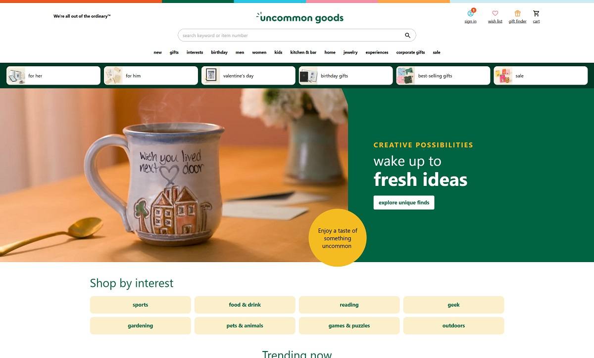
Uncommon Goods is an online marketplace offering a curated selection of unique, creatively designed products that meet high standards for design, social responsibility, and environmental friendliness. Their website features a clean, user-friendly interface with intuitive navigation, high-quality imagery, and detailed product descriptions, providing a seamless shopping experience.
Cards Against Humanity is a party game for horrible people. Each round, one player asks a question from a black card, and everyone else answers with their funniest white card.
Goodwell Co. was created to offer sustainable alternatives to the plastic oral care products that are sold by the billions every year and go un-recycled, only to end up in landfills. Our mission is to create 100% natural, subscription-based, sustainable products, systems, and technologies that raise environmental awareness and empower people to make choices that help protect and preserve the planet today, while also providing mouths with healthy tools.
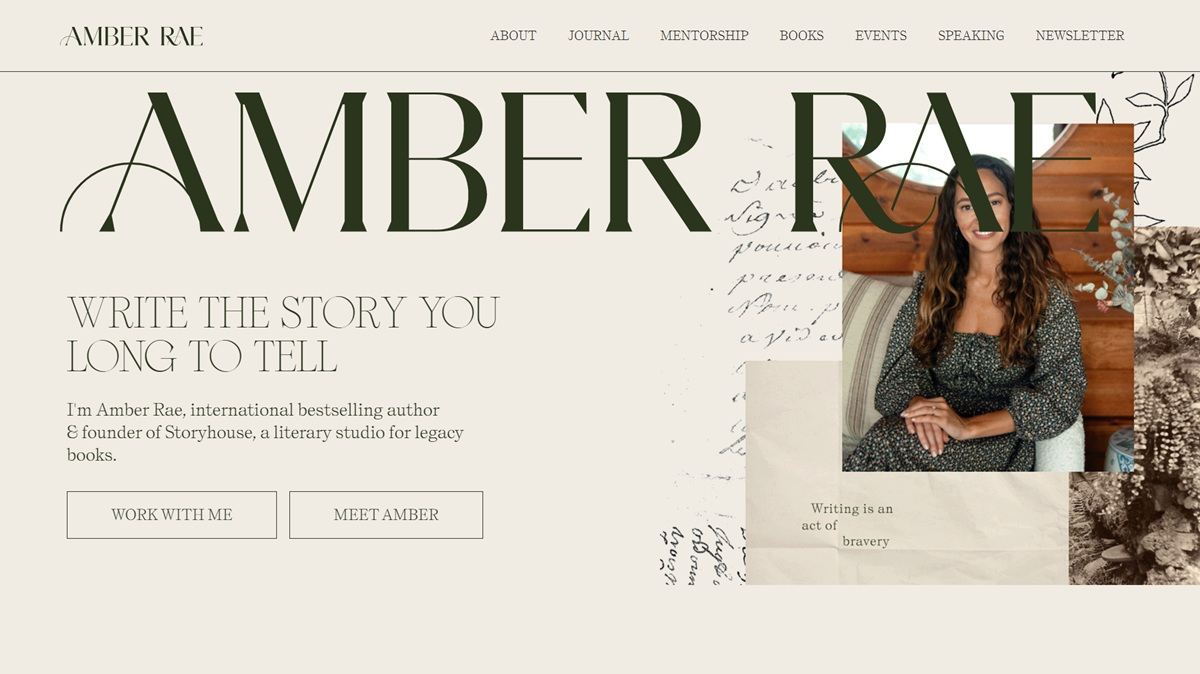
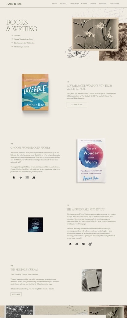
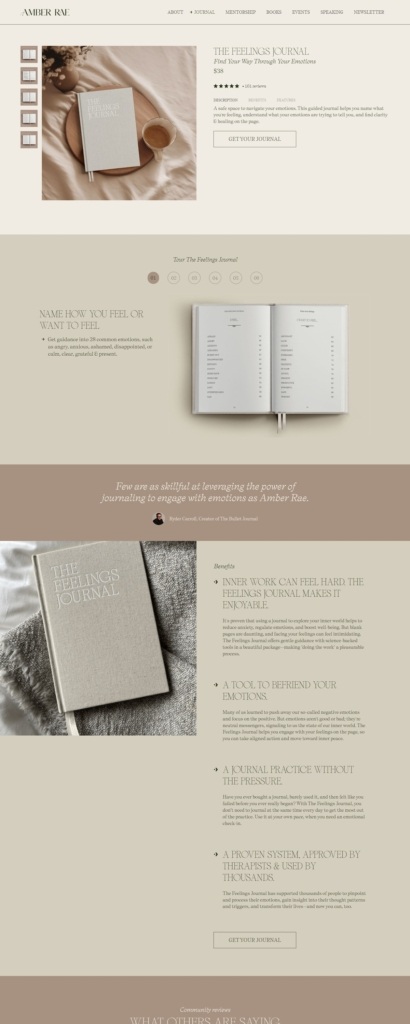
Amber Rae is an author and founder of Storyhouse, described on the site as “a literary studio for legacy books.” The site’s own commerce is narrow: her memoir Loveable links out to Amazon, Barnes and Noble and Bookshop.org rather than selling in-site, while The Feelings Journal, a guided journal, is sold directly through an on-page cart. Mentorship and speaking services round out the offering. Built on Webflow, with a Shopify-powered cart embedded on the journal’s product page.
Website Design
Two typefaces doing two jobs. Large headings run in a custom serif called Sometimes Times, set uppercase, while subheadings and smaller labels switch to an italic sans called Self Modern Web, splitting the page into a literary display voice and a softer, handwritten-feeling secondary voice.
Earth tones on the product page. The Feelings Journal page moves away from a neutral site-wide look into dark olive, taupe and cream, echoing the journal’s own linen cover and cream paper stock.
A tour instead of a spec sheet. Rather than a single features list, the journal page runs a numbered six-step tour walking through what the journal does, mixing product photography with short explanatory copy at each step.
Shopping Experience
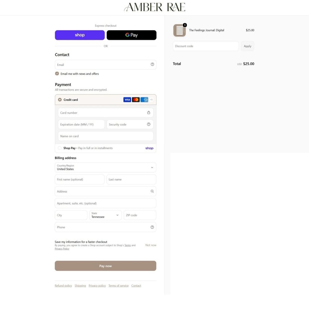
One product, one cart. Of everything on the site, only The Feelings Journal has an Add to cart button and an on-page checkout path; the books route to third-party retailers instead.
Price and reviews together. The journal is priced at 38 dollars, shown beside a count of 101 reviews directly under the product name, putting social proof next to the price rather than lower on the page.
Description, Benefits and Features as separate tabs. The product page splits its copy into three tabbed sections rather than one long block, letting a shopper choose between the pitch, the stated benefits and the physical specifications.
Brand Storytelling
A stated mission line. The site’s tagline, “Write the story you long to tell,” frames both the mentorship business and the journal as tools toward the same goal.
Manufacturing told as part of the story. The journal’s description states it was “Created in Topanga, designed in Atlanta and published in Toronto by an all women team,” turning production detail into part of the brand narrative rather than fine print.
Legacy books as the throughline. Storyhouse mentorship, the memoir and the journal are each positioned around the same idea of turning personal experience into a finished, shareable work.
Notable Features
Full material specifications on the product page. The journal listing states 256 pages of 120 gsm cream paper, a hardcover bound in 100 percent linen fabric, flat lay binding and two satin ribbon bookmarks, with exact page dimensions given.
A mixed commerce model. The site combines a direct, on-brand checkout for one flagship product with affiliate-style links out to major retailers for the book, rather than using one method across the whole catalogue.
28 named emotions as a content hook. The journal’s copy promises guidance into 28 named emotions, used repeatedly across the page as a concrete, countable feature rather than a vague wellness claim.
Amber Rae Shop page example
Amber Rae Product page example
Amber Rae Checkout page example
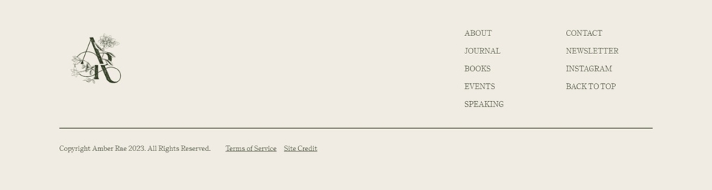
Amber Rae footer example
Join our community for the latest trends and ecommerce tips.