Find a cause you’d like to support and shop from their fundraiser page, or shop first and then choose a fundraiser.
Boon Supply


eCommerce Websites
Find a cause you’d like to support and shop from their fundraiser page, or shop first and then choose a fundraiser.
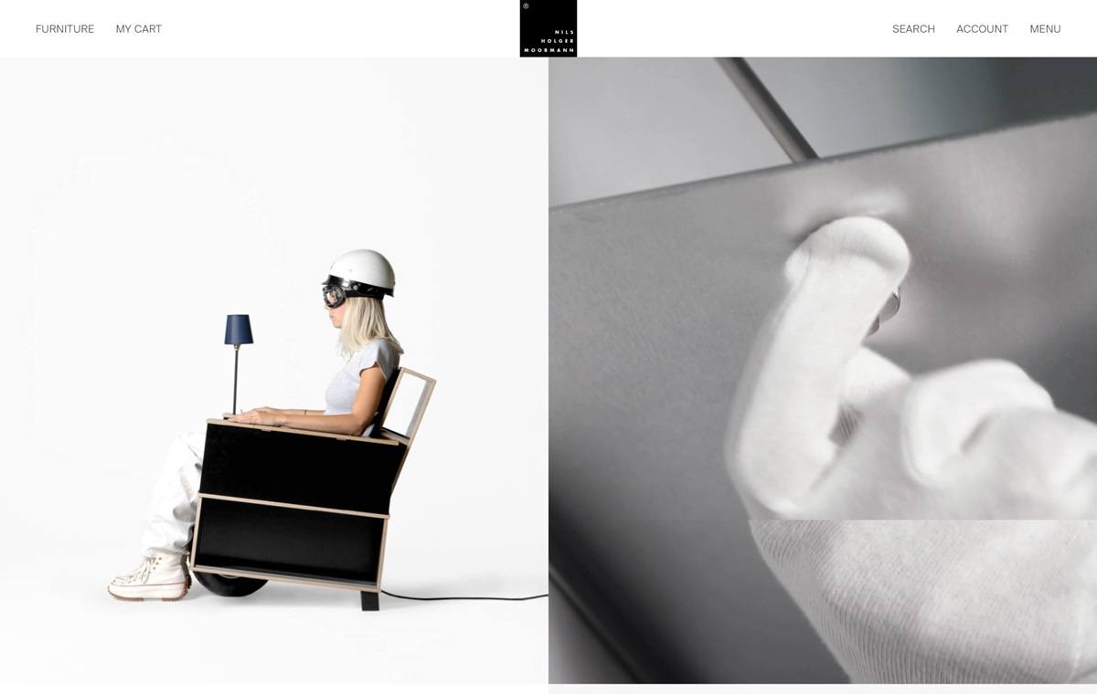
Nils Holger Moormann offers minimalist, innovative furniture designs, such as the FNP shelving system and the Egon table, emphasizing functionality and simplicity. Their website features a clean, intuitive design, showcasing products with high-quality imagery and detailed descriptions, providing an engaging and user-friendly experience.
Editions is the selected artwork of Jordan Sowers, a multidisciplinary artist living in Portland, OR.
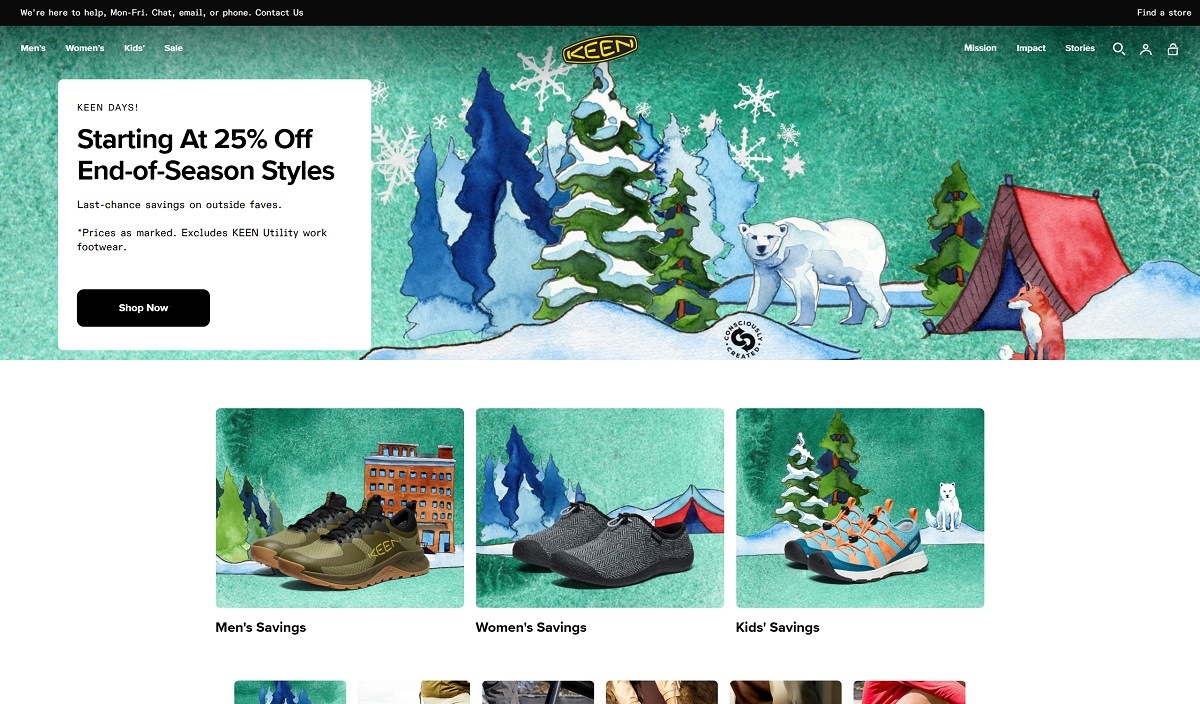
KEEN Footwear is an American company specializing in durable, high-performance shoes, boots, and sandals for outdoor enthusiasts. KEEN is known for innovative designs like the Newport sandal, which features a protective toe bumper. The brand emphasizes sustainability through its “Consciously Created” approach, focusing on environmentally friendly materials and manufacturing processes. Their website offers a user-friendly interface with intuitive navigation, high-quality imagery, and detailed product descriptions, providing a seamless shopping experience.
bonvelo is a German bicycle brand selling minimal singlespeed and urban bikes on a two-model range: the steel-framed BLIZZ at 399 euro, reduced from 449, and the aluminium RAKEDE at 549 euro, reduced from 649. Refurbished pre-owned bikes, accessories, spare parts and gift vouchers fill out the catalogue, and the shop ships to eight European countries in euro. The site is German-language. Built on Shopify.
Space Grotesk over Liter. Headings and subheadings are set in Space Grotesk, body and accent text in Liter. Both are contemporary sans faces, so headline and paragraph stay close in tone.
Section schemes instead of one palette. Backgrounds cycle through white, a near-black rgb(18, 18, 18), a lavender rgb(179, 136, 235), a pale lilac rgb(226, 200, 243) and a coral rgb(252, 116, 119). The primary button is a lime rgb(218, 255, 125) carrying near-black text, and it is the strongest single colour on the site.
Short copy against large photography. The hero states Weniger Bike. Mehr unterwegs. above one supporting line, and a lifestyle carousel captions itself in lower case fragments such as durch die Stadt and kurz zum kiosk.
Both bikes buy from the homepage. Each model appears as a full buy box inside the homepage flow, with colour and size selectors, price, sale comparison and an add to cart button, so a bike can be configured without reaching a product page.
Faceted filtering on the catalogue. The products page filters by availability, by a price slider topping out at 549 euro and by a long product type list running from batteries and brakes through bottom brackets, chains, bells, cranksets and wheels.
Fulfilment promises under the button. Three lines sit directly beneath add to cart: delivered 80% pre-assembled, arriving in two to four working days, and a two year manufacturer warranty.
Sizing written as advice, not a chart. The size table is followed by a note on what to do between sizes, explaining that the smaller frame rides more sporty and compact and the larger one more upright, and recommending the larger.
Positioned against maintenance. A homepage heading addresses people who would rather ride than turn a wrench, and the FAQ backs it with the argument that a singlespeed has no derailleur and little to service beyond chain, brakes and tyres.
Everyday use rather than sport. Copy names the commute, the university run, the errand and the evening loop, keeping the bikes inside daily routine instead of performance riding.
A refurbished line sold beside the new one. Pre-owned BLIZZ and RAKEDE models are listed at 358.99 euro and 518.99 euro with the same colour, drivetrain and size options as the current bikes.
Spare parts stocked as a real catalogue. Brake pad sets at 4.99 euro, belts, batteries, forks and tools sit under their own menu, which gives the low-maintenance claim something concrete behind it.
Region and currency switching. Belgium, Denmark, Germany, France, Luxembourg, the Netherlands, Austria and the Czech Republic are each selectable, and a Standort page in the top navigation points at a physical location.
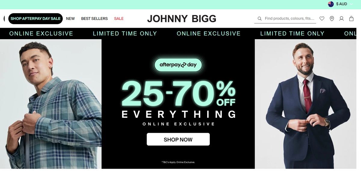
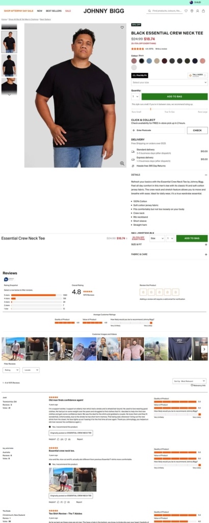
Johnny Bigg is an Australian menswear retailer built around extended sizing, covering regular sizes to 10XL and a dedicated tall range from LT to 5XLT. The catalogue runs tees, shirts, denim, chinos, suiting, outerwear, shoes and accessories, aimed at men who struggle to find fitted clothing through mainstream retail. The brand backs the range with 365-day returns, two-hour click and collect, and more than 57,000 customer reviews.
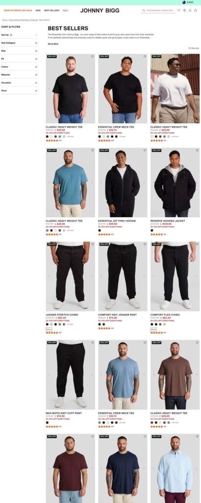
A stripped-back grid on white. Category and search pages sit on plain white and light grey, with black product type filters down the left rail and photography carrying the colour. Orange marks the site’s one accent, used for sale badges and site-wide banners rather than as a background colour.
Suisse Int’l across the interface. Headings, filters and navigation run on a single grotesque sans, Suisse Int’l, at a range of weights; there is no separate serif or display face, so the site reads utilitarian and catalogue-like rather than fashion-editorial.
Life-size model photography. Product and listing pages use plain-background photography of models in a range of builds, shown in full length rather than cropped, so fit and proportion stay visible at a glance.
Four products per row with visible savings. Best Sellers lists items in a dense grid, each card showing the discounted price struck through against the original, a colour swatch row, and a star rating pulled from Bazaarvoice.
A single product page with layered detail. The product template stacks a photo carousel, size run and Add to Bag button above a details panel, then a review summary with star breakdowns, verified photos from buyers, and individual written reviews further down the page.
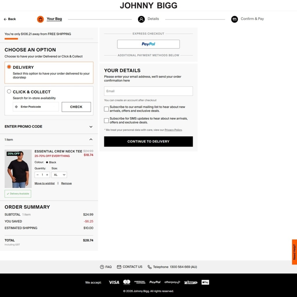
A named checkout flow. Checkout is split into three labelled steps, Your Bag, Details and Confirm & Pay, with PayPal offered as the sole express option and a solid black Continue to Delivery button.
Fit as the whole pitch. Delivery information on the product page includes a Find Your Fit tool link, and the footer repeats Find Your Denim Fit and Find Your Chino Fit as standalone destinations, keeping sizing guidance close to every purchase decision.
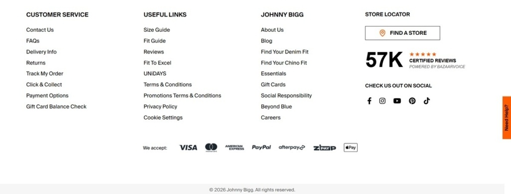
Reviews as proof of scale. The footer surfaces “57K certified reviews” with a five-star icon next to a store locator link, using review volume rather than brand copy to carry credibility.
Click and collect built into the cart. Shoppers can enter a postcode inside the shopping bag to check store stock before choosing delivery, without leaving the checkout flow.
Social responsibility in the footer. Alongside standard care and size guide links, the footer lists a Social Responsibility page and a program called Beyond Blue, tying the retailer to a stated cause rather than leaving it to a separate about page.
Renowned for technical innovation and high quality finishes, the Veronika Maine brand celebrates the art of fashion. A strong design ethic and innovative energy is combined to create a modern approach to dressing.
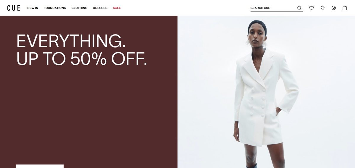
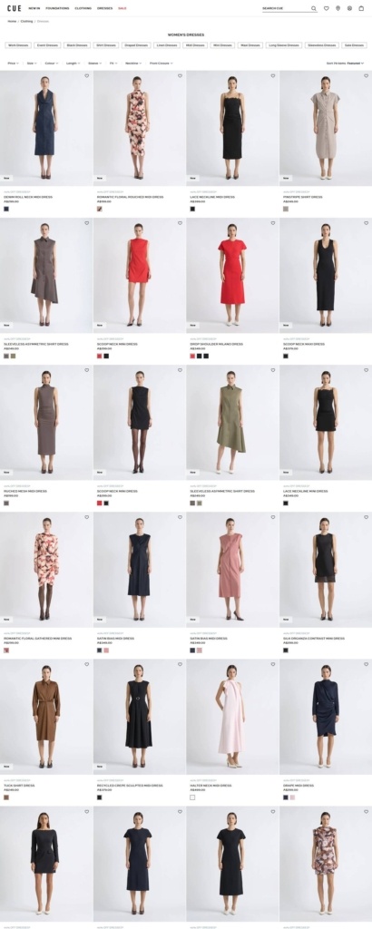
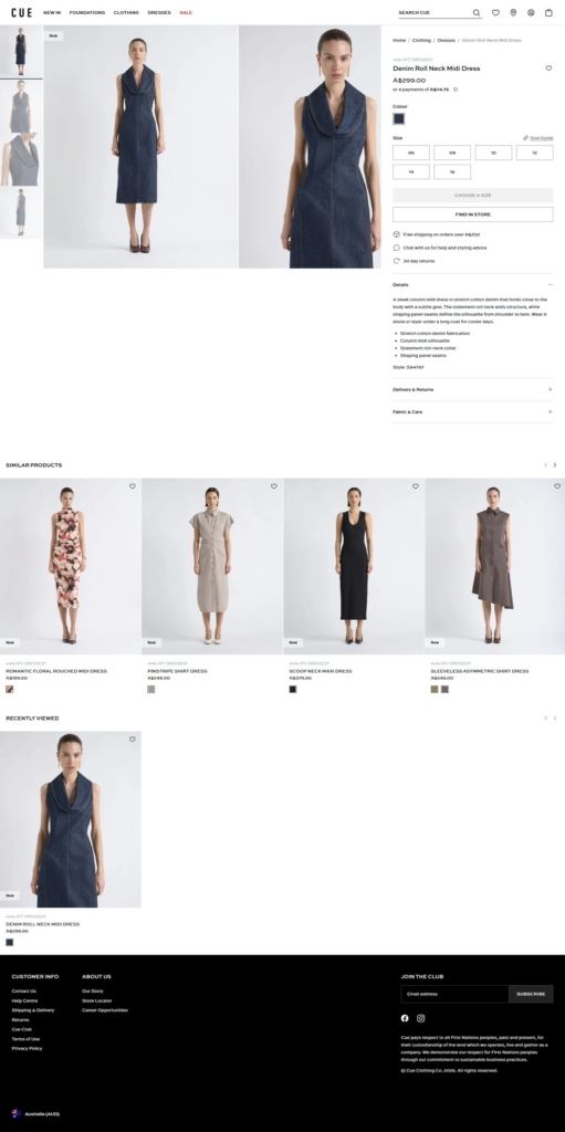
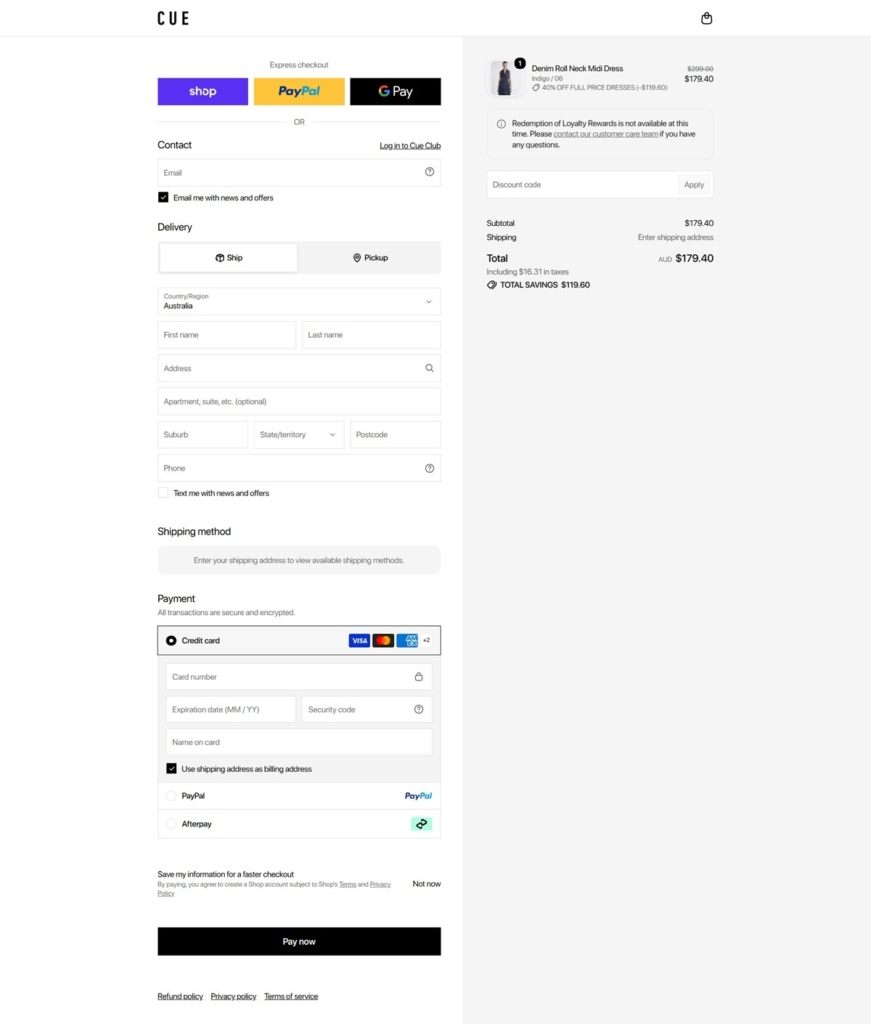
Cue Clothing Co is an Australian womenswear label that designs in Sydney and has traded since 1968, selling dresses, tailoring, knitwear, shirting and accessories. It serves Australia and New Zealand alongside 75 boutiques and concession stores, with prices from A$129 for a mesh top to A$449 for a double breasted blazer. The site runs on Shopify Hydrogen; the address held on file, global.cue.cc, now resolves to cue.com.
Greyscale chrome, one red. The interface palette is almost entirely neutral: near-black #0a0a0a, mid greys #4f4f4f and #878787, and pale grounds #d7d7d7 and #f2f2f2. A single saturated red, #e8051b, is held back for sale and promotion flags, so the only colour in the frame is either a discount or the clothing itself.
A single typeface. Sweet Sans Pro carries navigation, product names, prices and body copy, with no serif pairing anywhere. Product titles are set in lower case throughout, so a card reads “scoop neck lace bodysuit” rather than title case, which flattens the grid into a continuous run of descriptions.
Photography holds the page. Campaign imagery runs full width and product cards are tall and closely spaced, leaving the type small underneath rather than competing with it.
Four ways into one catalogue. The mega menu splits Clothing by garment, Collections by occasion (Suiting, Wear To Work, Event, Prints, Sets), Dresses by occasion, length and style, and Shop by Fabric into Crepe, Denim, Milano, Wool, Leather and Silk & Satin. Sale carries its own tree, including a browse by size from 6 to 16.
Cards carry status, not detail. Each grid tile shows a New badge, the current storewide offer, the lower case product name and one price in Australian dollars. There is no swatch row or hover state, so colour choice is deferred to the product page.
A buy box with a store hook. Product pages state the price, then instalment terms as “or 4 payments of A$99.75”, colour and size selectors with a Size Guide, and a Find In Store link beside the add to bag control. Below sit free shipping over A$250, a chat offer for styling advice, 30 day returns, a Details block of fabric bullets and a style code such as S41139, and Delivery & Returns and Fabric & Care accordions.
The design position is written out. Collection copy names the house signature as “sharp tailoring, signature details, statement colours and bespoke prints”, and says every style is designed in the Sydney studio and made in “considered quantities”.
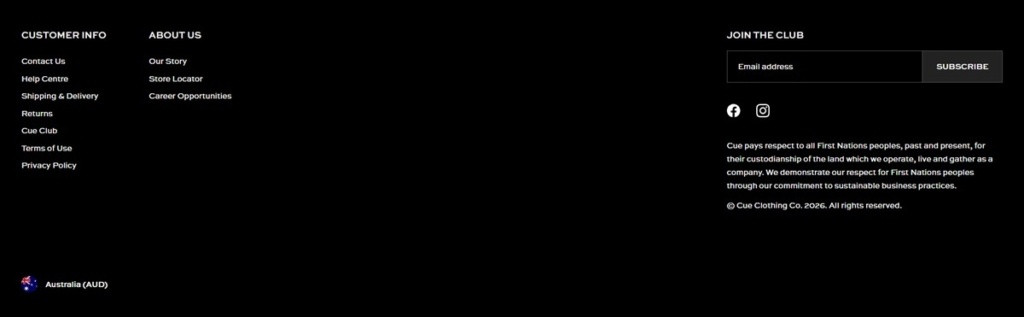
Acknowledgement in the footer. A First Nations acknowledgement runs across the foot of every page, paired with a line on sustainable business practices.
The store network sits in the purchase path. Find In Store on the product page and a Store Locator in the footer tie the online catalogue to the physical doors.
Cue Club. The loyalty programme sits in the Customer Info column and is repeated as a Join the Club prompt beside the newsletter signup.
Coming Soon as a browse state. Alongside New In and Best Sellers, the trending menu lists a Coming Soon collection, giving pre-release styles their own shelf.
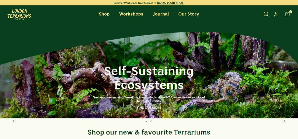
London Terrariums sells planted terrariums, crystal mossariums, DIY kits, houseplant accessories and gardening tools from a Shopify storefront tied to a physical studio at 139 Bethnal Green Road, London. The site calls the business “your local Terrarium Experts,” making terrariums in the studio since 2014, and also runs terrarium and Kokedama workshops with “No experience required.” Pricing sits in pounds, and the store accepts card, Apple Pay, Google Pay and Klarna.
A forest green and cream palette. A deep green, 093f1d, is the dominant colour across the interface, set against a cream fafaf0 ground, with a mustard f6dd82 and a sage 698a71 used as secondary accents. The combination reads as plant shop rather than generic ecommerce green.
Fraunces paired with Poppins. Headings run in Fraunces, a serif with soft, slightly quirky curves, while body text and interface labels use Poppins, a rounded sans. The pairing gives the site a handmade, editorial tone rather than a purely functional one.
Product photography inside the studio. Terrarium listings are shot in what reads as the shop’s own space rather than a plain studio backdrop, keeping the physical Shoreditch location visible through the product images themselves.
A wide price spread on one product type. Terrariums range from about 35 to 270 pounds, covering small DIY kits up to larger planted or crystal mossarium pieces within a single, clearly organised category.
Workshops sold alongside physical products. Terrarium and Kokedama Workshops sit in the same navigation as terrariums and accessories, so a shopper can book a class in the same session as ordering a kit.
Klarna at checkout. Alongside standard card payment, Apple Pay and Google Pay, Klarna is offered, giving a pay-later option on the higher end of the terrarium price range.
A stated founding year. “Since 2014” appears directly in the brand’s own description of itself, tying the business’s age to the studio rather than treating it as background information.
Self-sustaining ecosystems as the product idea. The site frames terrariums around the concept of a self-sustaining ecosystem, giving the product a functional claim rather than only a decorative one.
A real shop address used as proof. 139 Bethnal Green Road, with stated opening hours, gives the online store a specific physical anchor rather than presenting as web-only.
Corporate and bespoke terrarium services. The site references bespoke corporate terrarium kits, for example a batch made for Avanade, alongside private party bookings.
Gift vouchers as a standalone product. Vouchers sit in the catalogue as their own line, giving a non-perishable option next to the living plant range.
Wholesale enquiries accepted. A wholesale route sits alongside the retail and workshop offer, extending the business beyond direct-to-consumer sales.

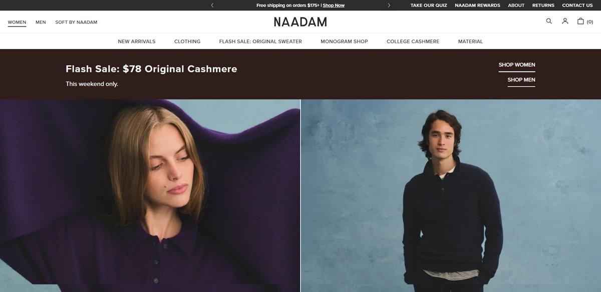
Naadam sells cashmere knitwear, cotton basics and accessories for women and men, sourced from hand-combed Mongolian fibre and pitched as “really good cashmere at fair prices”. The range runs from scarves and combs at the low end to colour-blocked zip sweaters around $225, with the Original Sweater held at $98 as the entry point. There is a third line, Soft by Naadam, alongside monogramming, college logo knits and an NFL collaboration. The store runs on Shopify.
Warm neutral ground, olive accent. Pages sit on white and a greige photographic backdrop, with type in a warm near-black rather than pure black. The only real colour in the chrome is a moss green used for navigation links.
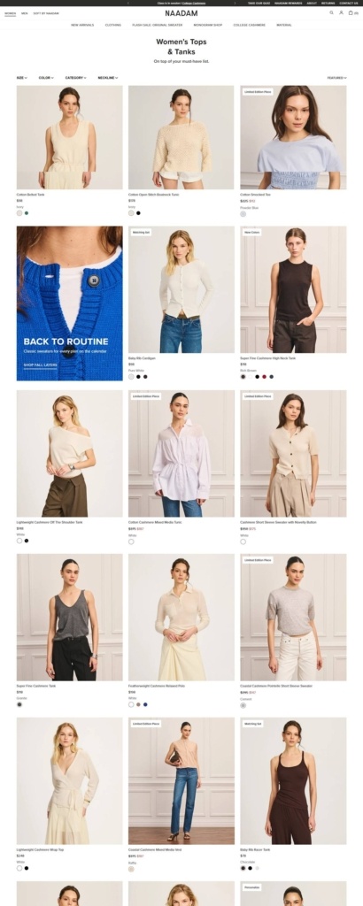
Fraunces over Proxima Nova. Headings and the wordmark use Fraunces, a serif with noticeable contrast, set centred above category pages. Everything functional, from filters to product names and prices, runs in Proxima Nova at small sizes.
Editorial tiles inside the grid. The product grid is regularly interrupted by a full-bleed campaign cell, one image with a short headline and a shop link, so seasonal merchandising keeps the grid rhythm.
Material is a navigation axis. The mega menu carries a Material column next to the clothing categories, listing Signature, Luxe, Super Fine, Lightweight, Cotton Cashmere, Organic Cotton and Baby Rib, each with a one-line description of weight and feel.
Filtered on fit details. Collection pages offer Size, Color, Category and Neckline filters with a sort control opposite. Cards carry colour swatch dots, any sale price against the original, and badges for Limited Edition Piece, New Colors or Waitlist Me.
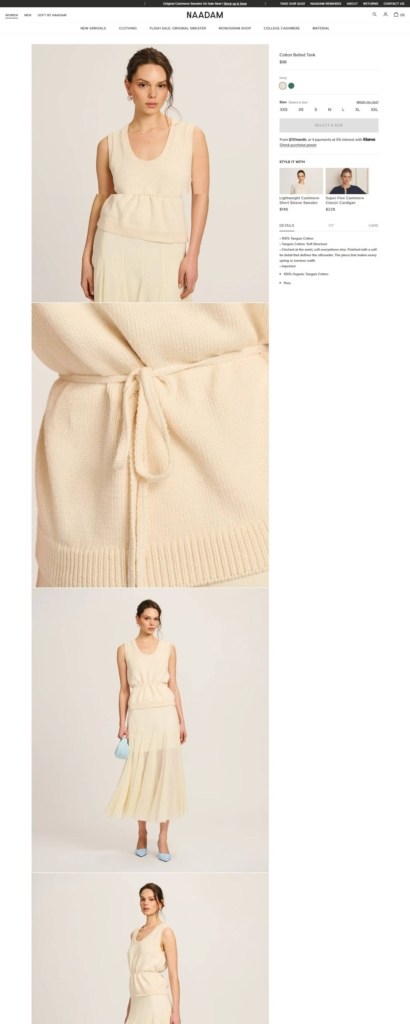
Product pages spell out fit. Below the swatches and a What’s my size link, three tabs split Details, Fit and Care. Fit is described in named terms such as Relaxed Classic, with guidance on sizing down and on length.
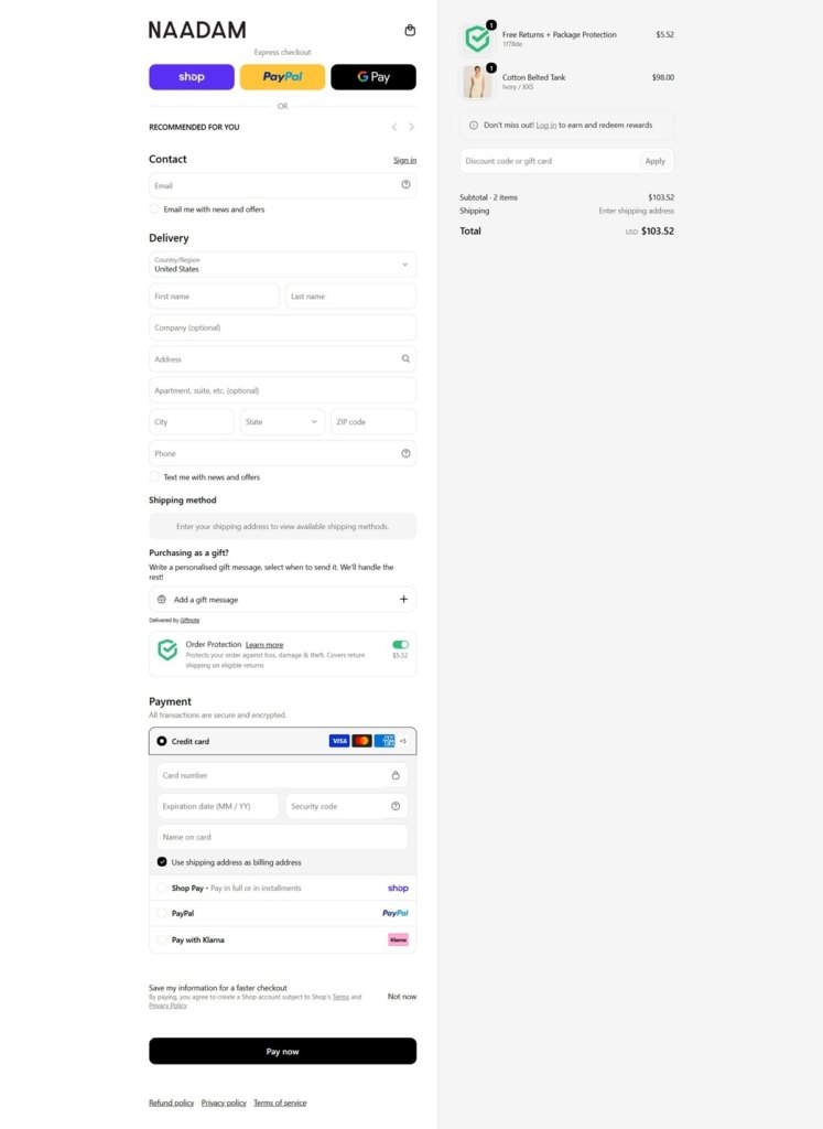
Checkout adds its own merchandising. The Shopify one-page checkout leads with Shop Pay, PayPal and Google Pay, then a Recommended for you carousel. A gift message accordion, an order protection toggle and a rewards sign-in prompt sit before card, Klarna and PayPal payment.
A numbered explainer instead of a manifesto. The Facts About Cashmere page runs six short entries under headings like Organic shmorganic and Anybody in there, covering hollow fibres, hand combing as the cruelty free method, and why longer fibres pill only once.
Supply chain named in the footer. Links for We Love Our Herders, Sustainability and Service and Accountability sit beside the usual customer service column, and the brand states membership of the Sustainable Fibre Alliance.
Gauge stated on the product. Copy specifies the knit gauge and weight name together, for example 12 Gauge Signature weight, so the material taxonomy in the menu resolves to a number on the page.
Waitlist rather than a dead card. Out of stock variants swap the add button for Notify Me, and the grid badge changes to Waitlist Me so the state is visible before the click.
Quiz, rewards and monogram shops. A style quiz, the Naadam Rewards programme and a monogram service are all promoted from the top utility bar rather than buried in account pages.
Will & Bear began whilst travelling Australia in our vintage Kombi just 4 short years ago. With life on the road, we trawled op-shops, met incredible humans and fell in love with the landscapes we explored. Being inspired by nature whilst living on the road, Will & bear was born.


