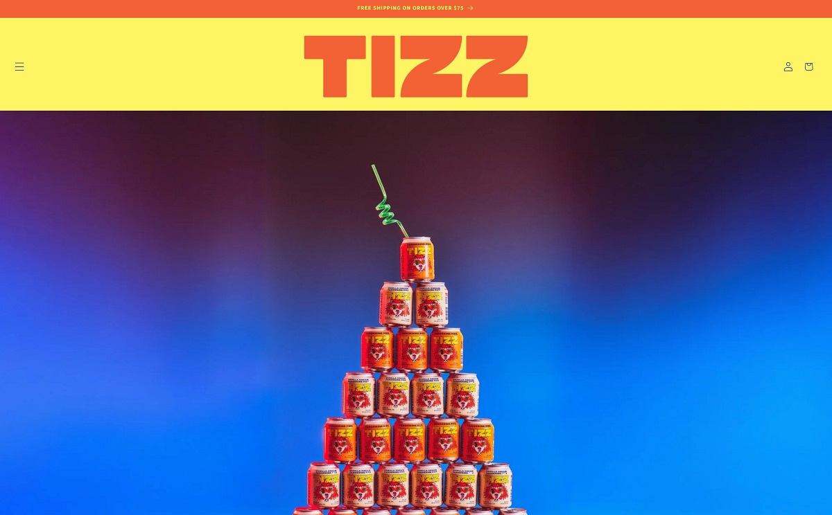
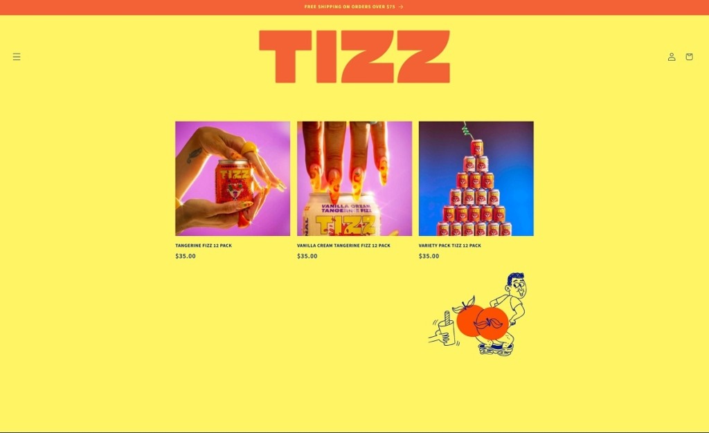
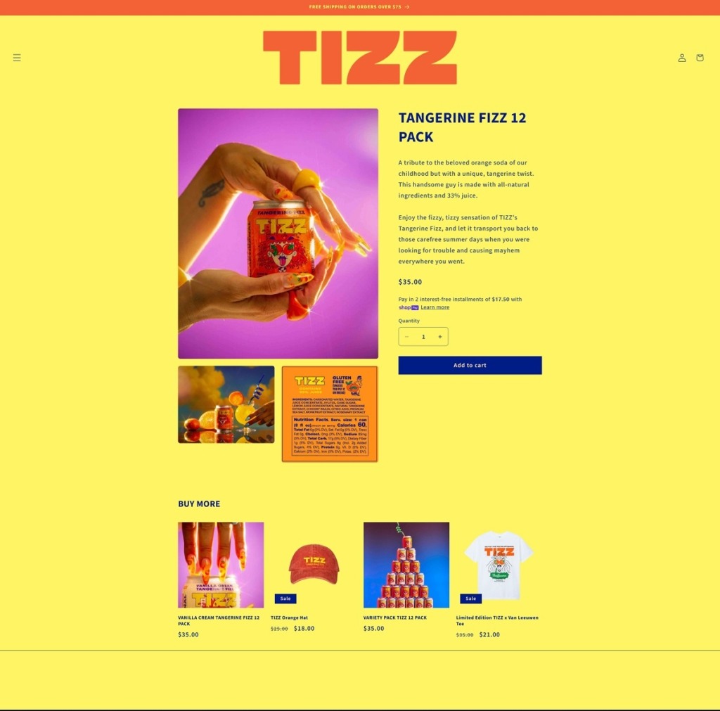
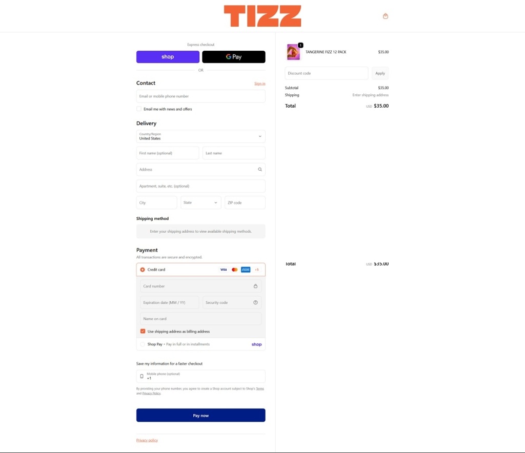
TIZZ is a beverage brand offering canned tangerine-flavoured fizzy drinks made with real juice and no added chemicals, available in core flavours like Tangerine Fizz and Vanilla Cream Tangerine Fizz. The website design is bold and playful, with large product visuals, simple top navigation, and energetic copy that keeps the focus on the drinks and their flavour lineup. Calls to action and shop sections are straightforward, guiding visitors into pack options and ways to find the product.
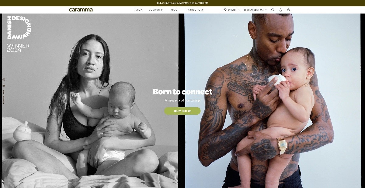
Caramma is a Danish infant feeding brand, registered as Caramma ApS, selling a silicone support bottle in two sizes plus a kit and replacement teats. It is aimed at parents combining breastfeeding with bottle feeding, and the copy states the position plainly: the bottle is “Designed to be the second best to breast”. Four claims carry it, air free feeding, a slow flow the baby controls, feeding in any position, and no microplastics. The store runs on Shopify and sells across Europe in three languages.
Website Design
Olive, periwinkle and white. The colour tokens set headings and body text in a dark olive #463e02, with an olive green accent #a4b450, a periwinkle blue #799cf0 as a full bleed footer ground and a lime #bbff00 held as a highlight. The announcement bar takes the dark olive, so the page is bracketed by two saturated bands with white between them.
One typeface, Garnett. Headings, body, navigation, buttons and prices all resolve to the same family, separated only by size and case. Footer section labels are set small, upper case and letterspaced, the only typographic contrast on the page.
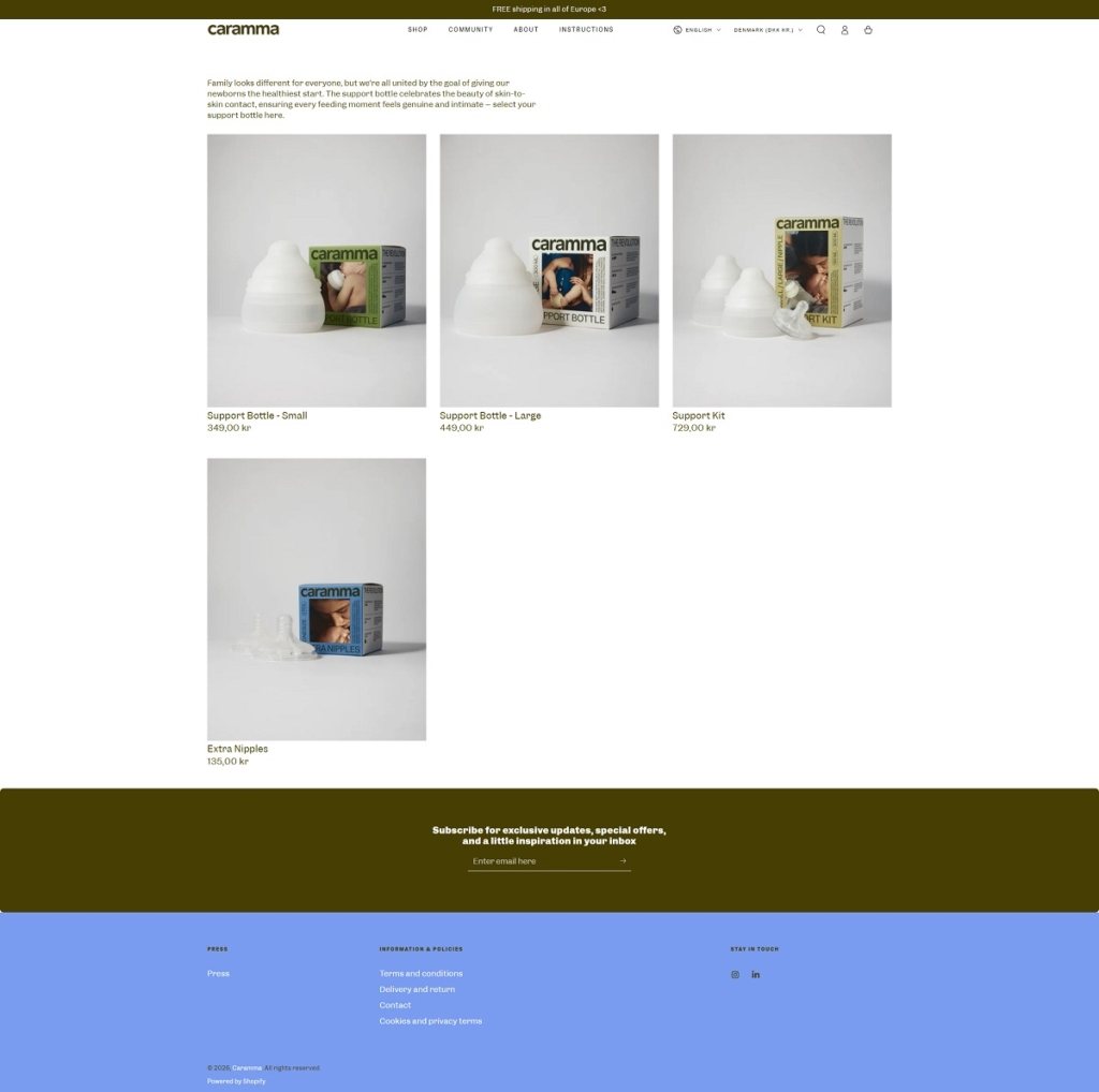
Product on a pale grey ground. Shop imagery photographs the white silicone bottle beside its printed carton on a near white studio surface, in a three across grid with name and price stacked beneath each card. There are no badges, no sale flags and no hover state beyond a Quick view link.
Shopping Experience
A four item catalogue. The shop holds the Support Bottle Small at 299,00 DKK, the Support Bottle Large at 349,00 DKK, a Support Kit pairing both at 599,00 DKK, and Extra Nipples at 99,00 DKK. Every card shows a star rating and review count, and every card has its own Add to cart button.
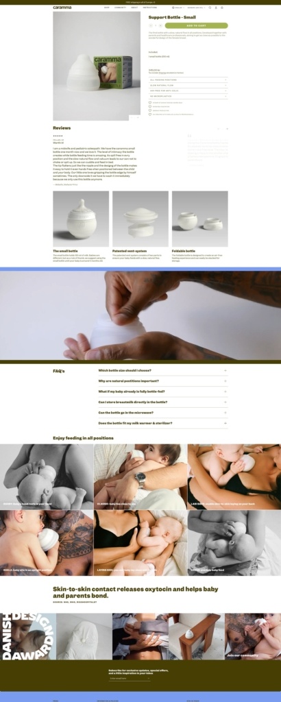
Product pages answer objections in order. Below the buy box sit four claim tiles, then a trust row reading “Winner of Red Dot Best of the best, 2026”, “Patented innovation”, “German production” and “Co-created with families & health professionals”, then a component breakdown, then a FAQ covering meal sizes, microwaving, sterilisers and teat fit.
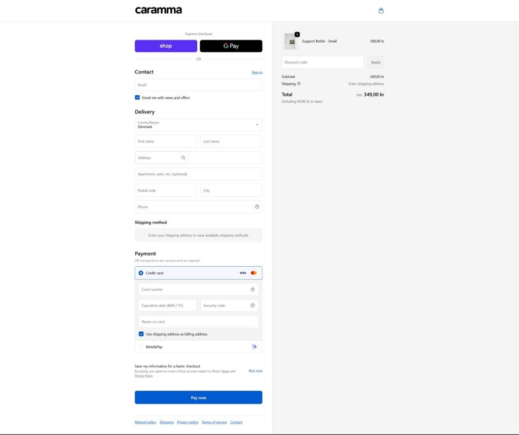
A localised Shopify checkout. Express options are Shop Pay and Google Pay above the fold. Card payment and MobilePay follow, the country defaults to Denmark, and the summary states the tax included in the total rather than adding it on.
Brand Storytelling
Interviews instead of testimonials. Parents and midwives are quoted at length and named with their children, each quote linking to a full interview and left in the speaker’s own phrasing.
Biology as the design argument. The vent system is explained as a patented two part mechanism that makes the baby create a vacuum to keep milk flowing, tied back to the sucking technique used at the breast. A six position diagram, labelled RUGBY, CLASSIC, LAID BACK, KOALA, LAYING SIDE and CROSS, extends the same argument.
Notable Features
Three languages and a European price list. English, Dansk and Deutsch sit in the header next to a country selector covering most of Europe, switching between DKK and EUR.
A professionals route. The footer separates inquiries for healthcare professionals and press from the standard policy links.
Community as a menu item. Alongside Shop, About and Instructions, a Community section collects the family stories and interviews that the homepage samples.
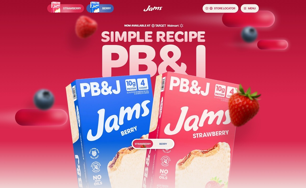
Jams is a US packaged PB&J brand selling flash-frozen peanut butter and jelly sandwiches in two flavours, Strawberry and Berry, each with 10g of protein, jelly made from real fruit and no seed oils. The sandwiches sell through Walmart and Target rather than direct, so the site handles flavour pages, a store locator, merchandise and a creator programme. Built on Webflow with a Shopify cart layered in through Smootify.
Website Design
The palette switches with the flavour. A Strawberry and Berry toggle at the top of every page swaps the whole theme. Strawberry runs a hot red against a blush tint and a deep maroon, Berry a mid blue against pale periwinkle and near-navy, with the text swatch moving from warm cream to cool near-white.
Display type doing the shouting. Headlines use Merge Pro, a heavy display face, with Neurial Grotesk on body copy and interface labels and ITC Avant Garde Gothic as a third face. Headings run large and are frequently set in capitals.
Motion as a structural device. Marquee strips repeat the four product claims between sections, sliders carry the flavour cards and testimonials, and smooth scrolling is applied site-wide.
Shopping Experience
Two buy paths, neither of them on site. Flavour pages end in Buy at Walmart and Buy at Target buttons that leave the domain, and the on-site cart serves the merchandise range instead, keeping checkout and core product on separate tracks.
A merch shop behind the rewards route. The nav item labelled Merchandise resolves to the rewards page, where a Jammy Mug is $25 and the water bottle and cooler pouches are $15 each in red and blue. Unstocked items show Coming Soon with an email capture instead of Add to Cart.
A cart built for urgency. The drawer states the cart is reserved for 30 minutes, counts down to free shipping with a line reading “Only 3 products away from free shipping”, then ends in Continue to Checkout.
Store locator as a primary nav item. Find Jams In Store sits in the header beside the flavour pages, and the FAQ below it answers the storage question: the sandwiches keep in the fridge 48 hours.
Brand Storytelling
A mascot with a motivational script. The About page introduces Jammy as a character “not here to change your life” but to make sure you do not forget what you said you would do, above a short essay on growth being quiet and slow.
Athlete and creator testimonials. Quotes from CJ Stroud, Alex Morgan and the Labrant family run on the homepage and flavour pages, beside press links to People, TODAY and TrendHunter.
Notable Features
A comparison block against unnamed rivals. A “Jams vs. Other Brands” section scores the product against unnamed competitors on protein, sugar, seed oils and artificial colours.
Creator Club with segmented tiers. An application form asks creators to pick a niche of family, athlete or lifestyle, each with listed benefits such as monthly shipments, brand trip access and category-specific merch.
An unlinked secret shop route. A secret-shop page sits in the sitemap but not the navigation, and currently renders “No items found.”
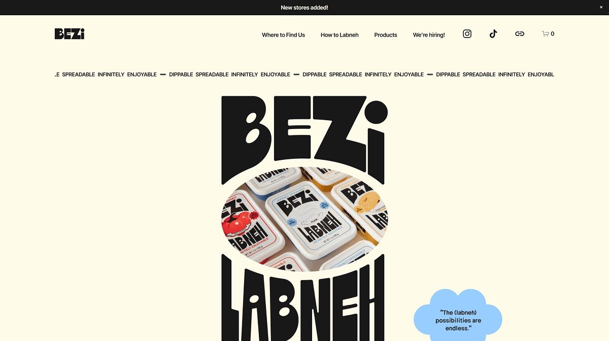
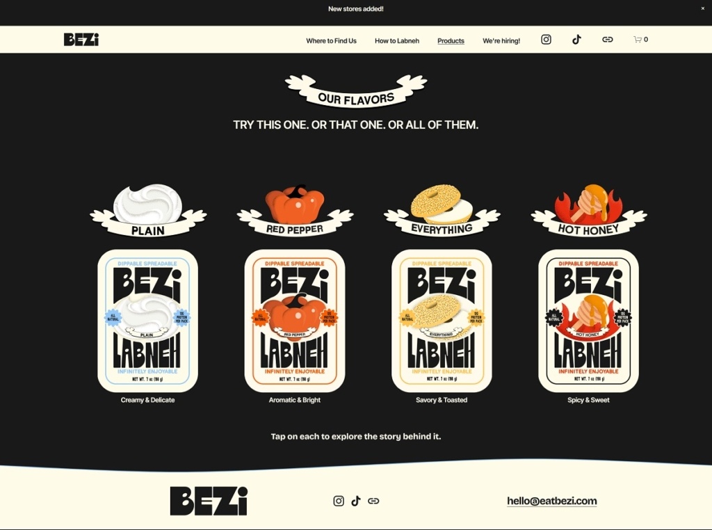
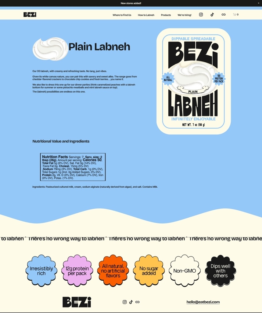
Bezi makes spreadable labneh, a creamy Middle Eastern yogurt-style cheese dip available in several flavour variations and designed as an alternative to traditional dips and spreads. The website design is clean and food-centric, with large product visuals, simple top navigation, and storytelling sections that guide visitors from heritage and usage ideas into the core product offerings.
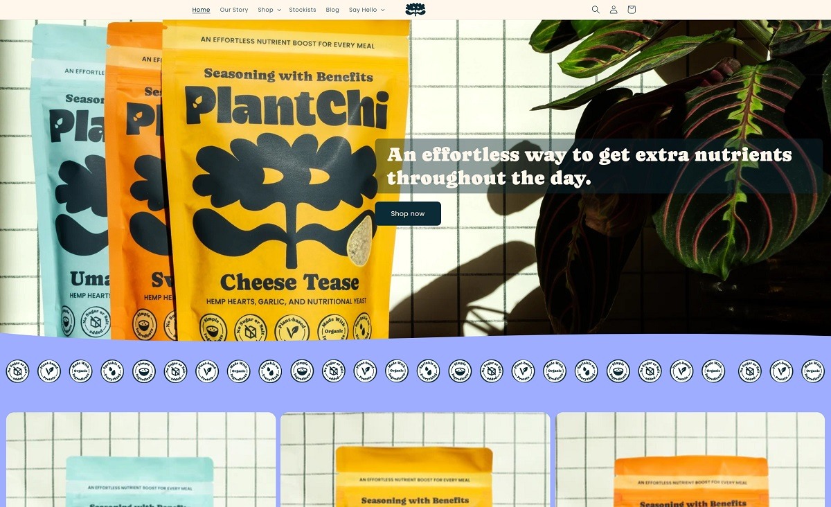
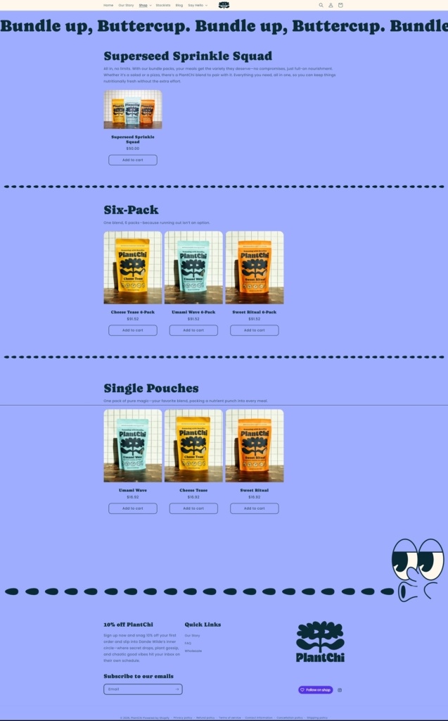
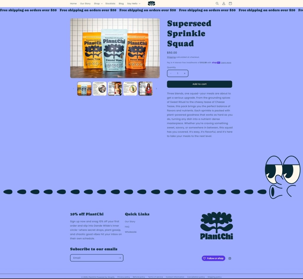
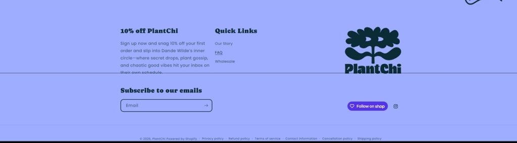
PlantChi is a pantry brand selling “seasoning with benefits” superseed sprinkle blends designed to add flavour and nutrients to everyday meals, with blends like Cheese Tease, Sweet Ritual, and Umami Wave, plus bundles and multi-packs. The website design is bold and modern, with oversized headlines, high-impact product photography, and a shop-forward layout that quickly routes visitors into the blends and bundle collections.
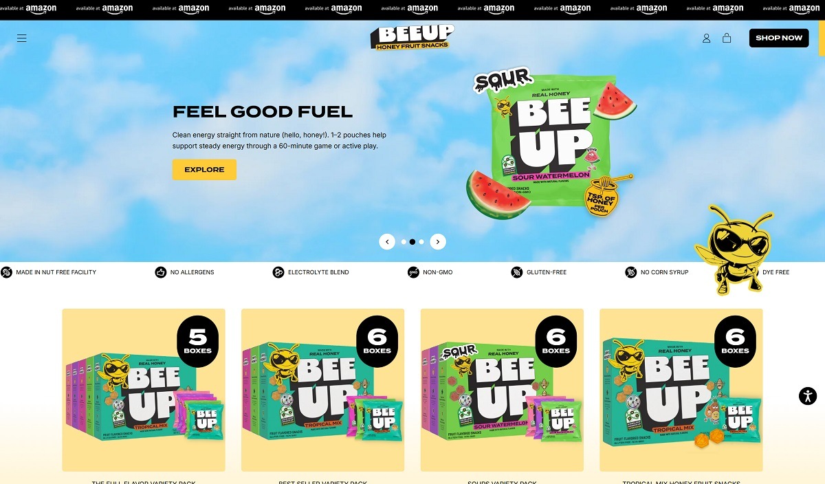
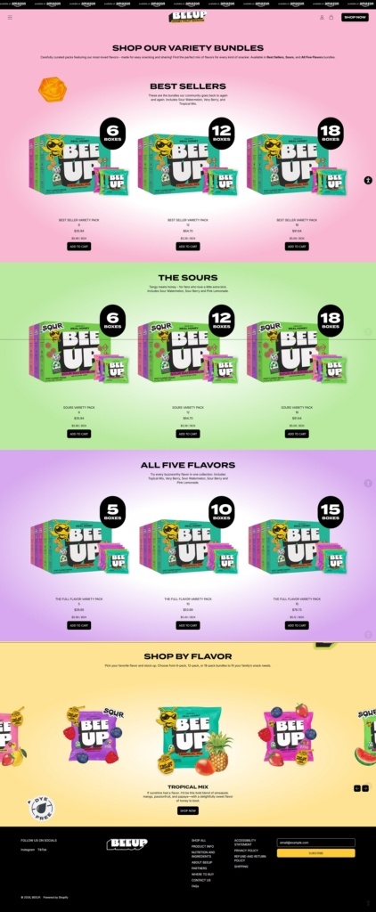
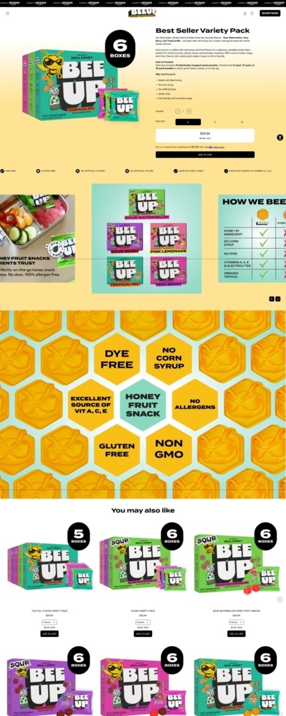
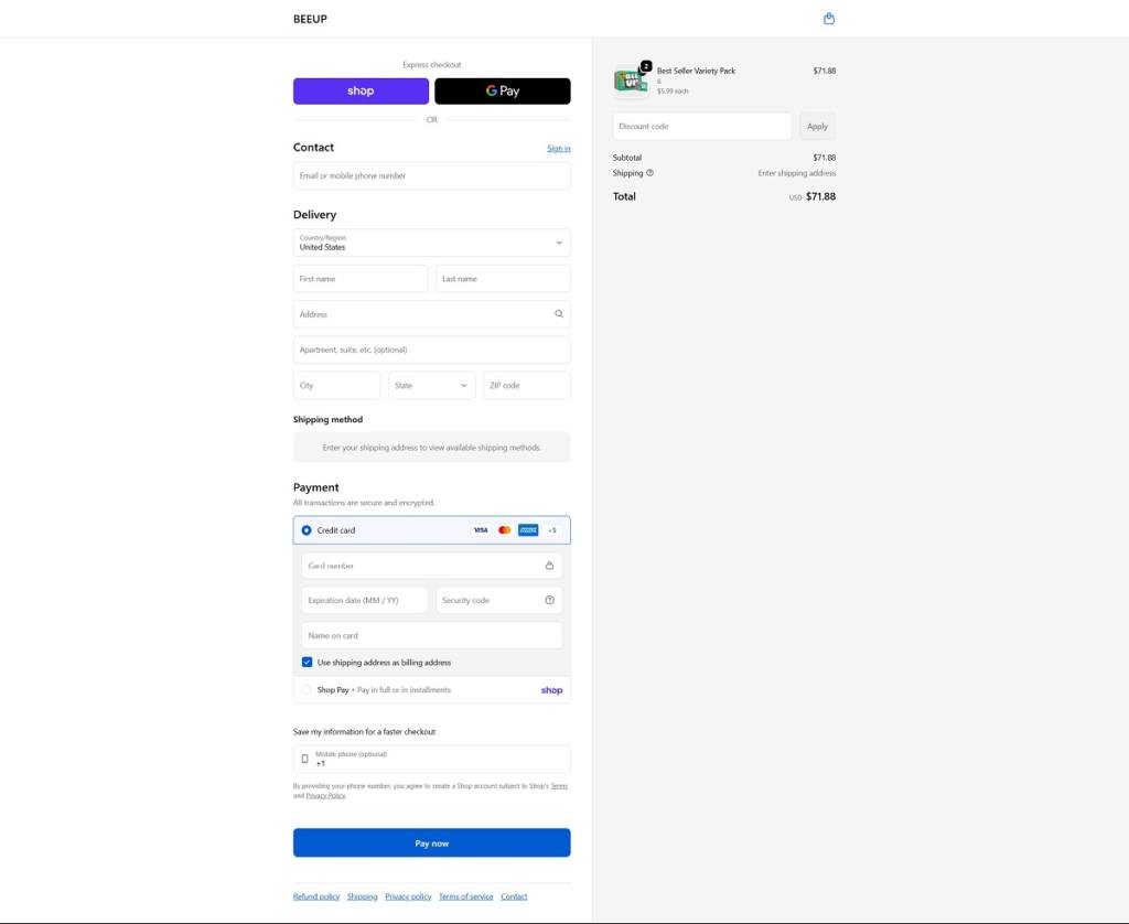
Bee Up Snacks offers honey fruit snack pouches in a range of bright, fruity flavours made with real honey and fruit purée, packaged in variety packs for easy on-the-go snacking. The website design is clean and playful, with large product visuals, flavour-led imagery, and simple navigation that helps visitors quickly find bundle options and explore product info. Messaging highlights the natural ingredients and energy-focused benefits, keeping the layout approachable and snack-forward.
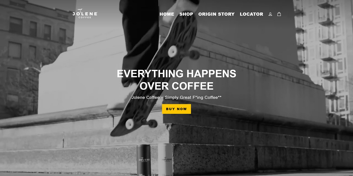
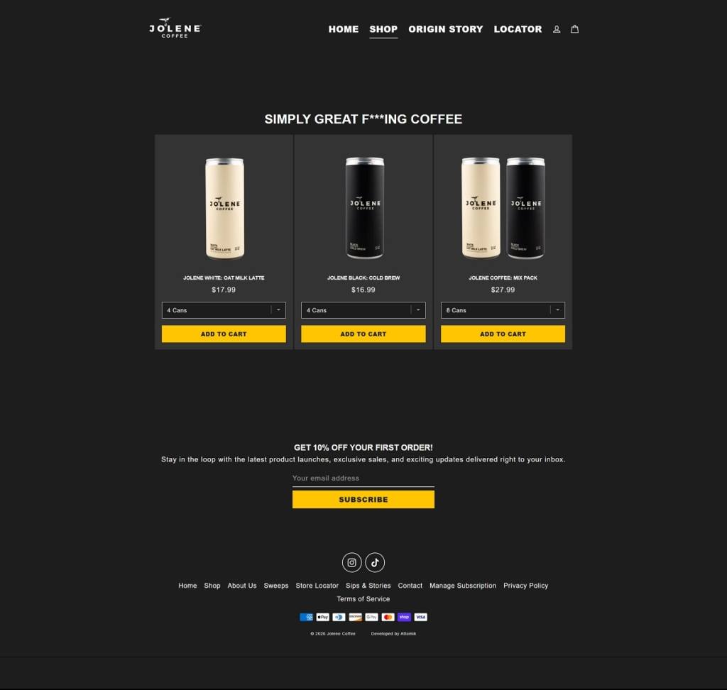
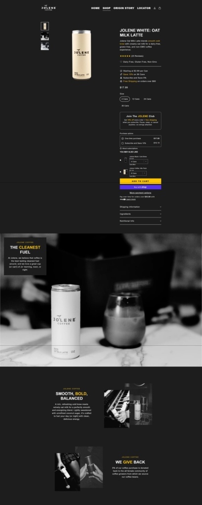
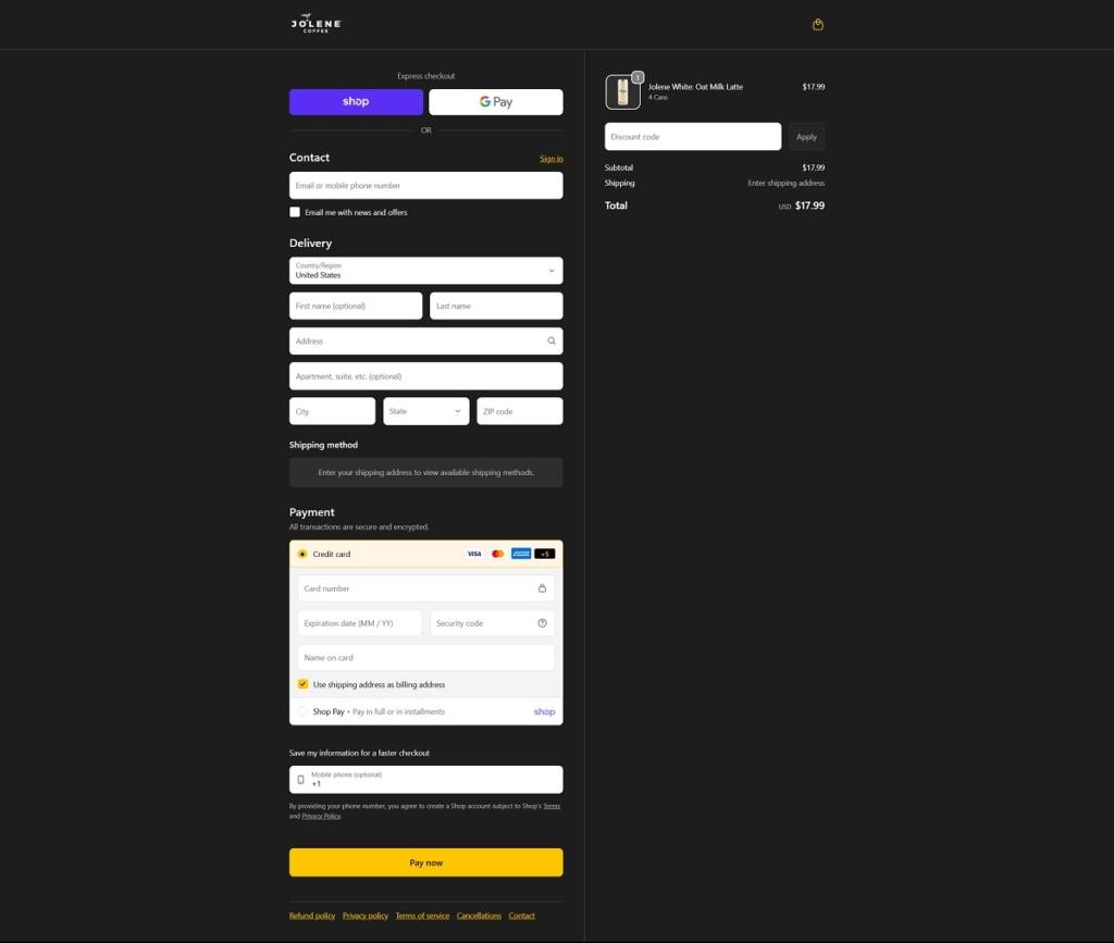
Jolene Coffee is a ready-to-drink coffee brand offering canned cold brew and oat milk latte coffees crafted with simple, high-quality ingredients and available in single packs or mixed can bundles. The website design is clean and shop-focused, featuring bold product imagery, clear navigation into its core brews and origin story, and straightforward calls to action that guide visitors into flavour selections and purchase options.
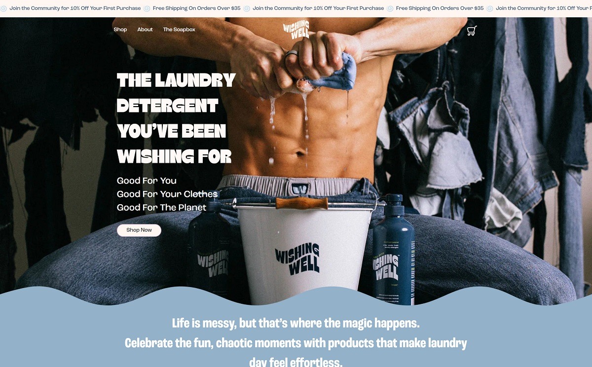
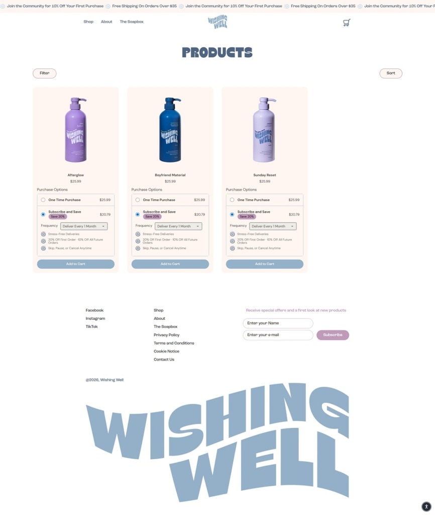
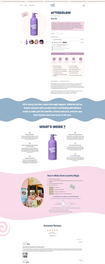
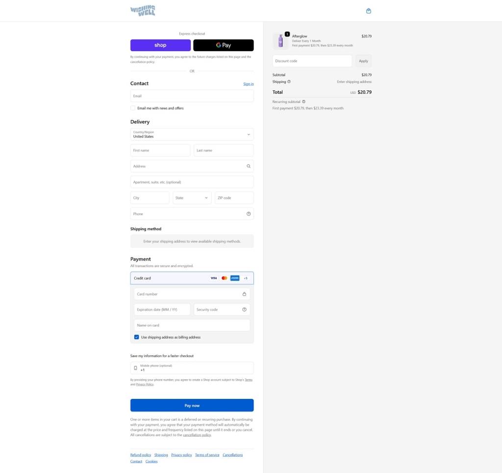
Wishing Well Washing offers premium laundry care products, including concentrated liquid detergents and stain-removal solutions formulated for gentle, effective cleaning. The website design is clean and modern, featuring large product imagery, simple category navigation, and shop-forward sections that guide visitors quickly into core offerings. Product pages combine clear benefit highlights with minimal layouts to make selection easy.
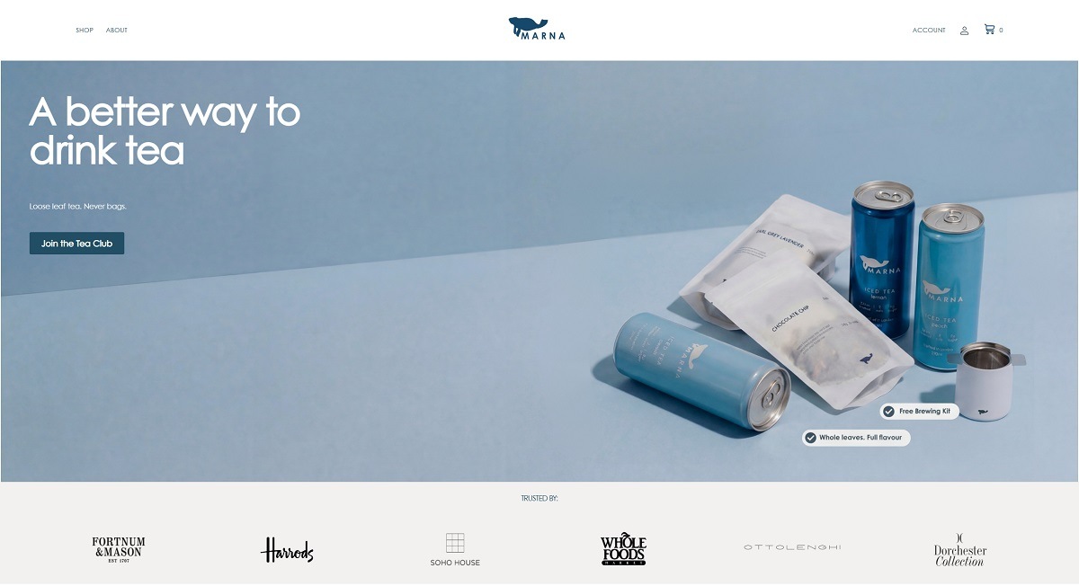
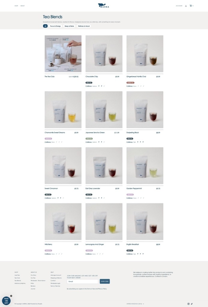
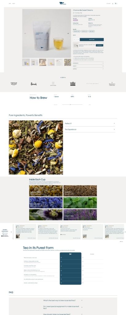
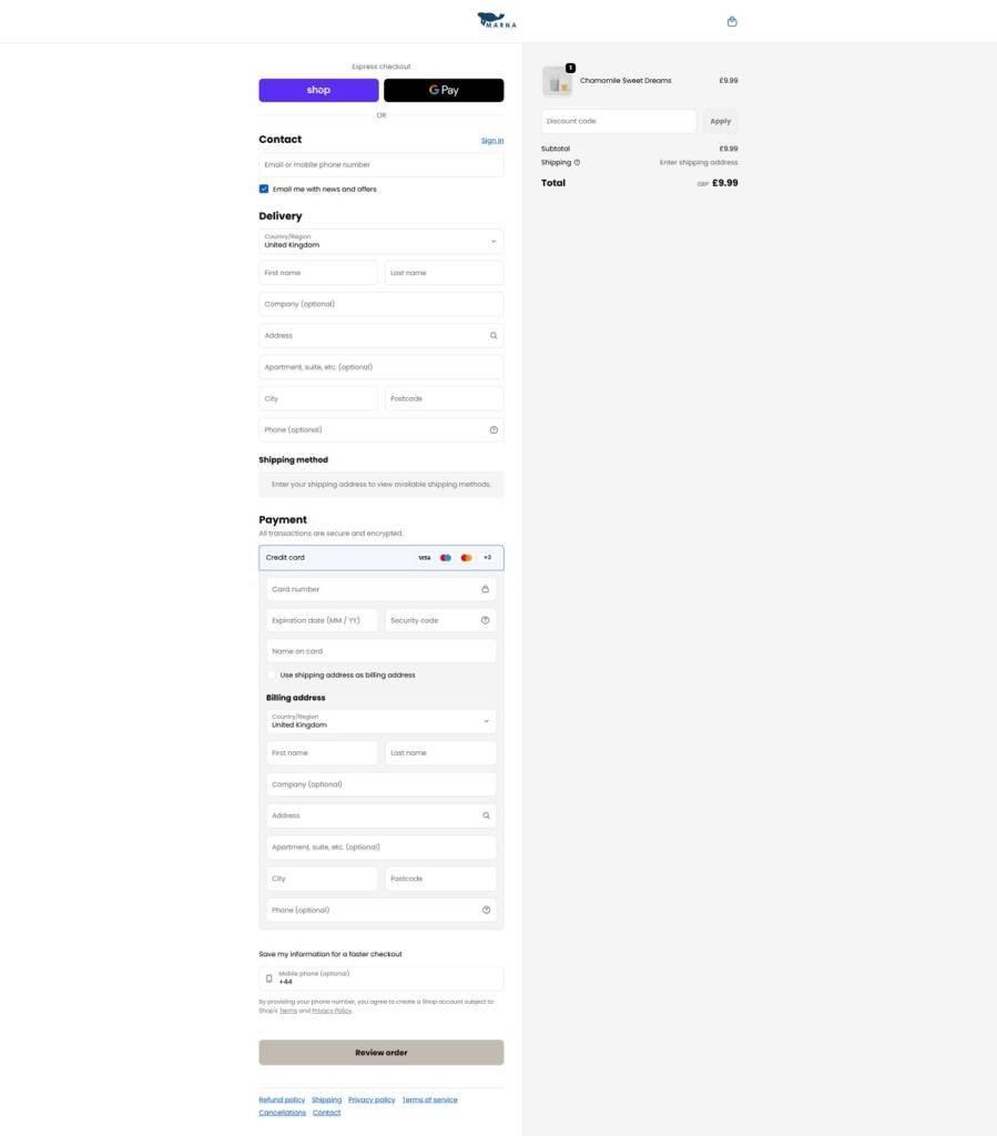
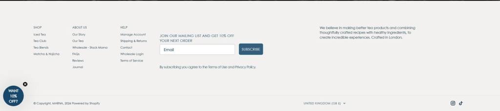
Marna is a London-based premium iced tea brand offering healthy, lightly flavoured cold brews made with natural ingredients and no added sugar. The website design is clean and contemporary, featuring large product imagery, soft colour accents, and simple shop-focused navigation that guides visitors straight into flavour collections and detailed product pages. Overall, the layout keeps the focus on the drinks and their key taste and health attributes with clear calls to action.
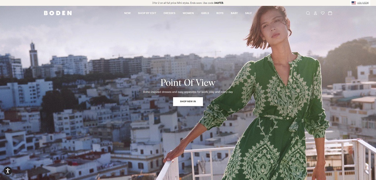
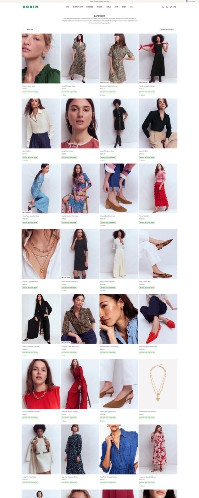
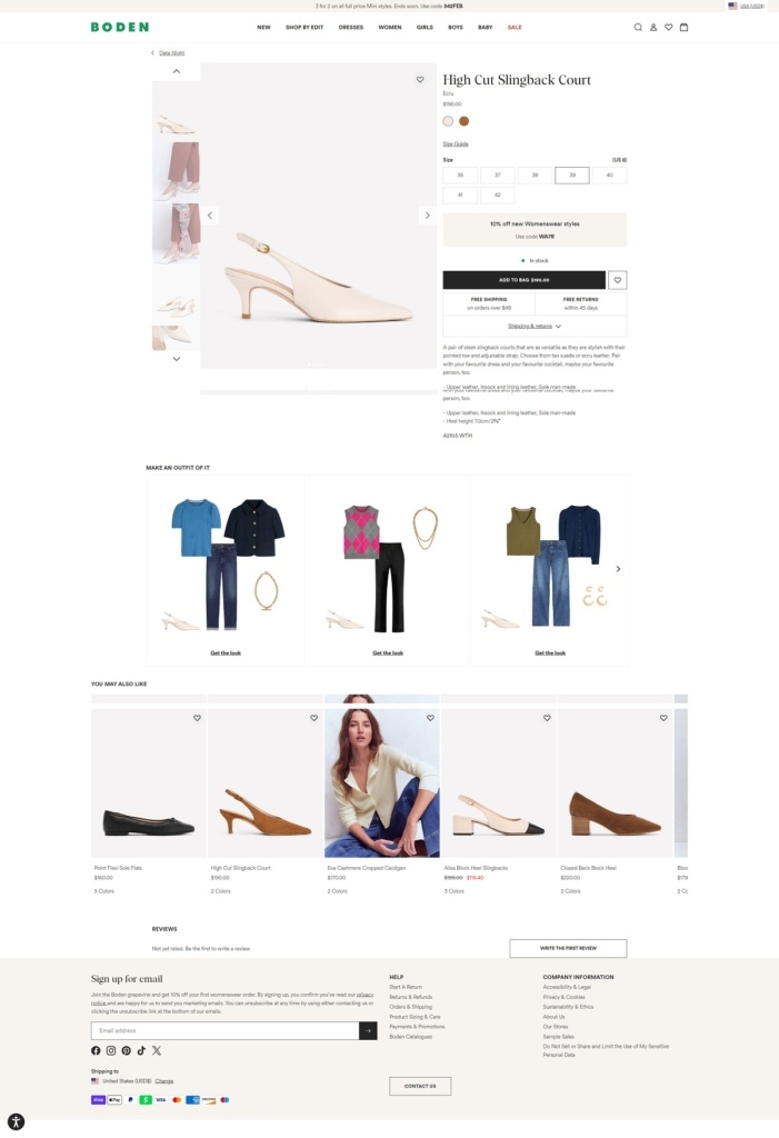
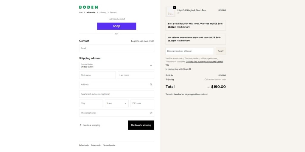
Boden is a lifestyle apparel brand offering women’s, men’s, and children’s clothing with a focus on colourful prints, classic tailoring, and wardrobe staples like dresses, tops, knitwear, and outerwear. The website design is bright and accessible, with clean category navigation, large product imagery, and promotional banners that guide visitors into new arrivals and curated collections. Product pages pair visuals with detailed descriptions, size guidance, and styling cues to support confident shopping.
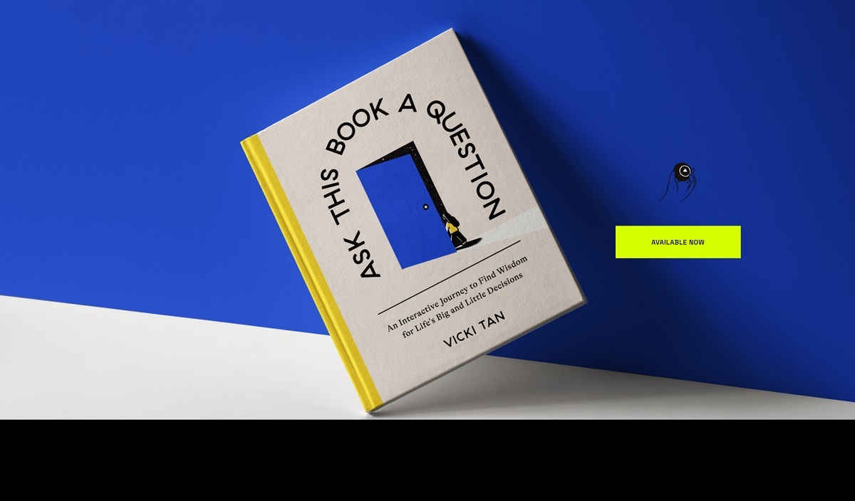
This page sells Ask This Book A Question, a book by designer Vicki Tan subtitled “An Interactive Journey to Find Wisdom for Life’s Big and Little Decisions”. It treats cognitive bias as a set of tools rather than flaws and uses visual prompts to walk a reader through a question of their own. The page fulfils through ten external booksellers rather than a checkout of its own, and sits on Squarespace inside a four page personal site covering home, book, work and speaking.
Website Design
Four flat colour fields. Sections commit to one ground each: a saturated blue near #0000d0, an acid chartreuse around #d6ff01, a pale sage grey at #cad5ca, and black, with near-white at #fcfcfc reversed out. The colour changes do the work rules and dividers usually do.
Space Grotesk over Raleway. Headings and pull quotes use Space Grotesk, a wide geometric sans, while running copy uses Raleway. Text is centred in narrow measures at similar sizes throughout, so hierarchy comes from colour and position more than scale.
Line art doing the heavy lifting. The book’s own drawings carry the page: a figure holding an outsized question mark, a grid of small pictograms, a door motif. Interior spreads run as a horizontal filmstrip on black, and the sage panel meets the blue band along a wave rather than a straight edge.
Shopping Experience
A retailer row instead of a cart. Buying sits under a heading reading “get yours today” and lists Amazon, Powell’s, Bookshop, Kindle, B&N, Nook, Target, Google Play, Books A Million and Apple Books as separate links, mixing print, ebook and app store editions into one row without grouping.
One call to action, no commerce detail. A chartreuse Available Now button sits beside the cover in the hero. There is no price, no format comparison and no stock state anywhere on the page.
An empty basket in the header. Squarespace leaves its cart counter in place at zero, and nothing on the site can add to it.
Brand Storytelling
The premise is argued, not asserted. A short block asks “Why did a designer write a book about decision-making?” and answers in first person, framing biases “not as flaws to fix, but as powerful tools for making more intentional, self-aware decisions”.
Three endorsements in one band. The blue panel carries quotes from Buster Benson, Yancey Strickler and Nir Eyal, each credited with their own book.
The book demonstrates itself. Instead of describing the format, the page shows the preface, a “Think of a question…” prompt and a flowchart spread, so the premise is visible before any copy explains it.
Notable Features
Scrolling marquee labels. Headings such as “available now” and “get yours today” run as animated bands with a decorative glyph repeating between them.
Product photography for a single SKU. A studio shoot places the physical book on the blue ground with its yellow page edges exposed, standing in for the variant imagery a larger catalogue would carry.
Portfolio structure around a sales page. Work and speaking sit in the same navigation, so the book page inherits a personal site rhythm rather than a store template.
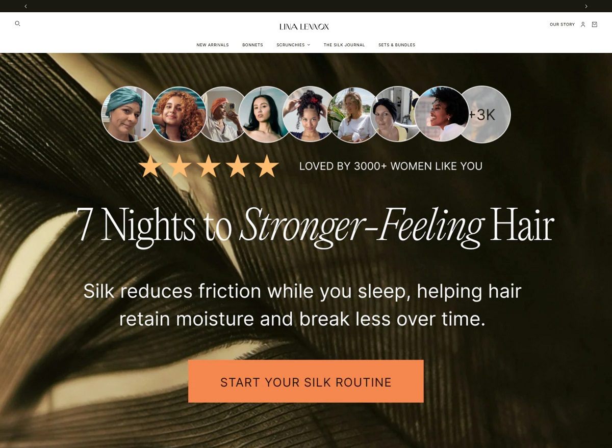
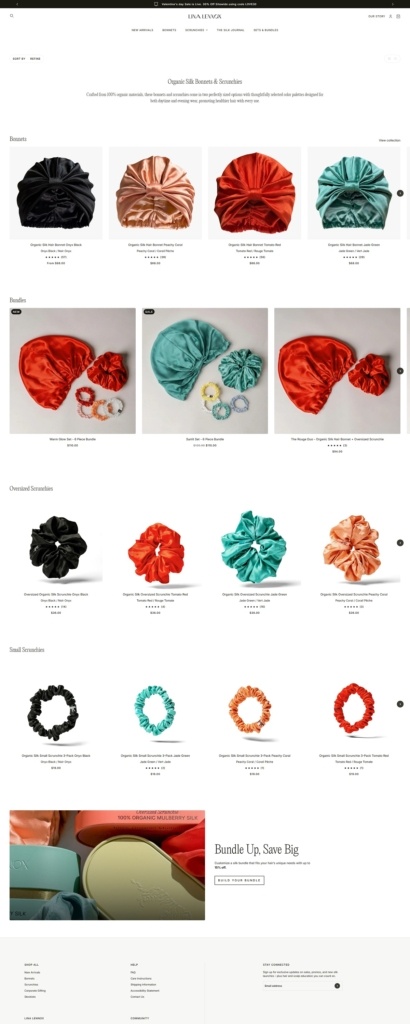
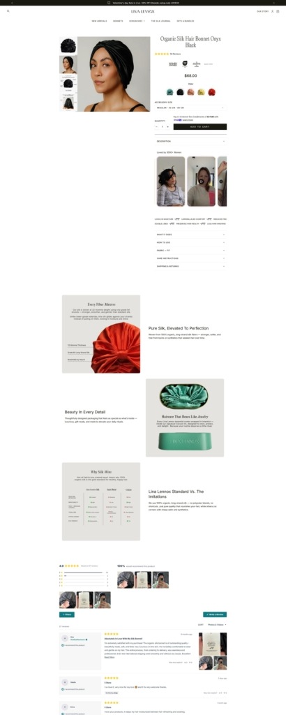
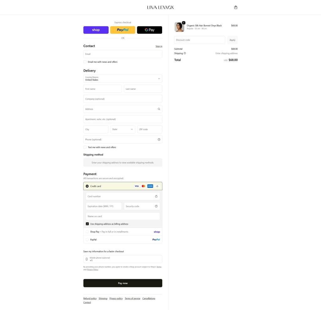
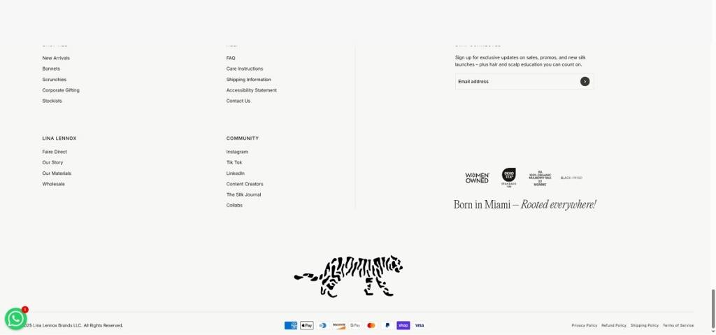
Lina Lennox offers premium hair accessories made from 100% organic mulberry silk, including silk bonnets, oversized scrunchies, and bundle sets designed to protect hair, reduce frizz and breakage, and support healthier styles. The website design is clean and product-forward, with large visuals, simple top navigation into categories like Bonnets and Scrunchies, and clear calls to action that guide visitors from lifestyle context into detailed product pages and collections.
Lina Lennox shop Category Page Example
Lina Lennox Product Page Example
Lina Lennox Checkout Page Example
Lina Lennox Footer Example
Join our community for the latest trends and ecommerce tips.

 By Jibin Kumar