L’isola Store


eCommerce Websites
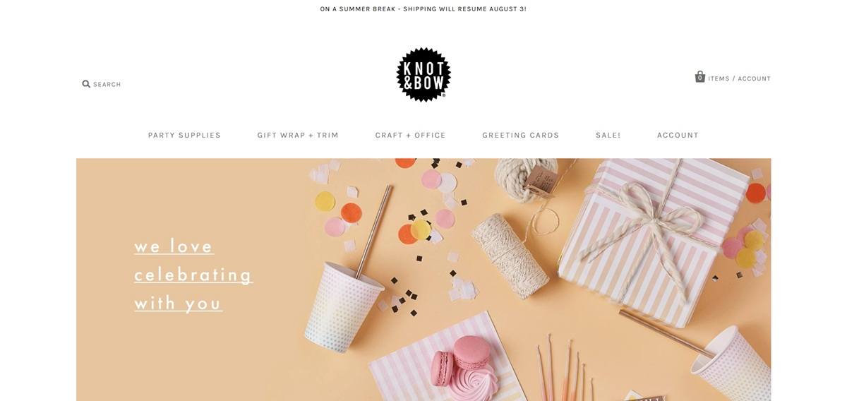
Knot & Bow sells party supplies, gift wrap and trim, craft and office goods, and greeting cards, positioned around domestic manufacturing: products are described as “proudly manufactured in the United States whenever possible” and “finished and assembled in our Los Angeles studio,” a claim repeated across category and product pages. The catalogue runs on Shopify and serves party planners, gift-givers and crafters buying individually or, through a linked wholesale programme, at trade quantities.
Grey with a single pink accent. The site’s working colours are a mid-grey used across text and structure, paired with one warm pink applied to sale flags and highlighted elements, against a pale pink-tinted background tone in places.
Karla as the sole typeface. Both headings and body copy run on Karla, a single grotesque sans-serif, giving the page a plain, consistent voice without a separate display face.
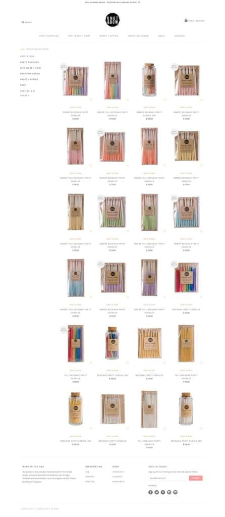
Product-forward, low-ornament layout. Listings favour flat product photography on plain grounds over lifestyle staging, with badges such as “Best Seller” and “Lower Price” used directly on the image rather than in separate copy blocks.
Five top-level categories. The shop is split into Party Supplies, Gift Wrap + Trim, Craft + Office, Greeting Cards and Sale, with subcategories such as balloons, confetti, birthday cards and sympathy cards nested beneath.
Everyday pricing shown on the grid. Prices are visible on listing pages without needing to open a product, for example beeswax party candles at $12, tall versions at $16, and confetti items from $6 to $12, with sale reductions marked directly.
Occasion-specific card subcategories. Greeting Cards are broken out by occasion rather than left as a single undifferentiated section, making it possible to browse directly to, for example, sympathy or birthday designs.
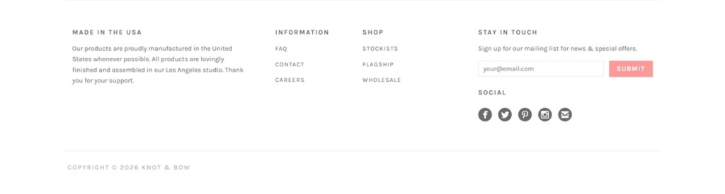
Domestic manufacturing as the central claim. The Made in the USA framing is repeated across the site’s value messaging rather than confined to a single about page, tying quality directly to where and how products are made.
The Los Angeles studio named specifically. Finishing and assembly are attributed to a named studio location rather than described generically, giving the manufacturing claim a concrete place rather than a vague one.
A linked wholesale channel. The footer routes trade buyers to a separate wholesale section and stockist list, indicating the brand sells both direct to consumers and through retail partners.
A visible operational notice. At the time of research the site displayed a seasonal shipping notice about a break in fulfilment, shown directly on the storefront rather than only in a policy page.
Stockist listing in the footer. Alongside FAQ and wholesale links, the footer names where Knot & Bow products can be bought in person, connecting the online shop to physical retail points across the wider gift and stationery trade.

Various Keytags is an online store for design-minded people who enjoy organization, happiness, and fun. It was born out of a sense of humor and the sheer necessity of finding a simple Keytag that isn’t too fussy.
We work to protect farm animals from cruelty, inspire change in the way society views and treats farm animals, and promote compassionate vegan living.
Haptic Lab is a small Brooklyn-based design studio. We make quilts, kites and spaces that explore the sense of touch.
Amy + Bill started American Heirloom in 2011 after fashioning their first trademark, state-shaped cutting boards for their wedding reception. The response was passionate, demand grew, and AH was born. We’ve grown the line to include all manner of tabletop and barware, with a particular eye on quality of materials and craftsmanship.
Classic footwear made to meet new horizons, designed in New York City.
Adam J. Kurtz is an artist and author whose illustrative work is rooted in honesty, humor and a little darkness.
Letterpress posters of words to live by.
Areaware is a gift and home accessories brand based in Brooklyn, NY and Columbus, OH.
Diane Bonheur is a Japanese farming shampoo made from natural ingredients.
The Northern Block is an independent British type foundry founded in 2006 by Jonathan Hill, selling retail typefaces to brands, creatives and makers. The library runs to 73 families, from single style designs such as Tondu and Zabawa to Lintel Next at 96 styles and Mynor at 85. Alongside font licences the foundry sells custom typeface design and multi script work covering Arabic, Cyrillic, Greek and Georgian. The site is a Next.js and Sanity build, with the store, font delivery and testing tools provided by Fontdue.
Black on white, and nothing else. The stylesheet resolves to #000 on #fff with grey reserved for secondary text, the only departure being a near black surface behind the type testers. No brand colour competes with the letterforms.
The catalogue is the specimen. The homepage is one long list of families, each name set large in its own face with a style count beside it, so scrolling the index is also scrolling the library. Recent releases carry a New! flag.
The site is set in its own fonts. The footer credits “Website Typefaces: Grobart and Leida”, naming the two faces the interface itself uses.
Two actions per family. Every row in the index offers Learn more and Buy, splitting the browsing route from the purchase route at first contact.
The family page is a testing rig. Each style gets a tester row with its name, a size control, an OT Features panel and an editable pangram defaulting to “Brick quiz whangs jumpy veldt fox.” Feature toggles appear as checkboxes: Case-Sensitive Forms, Denominators, Fractions, Lining Figures, Lowercase a, Lowercase g and Tabular Figures.
Trials offered ahead of pricing. Download Free Test Fonts and Download PDF Specimen sit at the top of every family page, above any Buy control, so evaluation comes before the licence decision.
Purchase opens over the page. Buying runs through a modal layered on the family page rather than a separate cart route, with account and cart links held in the header.
A one paragraph position. The homepage closes with the foundry calling itself “an independent type foundry internationally recognised for producing modernist fonts for brands, creatives and makers”, then naming the founder and the custom and multi script services.
Every family gets a written case. Family pages carry an Information section explaining the reference and the intent. Boxal is introduced as a pixel font drawn from classic arcade gaming, with five style variants and over 610 characters across 15 weights.
A full character viewer. Family pages expose the whole glyph set by Unicode block, from Basic Latin through Currency Symbols to Emoticons, with a readout giving glyph name, Unicode decimal and hex, plus cap height, x height, ascender and descender.
Feature demos with real strings. OpenType features are shown in use rather than listed, with Fractions on “Add 1/2 cup and 3/4 tsp”, Oldstyle Figures on “Established in 1842” and Superscript on “E = MC2”.
Licensing set out before purchase. A dedicated page defines Desktop, Web, Application and Canva licences, then lists the cases handled by quotation instead, among them broadcast and streaming, video games, OEM products and logo licences.
Tag based filtering. The index Filter is keyed to descriptive tags such as sharp, contemporary, elegant and headline rather than to formal classification.


