We curate, commission and sell contemporary objects rooted in craftsmanship and narrative.
The New Craftsmen


eCommerce Websites
We curate, commission and sell contemporary objects rooted in craftsmanship and narrative.
A blend of Grenache and Cinsault, Très Chic rosé is a sip of Southern France, an escape to coastal vineyards, lavender fields and Mediterranean beaches.
Innovative, effective and natural skincare from Austria.
Discover the next level fitness experience.
The highest quality pasta, made with the world’s most exceptional grains.
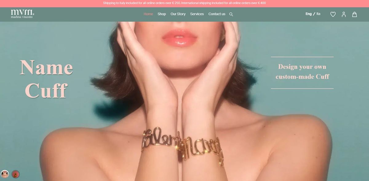
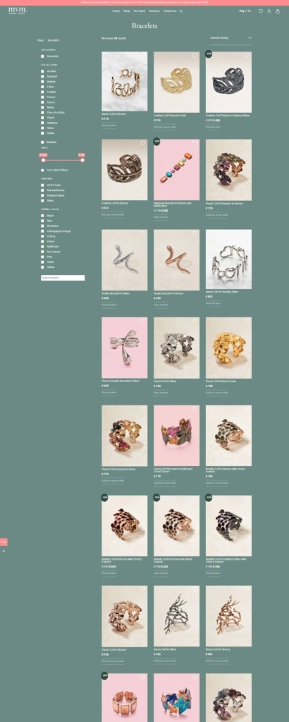
Madina Visconti sells handcrafted jewellery made in Milan, working mainly in fused bronze and sterling silver with hot enamel, and in gold and precious stones for a smaller fine line. The shop holds 393 products across earrings, necklaces and pendants, rings, bracelets, hair accessories, brooches, cufflinks and belts, grouped into named collections such as Ivy, Edera, Fiocco, Bouquet, Astri and Panzè. Pieces are described as a “reinterpretation of classic jewelry, unique pieces designed from organic and abstract shapes reflecting the essence of nature, handcrafted using lost-wax casting”. Built on WooCommerce.
Coral against forest green. The theme runs a soft coral pink (#ff8d8f) as its accent, set against a deep green (#334c45) and a muted sage (#6a8a83), with white and black doing the structural work. Coral appears on buttons and sale flags, the greens on full width panels.
A four family type system. Adobe Garamond Pro carries the editorial copy, Aktiv Grotesk the interface and product labels, Acta Display Extra Bold the largest headings, and a script face is kept for decorative lines. Long passages are set narrow and centred with hard line breaks, so the Our Story block reads as a poem rather than a paragraph.
Photography on flat colour. Product shots are cut out and placed on plain grounds, while campaign imagery and an embedded Instagram feed supply styled context further down.
Filters that describe the material. The shop filters on category, collection, price, stock and three attributes specific to this catalogue: Material, listing bronze, brass, silver and individual stones down to tsavorite and rhodolite; Finishing, covering 24 kt gold, natural bronze and oxidized silver; and Enamel colour, with eleven named shades plus No Enamel.
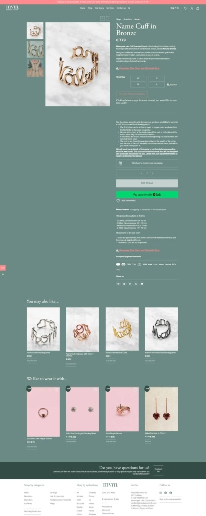
Made to order built into the buy box. The Name Cuff page combines a wrist size dropdown, a downloadable size chart and printable sizer, a free text field for the name to be cast, and a packaging choice between standard and gift wrap with a message. Tabs below cover measurements, shipping, attributes and personalisation.
Stock stated as pre-order. Sold out items are labelled “Sold out: on pre-order” rather than hidden, and custom pieces carry a lead time of four to five weeks from sketch approval.
The workshop as the argument. The Our Story panel places the brand in the medieval Cinque Vie district of Milan, “where the streets are named after” the goldsmiths and silversmiths who worked there, and ties production staying local to that tradition.
One object carries the history. The Name collection is traced to a cuff made by Madina’s mother Osanna for her sister in 1985, found later in the brand archive and put into production.
A bilingual storefront. An Eng and Ita toggle in the header swaps the whole site, including product pages, between English and Italian.
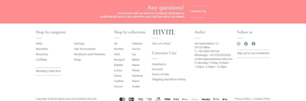
Services alongside the shop. The Services menu carries How to clean your jewellery, Made to Order and Weddings, and the footer lists the Milan atelier address, telephone, WhatsApp and opening hours.
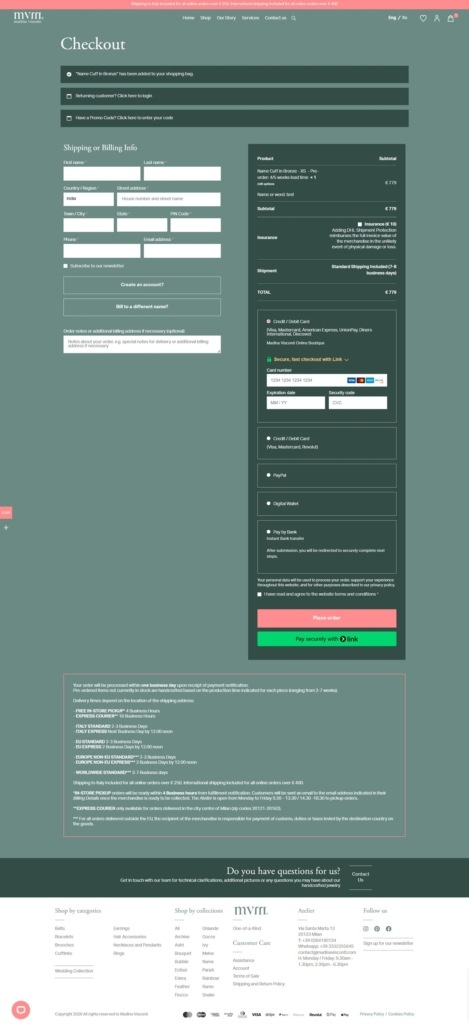
Free shipping thresholds in the top bar. A persistent banner states shipping included over 250 euro within Italy and over 400 euro internationally.
Britain’s favourite rooibos tea brand.
Femme and Fierce is a curated collection of personally selected clothes, from the worlds best independent brands, to make girl bosses feel damn-fine.
Denver and Liely is the culmination of ideas from Designers Denver Cramer and Liely Faulkner.
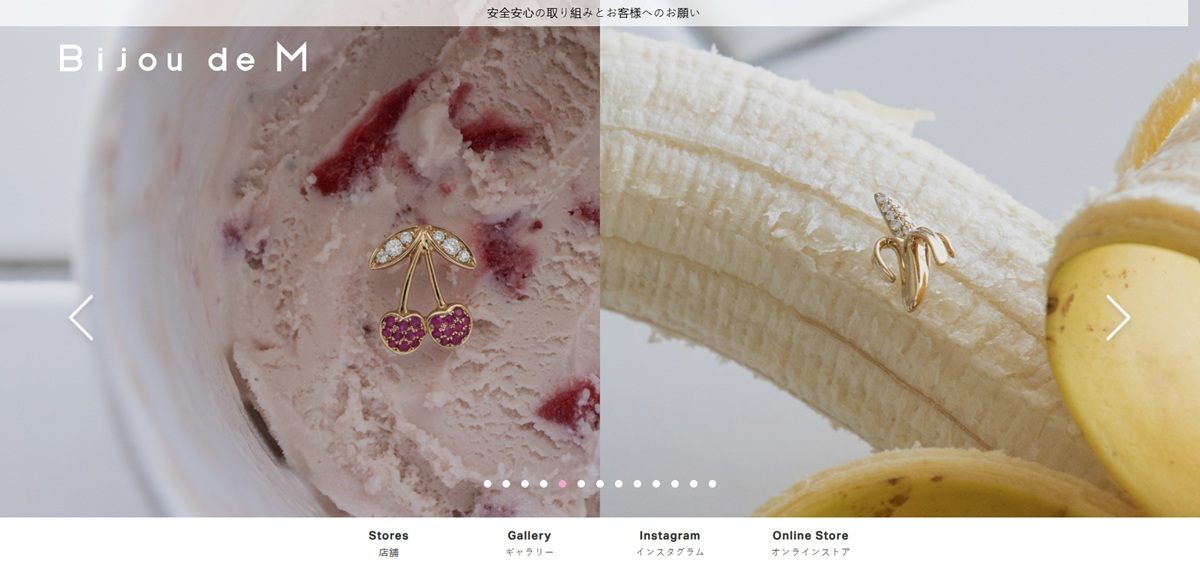
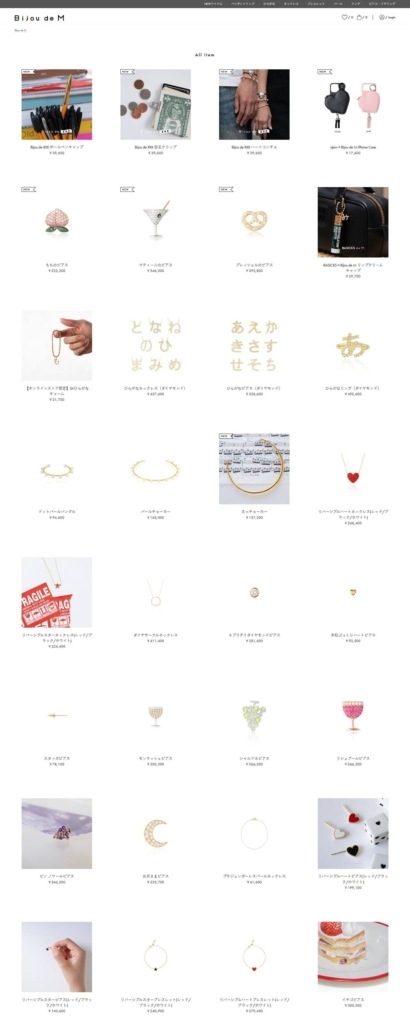
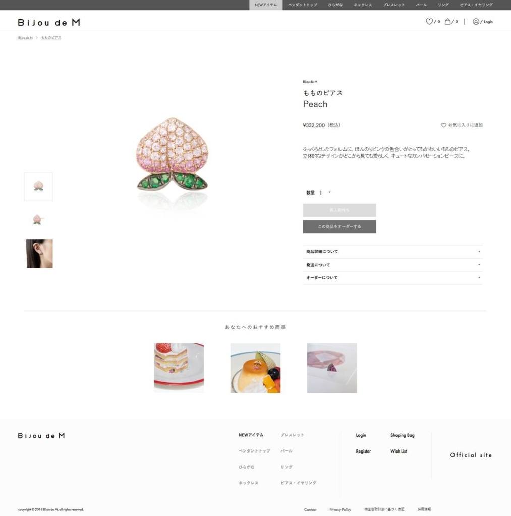
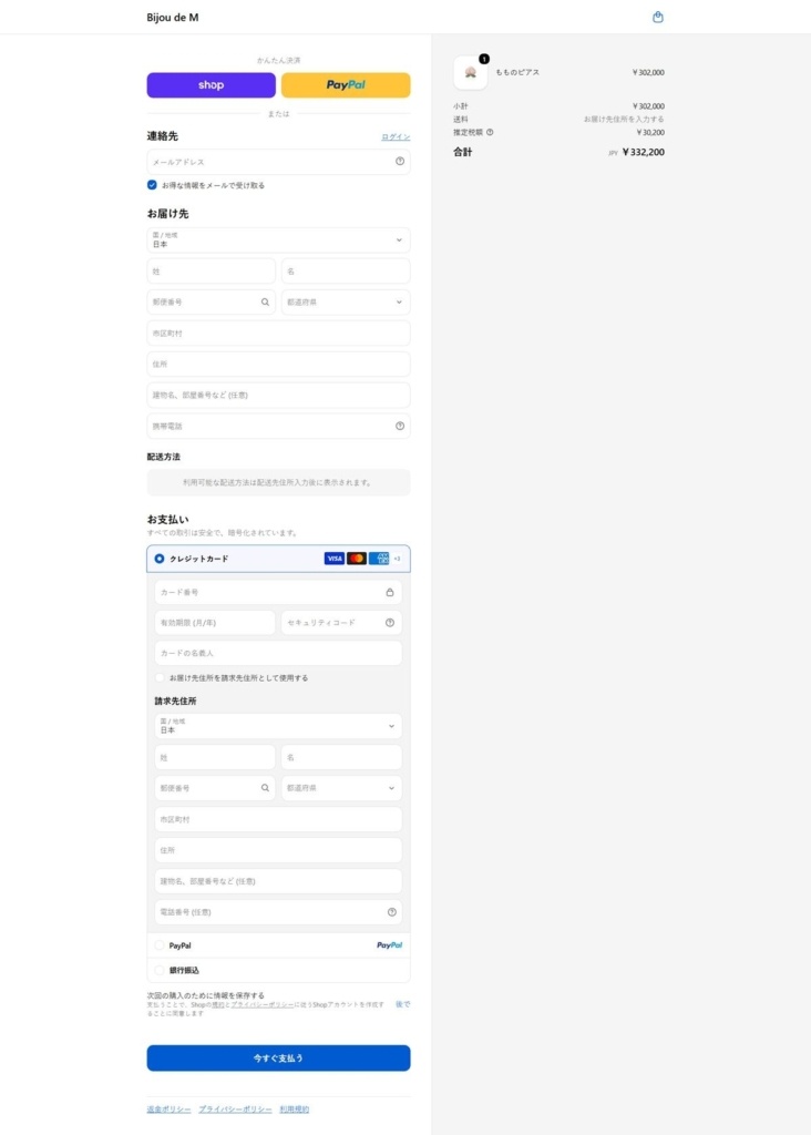
Bijou de M is a Japanese jewelry label selling casual, everyday pieces described as a finishing spice for personal style rather than formal fine jewelry. The range covers earrings, necklaces, rings and pearl pieces, with a bridal line handled separately by inquiry. The bilingual storefront supports the brand’s physical stores and sits alongside a gallery and Instagram presence.
A blush and gold palette. Backgrounds run mostly white and pale grey, set off by two pinks, a rose tone and a lighter blush, plus a muted gold used sparingly against black text and near-black panels. The effect is soft rather than saturated, closer to packaging than to a typical retail palette.
Sans-serif Latin, native Japanese type. Body copy sets in Aktiv Grotesk for Latin characters and switches to Hiragino Kaku Gothic Pro for Japanese text, keeping both scripts legible without leaning on a serif for either.
Photography-led homepage. A hero carousel opens onto a gallery of model photography, then a Pick Up strip of four staff-recommended items, so the page reads as a lookbook first and a shop second.
Keyword-driven browsing. Below the gallery, a popular-keywords block links out by motif, hiragana, pearl, earrings, ribbons, reversible items, letting shoppers browse by design detail instead of a conventional product category tree.
Three-way homepage split. Three calls to action, Gallery, Online Store and Bridal inquiry, sit side by side on the homepage, treating the shop as one of three equally weighted paths rather than the default destination.
Reversible pieces named for their mechanism. Several lines, reversible hearts among them, are described by how the piece works rather than by a generic style name, a detail that carries into the product naming itself.
A stated one-line mission. The brand’s own description, simple yet cute designs with a little added accent, sets the positioning directly: pieces built for daily wear, not occasion wear.
Bridal kept inquiry-only. Rather than listing bridal pieces for direct purchase, that category routes to an inquiry form, separating everyday stock from a consultative, made-to-order line.
Instagram folded into the homepage. A dedicated Instagram section sits among the shop sections rather than only in the footer, tying the social feed to the same model-photography style used across the site.
Direct customer service contact. The footer lists a phone number and stated service hours alongside the support email, a level of direct contact detail that is unusual among sites of this size.
Parent company credited in the footer. The footer names MIO HARUTAKA as the parent company with a link to its own site, keeping the jewelry label distinct from the wider business behind it.
Store locations listed alongside the shop. A dedicated Stores section sits in the primary navigation next to the Online Store link, treating the physical retail locations as equally prominent as the ecommerce catalogue rather than as a secondary footer item.
Unique fitness classes – combining HIIT, Meditation & Mantras. Physical, Mental & Emotional fitness for all.
Modern, eco-friendly and affordable furniture, made with love in Russia.


